Structural Violence and “The Great Equalizer”
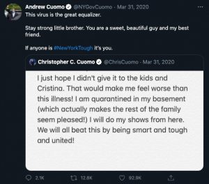
On March 31, 2020, New York City governor Andrew Cuomo declared in a press conference and on Twitter that the COVID-19 virus is “The Great Equalizer.”

Cuomo’s comment aimed to articulate that biologically, the human species all have receptors at the cellular level to allow the binding and endocytosis of the COVID-19 virion. However, this is not how society understood this statement. Cuomo improperly contextualized it.
In a pandemic, when society has to turn to media to garner crucial health-related information, information must be correctly contextualized.
Using a combination of ethnographic data visualization and narratives of a frontline healthcare worker operating a field site in Philadelphia, I will discuss how likening the COVID19 virus to an equalizer ignores the presence of structural violence in our society.
If COVID19 is genuinely an “equalizer,” media would flood our screens with maps similar to the one above. Rather than showing color gradients indicating difference, maps would function to depict similarity. However, maps such as this one published by the New York Times visually indicate stark differences; this is true for any unit of measurement of the pandemic, from the number of positive cases to available ICU beds and ventilators.
The phrase “the great equalizer” acknowledges that every homo sapien can contract the COVID19 virus as long as their respiratory tract allows the virus to bind; however, it omits that many other factors increase the likelihood of this mechanism in specific populations.
Data visualizations comparing the COVID19 pandemic in different geographic areas can provide a basis for this discussion. To visually illustrate that COVID19 is not an equalizer, I will take the same dataset (depicting the pandemic measures in Pennsylvania) and illustrate them in various ways (employing techniques of color, size, and time).
This first visualization utilizes a choropleth map layered with a timeline to depict the rise in cumulative cases of COVID19 in each of Pennsylvania’s counties throughout 2020 and 2021. The color scale indicates the number of cumulative cases in a Pennsylvania county, where similar colored geographic areas represent a similar “extent” of the COVID19 pandemic. Mouse-over each county for specific data, and cycle through the (month, year) options to understand the rise of COVID19 in each geographic area.
As this visualization shows, many counties in Pennsylvania followed unique paths as the pandemic grew. By cycling through the month and year options on the visualization, one can see that there have always been stark disparities in positive COVID19 cases in counties that are suburban/rural (concentrated more towards the center of the state) versus counties that have more prominent urban centers (such as Allegheny County with Pittsburgh, and Philadelphia County with Philadelphia).
As a comparison, this visualization depicts the case breakdown by county but additionally shows which day(s) yielded the greatest/smallest number of new, positive COVID19 cases. It uses color, size, and time (as a defined period between sunrise and sunset, rather than a continuum). Counties that occupy larger “boxes” and have a more significant percentage of darker red coloring indicate a more considerable daily impact of COVID19. There is a visually stark disparity between Philadelphia county (framed in black) and counties such as Susquehanna and Montour in the bottom right-hand corner.
To further compare, and reinforce that no visualization of the pandemic yields imagery of an “equalizer”, this visualization depicts the pandemic by county utilizing factors of size and time as a continuum. The viewer can now see the undulating waves of case counts, which connects days together rather than viewing them as discrete entities like the visualization above.
Use the bar on the right-hand side to scroll down by alphabetical order so that you can view Perry, Philadelphia, and Pike counties. While population influences the number of cases a county has (Philadelphia County has a major city, while Perry and Pike are rural), other factors caused Philadelphia to erupt with COVID19 cases early on, with sustained spread. In contrast, the other two counties remained relatively unaffected this entire time. Those factors, including factors that contribute to the relationships of structural violence, dismiss the theory of the great equalizer.
In summary, if the “Great Equalizer” were indeed a force that hit every geographic area and human “equally,” timelines, as well as the total number of cases present, would be theoretically equal. Additionally, I hope that my examples of describing the rise of the pandemic in different geographic areas emphasize how the visual medium chosen can impact the viewer’s comprehension (cumulative cases versus daily new cases; days as discrete versus a connected timeline).
Data is not the sole measure that we can utilize to disprove the theory of the great equalizer. While this page focused on the data-driven narratives of the COVID19 pandemic, I will contextualize this difference with further data and interlocutor narratives. These narratives will show that difference exists within the level of the county.


