About Ethnographic Data Visualization
Data visualization is a visual display of subjectivity, often cloaked in objectivity
Data and stories are not always “what they seem.” My page Whole, Not Half, Stories addresses part of this statement by qualifying the idea of the “whole, complete” story. However, because data and narrative are complementary and intertwined, it is imperative to additionally open a discussion as to how data is oftentimes only half the story. This will be achieved through an anthropological interpretation and analysis of our “data worlds.”
The chart below aims to discuss the differences between viewing data as our “reality” rather than a representation. The term representation, as used by Mitchell (1995), aims to articulate that everything in our world is subjective. Take a photograph of Philadelphia as an example: many argue that a photograph can be a technique to capture the “truth” of the world.

However, photographs signify subjects of importance to the photographer; additionally, they are positioned, framed, and edited in biased ways. The photograph presents a view that is limited by the edges of the paper.
The positioning of a photograph can serve as a metaphor for the collection, production, and use of data. Many of the same concepts apply to data and data visualizations; it is imperative to understand that data visualizations do not represent an ultimate truth of the world, but rather a biased perspective. I am using the word “bias” not solely in a negative way; rather, I want to bring your attention to the presence of the human eye in interpreting the world.
This chart provides some more concrete examples to help distinguish the differences between viewing data as “reality” versus “representation.”
An anthropological perspective can bring nuance to a discussion of data, namely how social forces play a role in its creation and existence. There are some main points that I want to draw your attention to, which are emphasized and reinforced by an anthropological analysis of data.
- Nature does not create categories- humans do as a social process! Namely, categories are created by those in power and they perpetually change. Categories are not realities, but skewed representations of the world.
- Data visualizations need contextualization so that the audience can properly, and actively, experience them. An example below will discuss how understanding and contextualizing space on maps and charts, specifically for COVID19 data, leads to a broader understanding of the “problem” depicted.
- Most visualizations, and specifically maps, are rendered in order to show difference; because of this, we as the audience need to be wary that differences rather than similarities are usually emphasized. See my example The Great Equalizer for a more in depth discussion on this topic.
- We need to rethink our assumptions about data visualizations in order to see them, and their data, as biased rather than ultimately factual.
The examples outlined below will provide evidence for how data is a social process. They will describe how data is active, and visualizations of it have the potential to alter how we see the world.
For a more in depth discussion of these topics, please navigate to the Resources tab to download a PDF of my methodology paper that accompanies this website.
Example 1: Data visualization creation and consumption during COVID19
Data visualization has a significant role in our society during the COVID19 pandemic; we are obsessed with the numbers which represent the number of cases per geographic area, how much personal protective equipment our hospitals have available on hand, the number of deceased individuals present in refrigerated trucks, the number of ventilators available per major metropolis, and the number of beds available in a local hospital.
These visualizations are significant because they are altering the way that we, as a society, experience and live our lives. For example, Pennsylvania in the early stages of the pandemic, devised a red-yellow-green color code system for its counties to designate the stage of “lockdown.” Suddenly, our local news channels started populating our screens with images like the one below, and the central topic of discussion was whether or not our county would be transitioning with others into the next phase.
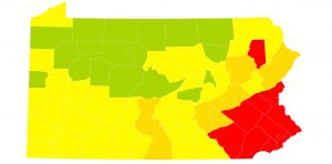
These maps essentially condensed the vast amount of data we had collected (so far) about the pandemic into colors or categories; the colors signified multiple things, from the number of cases per capita of the population in addition to the historical significance of the pandemic or the “moral” standing of the county population. It is important to note that while there was a sudden burst of data collection activity for the pandemic, there is always absence of data.
In some areas, the transition of a county “backwards,” or from yellow to red, was a signifier of “bad behavior” from the population, deemed so due to increased COVID19 cases per capita. On the other hand, counties such as Philadelphia which were designated COVID19 “hotspots” were “red” not from a moral or behavioral designation, but because of the city’s proximate location to New York City (another major hotspot). In addition to factors of morality, the colors represented work and social relations as detailed in the table below. They enabled a visual “simplicity” to the chaos and uncertainty of the pandemic and its restrictions. New events, data, and information were being developed daily, but a resident could filter out that chaos if their county remained the same color as yesterday. It gave the population a sense of daily pattern and repetition to grow accustomed to. As we progressed into the late summertime, when restrictions and capacities of public areas were changing rapidly (oftentimes on a daily basis) the public could look to their television screen and understand the standing of their county through a simplistic color.
Below is a table depicting the restriction information associated with the “color” designation in Pennsylvania.
However, while the visual simplicity of the Pennsylvania color-coded map allowed residents to understand a narrative of the pandemic statewide, it was an utterly simplistic and reductionist narrative.
The individuals who died of COVID19 and the number of restaurants and businesses affected economically through pandemic restrictions were all reduced into a color designation of red, yellow, or green. This color system contributed to creating a “distanced” mindset of the population, which directly opposed the “we are all in this together” message that Dr. Fauci, the NIH, and the CDC were attempting to reinforce.
This pattern additionally occurred in hospital level data, which has emerged in COVID19 data visualizations. As I stated before, society has a preoccupation with the number of hospital beds, ICU beds, and ventilators available. The following visualization presents an example of this:
The visualization contains two lines: the total number of adult ICU beds available in Philadelphia county in contrast with the ICU beds available.
There are two important social patterns that I want to raise about visualizations such as this one:
Visualizations like this one would serve as reference graphs for individuals in Pennsylvania; residents (especially in geographic areas drastically affected by the pandemic) would use them in order to determine whether it was “safe” to seek medical care for illnesses in hospitals. This is because the hospital as infrastructure suddenly was synonymous with mass contagion. Individuals would also utilize data to determine whether a hospital would have a bed available for them, or whether the hospital had “too many” COVID19 cases.
Additionally, visualizing the comparison of “total versus available” is an example of how data has the ability to “interpellate subjects [in this case COVID19 patients] as data points”, as Bowe et al. (2020) argue (1). In an effort to counteract patterns of interpellation, I created the visualization below with the same data. However, this time I shaded in the space between the two lines in order articulate that visual “absence” is instead the presence of individuals. It functions as a “counter” visualization of the data presented previously, which provides an example for how blank space needs to be contextualized in order to gain a more “whole” understanding of the patterns emphasized by the pandemic.
It is important to note that in all pandemic visualizations, there is no visualization which represents the entirety of the pandemic. There is no visualization that can effectively present all the possible viewpoints, challenges, and variables that comprise the COVID19 pandemic in one visual, interactive, and thoroughly contextualized, image. Rather, we as the audience of these visualizations need to keep in mind many of the points that I discussed earlier; namely, data visualizations are representations of our world, rather than images of reality.
Example 2: Data Visualizations Show the Power Dynamics Behind the Construction of the US Census Race and Ethnicity Categories
The visualization and discussion is inspired by Wihbey et al. (2020)‘s piece, Visualizing Diversity: Data Deficiencies and Semiotic Strategies. These authors examine how Census data was constructed to be deeply intertwined with “questions of identity [and] to power and inequality” (Wihbey et al. 2020, 375). The interactive visualization below articulates how the United States Census has created, and changed, the categories in which the population may classify themselves racially and ethnically. As a simplistic bar chart, it clearly articulates how the creators of the Census continually altered the number of categories decade by decade in which the US population had to conform themselves. Additionally, the tooltip feature lists the identity category options created for each decade. The continual changing of the Census categories shows the structurally violent societal norms that those in power deemed socially significant.
The data for this visualization was taken from the United States Census Bureau.
Note, please read: Many questions and categories historically included on the United States Census are offensive and racist. They are present on the visualization to depict how categories are socially constructed by those in power (often, and wrongly so, by the white majority) and how categories as social constructions change overtime (which elicits questions about methods of control and the systemic racism present in our society); however, I in no way condone the use of these words/this language in our society. The goal of this thesis is to visualize, in order to dismantle, the hands of structural violence and the harms they inflict; it is not to perpetuate or increase the power that these relationships contain.
The overarching narrative that is emphasized in this visualization is change: change in the number racial and ethnic categories presented to categorize the American public on the Census every decade since 1790. However, the underlying and hidden narrative which I would like to draw your attention to is the category absent of change.
The only racial/ethnic category to stay the same, while all others underwent continual processes of manipulation and alteration, is white males/females. This is the same racial category that created the Census, and who continually manipulated, altered, and created categories for others as a response to “racial anxieties” and “economic and cultural threat[s]” (Wihbey et al. 2020, 377). The white majority in the United States made others align themselves in relation to the white, stalwart category; the sudden disappearance of a category from one decade to the next represented not only issues with rectifying one’s identity under predetermined options, but how the Census had the power to make some populations visible, while others invisible.
This specific example, utilizing the historical categories of the United States Census, provides a context for us to understand how:
- Categories are intentionally created by those in power.
- Categories, and their names, are socially constructed.
- The Census categories force individuals to reconcile their identities with pre-determined options.
- The creation, and elimination, of racial and ethnic categories over time show the historical invisibility or presence of certain groups.
- The Census is inherently incomplete; it has historically failed to count certain populations and racial/ethnic groups, in addition to vulnerable populations today.
- The Census, in no way, shape, or form represents the “truth” or “reality” of the population of the United States. Rather, it is a biased representation of the population. However, the effects of the Census, such as federal funding, are very real and have very real health effects on the population.
Many of these concepts circle back to the main discussion of this page, which is to reinforce that data visualizations need to be actively engaged, rather than passively viewed. By eliminating the intimidating nature of an excel spreadsheet, data visualizations can make large and confusing datasets more accessible and intelligible to a broader audience; at the same time, they are simplified representations of our world. The audience of data visualizations needs to be critical, rather than accepting, of data in order to understand the social power which data holds.