COVID19 Data Stories
“Someone came up to me, came up very timidly, walked up. He was like a 55-year-old man; he just walks up to me at Saint Raymond’s and says hello. I say hello and then he was like,
‘I’m going to ask you a question. I know you’re gonna say no. So I’m just gonna walk away.’
And I’m like, ‘No, ask me the question! What is it?’ And he was like, ‘So, I’m in-between insurance companies. And I know you’re about to say no. I just really want to get tested; my granddaughter is coming to visit me. I just really want to make sure that I’m safe for her- like I have no symptoms, I haven’t been exposed to anyone that tested positive, and I know you’re gonna say no.’
And he just starts walking away. And I was like, ‘No, no no, stop, stop, wait! We will test you.’ He was like, ‘What?’ I said, ‘Of course we can still test you!’ Like, that’s the beauty of our testing sites and like that’s what I love most, is that we’re so inclusive; we include everyone as much as we can to help.” -Nicole Nestor
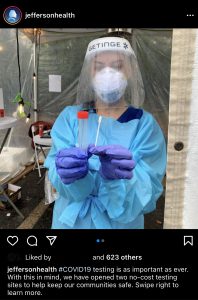
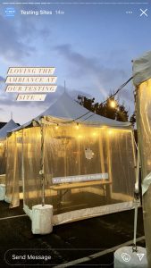
Nicole (Nikki) Nestor, a Philadelphia COVID19 field site testing coordinator, described this story as a ubiquitous interaction with her constituents residing in ZIP codes 19150 and 19143. Nikki is part of a team from Jefferson Health, which determined through statistical analysis with their College of Population Health which ZIP codes were in imminent need of COVID19 testing sites. The field sites, located at St Raymond’s Church in 19150 and Richard Allen Preparatory Charter School in 19143, aim to be pilot solutions to alleviate “testing deserts” in Philadelphia. These field sites operate with minimal infrastructure: a few plastic-draped tents and many propane heaters for the winter months. The essential nurses on staff at these locations volunteer their time to ensure that Philadelphia’s most impoverished neighborhoods have unobstructed access to COVID19 testing.
Nikki’s conversation with her constituent is just one example of how neoliberal influences have created exclusionary patterns in our healthcare system; the reinforcement of these patterns causes individuals to assume that they do not have access to care. In neighborhoods where field sites and clinics are set up specifically to break down barriers to health, often, individuals do not realize that they have access to them. This means that the neighborhood does not benefit as much as it theoretically could from their services.
This page will discuss how structural violence, operating through neoliberal influences, can be visualized in the COVID19 pandemic. The combination of Nikki’s stories as a COVID19 testing coordinator, paired with data collected from the City of Philadelphia, will build on the idea of “The Great Equalizer” to show the dissonance between what is and is not available to residents in different neighborhoods and geographic areas.
The Importance of Awareness
Nikki told me that this story began with a simple question, concerning an absence of information. Physicians at Thomas Jefferson University in Center City, Philadelphia were discussing how none of them knew, or had any information about, the pandemic’s story in low-income and poverty-stricken neighborhoods such as Kensington, Philadelphia. Here, it is important to note how the relative absence of healthcare infrastructure in these neighborhoods is a critical factor in contributing to a lack of information.
A chain of communication requires a source and a receiver: if there is no source to communicate need and difference, there is no reception. This point ties back to my discussion on how historical patterns have contributed to structural violence’s broad-reaching effects. Events and patterns of the past, such as how privatized healthcare through employers in the Riverwards was subject to deindustrialization’s vacuum effect, are impacting how COVID19 will impact current residents.
With this in mind, these physicians who prioritize “health design thinking” advocate that the combination of data, design, and compassion is needed to alleviate healthcare barriers. Many of their proposed solutions, such as field site testing locations for COVID19, counteract many “traditional” healthcare models that neoliberal mindsets have impacted.
Neoliberalism and Design
Field sites, which are designed as a solution to meet the testing needs of a community, are an example (among others that I will discuss on this website, like Roz’s Community Kits) of how creativity can act as a mechanism to work around or pave an alternative path, to our neoliberal construction of the healthcare system.
The physicians and pharmacists who devised the field sites, Dr. Hutchinson, Dr. Fields, Dr. Ku, and Robert Puglisi, compose Jefferson’s Health Design Lab, which promotes health design thinking. This methodology understands that solutions should never be preemptive to experience: they design through collaboration to try to understand how their constituents would view or experience a situation. They design solutions accordingly. This process is not unlike Agar’s suggestion in the chapter “Goals of Ethnography;” here, he argues that the goal of ethnography, “is to reduce the difference between the two accounts, so that mine better approximates a group member’s” (Agar 1980, 129).
Health design thinking argues that there is both a methodology and a potential social organization of health that is contrary to our current healthcare system. Their thinking “goes against the grain” because the methodology argues that solving problems requires an alternative mindset and goals rather than more of the same. By “the same,” I mean the perspectives and relationships that constructed our current healthcare system, in which neoliberal influences result in structural violence. In health design thinking, no solution is too wild or “outlandish;” instead, it argues that there are limitless possibilities to reconstruct our society’s relationships if only we as a society can “buy-in” to the potential it offers.
For example, body storming (a practice in which health-design-thinkers physically walk the space in which the design will take place) can break down barriers to healthcare. The practice of being in the field, much like ethnographers, benefited the design (and therefore accessibility) by acknowledging that not all Philadelphia residents have cars. Many of the COVID19 testing sites seen in the media are depicted in aerial pictures, containing a long lines of cars. However, many Philadelphians do not have a car (whether for practical or financial reasons) and instead utilize the public transportation infrastructure to navigate the city.
According to the American Community Survey (5 year estimates, 2019), 30.1% of occupied housing units in Philadelphia county (180,846 housing units out of 601,337 units) have no vehicles available. This means that 30% of Philadelphians, in order to access testing, would require a COVID19 testing site that accommodates walk-ups rather than drive-ups. In designing a solution to bring testing to vulnerable and forgotten populations, the Health Design Lab would have to include this vital aspect to render the service “useful.”
Visualizing Absence: Testing Deserts
Just as I discussed in the About Ethnographic Data Visualization section, the absence of data (whether visual or through methods of collection) is just as informative as the presence of data. This next section will focus on visualizing absence; I will connect data from OpenDataPhilly to my ethnographic interviews in order to visualize data, as an ethnographic fact, that is absent from COVID19 data spreadsheets.
This series of visualizations will deconstruct how data, and specifically COVID19 data, is an ethnographic fact. Understanding the complexity of missing data requires two things in tandem:
- Direct ethnographic experience with populations seen as “invisible” because of structural violence.
- Insight into digital anthropological theory discussions about how society socially constructs categories to be populated by data, and how data can wield power over the populations it characterizes. If you want more information on these topics, visit the About Ethnographic Data Visualization page.
Part 1: Identifying the Presence of COVID19 Testing Data
The COVID19 pandemic has increased the presence of “data” in everyone’s lives. Suddenly, visualizations and datasets that show vaccine availability or testing location by geographic region are common internet searches. Data, in this way, is very tied to health because data has a role in communicating vital information as to where resources are available.
In order to determine absence in Philadelphia’s COVID19 narrative, it is necessary to first start with the presence of data. I will visualize, using choropleth maps, COVID19 test results for Philadelphia county in order to see what patterns are contained in the “presence” of data.
This first visualization maps out the cumulative number of positive COVID19 tests per ZIP code (as of January 28, 2021) in addition to the COVID19 testing sites as listed on OpenDataPhilly. I downloaded the testing site spreadsheet in late November of 2020; I re-downloaded it in April of 2021 to see if any information had been updated or amended (which it hadn’t; I will expand on this in Part 3).
This interactive visualization maps out the cumulative number of negative COVID19 tests per ZIP code in addition to the COVID19 testing sites as listed on OpenDataPhilly. It is imperative to look at both the positive and negative testing numbers in a city, as the combination of both indicates where testing is most accessible.
Insights revealed through these visualizations:
- ZIP codes with the most significant number of positive COVID19 tests have the least testing sites available.
- The vast majority of testing locations do not have information on whether or not a previous physician’s referral is a requirement for testing.
- ZIP codes 19124, 19120, and 19111 have a combined 15,000+ positive tests while only having one testing site in the geographic area that does not require a physician’s referral.
- ZIP codes 19143 and 19111 have the most negative tests; these ZIP codes are part of communities with large University medical centers, making testing more accessible.
Part 2: Analysis of Theoretical Absence of COVID19 Testing Data
The patterns in the previous section raise some questions about how COVID19 data is collected in Philadelphia and who is included in this data. For example, how are the ZIP codes with the least amount of testing sites achieving such high positive test counts? Are they being forced to travel to other areas of the city to achieve testing, or are the results skewed because of population size?
The most important question is: if this is the data recorded with disparate access to testing in these ZIP codes, what would the data reveal if there was an ease of testing access?
Following these thoughts, it is essential to contextualize COVID19 testing data with other demographic data available for these ZIP codes. However, as always, it is necessary to remember that data is socially constructed, subjective, and not an “ultimate truth.” Cycle through the tabs on the top of the visualization to explore three different categorizations for Philadelphia ZIP codes: population, median household income, and percentage of individuals living in poverty. These visualizations provide analysis on how, in theory, the COVID19 data visualized in Part 1 is incomplete.
Insights, and specifically patterns, revealed through these ethnographic data visualizations:
- There is a geographic density of COVID19 testing locations in the center of Philadelphia county, around Center City.
- There is a drastic range in Philadelphia’s population per ZIP code, ranging from 5,000 to 75,000. This range exacerbates disparities, as Philadelphia ZIP codes with smaller populations have a greater density of COVID19 testing sites.
- ZIP codes with smaller populations are also making more money; the median household income for Philadelphia county is a 7.25 fold difference from $12,500 to $90,500.
- ZIP codes with higher median household incomes have more testing sites than ZIP codes with lower median household incomes.
- The socioeconomic difference emphasizes that testing is located and built in areas where residents are able to pay for it (meaning, these residents have the income to afford health insurance, which grants them access to testing).
- There is a drastic range of poverty in Philadelphia: high levels of poverty are localized in North and West Philadelphia.
- Individuals who suffer from poverty frequently do not have access to health insurance.
- To be accessible to individuals residing in ZIP codes with high levels of poverty, COVID19 testing sites need to ensure that barriers to healthcare are mitigated (for example, by not requiring a physician’s referral in order to access a test).
- The ZIP codes associated with the highest poverty levels in Philadelphia county have a greater percentage of COVID19 testing sites requiring a physician’s referral than sites not requiring a physician’s referral.
Many of the geographic patterns displayed on these visualizations reveal the neoliberal impact on our health system. Geographic areas with residents with the monetary means to “choose” to engage with the healthcare system have the greatest opportunity to do so. Additionally, these visualizations emphasize how viewing COVID19 as “the Great Equalizer” renders structural violence invisible, as it ignores the histories and relationships that contributed to making one geographic area wealthier than another.
Part 3: “Testing Deserts” and Absent Information
When I was talking to Nikki about her experiences in Philadelphia, the term “testing desert” came up in our conversation. I asked her to define it for me, and explain its relevance:
Nikki articulated that a critical resource’s absence (such as testing) causes the presence of a health concern (such as COVID19).
The use of the term desert to describe the environment in which Philadelphia residents reside lends itself to a discussion of structural violence and the idea of “choice,” which neoliberalism favors; the word desert implies barrenness and absence. Logically, if an idea or product is absent, then an individual would not have the choice to allocate resources to obtain it. In this section, my goal is to explain, in tandem with information gleaned from ethnographic interviews, how the relative distribution of COVID19 testing sites is indicative of our neoliberal view of healthcare. I will achieve this through data contextualization.
After my conversations with Nikki, I realized that the datasets available on OpenDataPhilly (a site sponsored by the City of Philadelphia) depicting testing locations do not include the Jefferson field sites, although they appear on the Health Department’s Search Engine tool. The absence of the field site locations in this dataset was surprising to me, as I learned the city of Philadelphia is partially funding the existence of these testing locations. This means that they are entirely aware of their presence.
The missing data that I am referring to is the Jefferson COVID19 testing field sites’ locations and services, which are not included in easily accessible datasets produced by the City of Philadelphia. I have provided a document from Nikki outlining these two field sites’ services in the Resources section if you are a Philadelphia resident and need further, more specific information on testing access.
This visualization presents a paradox, meaning that there is always a caveat when considering structural violence and data collected from testing. As I stated before, these visualizations only depict the presence of data (individuals that were able to access a test). There is no data on individuals who either required a test but could not access it or were asymptomatic and did not realize they should take a test. Additionally, because no precisely detailed methodology accompanies data, it is unclear which testing sites contribute to the aggregate “COVID19 tests” data visualized as this map’s base layer. This absence means that we have no way of knowing if the missing field sites’ testing numbers are or are not accounted for in the data set’s total testing numbers.
While this representation of COVID19 in Philadelphia contains many unknowns, it is also imperative to discuss how the absence of the Jefferson field sites in this dataset acts as a disruption of communication to ensure that vulnerable populations have access to the resources they require. Both of these field sites offer services and resources not always available at other testing locations, such as:
- Language services, especially Spanish
- No test/physician referral requirement
- Walk up or drive up services
- Walk-ins welcome: no previous appointment needed
Many of these services and resources break down barriers that prevent Philadelphia residents from accessing testing, besides geographic location.
However, despite these benefits, many of the other testing locations in Philadelphia are unclear as to whether they offer these services; for example, some include data on language while others do not. There is an inherent absence of information in these datasets, in a multitude of ways– while some do not provide services, others do not disclose any information. One of the most considerable barriers is asymptomatic testing and the lack of referral; according to the visualization above, adding the field sites’ two “green” testing locations would increase barrier-free testing’s geographic distribution.
Ethnographic Knowledge of COVID19 Field Testing
“Those people that have been disproportionately affected are invisible, in some way… We’re just viewing this one sided and we’re blindsided to what’s really going on.” – Nikki Nestor
While visualization helps to affirm how the Jefferson COVID19 field testing sites are absent from COVID19 testing data sets, visualization only represents a partial understanding of the story. First-hand ethnographic knowledge is needed to grasp the whole story, including the contexts that surround this data.
A theme that repeatedly came up in my conversations with Nikki was trust: healthcare providers did not trust the reputation of neighborhoods to make a healthcare investment in them, and in return, many residents of Philadelphia neighborhoods did not have trust in anyone administering healthcare. This community distrust is a direct result of the systemic racism in which the healthcare industry was built on; namely, the commodification of black bodies in the “name of science,” such as how Dr. J Marion Sims inflicted violence on the bodies of Anarcha, Betsy, and Lucy in his search for a cure to vaginal fistula (Wailoo 2018). Understanding this complex dynamic and how a COVID19 testing site was going to exist in it was a crucial first step to ensure the site’s success. As Nikki described, the testing site would not be successful if the neighborhood did not have a positive experience interacting with it; the sites’ presence in these neighborhoods is a last resort attempt to rekindle the relationship between those forgotten by the healthcare system and the broken system itself.
Nikki said that finding a location to host the site was one of the most considerable barriers to ensuring its presence: many influential businesses and leaders in these neighborhoods did not trust the healthcare system and viewed the field sites’ presence as a public relations stunt. Nikki articulated that many residents wrongly thought that Jefferson valued the data that resulted from the field sites in terms of quantity: in effect, “proving” their charity without caring for the individuals themselves. In describing this dynamic, Nikki stated:
I heard that, and it kind of bothered me because I do believe that in these communities, it’s not necessarily about the quantity. It’s more about the quality, of the way you treat these people, and the way you treat these patients. That matters so much more to them.
Nikki told me that it was the recognition of community need for testing by key community members, such as Father Walsh of St. Raymond Church, that enabled these sites’ existence. Father Walsh not only understood the needs of his constituents but that he could be a key figure in re-establishing a connection to health for his community. Currently, the field site is in operation at St. Raymond Church every Thursday and Saturday.

This ethnographic knowledge presents another example for how data only demonstrates patterns; it does not necessarily provide a solution.
Data from Jefferson’s College of Population Health informed this team that, statistically, a need was localized. However, it took care and compassion, in addition to clear communication, to enact a solution that would benefit the health of these neighborhoods.
![]()