
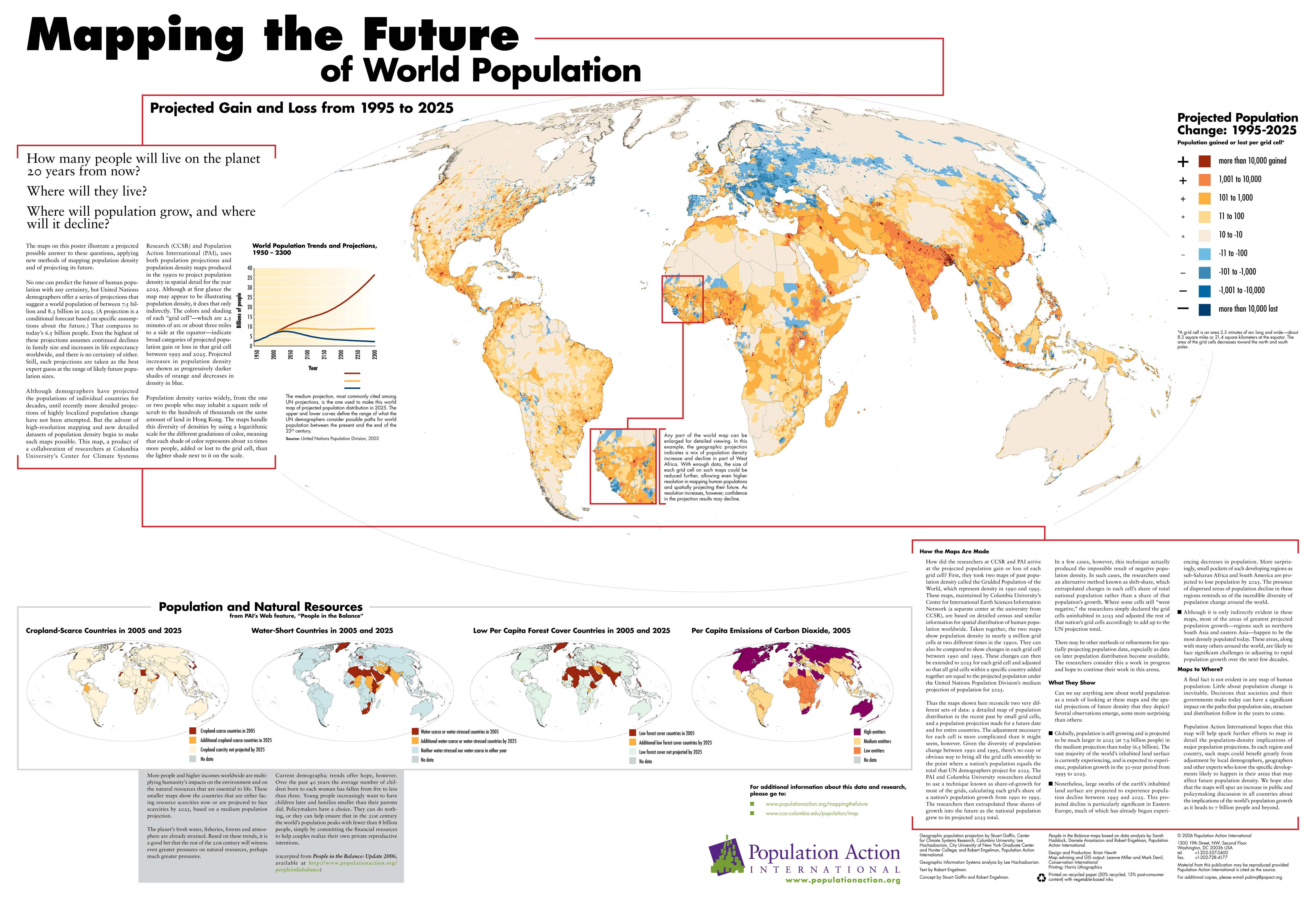
Image:Mapping the Future of World Population to 2025.jpg
From QED

Size of this preview: 800 × 547 pixels
Full resolution (5,700 × 3,900 pixel, file size: 5.58 MB, MIME type: image/jpeg)

A high-resolution DjVuwp version of this map is available here.
The main map may also be viewed interactively with a Flash magnifier at
[1]
Captions
Mapping the Future of World Population: Projected Gain and Loss from 1995 to 2025.
Cropland-Scarce Countries in 2005 and 2025
Water-Short Countries in 2005 and 2025
Low Per Capita Forest Cover Countries in 2005 and 2025
Per Capita Emissions of Carbon Dioxide, 2005
Summary
The main map shows projected population changes per grid cell, each
cell being 2.5 minutes of arc long and wide. At the equator, each cell
is about 8.3 square miles (21.4 square kilometers). The coloring is
on a logarithmic scale.
Most of the text displayed on the map is also available at [2].
For additional information:
Source
Population Action International
Copyright
© 2006 Population Action International
License
“Material from this publication may be reproduced provided Population Action International
is cited as the source.”
Marathas
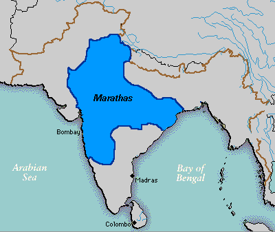
Caption
Extent of the Maratha Confederacy c. 1760
Summary
A map showing the extent of the Maratha empire (Maratha confederacy) at its zenith.
Source
Wikipedia wikipedia:Image:Marathas.GIF
Wikipedia user Deepak Gupta
Copyright
This image has been released into the public domain by its creator, Deepak Gupta
Map-of-human-migrations

Image:Map-of-human-migrations.jpg
From QED

Size of this preview: 800 × 571 pixels
Full resolution (889 × 635 pixel, file size: 274 KB, MIME type: image/jpeg)
Contents |
Summary
Schematic view of how planet Earth was populated in prehistoric times.
The numbers indicate thousands of years before the present.
The letters show mtDNA (mithocondrial DNA) haplogroups.
The blue lines show areas covered by ice or tundra during the last great ice age.
Copyright status
Copyright (C) 2005 Alexandre Van de Sande (User:Avsawp).
| Creative Commons License | This file is licensed under the Creative Commons Attribution-ShareAlike License v. 2.5: http://creativecommons.org/licenses/by-sa/2.5/ Attribution: see above |
Source
http://commons.wikimedia.org/wiki/Image:Map-of-human-migrations.jpg
from mitomap
See also
- MG/Narratives/Journey of Mankind — a Flash animation with commentary.
Map Showing the Telegraph Lines In Operation, Under Contract, and Contemplated to Complete the Circuit of the Globe, 1869
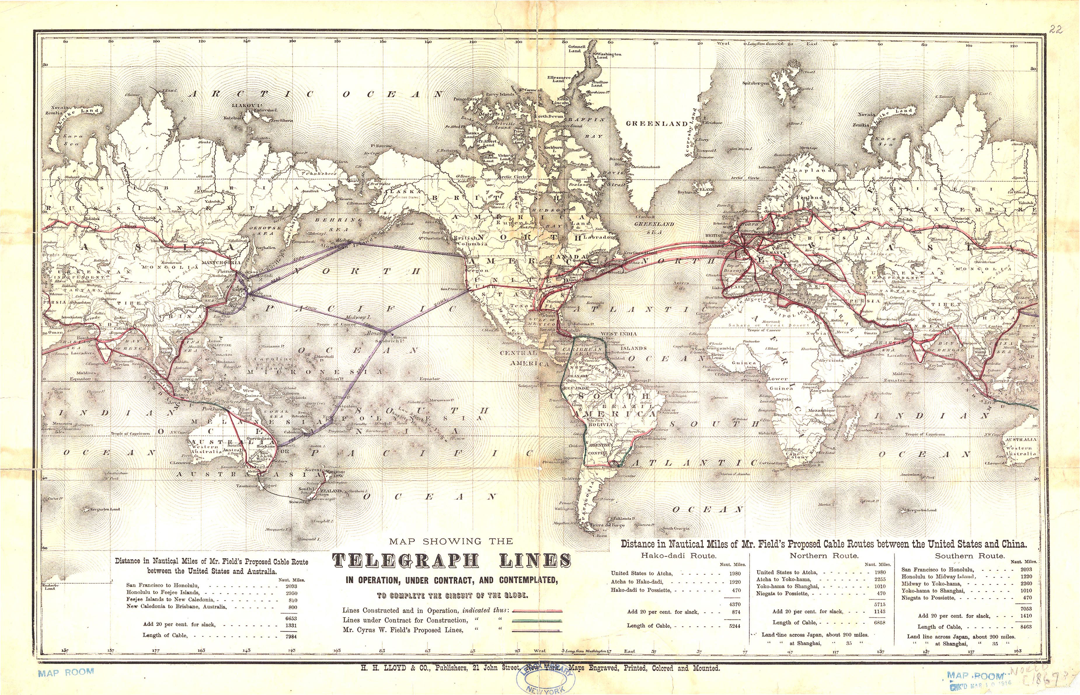
Caption
Map of Telegraph Lines In Operation, Under Contract, and Contemplated to Complete the Circuit of the Globe
Summary
World map shows lines constructed and in operation, lines under contract for construction, and Mr. Cyrus W. Field’s proposed lines. A detail of distances in miles of the contemplated lines between the United States and Australia, and between the United States and China is also offered.
H. H. Lloyd & Co. Publishers, New York. C.W. & C.B. Colton
Copyright
Out of copyright. Marking on map suggests year of publication was 1867 (or 1869).
Map of World showing the principal Ocean Currents & boundaries of River Systems
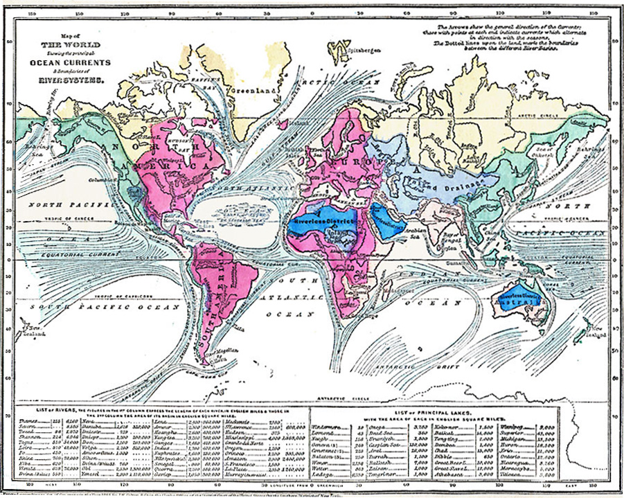
Caption
Map of World showing the principal Ocean Currents & boundaries of River Systems
Summary
Color-coded map indicates the major ocean currents and river systems. It also offers a list of rivers (with lengths and basin areas), and a list of lakes (with areas).
“The arrows show the general direction of the Currents: those with points at each end indicate currents which alternate in direction with the seasons. The dotted lines upon the land, mark the boundaries between the different River-Basins.”
Place Names: Africa, Antarctica, Asia, Australia, Europe, North America, South America
Source
George W. Fitch, Outlines of Physical Geography (New York, NY: Ivison, Phinney, Blakeman & Company, 1868) 26.
Map Credit: Courtesy The Private Collection of Roy Winkelman.
Courtesy of the
MAPS Technology Clearinghouse of the
Florida Center for Instructional Technology (FCIT) at the University of South Florida.
Copyright
The original map is public domain, but “Maps ETC is copyright © 2007 by the University of South Florida”.
See [2] for the license.
Map showing density of population in various regions of the world, 1901
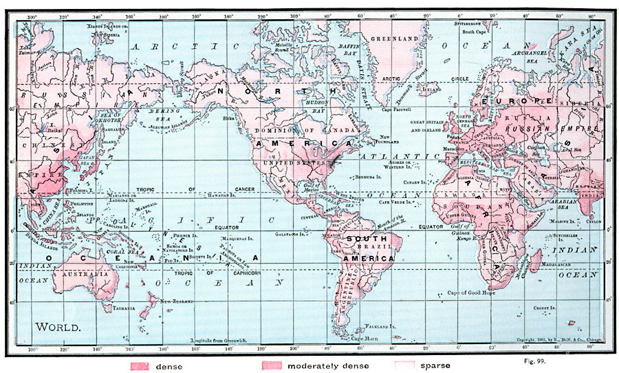
Caption
Map showing density of population in various regions of the world
Summary
Color shades on the map indicate the following population densities:
- dense
- moderately dense
- sparse
Place Names: Africa, Antarctica, Asia, Australia, Europe, North America, South America
This map is one of several global population density maps in the collection:
- Map showing density of population in various regions of the world, 1901.jpg
- Population density map 1994.djvu
See also:
Source
James A. Bowen, Grammar School Geography (Chicago, IL: Rand, McNally & Company, 1901) 58.
Map Credit: Courtesy The Private Collection of Roy Winkelman.
Courtesy of the
MAPS Technology Clearinghouse of the
Florida Center for Instructional Technology (FCIT) at the University of South Florida.
Copyright
The original map is public domain, but “Maps ETC is copyright © 2007 by the University of South Florida”.
See [2] for the license.
Map of the World showing the distribution of Vegetation according to the Zones of Physical Climate, 1891
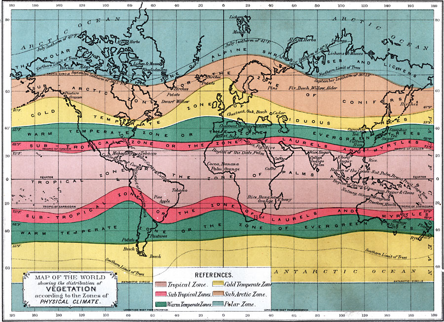
Caption
Map of the World showing the distribution of Vegetation according to the Zones of Physical Climate
Summary
This map was published Philadelphia, in 1891. It depicts a nineteenth-century classification of vegetation according to physical climate.
The legend gives this explanation of colors:
- Tropical zone: light purple – Zone of Palms and Bananas.
- Sub Tropical Zones: Pink – Zone of Laurels and Myrtles.
- Warm Temperate Zones: green – Zone of Evergreen Trees.
- Cold Temperate Zone: yellow – Zone of Deciduous Trees.
- Sub Arctic Zone: light brown – Zone of Conifers.
- Polar Zone: light blue – Zone of Alpine Schrubs Mosses and Lichens
Source
Edwin J. Houston, A. M., The Elements of Physical Geography (Philadelphia, PA: Eldredge & Brother, 1891) 121.
Map Credit: Courtesy The Private Collection of Roy Winkelman.
Courtesy of the
MAPS Technology Clearinghouse of the
Florida Center for Instructional Technology (FCIT) at the University of South Florida.
Copyright
The original map is public domain, but “Maps ETC is copyright © 2007 by the University of South Florida”.
See [2] for the license.
Map of the World Showing the Volume and Distribution of British Trade, 1912
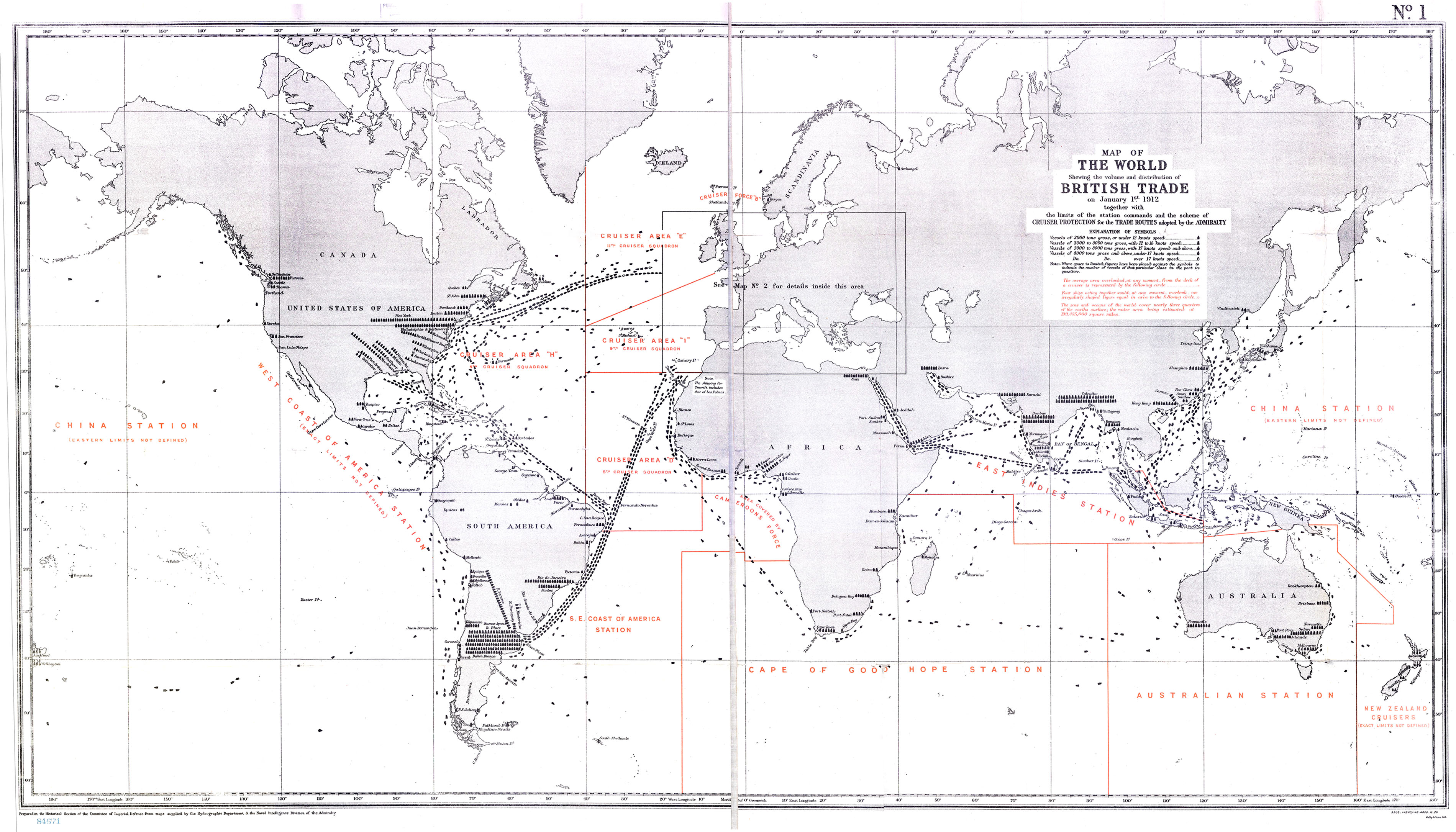
Caption
Map of the World Showing the Volume and Distribution of British Trade, 1912
Summary
World map shows the volume and distribution of British trade routes, as indicated by different vessel sizes. The limits of the station commands and the scheme of cruiser protection for the trade routes are additionally provided.
“Prepared in the Historical Section of the Committee of Imperial Defence from maps supplied by the Hydrographic Department & the naval Intelligence Division of the Admiralty.”
Copyright
Out of copyright. Copyright holder was apparently Mally & Sons Ltd.
Map of the World showing the distribution of its Principal Animals, 1891
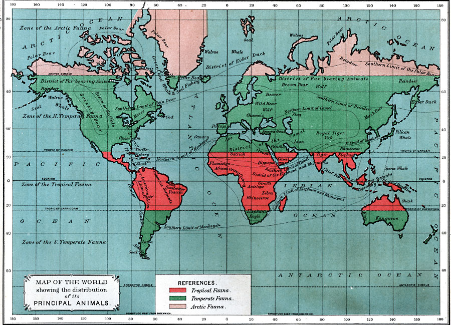
Caption
Map of the World showing the distribution of its Principal Animals
Summary
The legend gives this explanation of colors:
- Tropical Fauna: Red
- Temperate Fauna: Green
- Arctic Fauna: Pink
Source
Edwin J. Houston, A. M., The Elements of Physical Geography (Philadelphia, PA: Eldredge & Brother, 1891) 131.
Map Credit: Courtesy The Private Collection of Roy Winkelman.
Courtesy of the
MAPS Technology Clearinghouse of the
Florida Center for Instructional Technology (FCIT) at the University of South Florida.
Copyright
The original map is public domain, but “Maps ETC is copyright © 2007 by the University of South Florida”.
See [2] for the license.
Map of the Internet, 22 November 2003
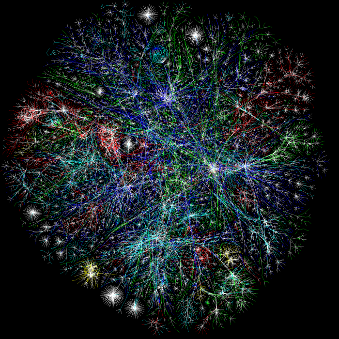
Caption
Map of the Internetwp, 22 November 2003.
Summary
“This is our first full Internet map with color and other graphing logic.
RFC1918 addresses have been hashed into a unique checksum so they do not incorrectly overlap with other routers or hosts.”
The colors are based on Class A allocation of IP space to different registrars in the world:
- Asia Pacific – Red
- Europe/Middle East/Central Asia/Africa – Green
- North America – Blue
- Latin American and Caribbean – Yellow
- RFC1918 IPwp addresses – Cyan
- Unknown – White
Graph Engine: LGL (Large Graph Layout)
Method
“Instead of mapping every single IP address on the Internet (theoretical maximum of 2^32=4,294,967,296 hosts) we simply traceroutewp to each class C network. The “traceroute” is a method to see how the operating Internet looks node-to-node. It’s more of a functional view than looking at how networks advertise over an ASNwp. This also reduces the theoretical maximum to 16,777,216 hosts.” [1]
Source
Map 1069524880.LGL.2D.700×700.png from The Opte Project. Other images at higher resolution are available from the same location.
Copyright
The Opte Project. The copyright date appears to be 2003.
License
Map of the World illustrating the Productive Industry of Various Countries, 1868
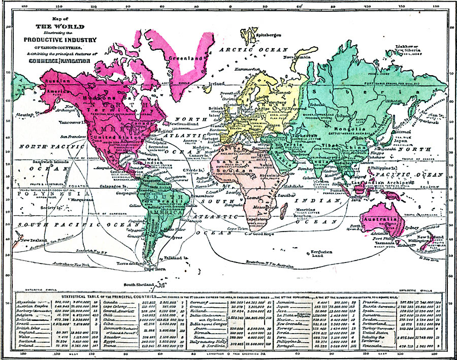
Caption
Map of the World illustrating the Productive Industry of Various Countries, & exhibiting the principal features of Commerce and Navigation
Summary
World map indicates main industrial products by country. It also shows main navigation lines.
Regions/continents are colored differently.
Map additionally offers a statistical table of the principal countries, expressing their areas, population and number of inhabitants to a square mile.
Place Names: Africa, Antarctica, Asia, Australia, Europe, North America, South America
Source
George W. Fitch, Outlines of Physical Geography (New York, NY: Ivison, Phinney, Blakeman & Company, 1868) 102.
Map Credit: Courtesy The Private Collection of Roy Winkelman.
Courtesy of the
MAPS Technology Clearinghouse of the
Florida Center for Instructional Technology (FCIT) at the University of South Florida.
Copyright
The original map is public domain, but “Maps ETC is copyright © 2007 by the University of South Florida”.
See [2] for the license.
Map of Agriculture and Population in Asia (without USSR), 1959
,_1959.jpg)
Caption
Karten zur Landwirtschaft und Bevoelkerung Asiens (ohne UdSSR)
Summary
Map of Asia and the Middle East shows agricultural production until 1959, for local consumption, exports, and imports. The latter are measured in the production of wheat, rice, tea, sugar, rubber, oil crops, wool and cotton, and other products. Annex to Geographische Rundschau 1963 Heft 10; edited by H. Boesch und A. Staedeli; printed by Georg Wastermann Verlag, Braunschweig.
Georg Westermann Verlag, Braunschweig
Source
This map is Map Number 5965 in the collection of copyrighted maps of the Geosciences and Map Library, Fine Hall (B level), Princeton University..
Copyright
None asserted; apparently published in 1963.
Map of Steamship Routes of the World, 1914
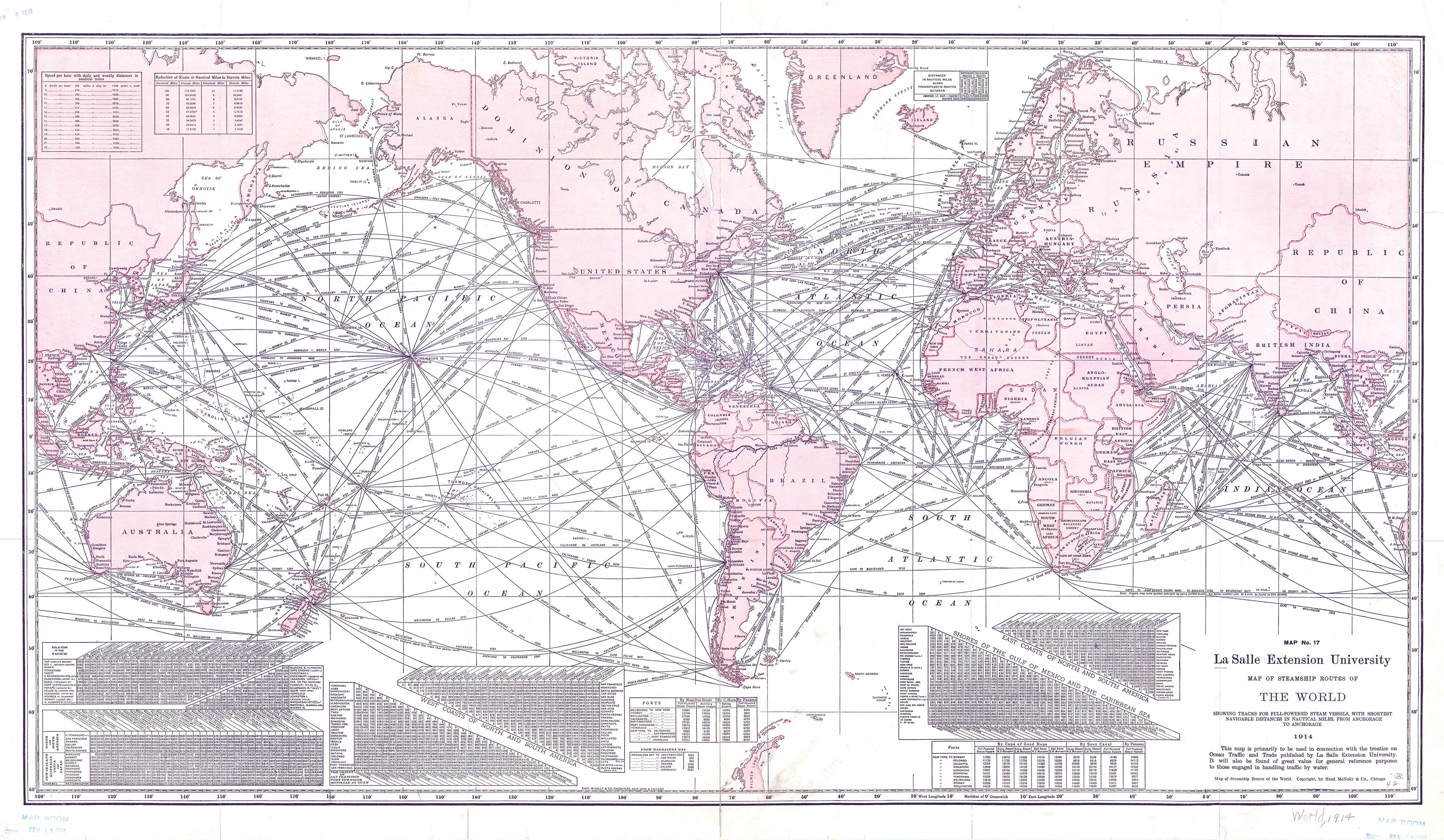
Caption
Map of Steamship Routes of the World
Summary
Shows Steamship Routes of the world, tracks for full-powered steam vessels, with shortest navigable distances in nautical miles, from anchorage to anchorage. Distances are in nautical miles along transatlantic routes. Map No. 17, to be used primarily in connection with the treatise on Ocean Traffic and Trade published by La Salle Extension University.
La Salle Extension University
Copyright
Out of copyright. Originally © Rand McNally & Co., Chicago.
Major Waste Exporters Major Waste Receivers in 2003

Caption
Major Waste Exporters and Waste Receivers in 2003
Summary
These two maps show the countries who are major exporters and receivers of waste in 2003. Only the countries who send or receive more than fifty tonnes of waste are displayed on the map.
Countries who report to the Basel Convention are colored in gray.
Major waste exporters are declared as “countries of origin” in the reporting of imports by other Parties to the Basel Convention.
Major waste importers are declared as “countries of destination” in the reporting of exports by other Parties to the Basel Convention.
Source
United Nations Environment Programme / GRID-Arendal [1]
Cartographer/Designer: Emmanuelle Bournay
Primary Source:
- Basel Convention, 2006 (data for 2003)
Copyright
© 2006 UNEP / GRID-Arendal
Licensing
For use constraints see [2].
Series
This map is one in a series
For a listing with flyovers, see Series:UNEP / GRID-Arendal.
Mali2
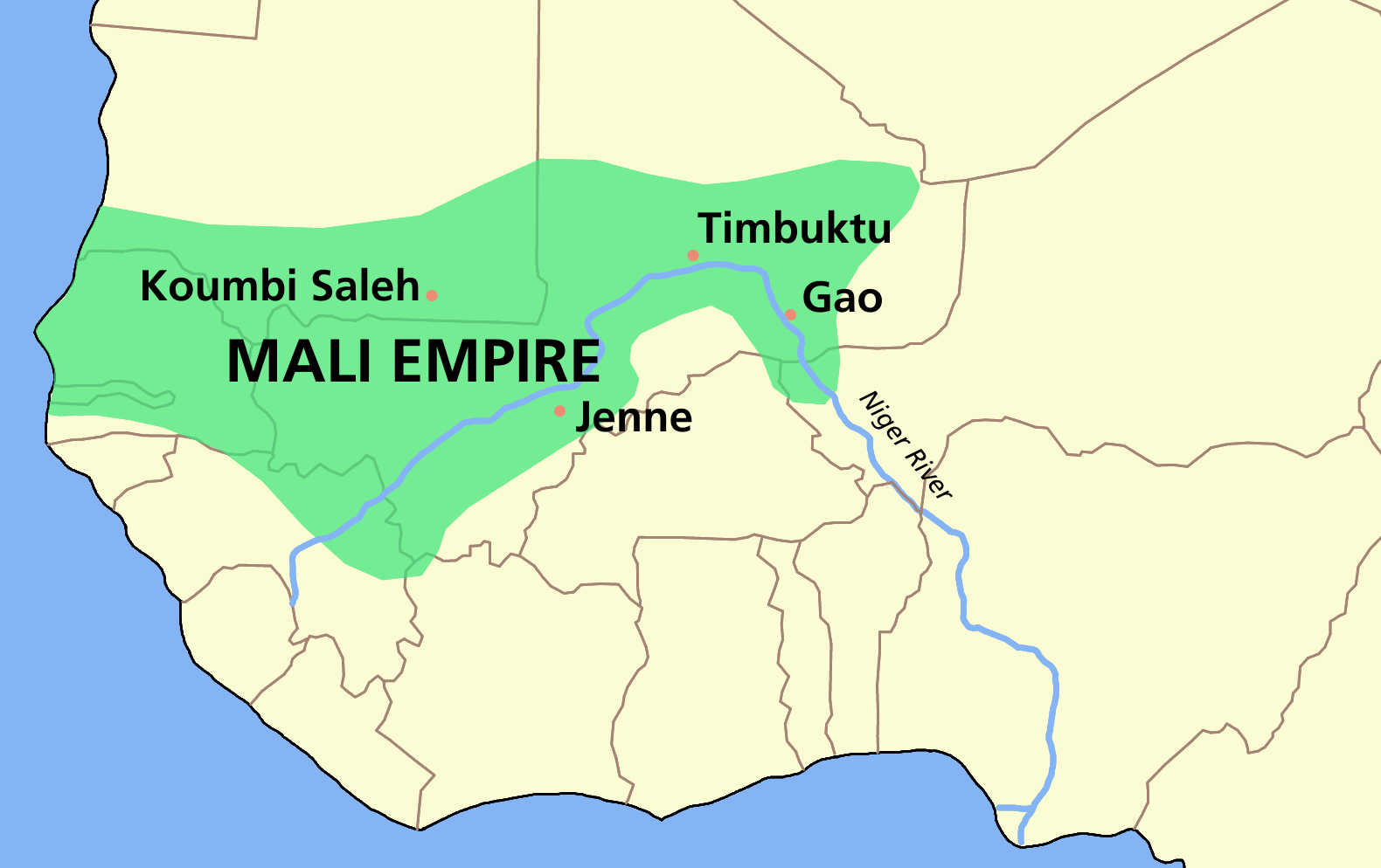
Caption
Mali Empire c. 1350
Summary
Mali Empire showing Koumbi Saleh, Jenne, Timbuktu, and Gao.
Source
Wikipedia wikipedia:Image:MALI_empire_map.PNG
User:Astrokey44
License
| Creative Commons License | This file is licensed under the Creative Commons Attribution-ShareAlike License v. 2.5: http://creativecommons.org/licenses/by-sa/2.5/ Attribution: wikipedia:User:Astrokey44 |
Major Merchandise Ports and Likely Waste Transit Points, 2003
Caption
Major Merchandise Ports [and likely waste transit points]
Summary
This map shows the major shipping ports of the world in 2003 together with the principal shipping routes.
The blue lines represent the major shipping routes and their widths are proportional to the volume of trade;
the circles vary in size according to the total volume of traffic in 2003.
Unscrupulous waste trade became a serious concern in the 1980s due to three converging factors: increasing amounts of hazardous waste; inadequate processing plants; and stricter regulations in the developed world as a result of growing environmental awareness.
Source
United Nations Environment Programme / GRID-Arendal [1]
Primary sources:
- Atlas du Monde Diplomatique 2006, Armand Colin; Panorama des ports de commerce mondiaux 2003, ISEMAR, January 2005;
- Images économiques du monde 2002, Sedes.
Cartographer/Designer: Philippe Rekacewicz, Emmanuelle Bournay
Copyright
© 2006 UNEP / GRID-Arendal
Licensing
For use constraints see
[2]
Series
This map is one in a series:
For a listing with flyovers, see Series:UNEP / GRID-Arendal.
Major Population Movements 1500-1914
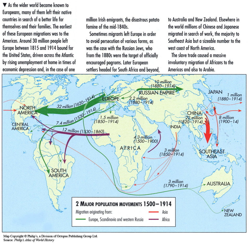
Caption
Major Population Movements 1500-1914
Summary
This map shows global migration routes from 1500 to 1914.
Source
Oxford Atlas of World History, Oxford University Press, 1999. General Editor Patrick K. O’Brien. (p. 211)
Copyright
Map copyright © Philip’s, a division of Octopus Publishing Group Ltd.
Source: Philip’s Atlas of World History
Used under license from Octopus Publishing Group.
Series
This map is one in a series of maps selected from the Oxford Atlas of World History.
A gallery using flyover images like this
Major Global Bird Migration Routes to the Arctic, 2004

Caption
Major Global Bird Migration Routes to the Arctic, 2004
Summary
This map shows the migration routes of birds that visit the Arctic.
“No other place on Earth receives so many migratory species from nearly all corners of the planet. The Arctic coastal regions therefore hold a very special global conservation value.”
Source
United Nations Environment Programme / GRID-Arendal[1]
Cartographer/Designer: Hugo Ahlenius, UNEP/GRID-Arendal
Primary Source:
- Adapted from Arctic Climate Impact Assessment (ACIA), 2004. Impacts of a Warming Arctic.
Copyright
© 2006 UNEP / GRID-Arendal
Licensing
Used with permission.
For use constraints, see [2].
Series
This map is one in a series For a listing with flyovers, see Series:UNEP / GRID-Arendal.
Major Global Trade Flows of Dairy Products in 2003

Caption
Major Global Trade Flows of Dairy Products in 2003
Summary
The map shows dairy exports categorized as follows:
- cheese
- cheese and butter
- powder milk
- powder milk and cheese
- all
The arrow widths are proportional to flows in millions of US dollars.
“The biggest players in international dairy trade are not necessarily the largest producers.
New Zealand, for example, is one of the smallest producing countries but is a major dairy trading
country.” (p. 35).
Source
Don P. Blayney, Mark J. Gehlar, U.S. Dairy at a New Crossroads in a Global Setting, Economic Research Service, USDA, November 2005.
An HTML version
is also available online in the November 2005 issue of the USDA’s Amber Waves.
Copyright
| |
This work is in the public domain in the United States because it is a work of the United States Federal Government under the terms of Title 17, Chapter 1, Section 105 of the United States Code. |
 |
Major Bottled Water Exporters and Importers, 2006
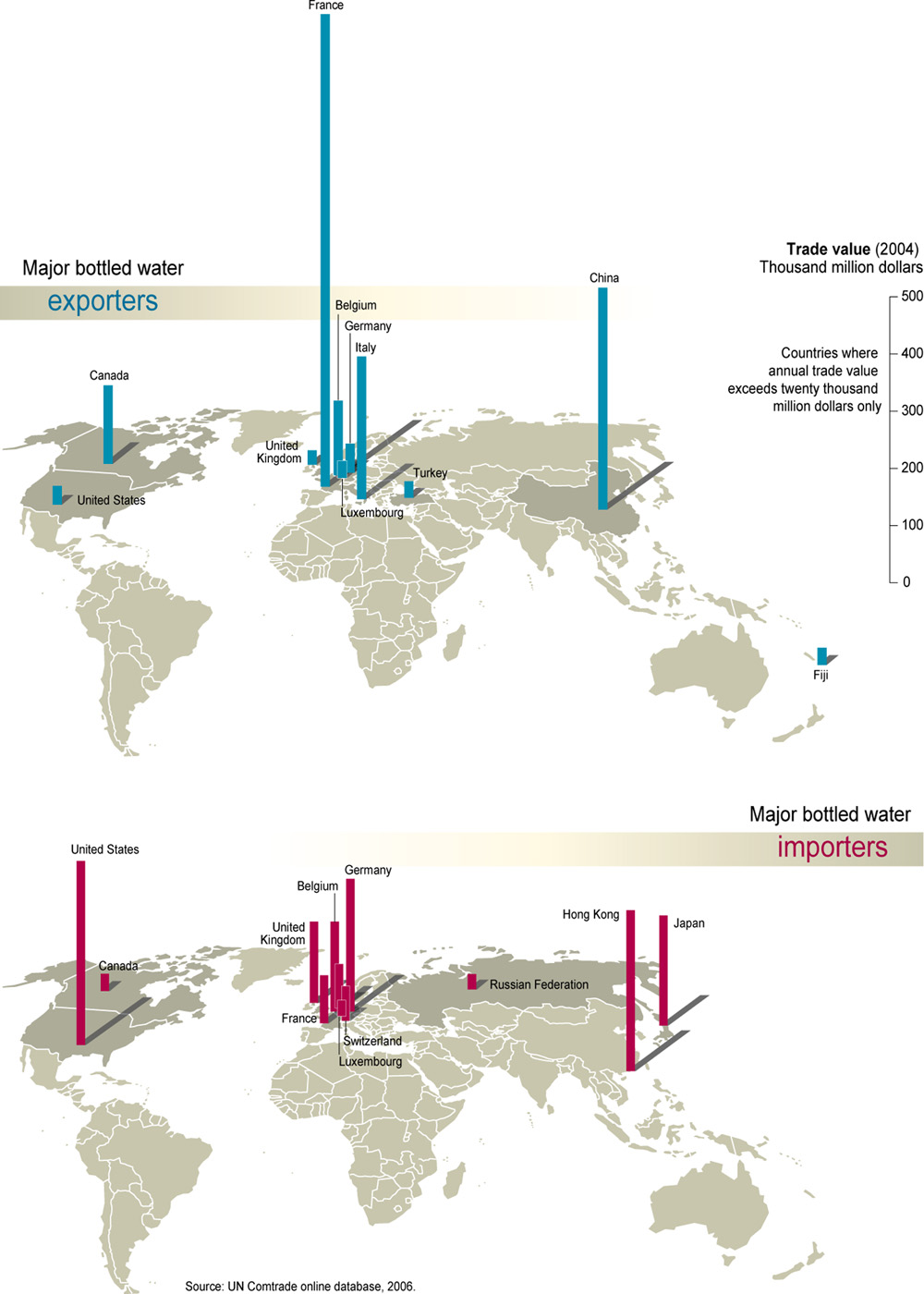
Caption
Major Bottled Water Exporters and Importers, 2006
Summary
These maps show the major exporters and importers of bottled water in the world. Countries are shown based on their annual trade value exceeding twenty thousand million dollars.
The maps illustrate unnecessary exchange in countries such as Germany, France and Belgium that regardless of their local needs or resource availability, represent major exporters and importers of bottled water in the world.
Source
United Nations Environment Programme / GRID-Arendal [1].
Cartographer/Designer: Emmanuelle Bournay.
Primary Source:
- UN Comtrade online database, 2006.
Copyright
© 2006 UNEP / GRID-Arendal
Licensing
For use constraints see [2].
Series
This map is one in a series
For a listing with flyovers, see Series:UNEP / GRID-Arendal.
Major drug routes in Latin America, 1997
Caption
Major drug routes in Latin America, 1997
Summary
This map shows the exportation of drugs from Latin America to countries around the world.
The map shows principal growing areas (represented in darker green), countries where the drugs are produced (indicated by an underline under the country’s name), and principal money-laundering areas (represented by red markers).
The majority of cocaine and marijuana that enters the US comes from Latin America. [1].
Source
Cartographer: Cécile Marin
Primary Sources:
- Geopolitical Drug Observatory (OGD), Atlas mondial des drogues, PUF, September 1996
- Yves Lacoste, Dictionnaire de géopolitique, Flammarion, 1997
Copyright
© Le Monde Diplomatique
Main Transport Facilities in Central and South Africa, 1942
Caption
Main Transport Facilities in Central and South Africa
Summary
Map shows Railroads, Highways, and Rivers.
Compiled and drawn in Geography Division, OSS
Copyright
Public Domain
Main Oil Movements By Sea 1961
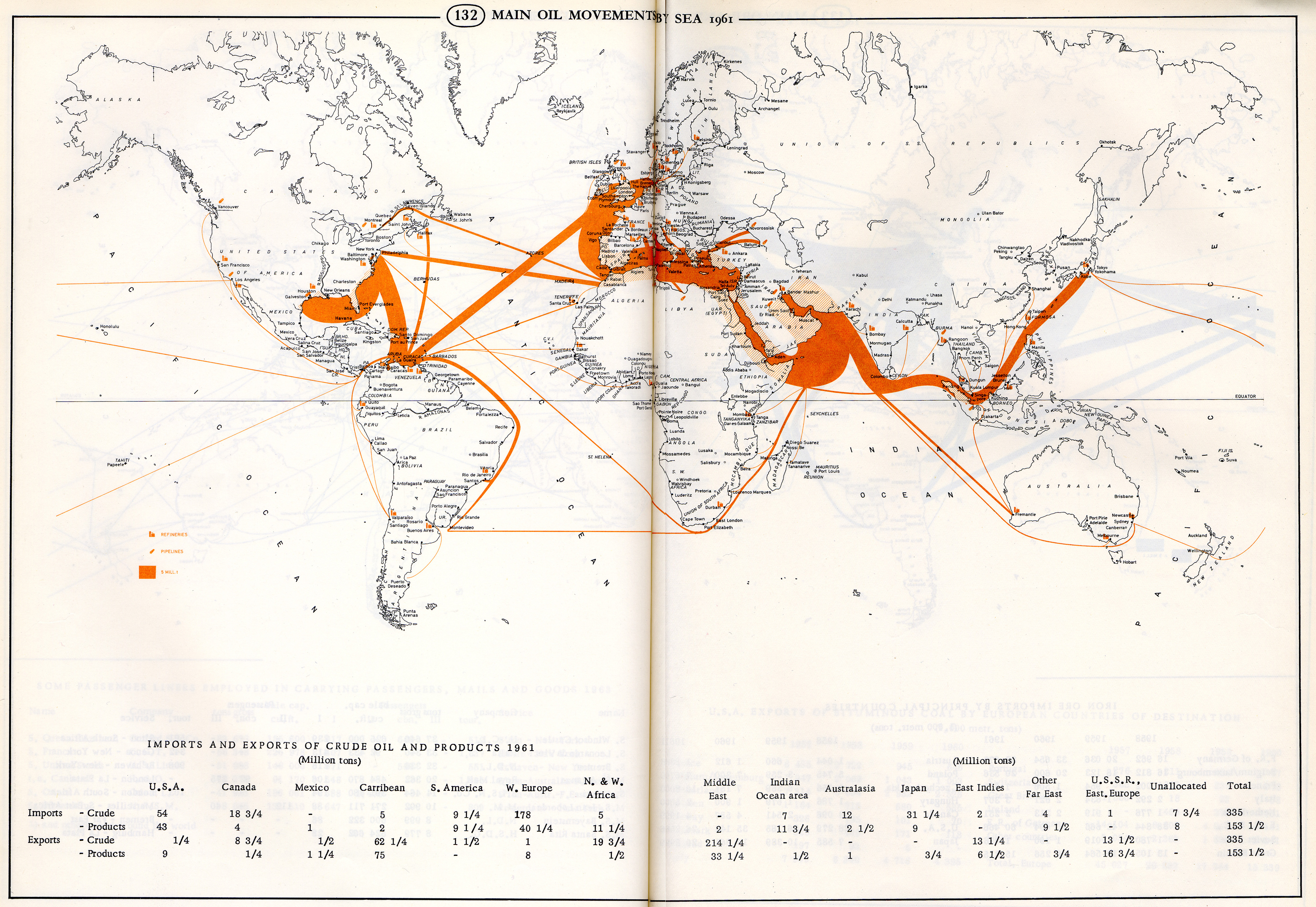
Caption
Main Oil Movements by Sea 1961
Summary
Map shows main global oil movements by sea, and the location of refineries and pipelines. Table below also summarizes imports and exports of crude oil and products by principal countries and regions in 1961.
Source
The World Shipping Scene: Atlas of Shipping, shipbuilding, Seaports and Sea-borne Trade (p. 96-97).
By Gustav Adolf Theel.
Weststadt-Verlag, Munich, 1963.
Copyright
JRO-Verlag Munchen 12, 1963.
This is a copyrighted work. Its use on QED is under the “Fair Use” rule.
Main Ore and Coal Movements by Sea, 1961

Caption
Main Coal and Ore Movements by Sea 1961
Summary
Map shows Main Ore and Coal Movements by Sea. Tables below also summarize iron ore imports by principal countries and U.S.A. exports of bituminous coal by European countries of destination from 1958 to 1961.
Source
The World Shipping Scene: Atlas of Shipping, shipbuilding, Seaports and Sea-borne Trade (p. 98-99).
By Gustav Adolf Theel.
Weststadt-Verlag, Munich, 1963.
Copyright
JRO-Verlag Munchen 12, 1963.
This is a copyrighted work. Its use on QED is under the “Fair Use” rule.
Main Exports in the 1990s
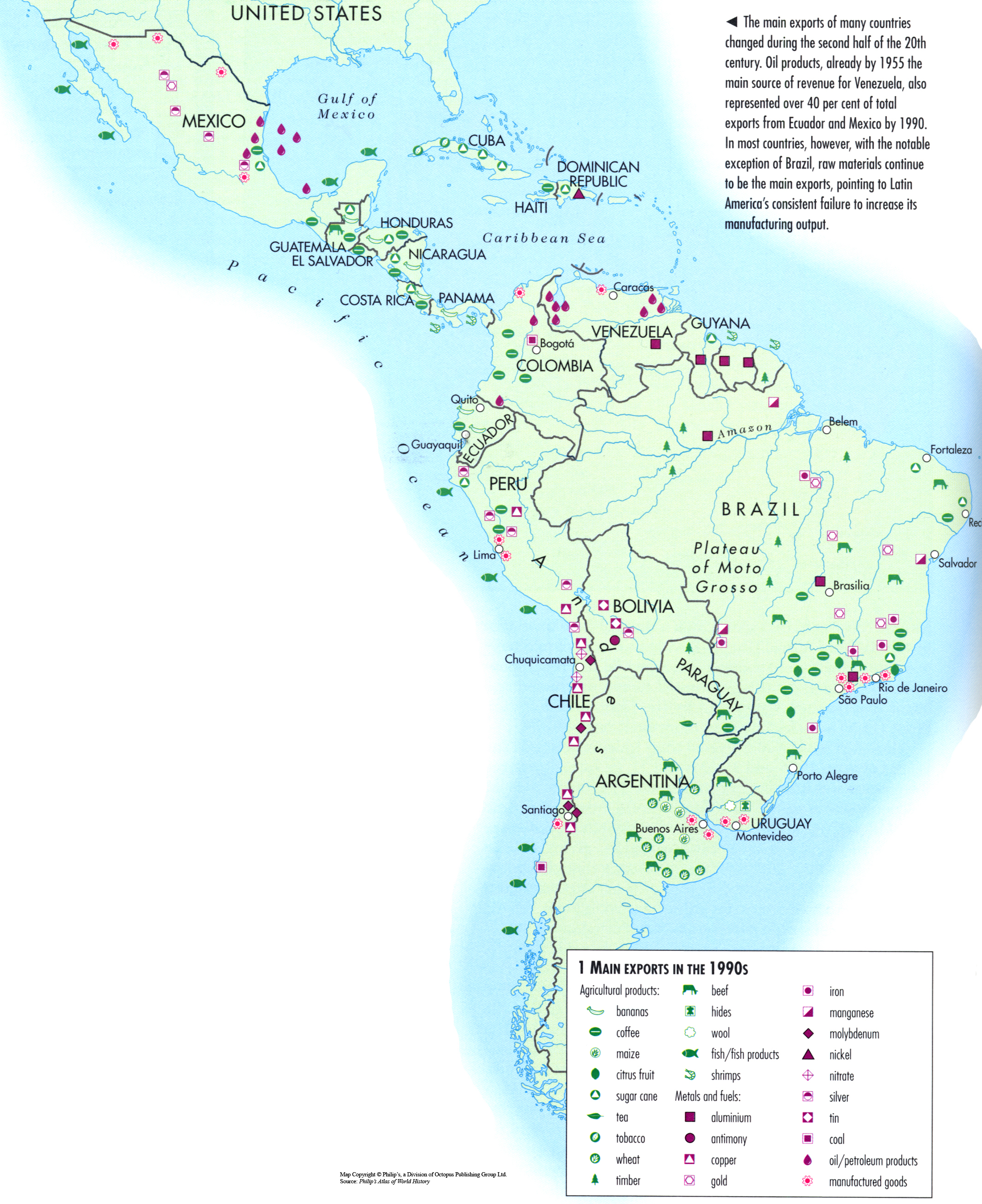
Caption
Main Exports in the 1990s
Summary
This map shows the sites of key export resources in Mexico, Central and South America in the 1990s.
Source
Oxford Atlas of World History, Oxford University Press, 1999. General Editor Patrick K. O’Brien. (p. 258)
Copyright
Map copyright © Philip’s, a division of Octopus Publishing Group Ltd.
Source: Philip’s Atlas of World History
Used under license from Octopus Publishing Group.
Series
This map is one in a series of maps selected from the Oxford Atlas of World History.
A gallery using flyover images like this
Magadha.GIF
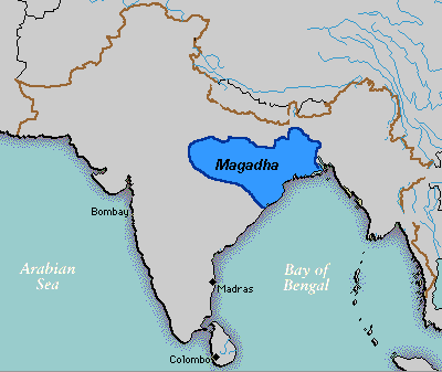
Image:Magadha.GIF
From QED

No higher resolution available.
Magadha.GIF (400 × 337 pixel, file size: 10 KB, MIME type: image/gif)
Contents |
Summary
A map showing the approximate extent of the Magadha Kingdom in 500 BCE.
Source
Wikipedia wikipedia:Image:Magadha.GIF
Wikipedia user Deepak Gupta
License
| |
Main Atmospheric and Underground Nuclear Explosions since 1945
Caption
Main Atmospheric and Underground Nuclear Explosions since 1945
Summary
This map shows the effects of nuclear explosions from tests, accidents and attacks on the Arctic.
The Chernobyl accident is the third biggest cause for radioactivity in the Arctic.
Source
United Nations Environment Programme / GRID-Arendal[1]
Cartographer/Designer: Philippe Rekacewicz, UNEP/GRID-Arendal
Primary Source:
- Assemblée nationale française, Christian Bataille, Henri Revol, Incidences environnementales et sanitaires des essais nucleaires effectues par la France entre 1960 et 1996 et elements de comparaison avec les essais des autres puissances nucleaires, rapport no. 3571, 2002
Cartographer/Designer: Philippe Rekacewicz, UNEP/GRID-Arendal
Copyright
© 2006 UNEP / GRID-Arendal
Licensing
Used with permission.
For use constraints, see [2].
Series
This map is one in a series For a listing with flyovers, see Series:UNEP / GRID-Arendal.
Loss of Great Ape Habitat from 2002 to 2032
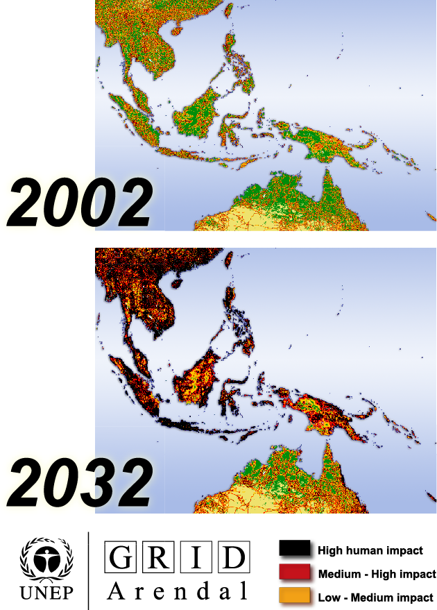
Caption
Loss of Great Ape Habitat from 2002 to 2032
Summary
This map shows the impact of human presence in traditional Great Ape (Orangutan) habitats in Southeast Asia. “The remaining forests are projected to be subject to piecemeal fragmentation and loss of wilderness characteristics.”” .
Source
United Nations Environment Programme / GRID-Arendal[1]
Cartographer/Designer: Hugo Ahlenius, UNEP/GRID-Arendal
Primary Source:
- GLOBIO2 model (prepared for GEO-3) using DCW (ESRI), Landscan 2000 (ORNL), ArcAtlas (ESRI and Data+) and GLCCv2 (USGS)
Copyright
© 2006 UNEP / GRID-Arendal
Licensing
For use constraints, see [2].
Series
This map is one in a series For a listing with flyovers, see Series:UNEP / GRID-Arendal.
Macedonian empire 336 323

Caption
Macedonian Empire 336-323 BC
Summary
The Macedonian empire under Alexander showing Routes of Alexander, Routes of Alexander’s generals, Persian royal highway, Greek colonies. Inset maps: The Aetolian and Achaian Leagues. Plan of Tyre 333-332 B.C.
Source
Perry-Castañeda Library: Map Collection.
“Historical Atlas” by William R. Shepherd, New York, Henry Holt and Company, 1923 (map)
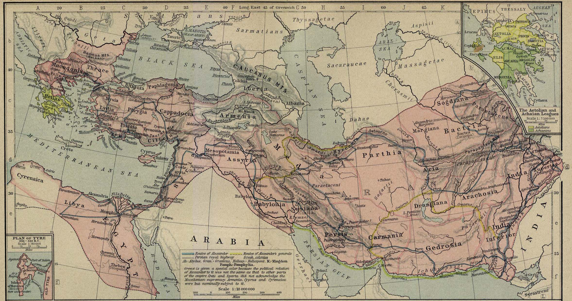
Copyright
Public domain
Linguistic Diversity
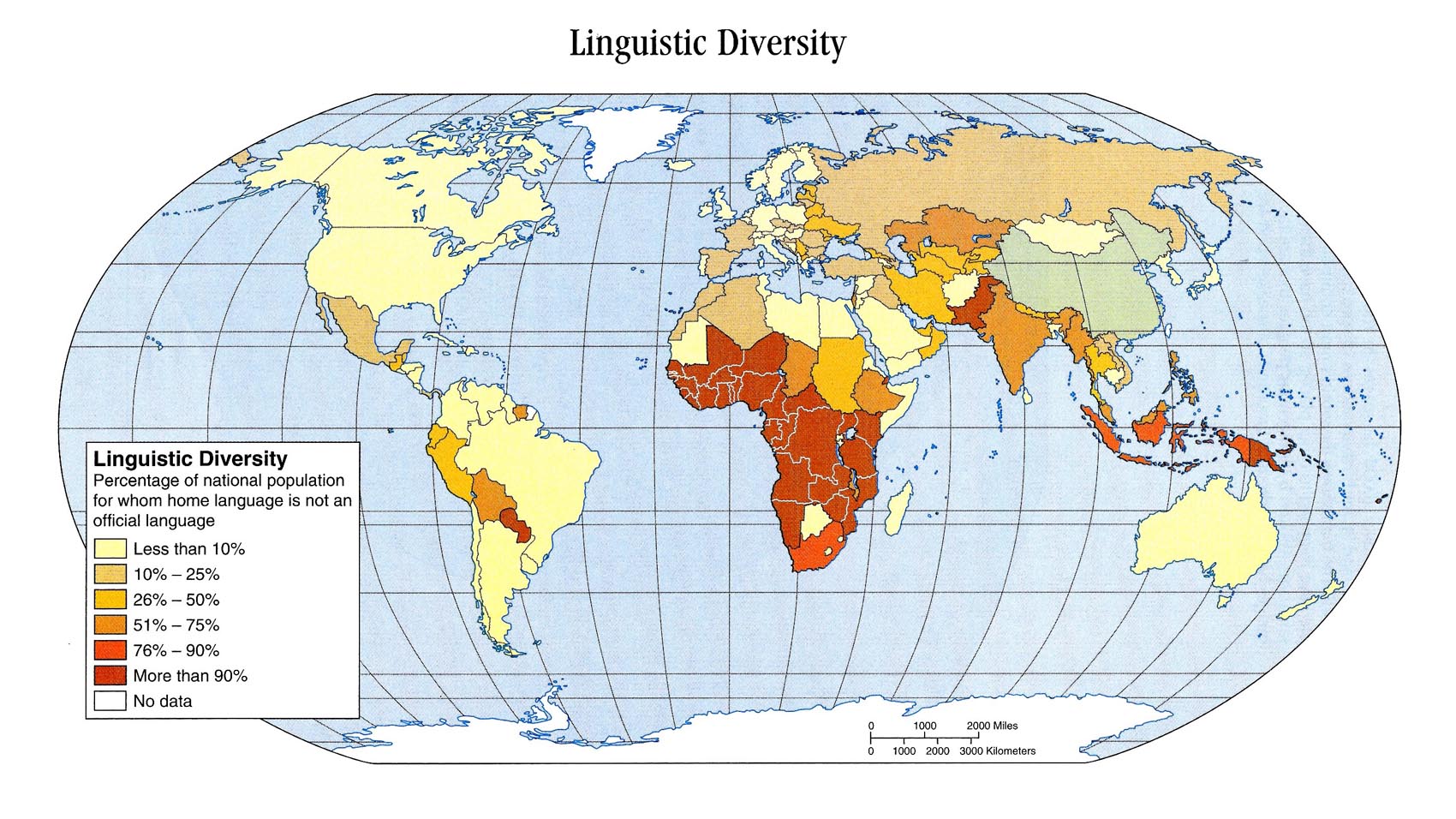
Caption
Linguistic Diversity
Summary
This world map is color coded to show linguistic diversity. It illustrates the percentage of the national population in different countries whose first language or home language is not the official language.
Source
John Allen, Student Atlas of Anthropology, First Edition (p. 57)
Copyright
Copyright © 2004 by The McGraw-Hill Companies
Reproduced by permission of McGraw-Hill Contemporary Learning Series.
Living on over $200, 2004
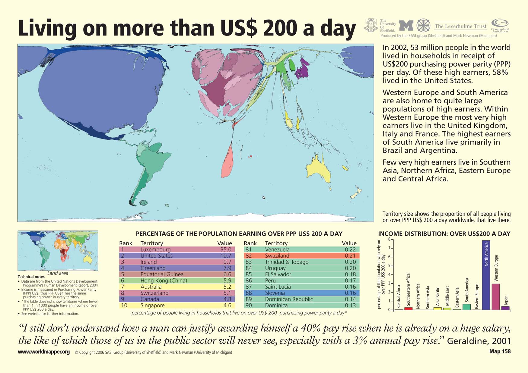
Caption
Living on more than US$ 200 a day
Summary
This “Worldmapper” map shows where the richest people, or those living on more than 200 US dollars of purchasing power parity (PPP) per day, live. Territory size shows the proportion of of all people living on over $200 a day that live in each particular country. In 2002, a majority of these high earners lived in the United States. Western Europe and South America are also home to significantly large high earning populations.
The map is accompanied by two tables that show ranked lists of the ten countries with the greatest and least percentages of the population earning over $200 in PPP a day. There is also a bar graph that shows the percentage of the population who receives over $200 per day by region.
Copyright status
© Copyright 2006 SASI Group (University of Sheffield) and Mark Newman (University of Michigan)
Used on QED by permission.
Licensing
All rights reserved
Source
Language Tapestry c. 2004
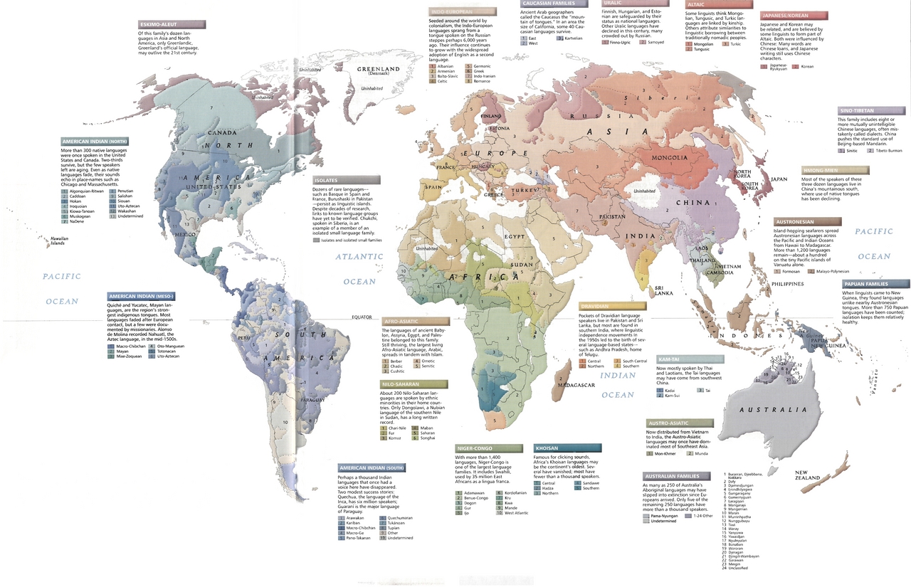
A .pdf version of this map is available here.
Summary
The map identifies the areas associated with specific languages
grouped by language family as follows:
- Eskimo-Aleut
- “Of this family’s dozen languages… only Greenlandic … may outlive the 21st century.”
- American Indian (North)
- Algonquian-Ritwan; Caddoan; Hokan; Iroquoian; Kiowa-Tanoan; Penutian; Salishan; Siouan; Uto-Aztecan; Wakashan
- American Indian (Meso-)
- Macro-Chibchan; Mayan; Mixe-Zoquean; Oto-Manguean; Totonacan
- American Indian (South)
- Arawakan; Kariban; Macro-Chibchan; Macro-Ge; Pano-Takanan; Quechumaran; Tukanoan; Tupian
- Afro-Asiatic
- Berber; Chadic; Cushitic; Omotic; Semitic
- Nilo-Saharan
- Chari-Nile; Fur; Komuz; Maban; Saharan; Songhai
- Niger-Congo
- Adamawan; Benue-Congo; Dogon; Gur; Ijo; Kordofanian; Kru; Kwa; Mande; West Atlantic
- Khoisan
- Central; Hadza; Northern; Sandawe; Southern
- Dravidian
- Central; Northern; South Central; Southern
- Kam-Tai
- Kadai; Kam-Sui; Tai
- Austro-Asiatic — 2 specific languages
- Mon-Khmer; Munda
- Australian Families — “only five of the remaining 250 languages have more than a thousand speakers
- Pama-Nyungan; 23 other named languages are grouped together
- Papuan Families — “more than 750 Papuan languages have been counted”
- Austronesian — “more than 1,200 languages remain”
- Hmong-Mien — “three dozen languages” are extant
- Sino-Tibetan — “this family includes eight or more mutually unintelligible Chinese languages, often mistakenly called dialects”
- Sinitic; Tibeto-Burman
- Indo-European
- Albanian; Armenian; Balto-Slavic; Celtic; Germanic; Greek; Info-Iranian; Romance
- Caucasian — “some 40 Caucasian languages survive”
- East; West; Kartvelian
- Uralic
- Finno-Ugric; Samoyed
- Altaic
- Mongolian; Tungusic; Turkic
- Japanese/Korean
- Japanese-Ryukyuan; Korean
In addition, regions where isolates and isolated small families “persist as linguistic islands”
are indicated.
Source
National Geographic Atlas of the World, 8th Edition, 2004.
Published by the National Geographic Society.
Copyright
© 2005 National Geographic Society
Map used on the QED website with permission of the National Geographic Society.
Series
This map is one in a series:
- Image:Language Tapestry c. 2004.jpg
- Image:MG©Energy and Minerals, 2005.jpg
- Image:MG©Regional Trade Agreements, 2005.jpg
- Image:MG©Flow of Oil in the World, 2005.jpg
- Image:MG©World Grains, 2005.jpg
- Image:MG©World Debt, 2005.jpg
- Image:MG©World Forests, 2005.jpg
- Image:MG©Inter-Region Agricultural Trade, 2005.jpg
- Image:MG©Tourist Arrivals Worldwide, 2005.jpg
- Image:MG©The Internet Explosion, 2003.jpg
- Image:MG©Average daily per capita calorie consumption, 2005.jpg
- Image:MG©Connecting the Planet – Cables and Satellites, 2004.jpg
- Image:MG©Gross Domestic Product, 2005.jpg
- Image:MG©Labor Migration, 2005.jpg
- Image:MG©Chemical, Biological and Nuclear Weapons, 2005.jpg
- Image:MG©Political regimes, 2005.jpg
- Image:MG©Human Trafficking, 2005.jpg
- Image:MG©Peacebuilding, 2005.jpg
- Image:MG©International Migration, 2004.jpg
- Image:MG©Terrorism, 1995-2003.jpg
Latin America in the First and Second World Wars, 1914 to 1945
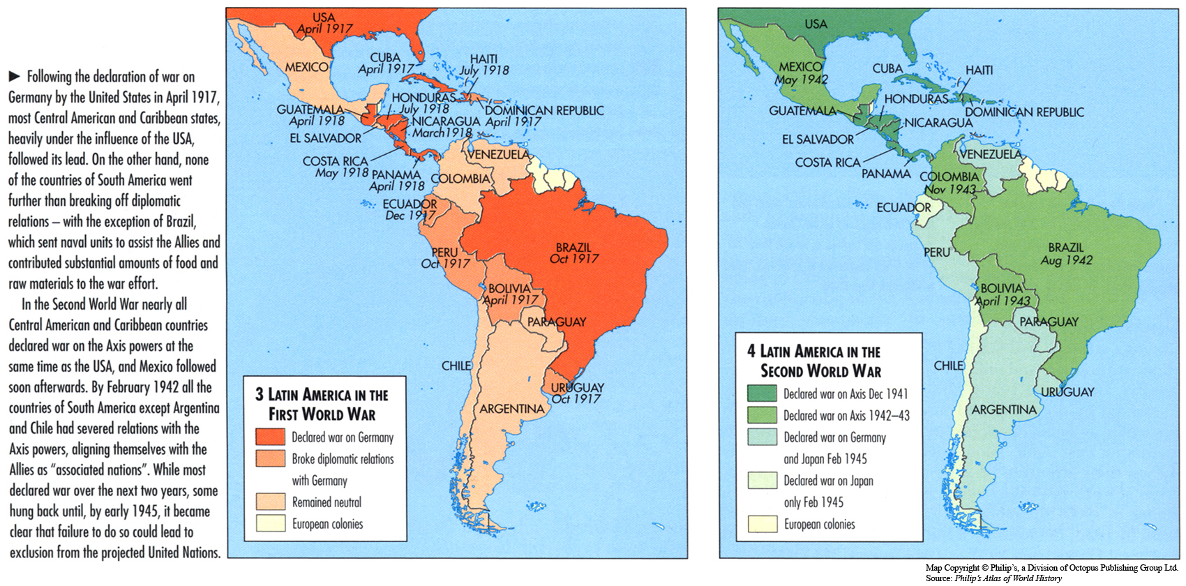
Caption
Latin America in the First and Second World Wars
Summary
This map shows the actions that South American countries took during the First and Second World War.
Source
‘Oxford Atlas of World History, Oxford University Press, 1999. General Editor Patrick K. O’Brien. (p. 226)
Copyright
Map copyright © Philip’s, a division of Octopus Publishing Group Ltd.
Source: Philip’s Atlas of World History
Used under license from Octopus Publishing Group.
Series
This map is one in a series of maps selected from the Oxford Atlas of World History.
A gallery using flyover images like this
Lack of Access to Safe Water, 2001
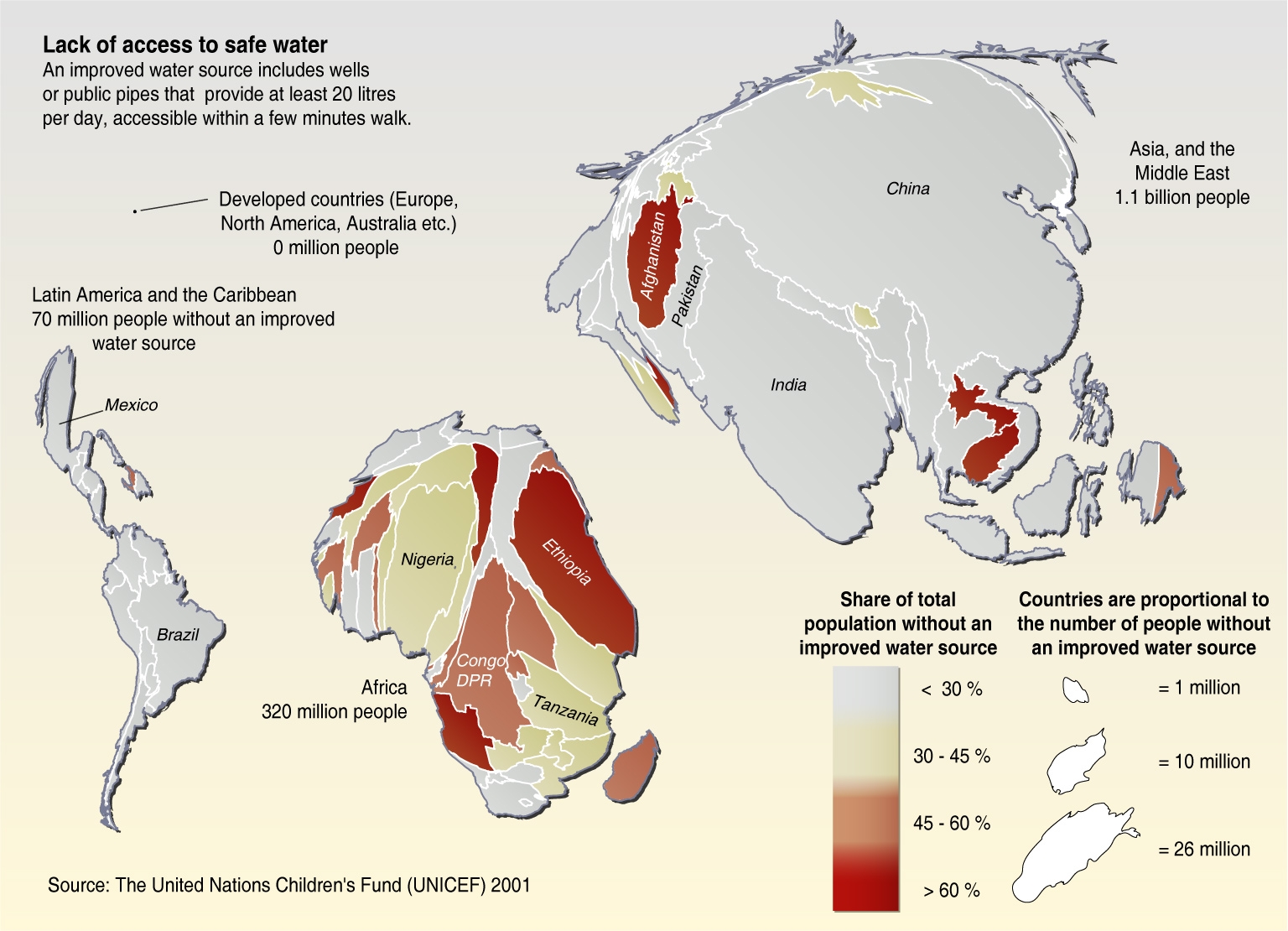
Caption
Lack of Access to Safe Water, 2001
Summary
This cartogram shows for each country the share of total population without an improved water source. The size of each country is distorted to reflect this variable.
“The need for access to safe water is most urgent in Sub-Saharan Africa, but huge populations in Asia are also without access.”
Source
United Nations Environment Programme / GRID-Arendal[1]
Cartographer/Designer: Hugo Ahlenius, UNEP/GRID-Arendal
Primary Source:
- UNICEF 2001
Copyright
© 2006 UNEP / GRID-Arendal
Licensing
Used with permission.
For use constraints, see [2].
Series
This map is one in a series For a listing with flyovers, see Series:UNEP / GRID-Arendal.
Land Use in Eastern European Countries, Forest and other Woodlands, 2000
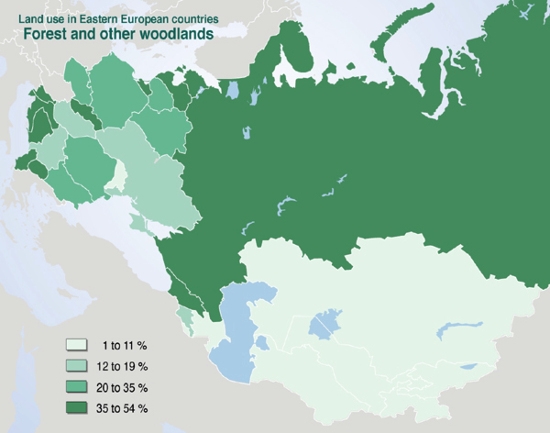
Caption
Land Use in Eastern European Countries, Forest and other Woodlands, 2000
Summary
This map shows the extent to which land is used in Eastern Europe, especially the woodland and forest areas.
Source
United Nations Environment Programme / GRID-Arendal[1]
Cartographer/Designer: Philippe Rekacewicz, UNEP/GRID-Arendal
Copyright
© 2006 UNEP / GRID-Arendal
Licensing
For use constraints, see [2].
Series
This map is one in a series For a listing with flyovers, see Series:UNEP / GRID-Arendal.