
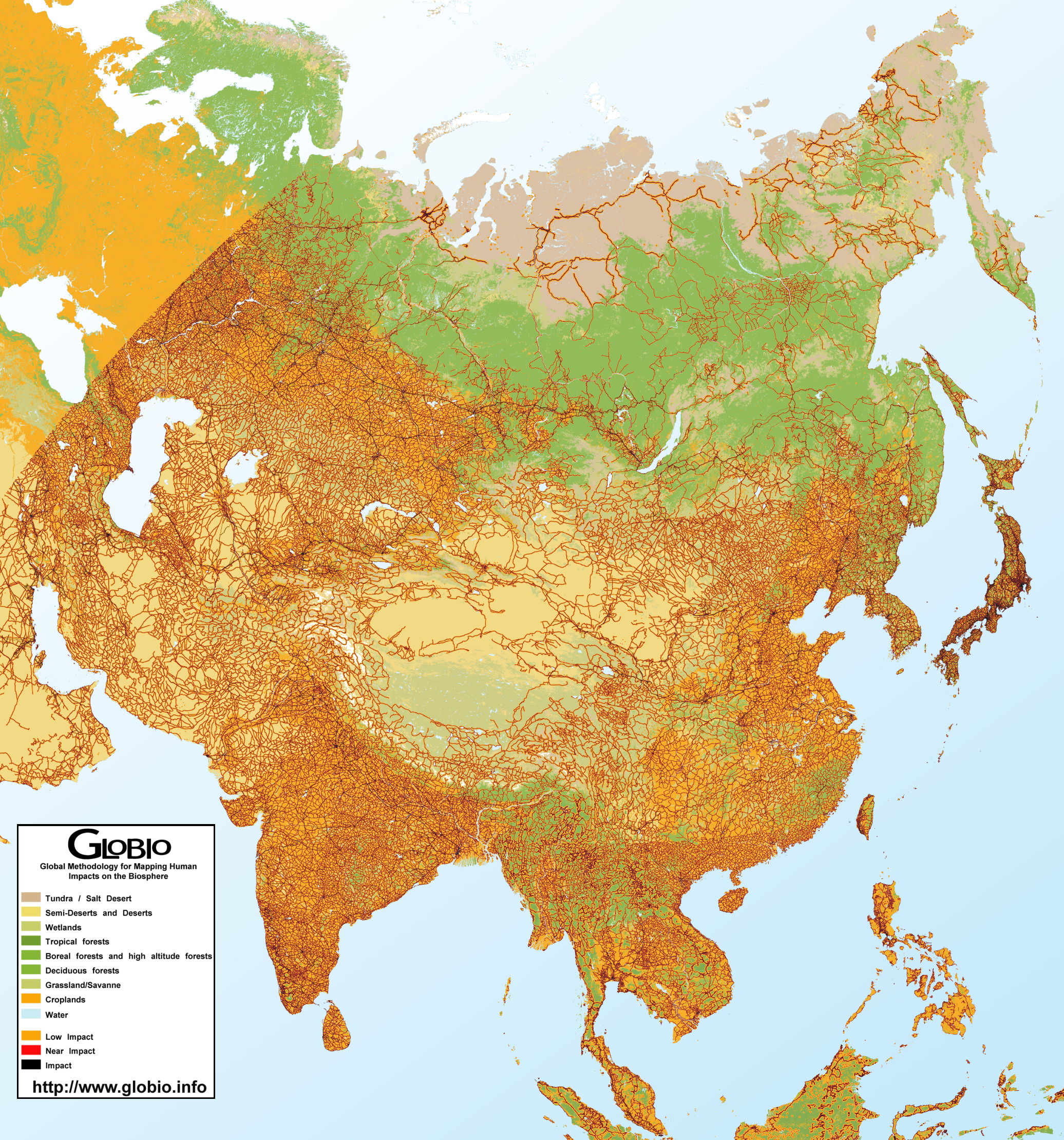
Caption
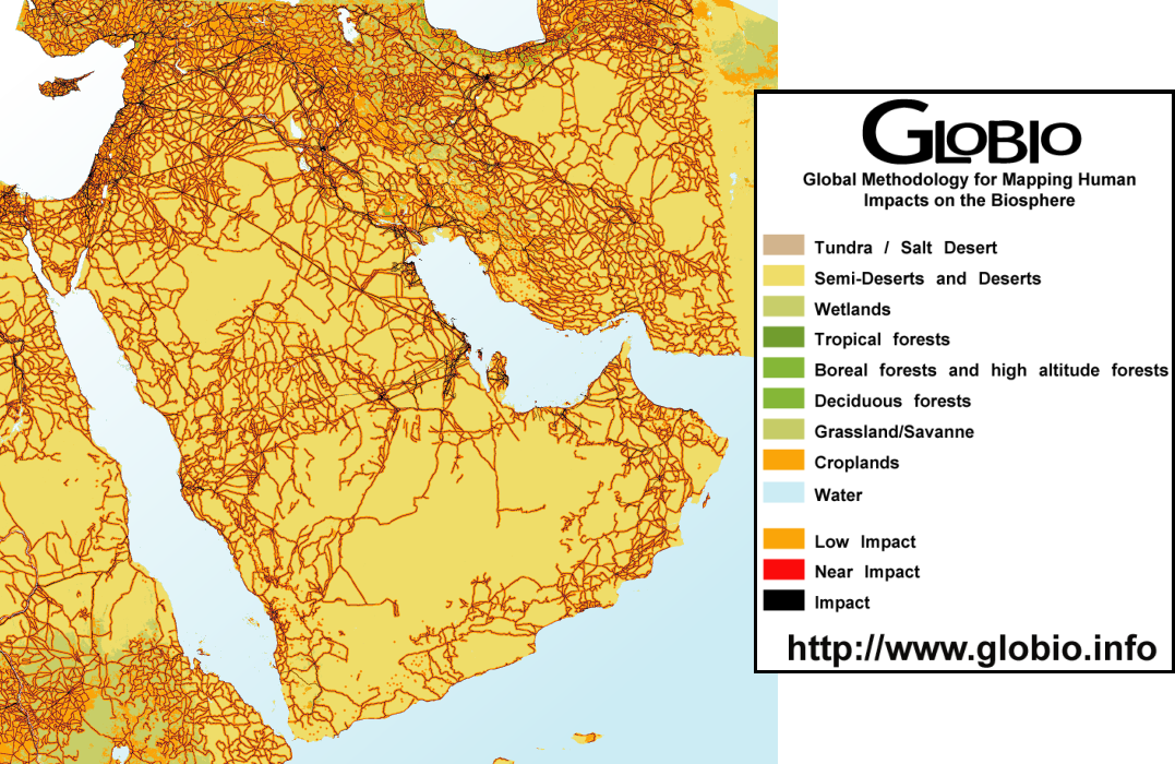
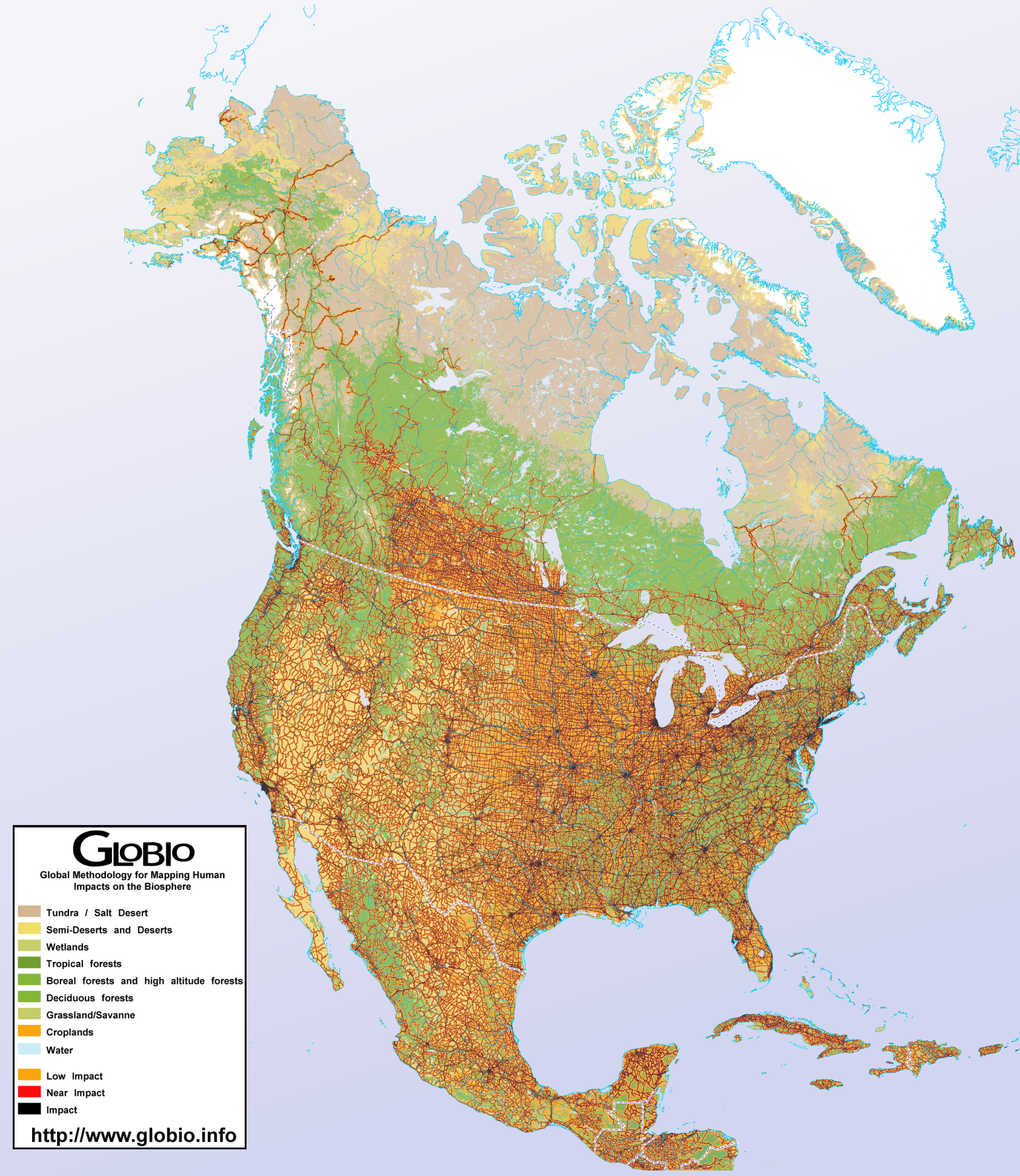
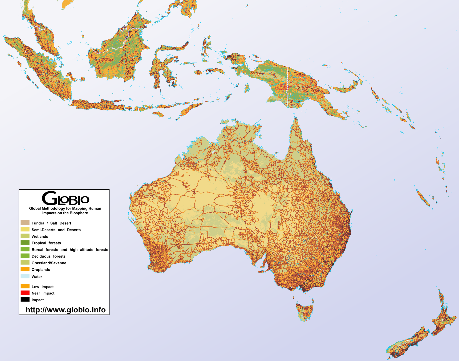
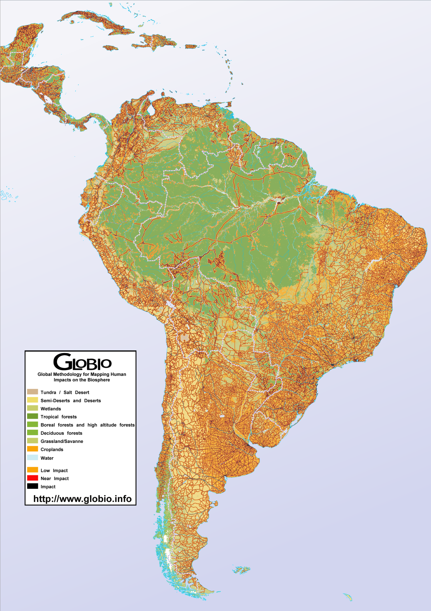
Human Impact in West Asia, 2001
Summary
This map shows the influence of human presence in the biosphere of West Asia. The impacts of agriculture, industry and general habitation are indicated in degrees: low impact, near impact, and (full) impact. The coloring of the map indicates the different types of climate zones in West Asia.
Source
United Nations Environment Programme / GRID-Arendal[1]
Cartographer/Designer: Torstein Olsen and Einar Lieng, Statens Kartverk (for UNEP/GRID-Arendal)
Primary Source:
- Analysis performed in November 2001, using the GLOBIO methodology as of November 2001, and the DCW (ESRI/NIMA) as data source, together with the GLCCv2 (USGS) land cover. Land cover classifications has been used for the non-impacted (wilderness) areas in the map graphics.
Copyright
© 2006 UNEP / GRID-Arendal
Licensing
Used with permission.
For use constraints, see [2].
Series
This map is one in a series For a listing with flyovers, see Series:UNEP / GRID-Arendal.


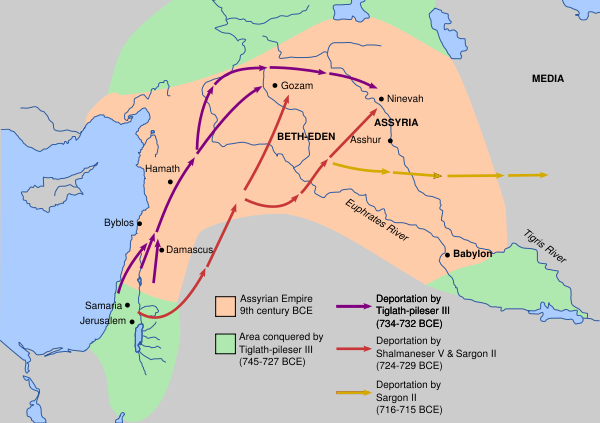


![[1]](http://commons.wikimedia.org/wiki/Image:Deportation_of_Jews_by_Assyrians.svg)
![[2]](http://veimages.gsfc.nasa.gov/2183/modis_EVI_2000_fall_lrg.jpg)
![[1]](http://veimages.gsfc.nasa.gov/1788/mopitt_first_year.jpg)