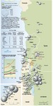
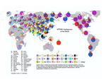
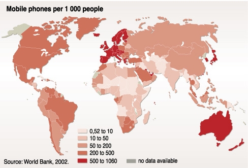
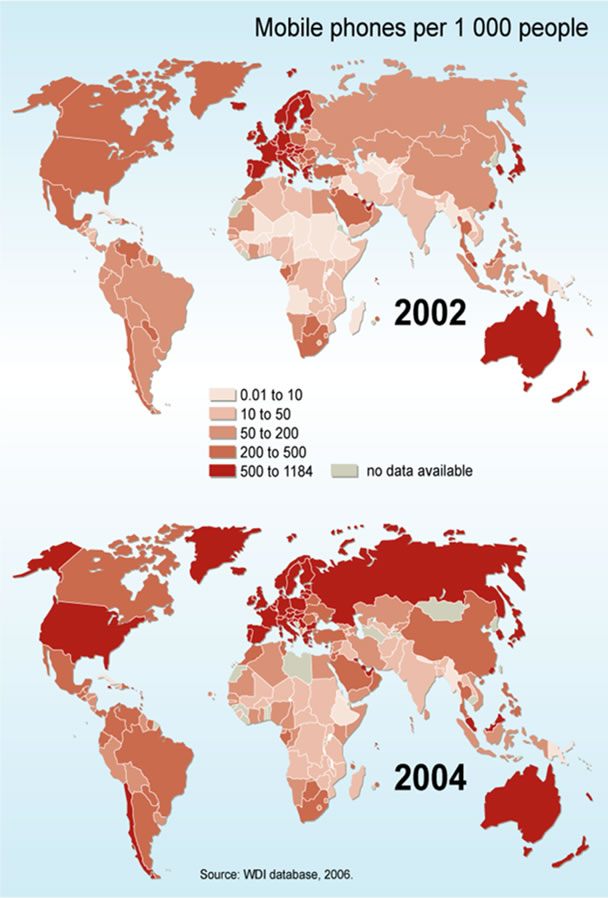
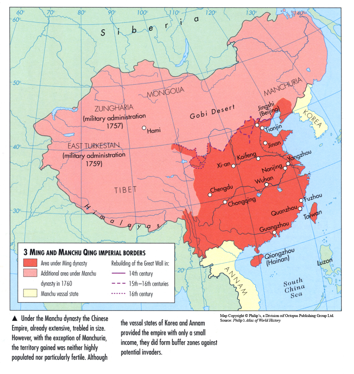
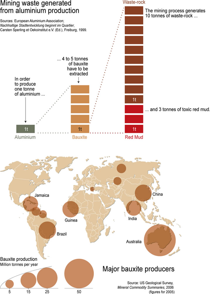
Category Archives: Unrestricted

PCBs in the Blood of Arctic Peoples, 2002

Caption

PCBs in the Blood of Arctic Peoples, 2002

Summary

This map shows the level of PCBs (polychlorinated biphenyls) found in the Arctic population in 2002.

PCBs are persistent organic pollutants.

This map illustrates the concern with the presence of these POPs and PCBs, which accumulate in the environments where the Arctic indigenous populations reside.

The presence of PCBs in the blood can cause several side effects, particularly in a woman’s reproductive system. Babies are exposed in the womb, as well as outside while nursing. It is reported that a child will receive ten times the exposure from breast milk than it will during its entire life.

Source

United Nations Environment Programme / GRID-Arendal[1]

Cartographer/Designer: Philippe Rekacewicz, UNEP/GRID-Arendal

Primary Source:

  • Arctic monitoring Assessment Programme (AMAP), 2003. AMAP Assessment 2002: Human Health in the Arctic.

Copyright

© 2006 UNEP / GRID-Arendal

Licensing

For use constraints, see [2].

Series

This map is one in a series For a listing with flyovers, see Series:UNEP / GRID-Arendal.

People Affected by Natural Disasters from 1971 to 2001 in Africa

Caption

People Affected by Natural Disasters from 1971 to 2001 in Africa

Summary

These maps show the number of people affected by natural disasters in Africa during the period 1971 to 2001, by country and by type of disaster:

drought, famine, flood, and epidemics related to disasters.

Source

United Nations Environment Programme / GRID-Arendal[1]

Cartographer/Designer: Digout, Delphine, based on a sketch by Philippe Rekacewicz; UNEP/GRID-Arendal

Primary Source:

  • Office of US Foreign Disaster Assistance (OFDA)
  • Centre for Research on the Epidemiology of Disasters (CRED)
  • International Disaster Database
  • www.cred.be/emdat
  • Université Catholique de Louvain, Brussels

Copyright

© 2006 UNEP / GRID-Arendal

Licensing

For use constraints, see [2].

Series

This map is one in a series For a listing with flyovers, see Series:UNEP / GRID-Arendal.

Patterns of Global Terrorism 1992

Caption

Appendix D. International Terrorist Incidents, 1992.

Summary

World map with color-coding of countries by “Number of incidents”.
An inset map shows Israel, Jordan, Syria, and Lebanon.

Released April 1993

Licensing

Public domain This work is in the public domain in the United States because it is a work of the United States Federal Government under the terms of Title 17, Chapter 1, Section 105 of the United States Code.

Source

Appendix D, Patterns of Global Terrorism, 1992.
United States Department of State
(Department of State Publication 10054)
(archived).

Patterns of Global Terrorism 2000

Caption

Appendix F: International Terrorist Incidents, 2000
959×600

Summary

World map with color-coding of countries by “Number of incidents” with
inset showing Central and Southern Europe.

Licensing

Public domain This work is in the public domain in the United States because it is a work of the United States Federal Government under the terms of Title 17, Chapter 1, Section 105 of the United States Code.

Source

Patterns of Global Terrorism – 2000.
Released by the Office of the Coordinator for Counterterrorism,
April 30, 2001.
United States Department of State
(archived)
[1].

Passenger kilometers (miles) flown 1994

Caption

Passenger Kilometers (Miles) Flown 1994

Summary

In this map countries are color-keyed according to the number of passenger kilometers (miles) flown (both international and domestic) by their citizens in 1994.

Legend indicates:

  • Over 100,000 (62,500) million
  • 50,000-100,000 (31,250-62,500) million
  • 10,000-50,000 (6,250-31,250) million
  • 1,000-10,000 (625-6,250) million
  • 500-1,000 (312-625) million
  • under 500 (312) million
  • Main tourist destination
  • Main tourist destination

Map also includes a graph that shows a sustained increase on the number of passenger kilometers flown between 1970-95, and a brief explanation about contemporary travel trends.

Source

Oxford Atlas of World History, Oxford University Press, 2002. General Editor Patrick K. O’Brien.

Chapter 5. The Twentieth Century: “Transport and Communication since 1945,” page 282.

Copyright

Map copyright © Philip’s, a division of Octopus Publishing Ltd. Source: Philip’s Atlas of World History.

Used under license from Octopus Publishing Group.

Series

This map is one in a series:
This map is one in a series of maps selected from the Oxford Atlas of World History.

A gallery using flyover images like this

Openness to Trade 1980
can be viewed here.

Patterns of Global Terrorism 1983

Caption

Appendix B. International Terrorist Incidents, 1983.

Summary

World map with color-coding of countries by “Number of incidents”.

Map annotation: 703144 (545038) 9-84.

Licensing

Public domain This work is in the public domain in the United States because it is a work of the United States Federal Government under the terms of Title 17, Chapter 1, Section 105 of the United States Code.

Source

Appendix B, Patterns of Global Terrorism, 1983.
United States Department of State,
September 1984.
(previously available online at //www.mipt.org/pdf/1983pogt.pdf)

Palestinian Refugees Living in the Middle East, 1999

Caption

Palestinian refugees living in the Middle East

Summary

This map shows the distribution of Palestinian refugees in the Middle East. The map represents refugee camps with circles whose area is proportional to the size of each camp. Countries with UNRWA UNRWA intervention and the security zone in southern Libya are noted.

The data table to the left details the number of refugee camps, the number of refugees, and the number of refugees living in those camps in each country. Additionally, there is an inset line graph to the left of the map which shows the rise of refugees found in 6 areas and countries in the Middle East from 1985-1999. Approximately 3.6 million refugees lived in Jordan, Syria, Lebanon, the West Bank and Gaza in 1999. [1]

Translation

  • For the population of Talbieh, Jerash, Soug and Housn camps in Jordan, the UNRWA indicates a superior number (black circles) to those of registered refugees (grey circles). In addition, the UNRWA notes the existence of two “unofficial” camps in Syria (red circles). The first is situated near the Lattaquie with about 2,500 refugees. The second camp is much more important: Yarmouk has close to 100,000 people and is situated in outskirts/ghettos of Damas.

Source

Le Monde Diplomatique [2]

Cartographer: Philippe Rekacewicz

Copyright

© Le Monde Diplomatique

Paper and Paperboard Production in 2003

Caption

Paper and Paperboard Production in 2003

Summary

This map shows the global production of paper and paperboard products by country. The pulp and paper industries, which are based on wood, represent one of the worst sources of worldwide pollution.

Circles varying in size according to the total amount of paper and paperboard production in 2003 are shown for countries which produced more than 500,000 tonnes.

"It concerns all sorts of paper and paperboard: newsprint, printing and writing paper, construction paper and paperboard, 
household and sanitary paper, special thin paper, wrapping and packaging paper and paperboard and all other paper and paperboard."

Source

United Nations Environment Programme / GRID-Arendal [1].

Cartographer/Designer: Cécile Marin

Primary sources:

FAO, Forestry Report, 2003.

Copyright

© 2006 UNEP / GRID-Arendal

Licensing

For use constraints see
[2]

Series

This map is one in a series
For a listing with flyovers, see Series:UNEP / GRID-Arendal.

Packaging Waste Production per Capita in Europe in 2005

Caption

Packaging Waste Production per Capita in Europe in 2005

Summary

This map shows the packaging-related waste production of major European countries per year. It illustrates a major challenge for waste management efforts.

Legend indicates:

  • Packaging waste production per capita (Kilograms per year):
    • 200
    • 176 (EU15 average)
    • 150
    • 100

Source

United Nations Environment Programme / GRID-Arendal [1].

Cartographer/Designer: Emmanuelle Bournay.

Primary Sources:

European Environmental Agency, Generation and recycling of packaging waste, May 2005 Assessment.

Copyright

© 2006 UNEP / GRID-Arendal

Licensing

For use constraints see [2]

Series

This map is one in a series
For a listing with flyovers, see Series:UNEP / GRID-Arendal.

Openness to Trade 1980

Caption

Openness to Trade 1980

Summary

This map shows to ratio of trade to domestic output, by each country from 1970 to 1990.
It also shows, for selected countries, the annual average growth rate.

Source

Oxford Atlas of World History, Oxford University Press, 1999. General Editor Patrick K. O’Brien. (p. 273)

Copyright

Map copyright © Philip’s, a division of Octopus Publishing Group Ltd.
Source: Philip’s Atlas of World History

Used under license from Octopus Publishing Group.

Series

This map is one in a series of maps selected from the Oxford Atlas of World History.

A gallery using flyover images like this

Openness to Trade 1980
can be viewed here.

Outbreaks of Avian Flu in 2003-4 with Overlays of Human and Poultry Population Densities

Caption

google_earth_link.gif Outbreaks of Avian Flu from 24 Nov 2003 to 8 Jan 2004, with
Overlays of Human and Poultry Population Densities

Note: Google Earth Version 4 is required.

Summary

This map uses Google Earth’s time series animation feature to show outbreaks of avian flu.
One may select outbreaks in humans and/or birds. Human and poultry population density layers are
also provided.

Instructions

Once the data file has been opened in Google Earth, you can start the animation by clicking on the “Play” button (the right arrow to the right of the timeline at the top of the main window in Google Earth).

Source

Declan Butler.

Data sources:

  • FAO Gridded Livestock of the World datasets [1]
  • CIESIN Human Population Density: [2]

Copyright

Creative Commons BY-NC-SA 2.0

North-West Regions of Medieval India – Major Routes from 10th to 15th Century

Caption

North-West Regions of Medieval India – Major Routes from 10th to 15th Century

Summary

Shows Main Transportation Routes along the North-West Regions of Medieval India.

Source

Medieval Routes to India: Baghdad to Delhi – A Study of Trade and Military Routes

Produced by H.C. Verma (Department of History – University of Delhi), Published by Mustafa Waheed, Printed at Islamia al Saudia Printers, Lahore, 1983.

Copyright

None Asserted.

Ocean Currents and Sea Ice, 1943

Caption

Ocean Currents and Sea Ice

Summary

This world map differentiates between cold and warm ocean currents,
and shows sea ice indicators such as:

  • the average limit of the polar ice pack
  • regions accessible to heavily built vessels

The map is marked “Provisional Edition”.

Source

Atlas of World Maps. United States Army Service Forces, Army Specialized Training Division.
Army Service Forces Manual M-101. 1943

Prepared by American Geographical Society for the Department of State.

Perry-Castañeda Library Map Collection [1]

Copyright

Public domain This work is in the public domain in the United States because it is a work of the United States Federal Government under the terms of Title 17, Chapter 1, Section 105 of the United States Code.

Oil pipelines and tanker routes, 2003

Caption

Proposed Bosporus Bypass Pipelines

Summary

This 2003 map of the area between the North Sea and the Caspian Sea shows existing oil pipelines, existing bypass pipelines, planned pipelines, tanker routes, and selected refineries and tanker terminals.

Source

Caspian Sea maps, Energy Information Administration , US DOE.

Image source: [1]

See also

Licensing

Public domain This work is in the public domain in the United States because it is a work of the United States Federal Government under the terms of Title 17, Chapter 1, Section 105 of the United States Code.

Nomad Confederacies 800 BC – AD 100

Caption

Nomad Confederacies 800 BC – AD 100

Summary

This map shows nomadic movement from 800 BCE – AD 100 in the Middle East and China.
Names of several nomadic tribes are also listed.

Source

Oxford Atlas of World History, Oxford University Press, 1999. General Editor Patrick K. O’Brien. (p. 51)

Copyright

Map copyright © Philip’s, a division of Octopus Publishing Group Ltd.
Source: Philip’s Atlas of World History

Used under license from Octopus Publishing Group.

Series

This map is one in a series of maps selected from the Oxford Atlas of World History.

A gallery using flyover images like this

Openness to Trade 1980
can be viewed here.

North Afghanistan Passes and Rivers

Caption

North Afghanistan Passes and Rivers

Summary

Shows Main Transportation Routes along the Northern Afghanistan region.

Source

Medieval Routes to India: Baghdad to Delhi – A Study of Trade and Military Routes

Produced by H.C. Verma (Department of History – University of Delhi), Published by Mustafa Waheed, Printed at Islamia al Saudia Printers, Lahore, 1983.

Copyright

None Asserted.

Neo-Babylonian Chaldean Empire at the Time of Nebuchadnezzar about 570 BC

Caption

Neo-Babylonian Chaldean Empire at the Time of Nebuchadnezzar about 570 B.C.

Summary

This map shows the extent of the Neo-Babylonian Chaldean Empire at the time of Nebuchadnezzar II in about 570 BCE. The cities of Gaza, Jerusalem, Tyre, Mergiddo, Assur and Babylon are shown within the empire’s boundaries.

Source

Donald Huber. The Prophetic Revolution: Hosea and Isaiah [1]. The University of the South, Sewanee, Tennessee, USA.

Image: [2]

Copyright

Dr. Donald Huber.

This map is included in the Mapping Globalization collection with the kind permission of Dr Huber.

No Shelter, 2003

Caption

No Shelter, 2003

Summary

This map shows the locations of refugee camps worldwide. The circles indicate the size of each refugee camp ranging from 20,000 to 50,000 people, 50,000 to 100,000 people, and over 100,000 people. These statistics do not include camps housing refugees from within their own country.

Also noted on the map is the correlation between cities with population exceeding 750,000 people and their improved access to sanitation for the year 2002.

Additionally, an inset bar graph comparing the number of people living in slums in different regions of the world for 1990 and 2001 is included. This information is measured in millions of people.

Source

United Nations Environment Programme / GRID-Arendal[1]

Cartographer/Designer: Emmanuelle Bournay, UNEP/GRID-Arendal

Primary Source:

  • UNHCR, UNRWA, 2004
  • World Urbanisation Prospects, 2004
  • UN-Habitat, 2003
  • WHO, UNICEF, 2003

Copyright

© 2006 UNEP / GRID-Arendal

Licensing

Used with permission.

For use constraints, see [2].

Series

This map is one in a series For a listing with flyovers, see Series:UNEP / GRID-Arendal.

NATO bombing targets in the Federal Republic of Yugoslavia, March to June 1999

Caption

NATO bombing targets in the Federal Republic of Yugoslavia, March to June 1999

Summary

This map shows the involvement of NATO in Yugoslavia. The map indicates the capital, major administrative places, other cities, roads (highways, principal routes, and secondary routes), railways, canals, and airports. The sites that pose the largest threat to the environment if bombed — electricity centers, national parks, industrial centers and oil refineries — are also marked on the map.

Source

Le Monde Diplomatique [1]

Cartographer: Philippe Rekacewicz

Primary Source:

  • The Kosovo conflict : consequences for the environment and human settlements, Balkan Task Force, United Nations Environment Programme (UNEP), Geneva, October 1999

Copyright

© Le Monde Diplomatique

MTDNA Haplogroups of the World

Caption

MTDNAwp Haplogroups of the World

Summary

“The data in this chart is supposed
to represent the situation before the recent European expansion beginning about 1500 AD.
Assignments in Australia are somewhat iffy.”

Copyright

© 2005 J.D. McDonald

Source

J.D. McDonald,
WorldHaplogroupsMaps.pdf.
The data sources are given in the document.

Series

This map is one of a series of three:

Municipal Solid Waste Generation for Selected Large Cities in Asia, 1995-2025

Caption

Municipal Solid Waste Generation in Asia, 1995-2025

Summary

This map shows the solid waste generation for municipalities in Asia.

Municipal waste, which is generated by households, small businesses, commercial and other municipal activities, and produced by consumption and production processes, is on the rise in Asia. The map reflects a major environmental concern related to municipal waste.

The map provides the Human Development Index of 2002 for Singapore and Hong Kong.

Legend indicates kilogram per capita per day, showing data from 1995 as compared to projected data for 2025.

Source

United Nations Environment Programme / GRID-Arendal [1].

Cartographer/Designer: Philippe Rekacewicz, UNEP/GRID-Arendal.

Primary Source:

World Bank, 1999; UNDP, 2002.

Copyright

© 2006 UNEP / GRID-Arendal

Licensing

For use constraints see [2]

Series

This map is one in a series
For a listing with flyovers, see Series:UNEP / GRID-Arendal.

Mobile Phones per Thousand People, 2002

Caption

Mobile Phones per Thousand People, 2002

Summary

This map shows the ratio of mobile phones per thousand people in 2002.

As the world relies on technology more and more to communicate, the use of cell phones increases, particularly in the instance when a cell phone doubles as a personal digital assistant (PDA) or triples as a MP3 player as well as a PDA.

Source

United Nations Environment Programme / GRID-Arendal[1]

Cartographer/Designer: Philippe Rekacewicz, UNEP/GRID-Arendal

Primary Sources:

  • World Bank, 2002

Copyright

© 2006 UNEP / GRID-Arendal

Licensing

Used with permission.

For use constraints, see [2].

Series

This map is one in a series For a listing with flyovers, see Series:UNEP / GRID-Arendal.

Modern China-Traffic and Communications, 20th Century

Caption

Modern China-Traffic and Communications

Summary

This map shows navigable rivers for small and large steamers, railways in operation and under construction, telegraph and submarine cables, regular airways, and imports and exports in millions of Haikuan Taels between 1921-30.

Also shown are:

  • Treaty Ports with Date of Customs Opening
  • Aerodromes
  • Wireless Stations

An inset graph depicts the foreign trade of China (including Manchuria).

Source

History and Commercial Atlas of China, Albert Herrmann, Ph.D., Harvard University Press, 1935.

See Huhai Website.

Copyright status

Public license
This work is believed to be in the public domain because its copyright is believed to have expired.

Series

This map is one in the series:

Mobile Phone Subscribers in 2002 and 2004

Caption

Mobile Phones per 1,000 People

Summary

This map shows the proportion of phones to people in the world in 2002 and 2004. The purpose of these maps is to illustrate the dramatic increase in the mobile phones market since 1984 when it was launched.

Source

United Nations Environment Programme / GRID-Arendal Mobile Phone Subscribers.

Cartographer/Designer: Emmanuelle Bournay.

Primary source:

WDI database, 2006.

Copyright

© 2006 UNEP / GRID-Arendal

Licensing

For use constraints see [1]

Series

This map is one in a series
For a listing with flyovers, see Series:UNEP / GRID-Arendal.

Ming and Manchu Qing Imperial Borders, 14th Century to 1760

Caption

Ming and Manchu Qing Imperial Borders

Summary

This map shows the imperial borders of the Ming and Manchu Qing Dynasties from the 14th Century to 1760.

Source

Oxford Atlas of World History, Oxford University Press, 1999. General Editor Patrick K. O’Brien. (p. 139)

Copyright

Map copyright © Philip’s, a division of Octopus Publishing Group Ltd.
Source: Philip’s Atlas of World History

Used under license from Octopus Publishing Group.

Series

This map is one in a series of maps selected from the Oxford Atlas of World History.

A gallery using flyover images like this

Openness to Trade 1980
can be viewed here.

Mining Waste Generated From Aluminium Production and Major Bauxite Producers, 2005

Caption

Mining Waste Generated From Aluminium Production and Major Bauxite Producers, 2005

Summary

This map shows the major bauxite producers in the world by million tonnes per year. Bauxite is the main waste generated during the process of production of aluminum. Mining bauxite ore is produced during the first stage, followed by alumina (AI203), and smelting alumina, from which aluminum is finally derived.

The bar graph above illustrates the amount of waste produced from aluminium production. Legend narrates:

"In order to produce one tonne of aluminium...4 to 5 tonnes of bauxite have to be extracted. The mining process generates 10 
tonnes of waste rock..."

Source

United Nations Environment Programme / GRID-Arendal [1].

Cartographer/Designer: Cécile Marin, Emmanuelle Bournay.

Primary sources for the map: US Geological Survey, Mineral Commodity Summaries, 2006 (figures for 2005).

Primary sources for the graph: European Aluminium Association; Nachhaltige Stadtentwicklung beginnt im Quartier, Carsten Sperling et Oekoinstitut e. V. (Ed.), Freiburg, 1999.

Copyright

© 2006 UNEP / GRID-Arendal

Licensing

For use constraints see [2]

Series

This map is one in a series
For a listing with flyovers, see Series:UNEP / GRID-Arendal.

Millions of Refugees in Africa, 1999

Caption

Millions of refugees in Africa, 1999

Summary

This map shows the amount of refugees in Africa as of 1999. The map uses circles with areas proportional to the number of refugees as a visual representation of the comparative size of refugee populations.

Around the map are statistics on refugees from the Liberian civil war and trouble in Sierra Leone, the war in Angola, conflicts in Burundi, Rwanda and the war in the east of ex-Zaire, and conflicts in other areas of Africa.

Translation

The Conflict of the Occidental Sahara: 165,000 refugees in Algeria

War in Angola: 312,200 refugees

  • Zambia: 149,800
  • Congo: 20,600
  • The Democratic Republic of Congo: 137,000
  • Namibia: 2,500
  • France and Brazil: 2,900

Civil War in Liberia and Troubles in Sierra Leone: 1,976,680 people

  • Sierra Leone: 10,000 refugees from Liberia and 670,000 moved inside the country.
  • Guinea-Bissau: 411,500 refugees from Liberia and Sierra Leone.
  • Ghana: 12,600 refugees from Liberia.
  • Cote d’Ivoire: 119,200 refugees from Liberia and Sierra Leone.
  • Liberia: 103,000 refugees from Sierra Leone and 251,000 refugees have returned home to Liberia under the protection of the HCR.

Conflicts in Burundi, Rwanda and the war in old Zaire

  • Rwanda: 32,300 refugees from the Democratic Republic of Congo and 625,000 moved inside the country.
  • Burundi: 23,000 refugees from the Democratic Republic of Congo and 100,000 moved to the inside of the country.
  • Tanzania: 532,100 refugees from Burundi and Democratic Republic of Congo.
  • Democratic Republic of Congo: 55,000 refugees from Burundi and Rwanda.

Wars in the Corner of Africa

  • Sudan: 342,300 refugees from Eritrea.
  • Uganda: 189,800 refugees from Sudan.
  • Djibouti: 21,600 refugees from Somalia.
  • Ethiopia: 254,000 refugees from Somalia and Sudan.
  • Yemen: 57,400 refugees from Somalia.
  • Democratic Republic of Congo: 31,200 refugees from Sudan.
  • Kenya: 212,900 refugees from Somalia and Sudan.
  • Somalia: 155,240 refugees return to Somalia under the protection of the HCR.

Source

Le Monde Diplomatique [1]

Cartographer: Philippe Rekacewicz

Copyright

© Le Monde Diplomatique

Minard carte figurative


Image:Minard carte figurative.jpg – QED


Image:Minard carte figurative.jpg

From QED

Jump to: navigation, search

Contents

Summary

“Carte figurative des pertes successives en hommes de l’Armée Française dans la campagne de Russie 1812-1813”

This “figurative map” by Charles Joseph Minard displays a wide variety of information about the advance of Napoleon’s army into Russia and its subsequent retreat.

See also

Copyright status

This image is in the public domain as it is a two-dimensional photo of a two-dimensional work, the copyright on which has expired.

Source

[1]

Millennium Development Goals by 2015

Caption

Millennium Development Goals by 2015

Summary

This map provides an assessment by region of progress towards meeting the UN’s Millenium_Development_Goals, which were originally defined in 2001.

For each major region of the developing world, the map indicates the status of each of the 16 targets defined in the 2005 Progress Report of the UN Statistics Division.

The “Millennium Development Goals”” were intended to define a set of reachable and realistic targets addressing various areas of development, such as the reduction of household poverty.

The assessment is based on the findings of the “”Millennium Project””, a UN research initiative. “”Sub-Saharan Africa, Oceania, Western- and Southern Asia are showing the least of amount of progress and are not expected to meet the targets with the current trends.””.

Source

United Nations Environment Programme / GRID-Arendal[1]

Cartographer/Designer: Hugo Ahlenius, UNEP/GRID-Arendal

Primary Source:

  • Millennium project (2005)

Copyright

© 2006 UNEP / GRID-Arendal

Licensing

Used with permission.

For use constraints, see [2].

Series

This map is one in a series For a listing with flyovers, see Series:UNEP / GRID-Arendal.

Mercury Levels in the Blood of Indigenous Women of Reproductive Age, 1999

Caption

Mercury Levels in the Blood of Indigenous Women of Reproductive Age, 1999

Summary

This map shows the percentage of mercury in the blood of indigenous Arctic women of reproductive age.

At high levels, mercury not only affects the developing fetus, but can also cause damage to the brain and kidneys of the mother.

Exposure to mercury can be caused by consumption of fish, by burning fossil fuels (such as high-sulfur coal), and by industrial air emissions.

Mercury is a persistent organic pollutant.

Source

United Nations Environment Programme / GRID-Arendal[1]

Cartographer/Designer: Philippe Rekacewicz, UNEP/GRID-Arendal

Primary Source:

  • Arctic monitoring and Assessment Programme (AMAP), 2003. AMAP Assessment 2002: Human Health in the Arctic.

Copyright

© 2006 UNEP / GRID-Arendal

Licensing

For use constraints, see [2].

Series

This map is one in a series For a listing with flyovers, see Series:UNEP / GRID-Arendal.

Mexico, Central America and the Eastern Caribbean 1520-1750

Caption

Mexico, Central America and the Eastern Caribbean 1520-1750

Summary

This map illustrates the colonization of Mexico, Central America and the Caribbean between 1520-1750 by Spain. Legend on the left summarizes the economy of the Spanish Caribbean colonies.

Legend indicates:

  • Native people c. 1520
  • Aztec Empire 1519
  • Territory colonized by the Spanish:
    • to 1640
    • to 1750
    • frontier lands in 1750
  • Date of foundation of town
  • Sea trade route
  • Economic Activities
    • livestock
    • leather
    • sugar
    • coffee
    • cochineal
    • indigo
    • silver
    • textiles
    • hides
    • wine

Source

Oxford Atlas of World History, Oxford University Press, 2002. General Editor Patrick K. O’Brien.

Chapter 3. The Early Modern World: “The Colonization of Central and South America 1500-1780,” page 122.

Copyright

Map copyright © Philip’s, a division of Octopus Publishing Ltd. Source: Philip’s Atlas of World History.

Used under license from Octopus Publishing Group.

Series

This map is one in a series:
This map is one in a series of maps selected from the Oxford Atlas of World History.

A gallery using flyover images like this

Openness to Trade 1980
can be viewed here.

MassMigrationAsia


Image:MassMigrationAsia.jpg – QED


Image:MassMigrationAsia.jpg

From QED

Jump to: navigation, search

Contents

Summary

Screen shot from MassMigration/Asia.swf (see MG/Mass Migration/Asia).

Copyright status

Source

ETC

Mediterranean Trade in the 12th and 13th Centuries

Caption

Mediterranean Trade in the 12th and 13th Centuries

Summary

This map shows trade routes in the Mediterranean in the 12th and 13th centuries.
The areas involved in the Mediterranean trade are Europe, North Africa, and western Asia
Also displayed is Ibn Jubayr’s pilgrimage to Mecca from 1183 to 1185.

Source

Oxford Atlas of World History, Oxford University Press, 1999. General Editor Patrick K. O’Brien. (p. 101)

Copyright

Map copyright © Philip’s, a division of Octopus Publishing Group Ltd.
Source: Philip’s Atlas of World History

Used under license from Octopus Publishing Group.

Series

This map is one in a series of maps selected from the Oxford Atlas of World History.

A gallery using flyover images like this

Openness to Trade 1980
can be viewed here.