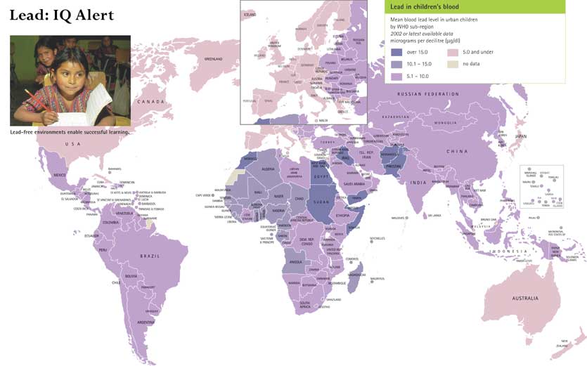
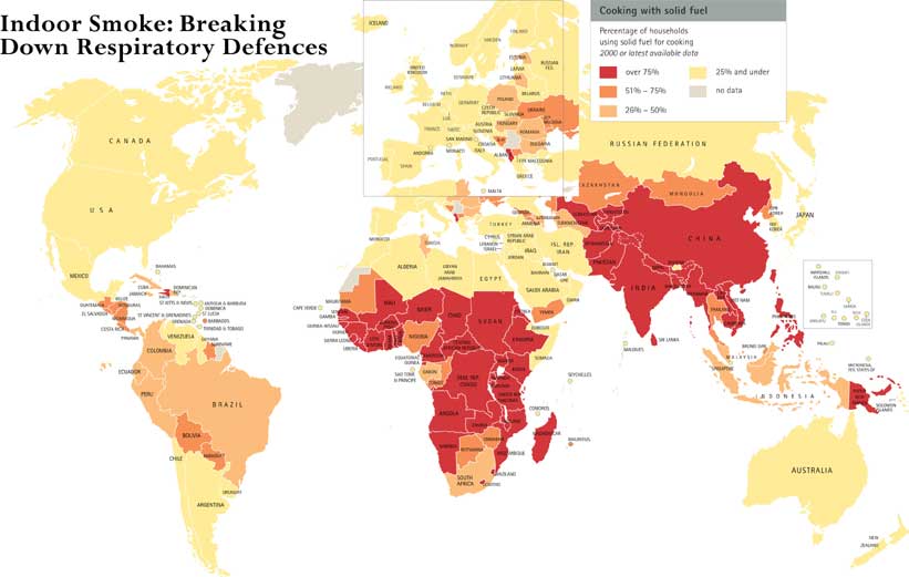
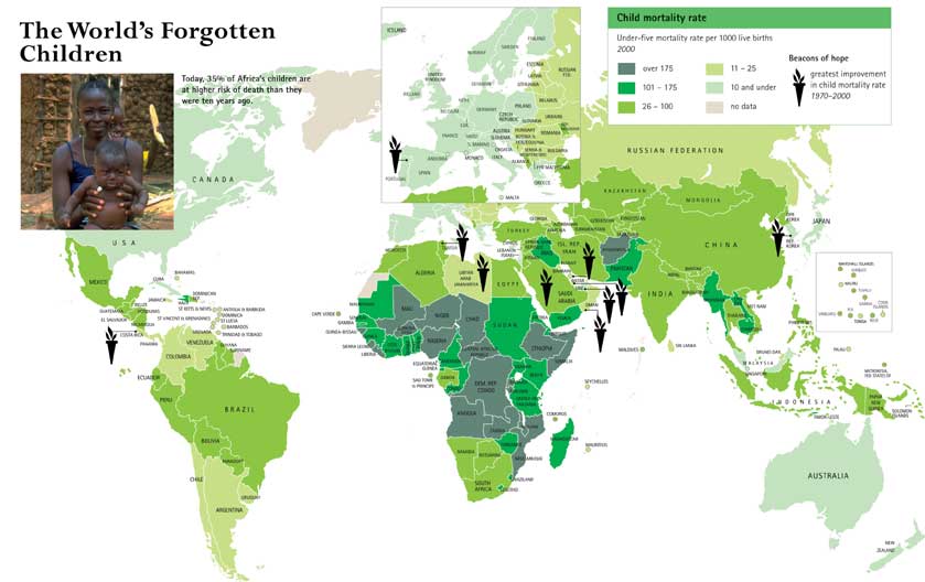
Category Archives: Transcluded

Culture c. BCE – 1500 CE – Genital Mutilations and Cranial Deformation

Caption

Genital Mutilations and Cranial Deformation and Swaddling

Summary

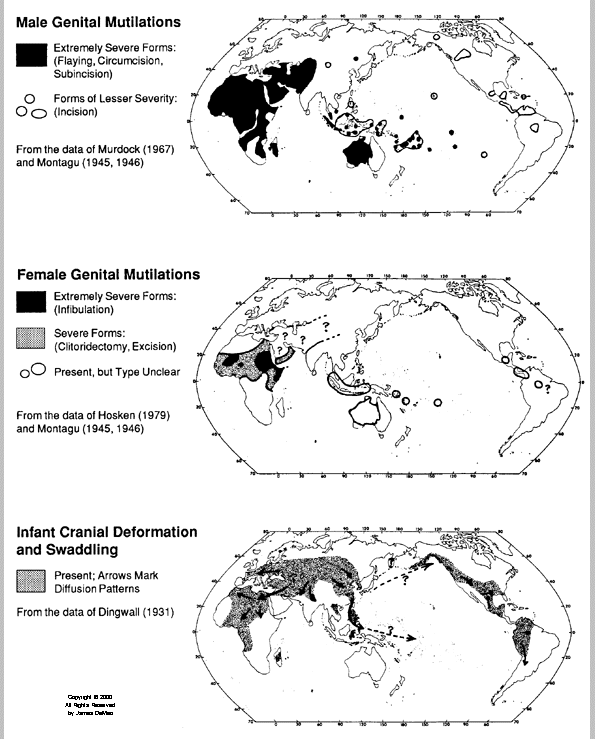
The first map shows the areas of the world where male genital mutilation was practiced. The map differentiates between:

  • extremely severe forms (flaying, circumcision, subincision) – dark shaded areas
  • forms of lesser severity – solid lines

Elaborated from the data advanced by Murdock (1967) and Montagu (1945,1946).

The second map shows the areas of the world where female genital mutilation was practiced:

  • extremely severe forms (infibulation) – darker shaded areas
  • severe forms (clitoridectomy, excision) – lighter shaded areas
  • areas with presence of such practices, though unclear

Elaborated from the data advanced by Hosken (1979) and Montagu (1945,1946).

The third map indicates where cranial deformation and swaddling took place:

  • areas where these practices were detected, and their diffusion patterns.

Elaborated from the data advanced by Dingwall (1931).

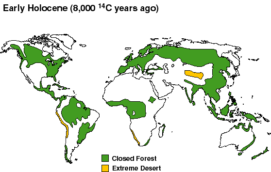
“All maps are composed of data from native, aboriginal, subsistence-level peoples. In the Americas and Oceania, these data reflect conditions generally prior to the arrival of European settlers.”

Source

The Origins and Diffusion of Patrism in Saharasia, c.4000 BCE: Evidence for a Worldwide, Climate-Linked Geographical Pattern in Human Behavior, James DeMeo, Ph.D., 2000. [1]

A more extensive presentation of this work is available in Saharasia: The 4000 BCE Origins of Child Abuse, Sex-Repression, Warfare and Social Violence, In the Deserts of the Old World, Natural Energy Works, 1998.

Copyright

© James DeMeo, 2000. All rights reserved.

Enjoying the Sun Safely, c. 2000

Caption

Enjoying the Sun Safely

Summary

This infographic includes a color-coded map of the world that shows the mean annual UV radiation level in 2003 (banded according to Global Solar UV Index). It also shows countries with the highest melanoma incidence rates in 2000.

Legend:

  • UV Index 1-2: No protection required
  • UV Index 3-4-5-6-7: Protection required (“Slip on a shirt, slop on sunscreen and slap a hat!”)
  • UV Index 8-9-10-11+: Extra protection required (“Avoid being outside during mid-day hours! Make sure you seek shade!. Shirt, sunscreen and hat are a must!”)

A more detailed version of this infographic [1] makes these observations:

  • “The discovery of a hole in the ozone layer over the Antarctic in 1985 sounded the alarm. Chlorofluorocarbons (CFCs), and other industrial chemicals released into the atmosphere, were destroying the stratospheric ozone, which shields the Earth from harmful ultraviolet (UV) radiation from the sun.”
  • “Children are most at risk, as exposure to the sun during childhood appears to set the stage for the development of skin cancer later in life.”

Source

Inheriting the World: The Atlas of Children’s Health and the Environment, Part Three: A look to the future. By Bruce Gordon, Richard Mackay and Eva Rehfuess, World Health Organization, 2004.
ISBN 92 4 159156 0.

Copyright

© WHO 2004. All rights reserved.

Series

This map is one in a series:

Select global biotechnology and bioscience clusters, c. 2005

Caption

Select global biotechnology and bioscience clusters.

Summary

Countries colored in brown rank highly in the Growth Competitiveness Index 2004 – 2005,
World Economic Forum. Black circles represent select biotechnology and life sciences clusters.

See [1] for further details and
references.

The map uses a Mercator projection that exaggerates the size of areas far from the equator.

A variant of this map appears in
Analysis,
EMBO reports, Vol 7, No. 2, 2006.

(EMBO is the European Molecular Biology Organization.)

Source

http://www.mbbnet.umn.edu/scmap/biotechmap.html

Copyright

Copyright MBBNet, University of Minnesota Medical School.

Disclaimer

“This work is a communications project of William Hoffman, a
non-faculty employee of the University of Minnesota, and not the
University of Minnesota. It is meant to help inform public discussion
of stem cell research and human development.”

Safe Food: Crucial for Child Development, c. 2000

Caption

Safe Food: Pollutants lurking in vegetation

Summary

Color-coded map shows mean concentration of dioxins and furans (toxic equivalent – TEQ – units) in vegetation, measured in picograms per gram of vegetation, in 2000. The map reflects concerns with children’s exposure to microbes and hazardous chemicals in food, especially during pregnancy or at an early stage.

Legend indicates:

  • Purple: Over 1.0
  • Dark Violet: 0.6-1.0
  • Light Violet: 0.1-0.5
  • Light Blue: under 0.1
  • Light Brown: no data

A more detailed version of this map:
[1]

Source

Inheriting the World: The Atlas of Children’s Health and the Environment, Part Two: Global Environmental Issues. By Bruce Gordon, Richard Mackay and Eva Rehfuess, World Health Organization, 2004.
ISBN 92 4 159156 0.

Copyright

© WHO 2004. All rights reserved.

Polluted Cities: The Air Children Breathe, c. 2000

Caption

Dirty Air: the silent killer

Summary

Color-coded map shows the average concentration of small particles (PM10) of pollution in outdoor urban air by WHO sub-region in 2000. The map reflects concerns with the potential adverse health effects of inhaling particles of pollution. Children’s exposure to pollution may cause pneumonia, asthma, and low birth weight.

Legend indicates:

  • Violet: Over 25
  • Dark Blue: 21-25
  • Lighter Blue: 16-20
  • Light Blue: 11-15
  • Light Brown: no data

Inset map of Europe shows average concentration (measured in micrograms per cubic metre) of small particles (PM10) of pollution in selected cities in 2001.

Legend indicates:

  • Red dot: over 30
  • Orange dot: 21-30
  • Green dot: 20 and under

A more detailed version of this map:
[1]

Source

Inheriting the World: The Atlas of Children’s Health and the Environment, Part Two: Global Environmental Issues. By Bruce Gordon, Richard Mackay and Eva Rehfuess, World Health Organization, 2004.
ISBN 92 4 159156 0.

Copyright

© WHO 2004. All rights reserved.

Outbreaks of Avian Flu in 2003-4 with Overlays of Human and Poultry Population Densities.kml

Caption

google_earth_link.gif Outbreaks of Avian Flu from 24 Nov 2003 to 8 Jan 2004, with
Overlays of Human and Poultry Population Densities

Note: Google Earth Version 4 is required.

Summary

This map uses Google Earth’s time series animation feature to show outbreaks of avian flu.
One may select outbreaks in humans and/or birds. Human and poultry population density layers are
also provided.

Instructions

Once the data file has been opened in Google Earth, you can start the animation by clicking on the “Play” button (the right arrow to the right of the timeline at the top of the main window in Google Earth).

Source

Declan Butler.

Data sources:

  • FAO Gridded Livestock of the World datasets [1]
  • CIESIN Human Population Density: [2]

Copyright

Creative Commons BY-NC-SA 2.0

Lead: IQ Alert, c. 2002

Caption

IQ Alert: Lead in Children’s Blood

Summary

Color-coded map shows mean blood lead level (measured in micrograms per decilitre) in urban children by WHO sub-region in 2002 or later. Blood lead levels above 10 mg/dl may have serious consequences in children’s learning.

Legend indicates:

  • Dark Blue: Over 15.0
  • Violet: 10.1-15.0
  • Purple: 5.1-10.0
  • Pink: 5.0 and under
  • Light Brown: no data

A more detailed version of this map:
[1]

Source

Inheriting the World: The Atlas of Children’s Health and the Environment, Part Two: Global Environmental Issues. By Bruce Gordon, Richard Mackay and Eva Rehfuess, World Health Organization, 2004.
ISBN 92 4 159156 0.

Copyright

© WHO 2004. All rights reserved.

Series

This map is one in a series:

Indoor Smoke: Breaking Down Respiratory Defences, c. 2000

Caption

Indoor Smoke: Cooking with Solid Fuel

Summary

Color-coded map shows percentage of households using solid fuel for cooking in 2002. The map reflects health-related concerns with the use of dung, wood, crop waste or coal to cook. Young (under five years) children’s exposure to the smoke may cause respiratory-related diseases, and eventually lead to their death.

Legend indicates:

  • Red: Over 75%
  • Dark Orange: 51%-75%
  • Light Orange: 26%-50%
  • Yellow: 25% and under
  • Grey: no data

A more detailed version of this map:
[1]

Source

Inheriting the World: The Atlas of Children’s Health and the Environment, Part Two: Global Environmental Issues. By Bruce Gordon, Richard Mackay and Eva Rehfuess, World Health Organization, 2004.
ISBN 92 4 159156 0.

Copyright

© WHO 2004. All rights reserved.

Series

This map is one in a series:

When H5N1 was first detected

Caption

When H5N1 was first detected

Summary

Color-coded map shows detection of avian flu by year, with statistics about human cases and human deaths.

GRAPHIC: Christina Rivero, Dita Smith and Gene Thorp, The Washington Post – March 18, 2006.; 2004-2005-2006.
[1].

Copyright

©2006 The Washington Post

Source

Centers for Disease Control and Prevention, National Institutes of Health, Food and Agriculture Organization of the United Nations, World Health Organization, World Organization for Animal Health, International Society for Infectious Diseases.

Vegetation Cover from the Early Holocene to the Present

Summary

  1. The first map shows vegetation cover at 8,000 14C years BP (i.e. 8,000 carbon-dating years before the present)
  2. The second maps shows vegetation cover at 5,000 14C years BP
  3. The third map shows “present potential” vegetation, the areas of forest and desert that would be present but for human activity. The authors write that “Although it represents a ‘potential’ state, it is nevertheless much as the world would actually have looked about 4,000-3,000 14C y.a., before agriculture became important in modifying vegetation cover in many regions.”

Legend: Closed Forest; Extreme Desert.

Source

http://www.esd.ornl.gov/projects/qen/nerc.html (accessed April 30, 2007)

Adams J.M. & Faure H. (1997) (ed.s), QEN members. Review and Atlas of Palaeovegetation: Preliminary land ecosystem maps of the world since the Last Glacial Maximum. Oak Ridge National Laboratory, TN, USA. http://www.esd.ornl.gov/ern/qen/adams1.html

Typhus in Asia

Caption

Typhus in Asia, 1996

Summary

Map shows areas in south-east Asia and western Pacific where scrub Typhus occurs and is endemic, 1996.
See “Mites” section in Chapter 4- “Bedbugs, fleas, lice, ticks and mites” in the following link: [1].

Source

WHO, 1996

Two Worlds: Rich and Poor, 2004

Caption

Two Worlds: Rich and Poor

Summary

These maps show the connection between income and the use of solid fuels for cooking.
The use of such fuels in the home is associated with child mortality.

The first map shows for each WHO sub-region the percentage of people living on more than two dollars a day
who use solid fuel for cooking.

The second map indicates the percentages of people living on less than one dollar a day who use solid fuel for cooking.

Legend:

  • Red: over 75%
  • Dark Orange: 51%-75%
  • Light Orange: 26%-50%
  • Yellow: 25% and under
  • Gray: no data

A more detailed version of this map [1] makes these observations:

  • “Households on higher incomes mostly use electricity or gas for cooking.

Those on lower incomes are more likely to use polluting solid fuels, such as dung, wood and coal.
As a result, children living in these households suffer disproportionately from the adverse health
effects of indoor smoke.”

  • “Every year smoke from burning solid fuels in the home kills one million children under five years.”

Source

Inheriting the World: The Atlas of Children’s Health and the Environment, Part One: Child health and poverty. By Bruce Gordon, Richard Mackay and Eva Rehfuess, World Health Organization, 2004.
ISBN 92 4 159156 0.

Copyright

© WHO 2004. All rights reserved.

Series

This map is one in a series:

Tracing Human History Through Genetic Mutations

Summary

This world map depicts probable migration routes of different human lineages as suggested
by studies of the DNA in mitochondria and Y chromosomes.

Source

Nicholas Wade. “The Human Family Tree: 10 Adams and 18 Eves”, NYT on the Web, May 2, 2000.
[1]

Credits: Dr Douglas C. Wallace, Marie T. Lott, Emory University; Dr Peter A. Underhill,
Stanford University; “Genes, Peoples, and Languages”, by Dr. Luca Cavalli-Sforza.

Copyright

© 2000 The New York Times Company [2]

The World’s Forgotten Children, 1970-2000

Caption

The World’s Forgotten Children: Child Mortality Rate

Summary

Color-coded map shows mortality rate per 1000 live births of children under five years old in 2000. It also shows countries considered “Beacons of hope,” where the greatest improvement in child mortality rate has been accomplished between 1970-2000.

Legend indicates:

  • Dark Blue: Over 175
  • Dark Green: 101-175
  • Light Green: 26-100
  • Light Brown: 11-25
  • Light Blue: 10 and under
  • Light Purple: no data

A more detailed version of this map:
[1]

Source

Inheriting the World: The Atlas of Children’s Health and the Environment, Part One: Child health and poverty. By Bruce Gordon, Richard Mackay and Eva Rehfuess, World Health Organization, 2004.
ISBN 92 4 159156 0.

Copyright

© WHO 2004. All rights reserved.

Series

This map is one in a series:

Technology: Spread of the chariot, 2000-500 BC

Caption

Approximate historical map of the spread of the chariot, 2000-500 B.C.

Summary

This map shows the diffusion of chariot technology in Eurasia and to the Middle East from about 2000 BCE to 500 BCE. The ‘isochrones’ are only rough approximations.

Legend (from [1]):

  • red, 2000 BC: area of the earliest known spoke-wheeled chariots (Sintashta-Petrovka culture)
  • orange, 1900 BC: extent of the Andronovo culture, expanding from its early Sintashta-Petrovka phase; spread of technology in this area would have been unimpeded and practically instantaneous
  • yellow, 1800 BC: extent of the great steppes and half-deserts of Central Asia, approximate extent of the early Indo-Iranian diaspora at that time. Note that early examples of chariots appear in Anatolia as early as around this time.
  • light green, 1700 BC: unknown, early period of spread beyond the steppes
  • green/cyan, 1600-1200 BC: the Kassite period in Mesopotamia, rise to notability of the chariot in the Ancient Near East, introduction to China, possibly also to the Punjab and the Gangetic plain (Rigveda) and East and North Europe (Trundholm Sun Chariot), assumed spread of the chariot as part of Late Bronze Age technology
  • blue, 1000-500 BC: Iron Age spread of the chariot to W Europe by Celtic migrations

See [2].

Source

Wikimedia Commons,

Copyright

User:Dbachmann, 2005.

License

GNU Free Documentation License

Spread of Small Pox in the Pacific Northwest, in the late 1700s to 1863

Caption

Spread of Small Pox in the Pacific Northwest, in the late 1700s to 1863

Summary

This map shows the spread of smallpox in the Pacific Northwest, USA, from the late 1700s to 1863. The color-coded areas indicate the approximate range of the epidemics. The map indicates that the locations where small-pox was detected was documented by early explorers, missionaries and anthropologists.

Source

“Handbook of North American Indians,” Vol.7, Northwest Coast, Wayne Suttles (Smithsonian Institution, 1990.); “The Coming of the Spirit of Pestilence,” Robert Boyd (University of Washington Press, 1999.); “Pox Americana, The Great Smallpox Epidemic of 1775-82,” Elizabeth A. Fenn (Hill and Wang, 2001).

Map produced by Mark Nowlin, The Seattle Times.

Copyright

©2005, The Seattle Times

Small pox and the trail of tears

Caption

Small pox and the trail of tears, 1781-1783

Summary

This map shows the diffusion pattern of the 1781-1783 smallpox epidemic, from Detroit up the Mississippi to Saskatchewan and to the Athabaska country. The first incidents of smallpox coincide with Peter Pond’s trade route in all of the indicated locations in Western Canada.

Source

“Did Peter Pond participate in the ethnic cleansing of Western Canada’s Indigenous Peoples?” [1]archived
The School of Native Studies, University of Alberta.

This article was published in:
Phillip R. Coutu and Lorraine Hoffman-Mercredi. Inkonze: The Stones of Traditional Knowledge.
Thunderwoman Ethnographics, Edmonton, 1999. (The second edition was published in 2002.)


Copyright

© Lorraine Hoffman (Mercredi) and Phillip R. Coutu 1999.

An attempt to contact the rights holder in accordance with the instructions in the article was made in October 2007, but the email address no longer exists.

Progress in Reducing Measles Mortality – Worldwide, 2000-2003

Caption

Progress in Reducing Measles Mortality – Worldwide

Summary

Map shows results of implementation of second opportunity for measles immunization between 2000 and 2003. Colors mark nationwide campaigns, partial campaigns, and countries where a second opportunity for immunization was not enacted.

See [1]

Source

Centers for Disease Control and Prevention, U.S.A.

Copyright

Public domain This work is in the public domain in the United States because it is a work of the United States Federal Government under the terms of Title 17, Chapter 1, Section 105 of the United States Code.

Passive Smoking: Children Protest, 1999-2003

Caption

Passive Smoking: Children’s Voices

Summary

Color-coded map shows percentage of students aged 13-15 years who want bans on smoking in public places between 1999-2002. It also locates the first five countries to ratify the WHO Framework Convention on Tobacco Control.

This map reflects concerns for the health-related effects of children’s exposure to tobacco, such as sudden infant death syndrome, possible brain tumors and long-term mental effects, respiratory diseases such as bronchitis and pneumonia, blood diseases such as lymphoma, fire burns, etc.

Legend:

  • Brown: Over 75%
  • Orange: 51%-75%
  • Yellow: 26%-50%
  • Purple: 41%-60%
  • Light Grey: no data
  • Black dot: sub-national data available only

A more detailed version of this map:
[1]

Source

Inheriting the World: The Atlas of Children’s Health and the Environment, Part Two: Global Environmental Issues. By Bruce Gordon, Richard Mackay and Eva Rehfuess, World Health Organization, 2004.
ISBN 92 4 159156 0.

Copyright

© WHO 2004. All rights reserved.

Series

This map is one in the series:

Adult (15-49) HIV prevalence rate, 2005

Caption

Adult (15-49) HIV prevalence rate (%), 2005

Summary

This map shows the percentage of the adult population in each country living with AIDS in 2005.

Other maps in this series:

1985

1995

Similar maps are available from the WHO Public Health Mapping and GIS Map Library.

Source

UNAIDS. Map Production: Public Health Mapping and GIS, Communicable Diseases (CDS), World Health Organization.

World Health Organization Public Health Mapping and GIS Map Library.

Copyright

© WHO 2006. All rights reserved.