
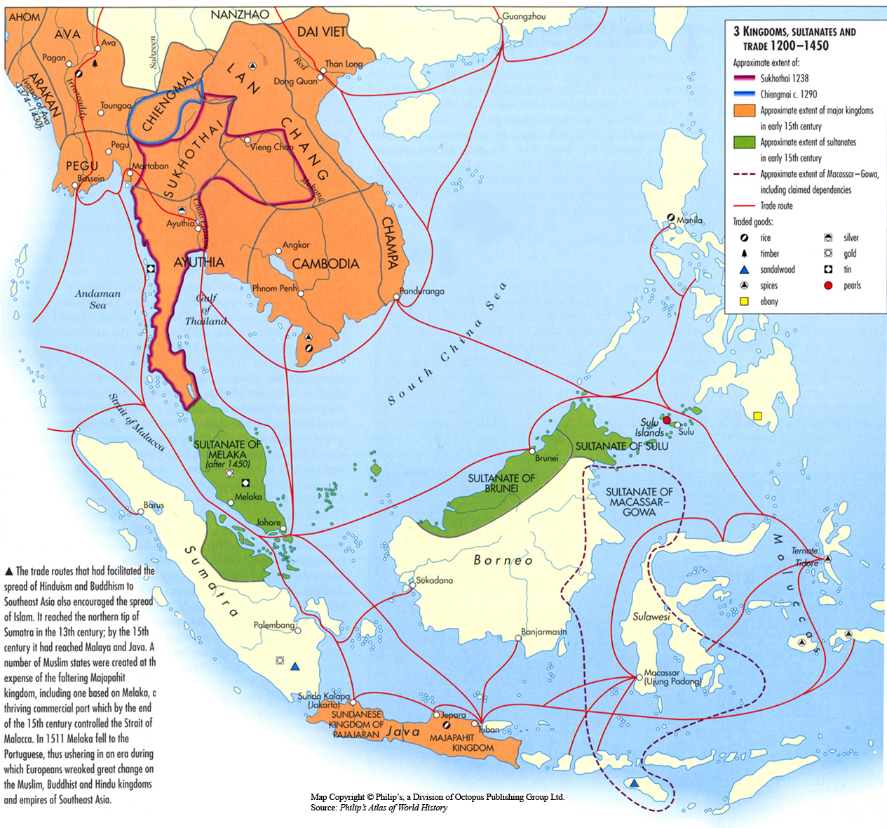
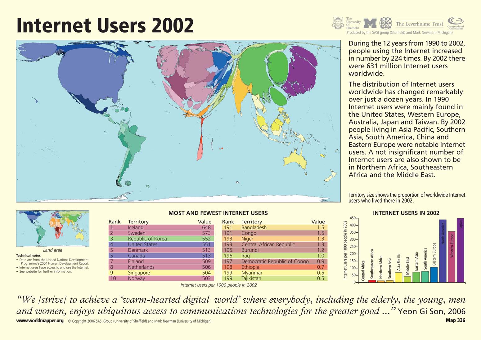
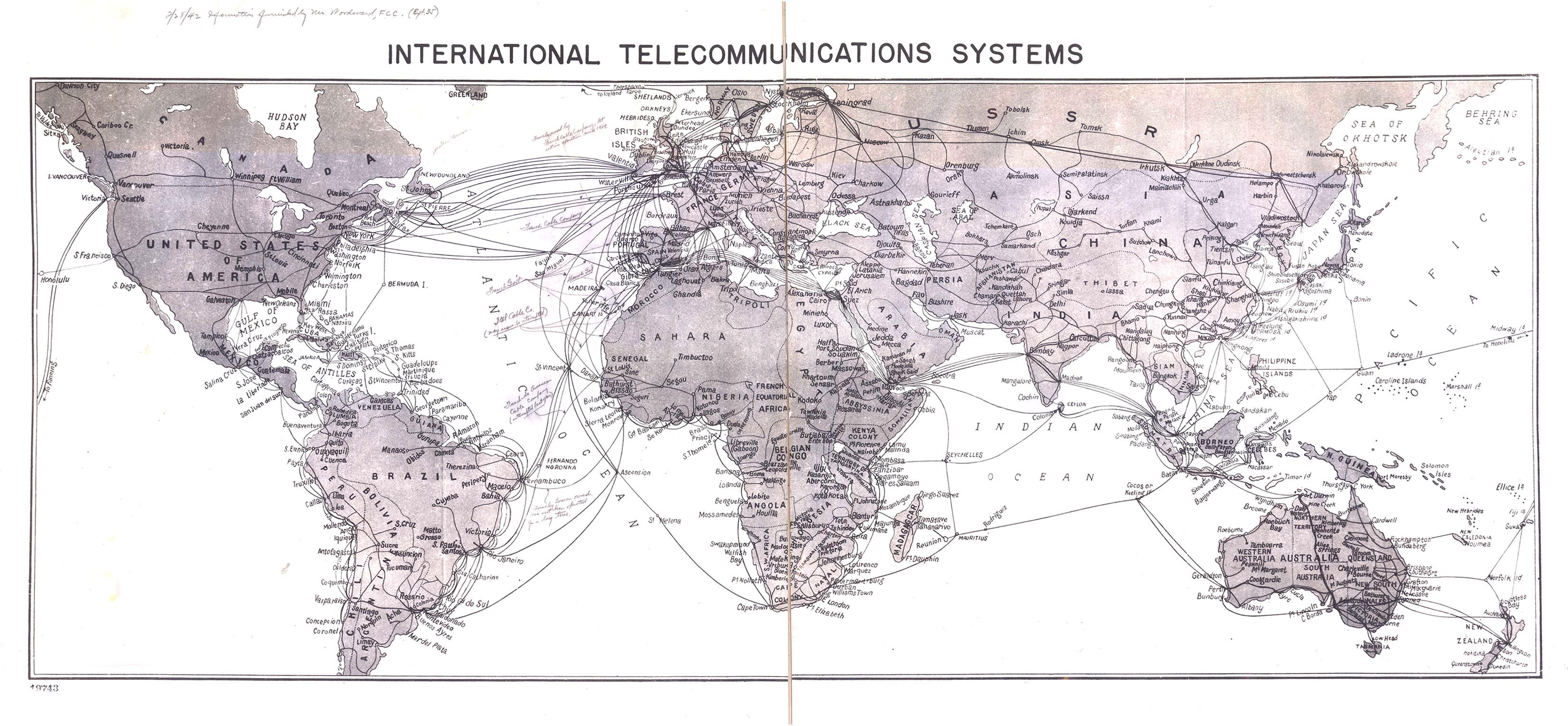
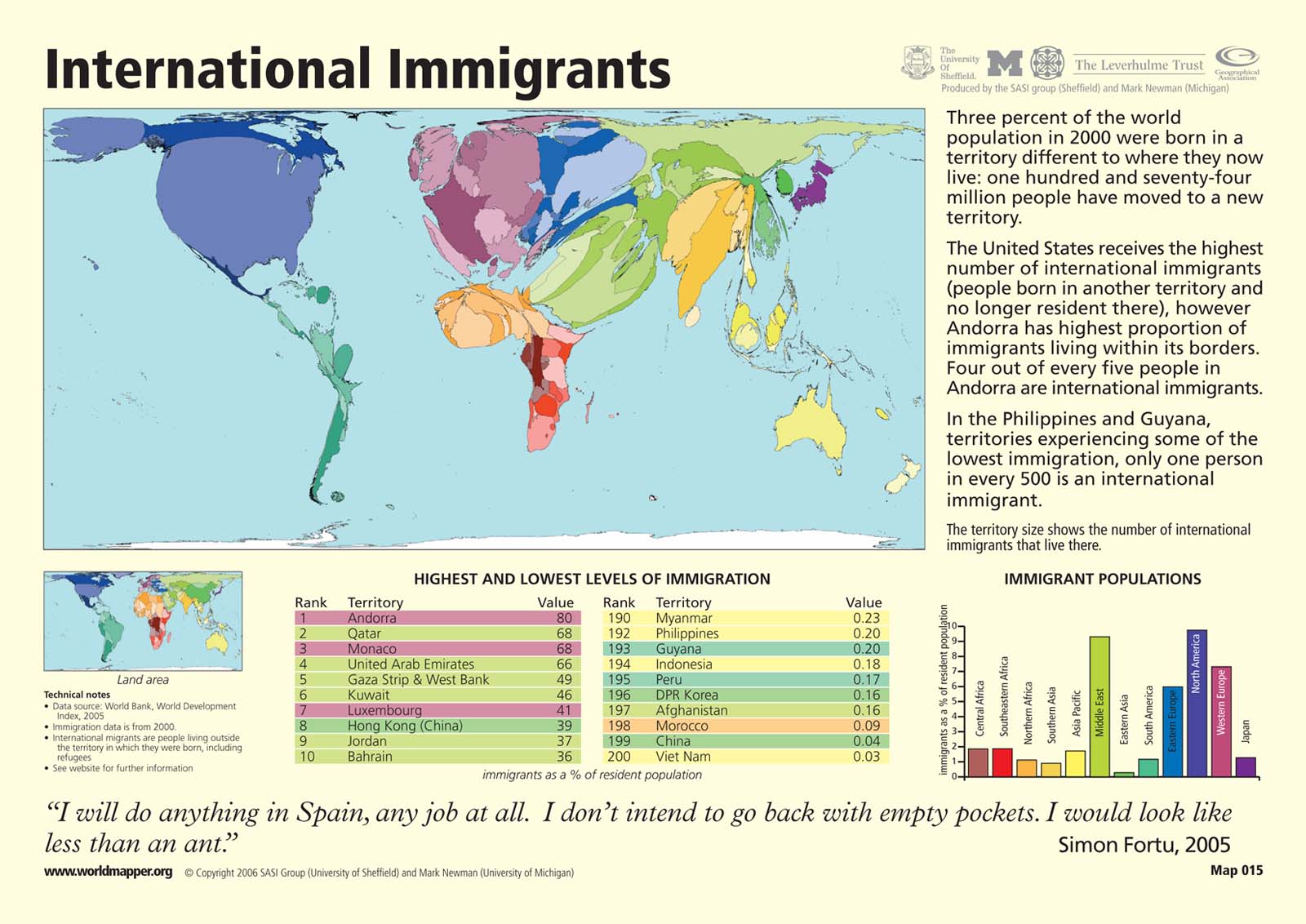
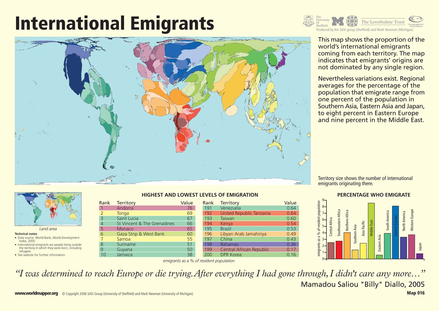
Caption
Kingdoms, Sultanates and Trade 1200-1450
Summary
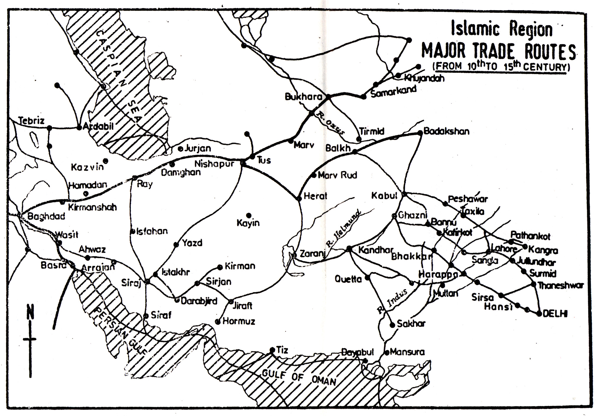
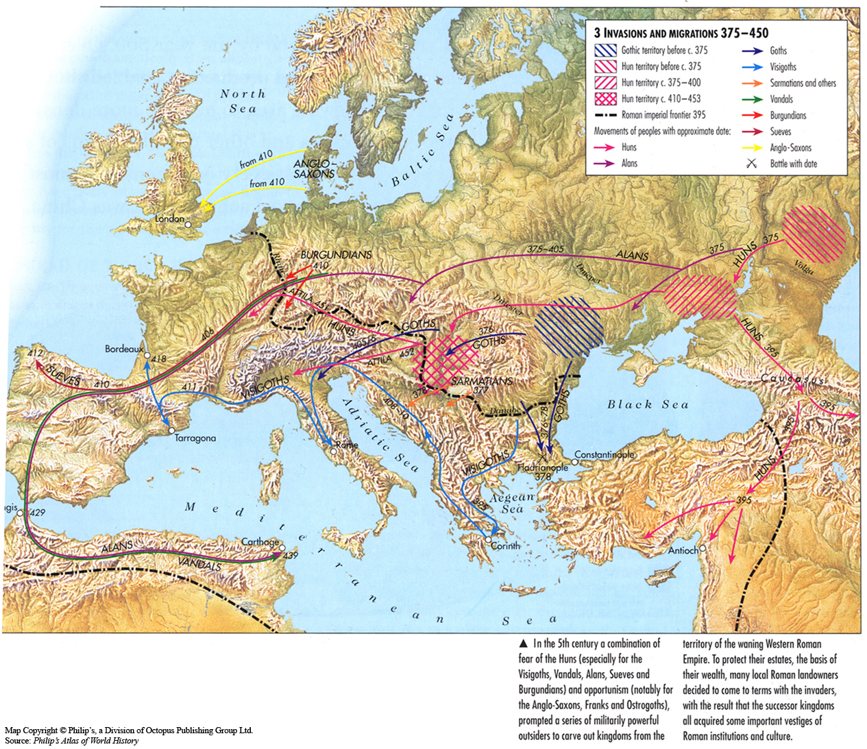
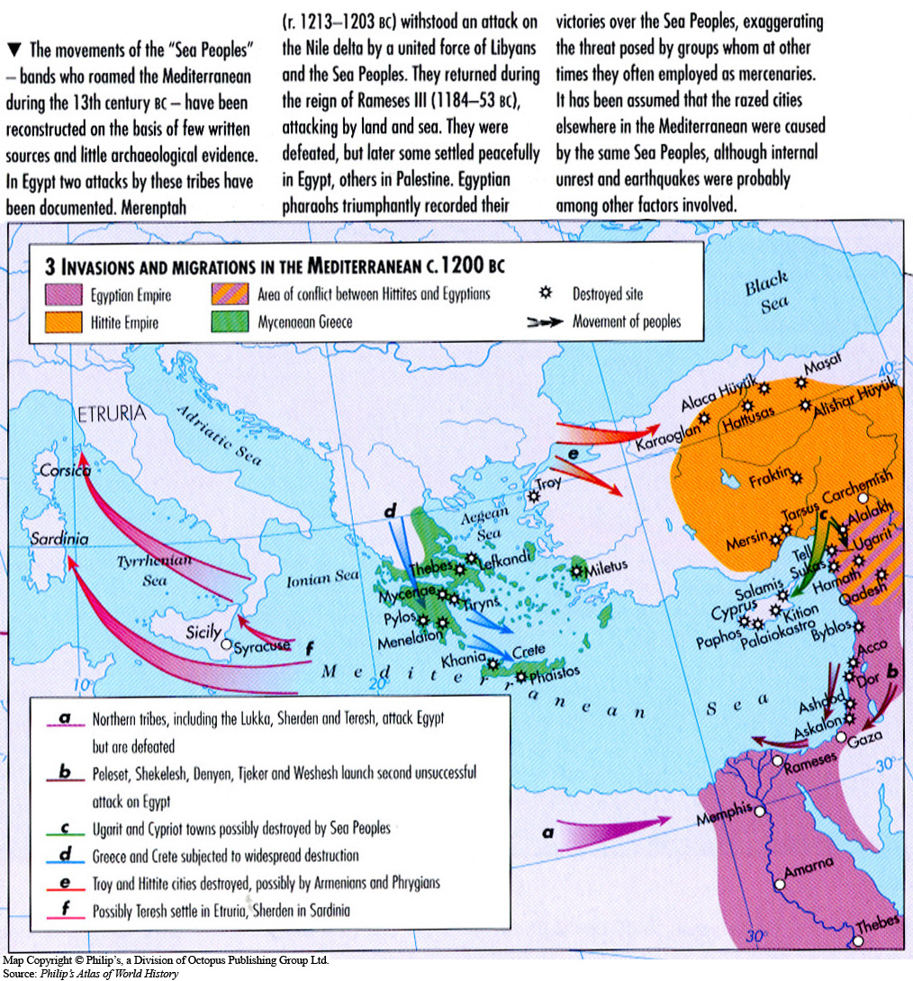
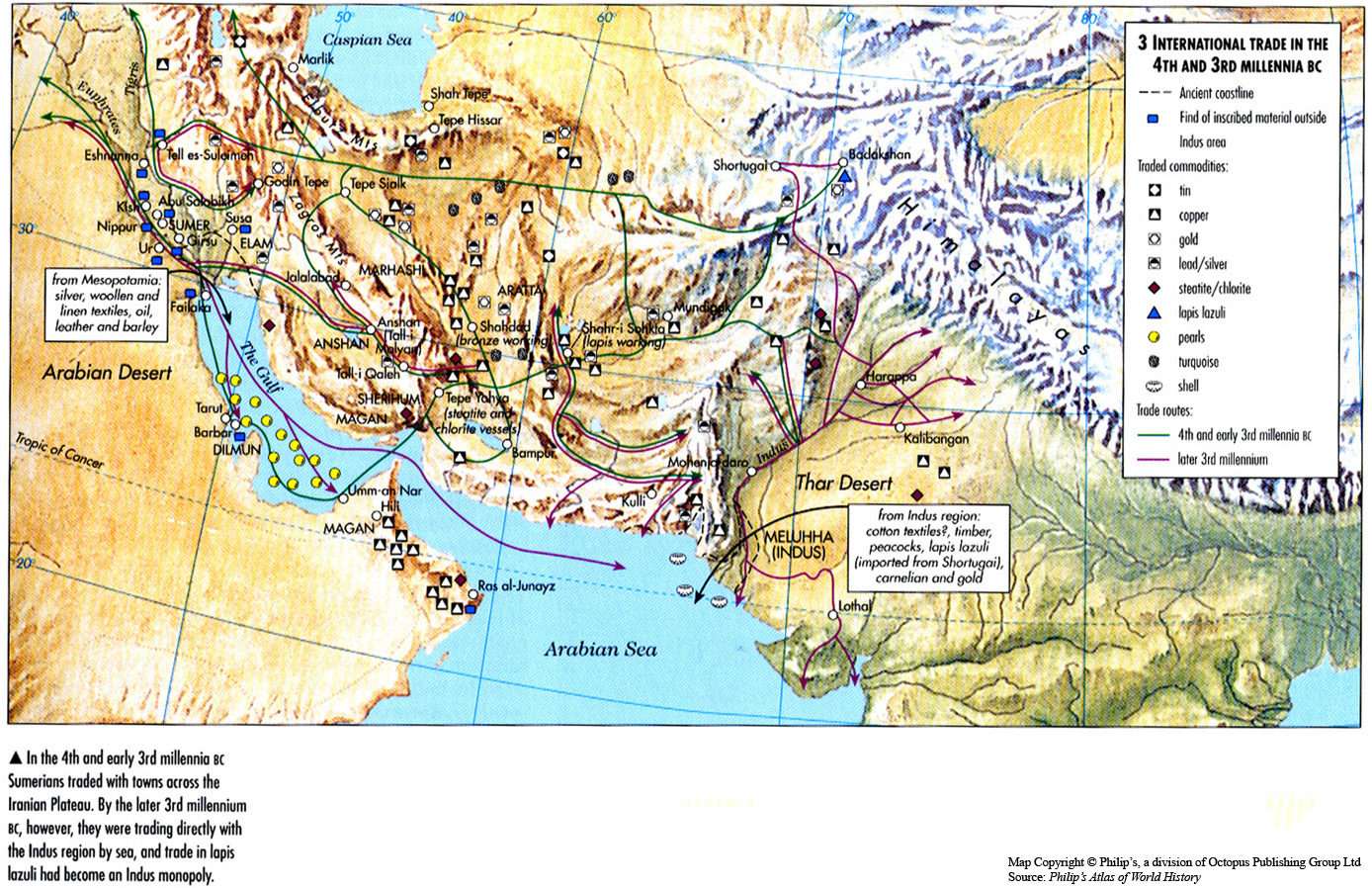
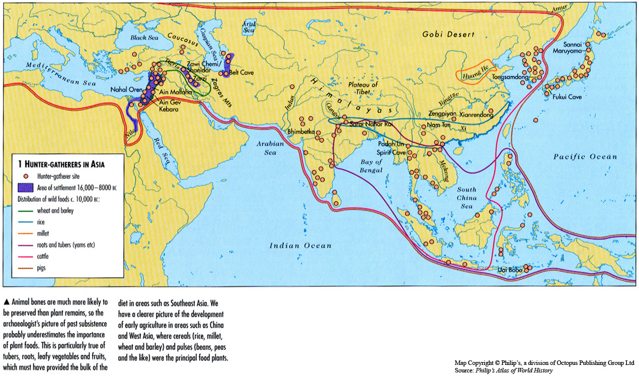
This map shows sites of key resources and trade routes to be found in southeast Asia from 1200 to 1450.
Source
Oxford Atlas of World History, Oxford University Press, 1999. General Editor Patrick K. O’Brien. (p. 65)
Copyright
Map copyright © Philip’s, a division of Octopus Publishing Group Ltd.
Source: Philip’s Atlas of World History
Used under license from Octopus Publishing Group.
Series
This map is one in a series of maps selected from the Oxford Atlas of World History.
A gallery using flyover images like this


![[3]](ftp://ftp.cs.wisc.edu/connectivity_table/version_16.map.color.gif)
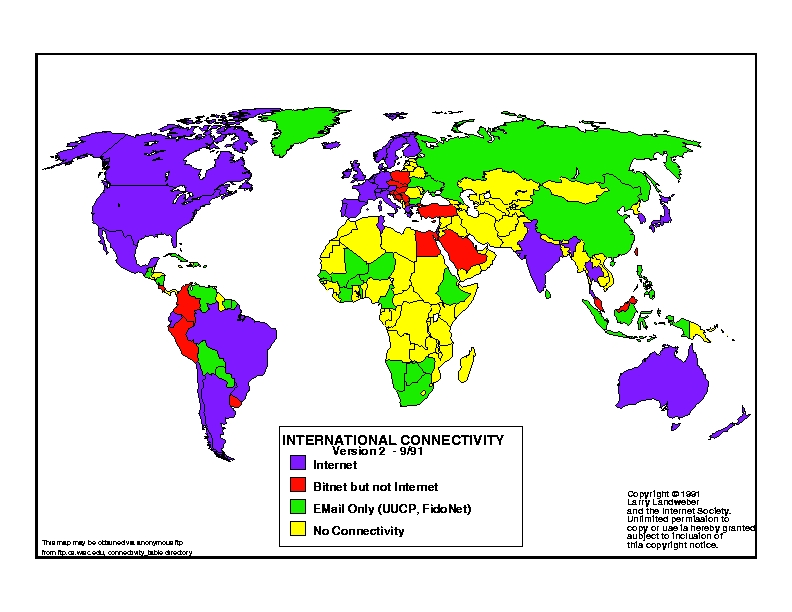
![[3]](ftp://ftp.cs.wisc.edu/connectivity_table/version_2.bmp)
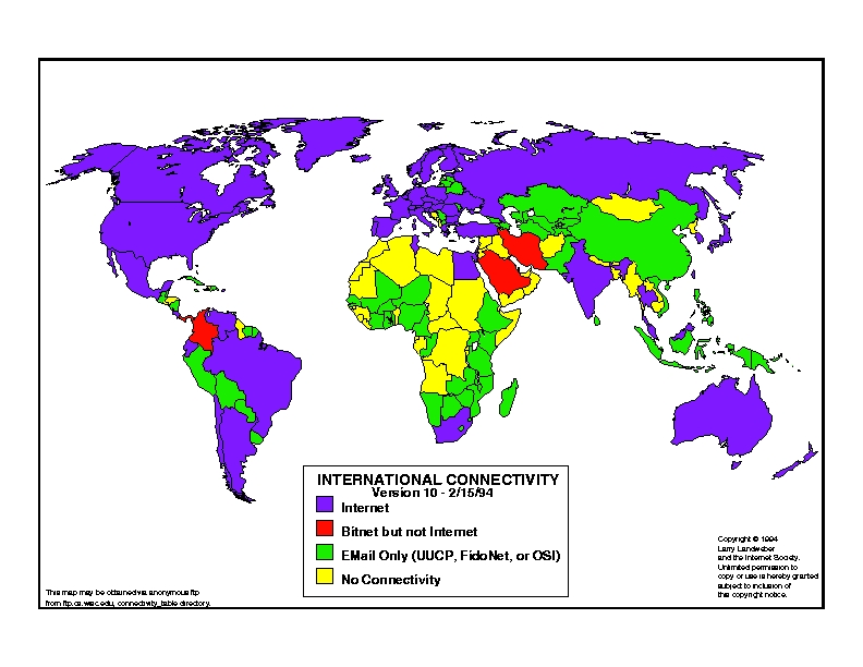
![[3]](ftp://ftp.cs.wisc.edu/connectivity_table/version_10.bmp)
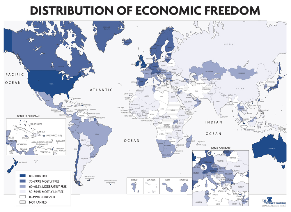
![[1]](http://www.heritage.org/research/features/index/downloads/Index2007_EconFreedomMAP.jpg)