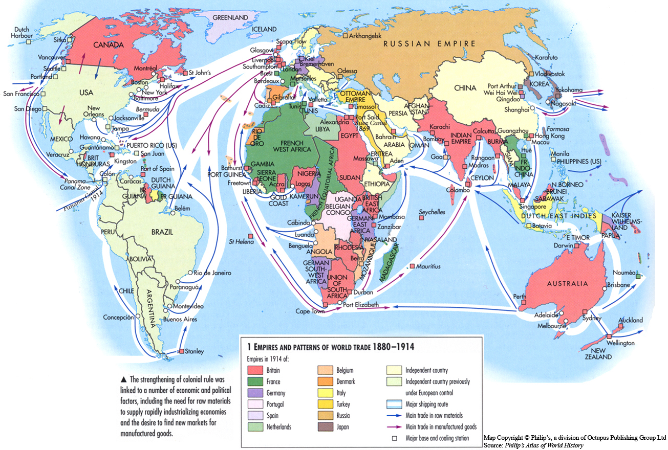
Caption
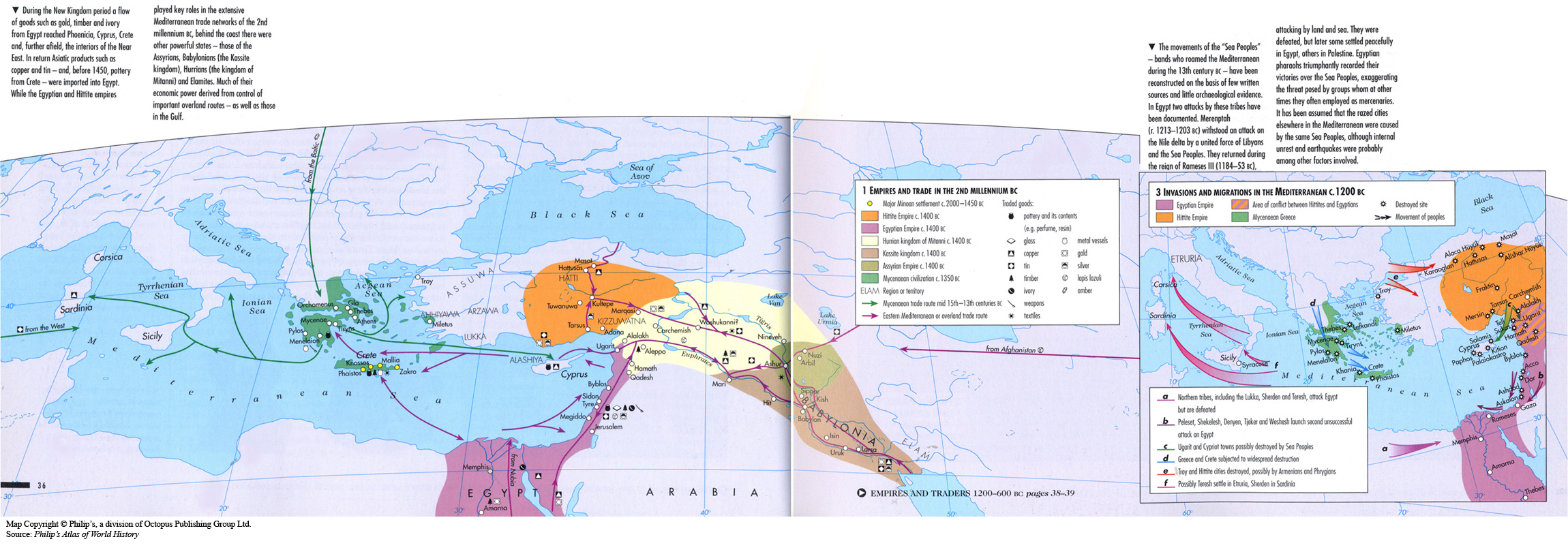
Empires and Trade in the 2nd Millennium BC
Summary
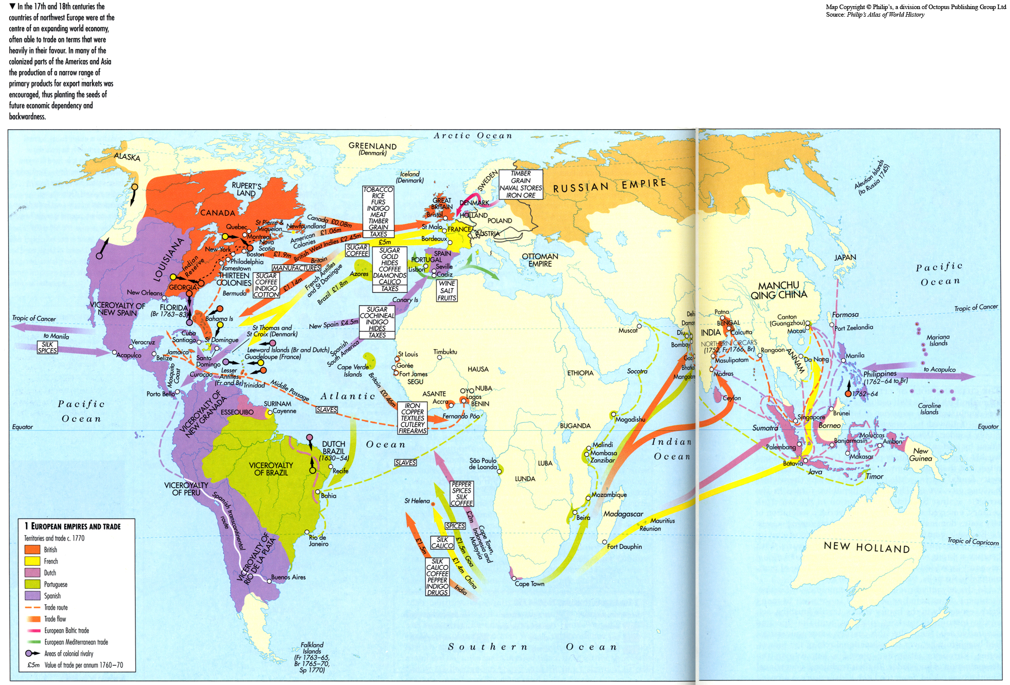
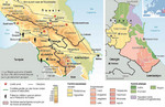
This map shows the boundaries of empires from 2000-1000 BCE, primarily around 1400 BC in southern Europe, North Africa, Middle East. The map shows the Hittite Empire, the Egyptian Empire, the Hurrian kingdom of Mitanni, the Kassite kingdom, and the Assyrian Empire around 1400 BCE, as well as the Mycenaean civilization c. 1350 BCE. Mycenaean and eastern Mediterranean trade routes are indicated, along with a variety of traded goods (pottery and its contents, glass, copper, tin, timber, ivory, weapons, textiles, metal vessels, gold, silver, lapis lazuli, and amber).
An inset map shows invasions and migrations in the Mediterranean c. 1200 BCE. The Egyptian and Hittite Empires and Mycenaean Greece are shown, with areas of conflict between Hittites and Egyptians, the movement of peoples, and destroyed sites are also noted. A play-by-play of conflicts is indicated with letters noting specific battle movements/events.
Source
Oxford Atlas of World History, Oxford University Press, 1999. General Editor Patrick K. O’Brien. (pp. 36-37).
Copyright
Map copyright © Philip’s, a division of Octopus Publishing Group Ltd.
Source: Philip’s Atlas of World History
Used under license from Octopus Publishing Group.
Series
This map is one in a series of maps selected from the Oxford Atlas of World History.
A gallery using flyover images like this
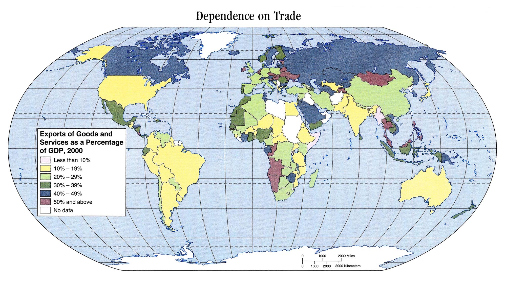
Openness to Trade 1980 can be viewed here.


![[1]](http://www.ethnologue.com/maps/WRLD_ETH.jpg)
![[1]](http://www.lib.utexas.edu/maps/historical/eastern_roman_empire.jpg)
![[1]](http://www.gutenberg.org/files/3567/3567-h/images/pc452.jpg)
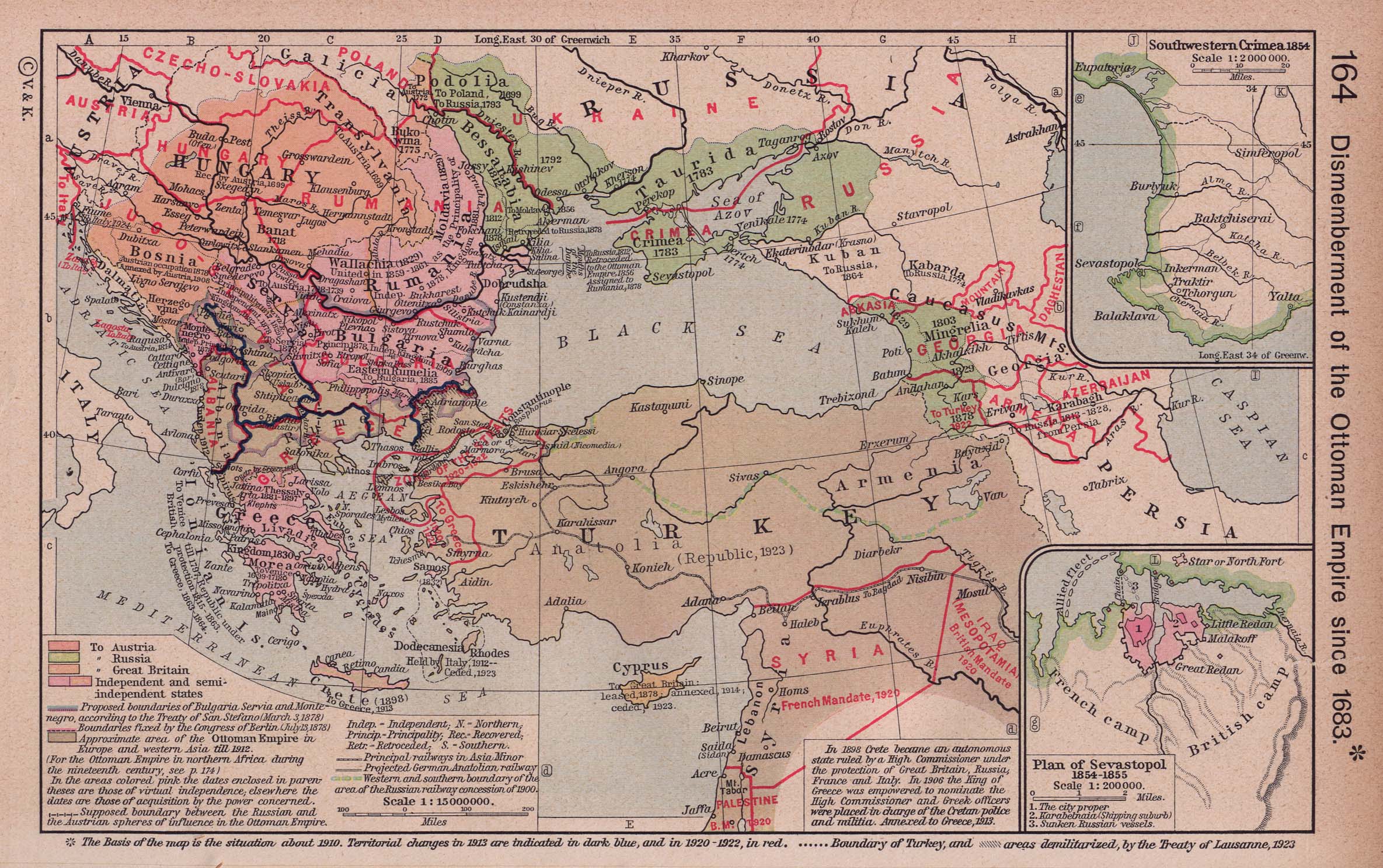
![[2]](http://www.lib.utexas.edu/maps/historical/ottoman1683_shepherd.jpg)