
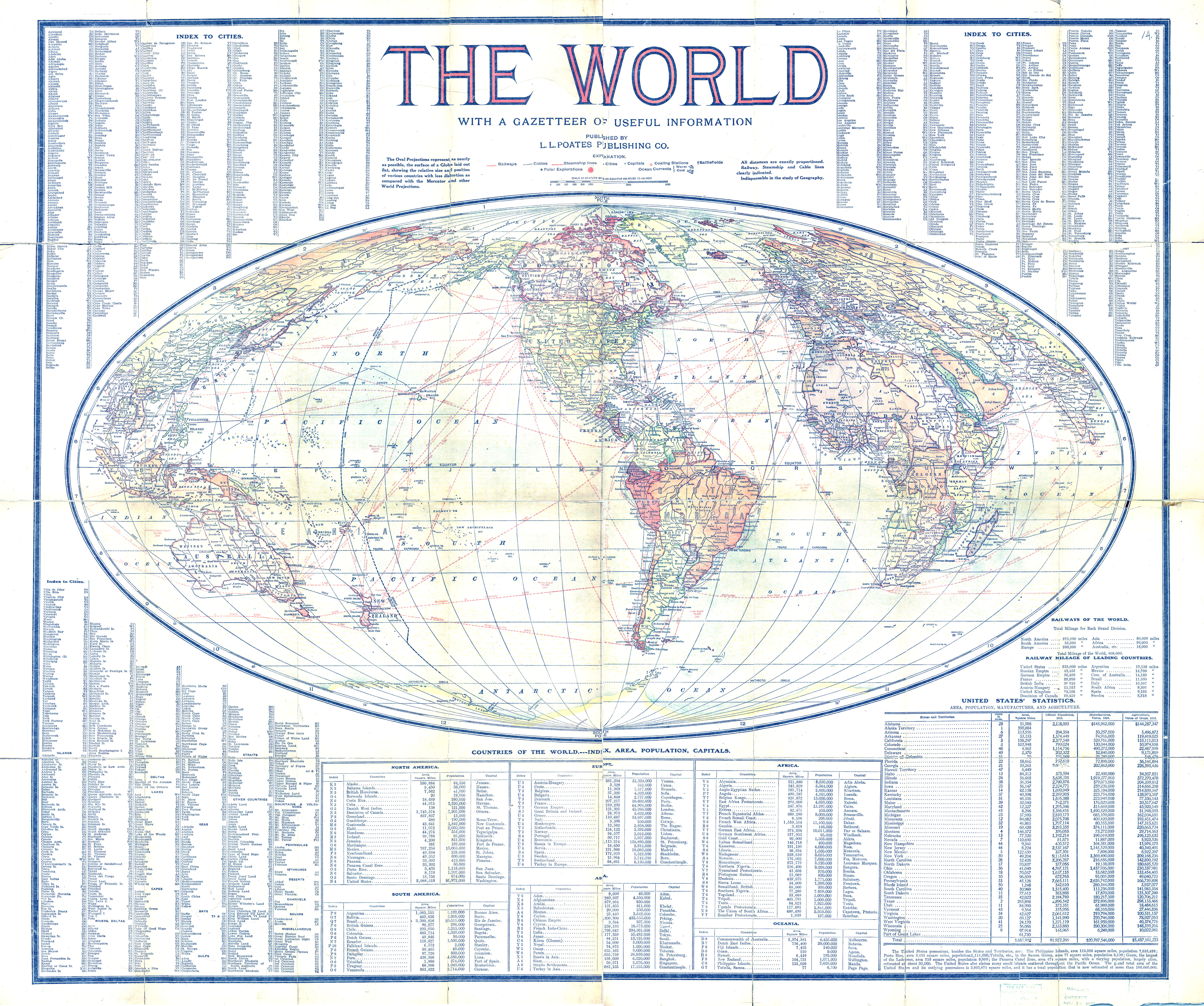
Caption
The World – With a Gazetteer of Useful Information
Summary
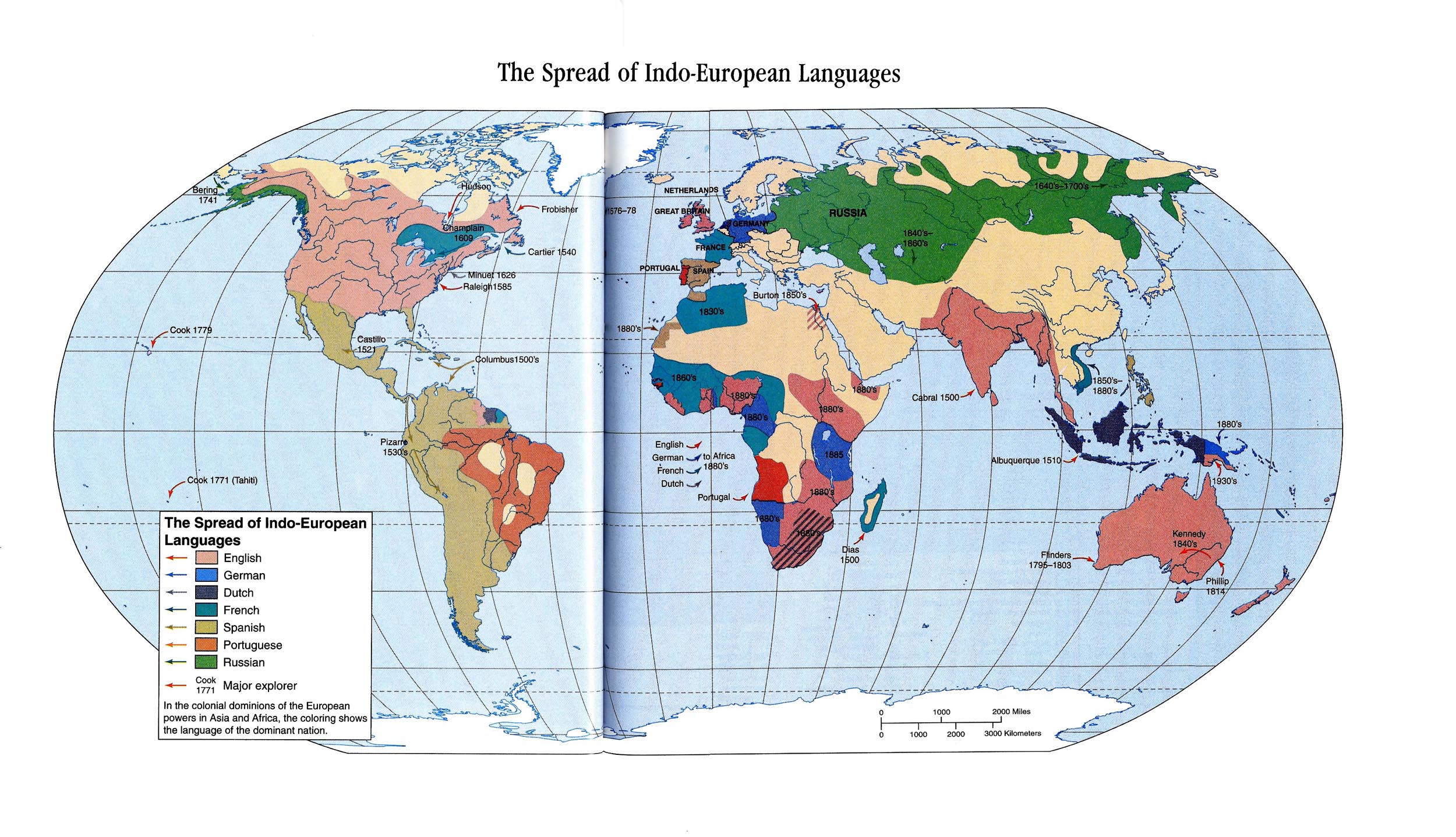
World map shows Railways, Cables, Steamship Lines, and Coaling Stations. Also provides a list of cities worldwide, and a description of countries with an index of area, population, and capitals. Detail about railways of the world, and of railway mileage in leading countries, are also given. Additionally, United States’ Statistics are provided indicating its different areas, population, manufactures, and agriculture. Battlefields, Polar Explorations and Ocean Currents are featured. The map is presented in an Oval Projection representing the surface of the globe laid out flat, showing the relative sizes and positions of various countries.
Published by L.L. Poates Publishing Co.
Copyright
Out of copyright.
,_2004.jpg)


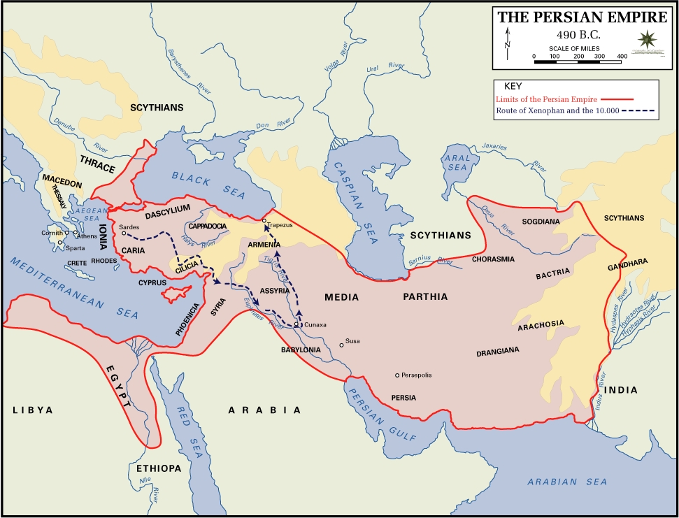
![[1]](http://en.wikipedia.org/wiki/Image:Persian_empire_490bc.gif)
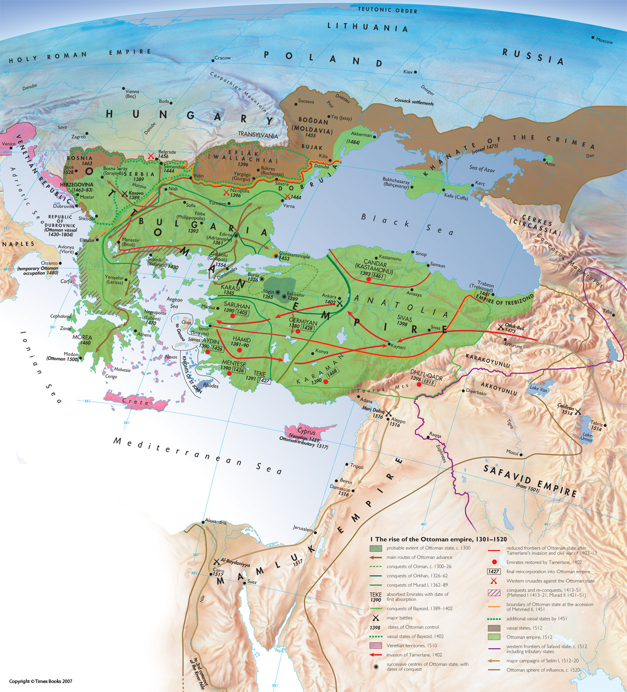
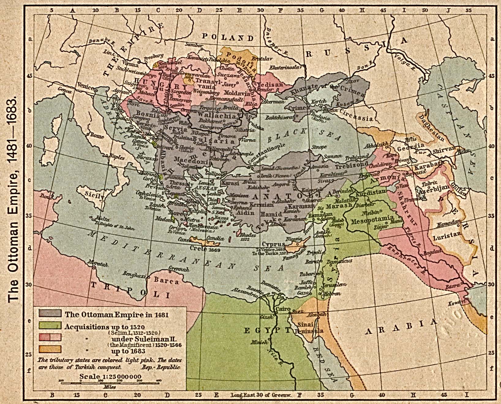
![[1]](http://www.lib.utexas.edu/maps/historical/shepherd/ottoman_empire_1481-1683.jpg)