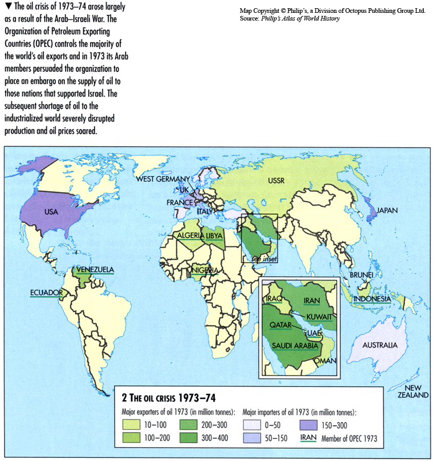
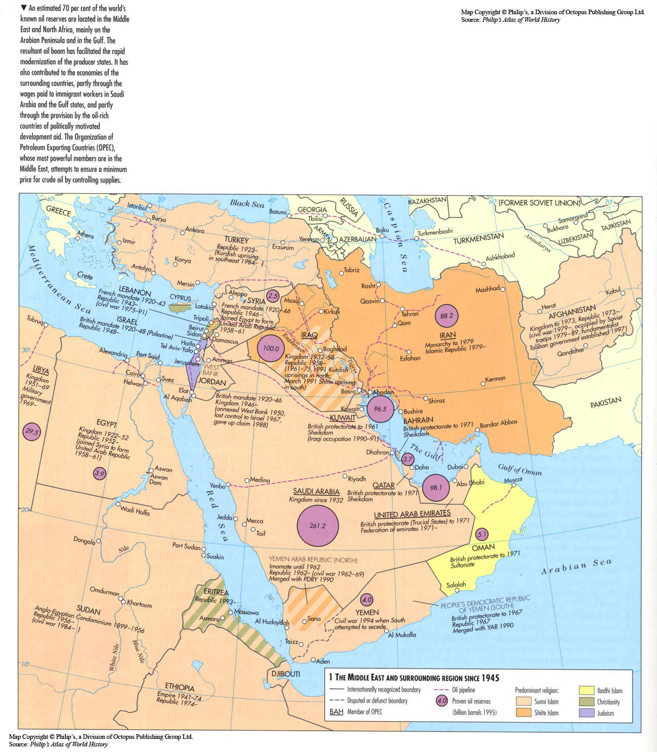
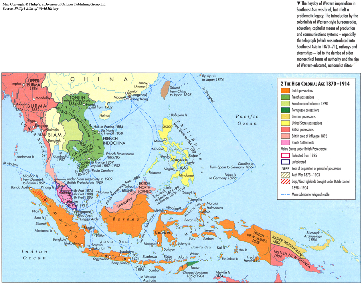
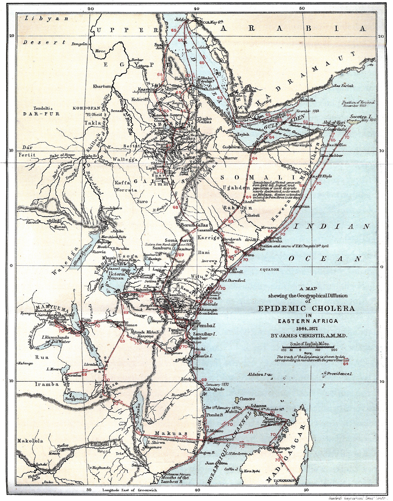
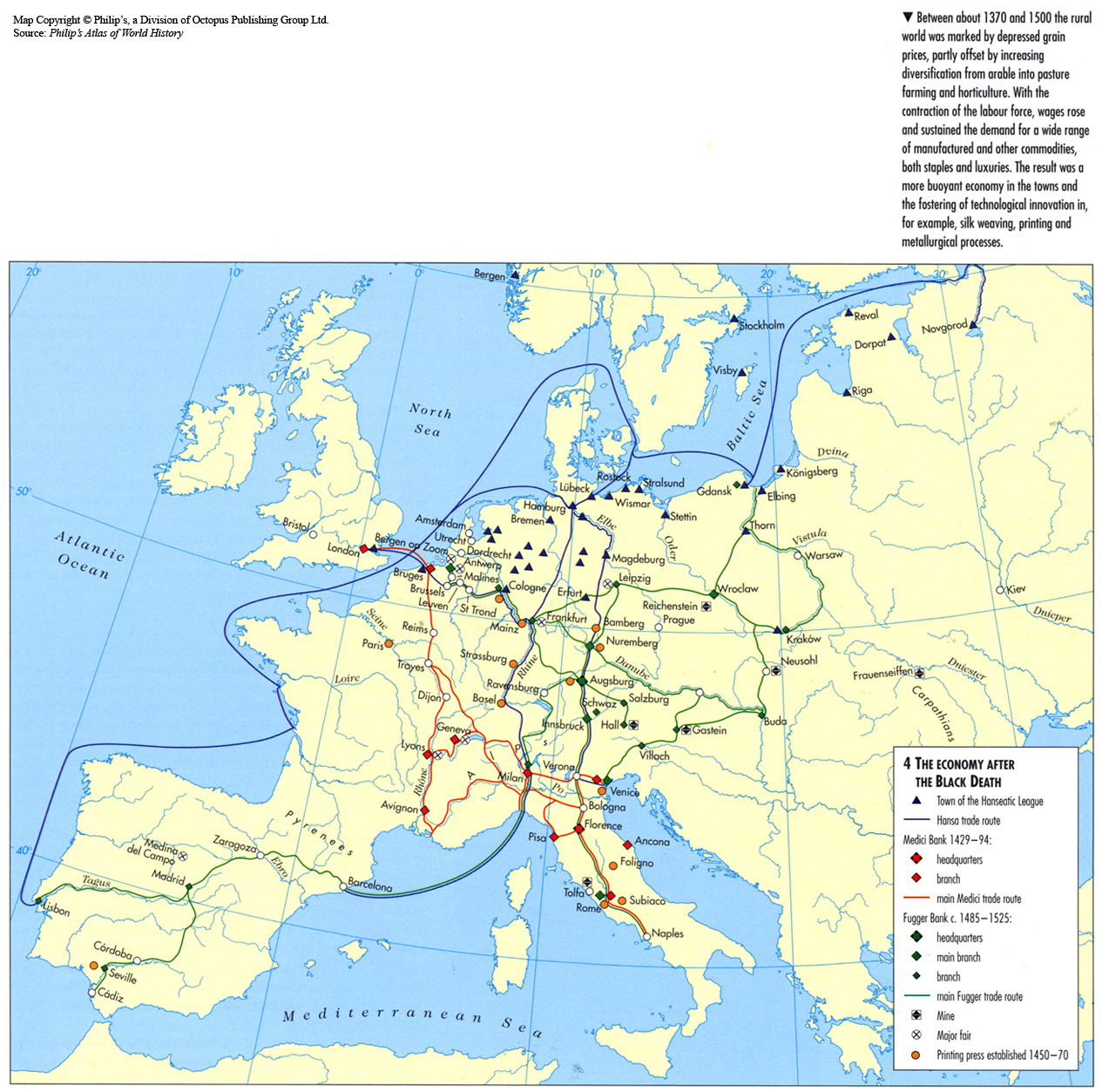
Category Archives: Unrestricted

The Oil Crisis 1973-1974

Caption

The Oil Crisis 1973-1974

Summary

This globe shows the major exporters and importers of oil, by country, from 1973 to 1974 during the Oil Crisis.

Source

Oxford Atlas of World History, Oxford University Press, 1999. General Editor Patrick K. O’Brien. (p. 272)

Copyright

Map copyright © Philip’s, a division of Octopus Publishing Group Ltd.
Source: Philip’s Atlas of World History

Used under license from Octopus Publishing Group.

Series

This map is one in a series of maps selected from the Oxford Atlas of World History.

A gallery using flyover images like this

Openness to Trade 1980
can be viewed here.

The Mongol Empire

Caption

The Mongol Empire

Summary

A topographic map showing the maximum extent of the Mongol Empire and its constituent Khanates, as well as invasion routes and major sites.

Source

Prepared for the Mapping Globalization] project by Anandaroop Roy.

The map was originally designed for the exhibition, “The Legacy of Genghis Khan: Courtly Art and Culture in Western Asia, 1256-1353”, Metropolitan Museum of Art, New York, July 2002 [1].

Copyright

© 2002 Anandaroop Roy

Used here with the kind permission of Anandaroop Roy (June 29, 2007).

The Mongol Conquests 1207-79

Caption

The Mongol Conquests 1207-79

Summary

This map shows the various stages of Mongol control in Europe and Asia from 1207 to 1279, with references to the boundaries of other empires.
Military campaigns led by Chinggis Khan (Genghis Khan) and others are labeled with dates.

===Inset===
Caption: Mongol Campaigns in Eastern Europe

This map shows military action from 1206 to 1405 and various battle sites in eastern Europe.
The Mongol advance into Europe did not last long.
Some speculate it was because of the death of Great Khan Ogodei, while others speculate that the pastureland was not good enough to stay.

Source

Oxford Atlas of World History, Oxford University Press, 1999. General Editor Patrick K. O’Brien. (p. 98)

Copyright

Map copyright © Philip’s, a division of Octopus Publishing Group Ltd.
Source: Philip’s Atlas of World History

Used under license from Octopus Publishing Group.

Series

This map is one in a series of maps selected from the Oxford Atlas of World History.

A gallery using flyover images like this

Openness to Trade 1980
can be viewed here.

The Middle East in 1914

Caption

The Middle East in 1914

Summary

This map shows the the colonial divisions in the Middle East in 1914, including zones of influence, independent territories, and dates of occupation or treaty signature in the colonial territories. The map also shows the extent of the Ottoman Empire in the Middle East in 1800.

Translation

Territory Under Control:

  • Britain
  • France
  • Italy
  • Spain
  • Date of Occupation or Treaty signature
  • International Zone
  • Independent Territory
  • Ottoman Empire in 1914
  • Limits of the Ottoman Empire around 1800
  • International boundaries in 1914

Zone of Influence:

  • Russia
  • Britain.

Source

Le Monde Diplomatique [1]

Cartographer: Philippe Rekacewicz

Copyright

© Le Monde Diplomatique

The Middle East in 1939

Caption

The Middle East in 1939

Summary

This map shows the European colonies and independent states in the Middle East in 1939, with dates of independence marked (if applicable). Also marked on the map is the area under UN mandate from 1920 through 1939.

Translation

Territories Under Control:

  • United Kingdom
  • France
  • Italy
  • Spain
  • Date of Independence
  • International Zone
  • Independent territory
  • State under the UN mandate since 1920
  • International boundaries since 1920.

Source

Le Monde Diplomatique [1]

Cartographer: Philippe Rekacewicz

Copyright

© Le Monde Diplomatique

The Middle East and surrounding region since 1945

Caption

The Middle East and surrounding region since 1945

Summary

This map shows the boundaries of countries in the Middle East since 1945 together with information about oil reserves.
Regions in the map are separated in reference to religious affiliations.

Source

‘Oxford Atlas of World History, Oxford University Press, 1999. General Editor Patrick K. O’Brien. (p. 260)

Copyright

Map copyright © Philip’s, a division of Octopus Publishing Group Ltd.
Source: Philip’s Atlas of World History

Used under license from Octopus Publishing Group.

Series

This map is one in a series of maps selected from the Oxford Atlas of World History.

A gallery using flyover images like this

Openness to Trade 1980
can be viewed here.

The March of Cholera in 1865

Caption

Chart Indicating the March of Cholera in 1865

Note: the chart “actually maps the pandemic’s diffusion from 1865 into the 1870s” (Koch, p. 160).

Summary

“From the pandemic’s origin in India, it moves first by sea routes and then over land into Africa, the Middle East, Europe, and finally to Britain, from which it travels to Canada and the United States.” (Koch, p. 160)

Source

This “English Government Map” was included in the U.S. Congressional report by J.M. Woodworth (1875).

The image was scanned from Fig 7.1 in Koch (2005).

Copyright status

Public license

The two-dimensional work of art depicted in this image is in the public domain in the United States and in those countries with a copyright term of life of the author plus 100 years. This photograph of the work is also in the public domain in the United States (see Bridgeman Art Library v. Corel Corp.).

References

Woodworth, J.M. (1875) “The cholera epidemic of 1873 in the United States.
House of Representatives. 43d Cong. 2d Session, House Ex. Doc. No. 95
(University of British Columbia Library).

Koch, Tom (2005). Cartographies of Disease. ESRI Press, Redlands, California.

Collection

The Manchu Empire and the European Powers, 1644-1912 A.D.

Caption

The Manchu Empire and the European Powers

Summary

This color-coded map shows the changes in the political landscape of Asia from approximately 1600 to 1900. It indicates the expansion and contraction of the Manchu empire from 1606 to 1912, the extension of the Russian empire from 1689 to 1912, and the British empire in South Asia during the same period. The years of foundation/acquisition, loss, and boundary-agreement are also marked on the map. In addition, railway lines and return migrations of the eastern Torgut are indicated.

Legend indicates:

  • Original country of the Manchus, 1606 A.D.
  • The Manchu Empire during its greatest expansion, 1760-1842 and 1858 A.D.
  • The later Manchu Empire until 1912 A.D.
  • The British Empire
  • The Russian Empire at the Accession of Peter the Great, 1689 A.D.
  • Russian conquests until 1858 A.D.
  • Russian conquests between 1858-1912 A.D.

Source

History and Commercial Atlas of China, Albert Herrmann, Ph.D., Harvard University Press, 1935.

See Huhai Website.

Copyright status

Public license
This work is believed to be in the public domain because its copyright is believed to have expired.

Series

This map is one in the series:

The Main Passenger and Cargo Liner Routes, 1963

Caption

The Main Passenger and Cargo Liner Routes

Summary

Map shows the main passenger and cargo liner routes. Table below summarizes some passenger liners employed in carrying passengers, mails and goods 1963.

Source

The World Shipping Scene: Atlas of Shipping, shipbuilding, Seaports and Sea-borne Trade (p. 98-99).
By Gustav Adolf Theel.

Weststadt-Verlag, Munich, 1963.

Copyright

JRO-Verlag Munchen 12, 1963.
This is a copyrighted work. Its use on QED is under the “Fair Use” rule.

The Main Conflicts of the 1990s

Caption

The Main Conflicts of the 1990s

Summary

This map illustrates the main political and national conflicts the world faced in the 1990s. The map shows border disputes, international conflicts, serious internal troubles, civil wars, independence movements, and negotiations in progress or terminated (in order according to the legend). Next to the symbols representing these conflicts are the names of the movements, nations, and/or groups behind the dispute.

Source

Le Monde Diplomatique [1]

Cartographer: Philippe Rekacewicz

Copyright

© Le Monde Diplomatique

The Magyars 896-955

Caption

The Magyars 896-955

Summary

This map shows Magyar military campaigns and battle sites from 896-955 in eastern Europe and western Asia.
This map also shows the influx of Pechengs in the 890s into Magyar territory.

Source

Oxford Atlas of World History, Oxford University Press, 1999. General Editor Patrick K. O’Brien. (p. 77)

Copyright

Map copyright © Philip’s, a division of Octopus Publishing Group Ltd.
Source: Philip’s Atlas of World History

Used under license from Octopus Publishing Group.

Series

This map is one in a series of maps selected from the Oxford Atlas of World History.

A gallery using flyover images like this

Openness to Trade 1980
can be viewed here.

The Influence of Byzantine Art in the West

Caption

The Influence of Byzantine Art in the West

Summary

This map shows the long arm of influence of Byzantine art into western Europe. Byzantine influence was at its height in the 11th and 12th centuries but can be traced as far back as the 6th century.

Source

Atlas of Western Art History. Facts on File, Inc., New York, 1994, page 81

Antony White Publishing Ltd.

Copyright

© Parchment Books Ltd. This appears to be an “orphan work”. If you can help us locate the copyright holder, please send mail to qed@princeton.edu.

The Islamic Conquests to 750

Caption

The Islamic Conquests to 750

Summary

This map indicates the Muslim conquest routes and sites of major battles from 630 to 750 in North Africa, Europe, the Middle East and western Asia.

Source

Oxford Atlas of World History, Oxford University Press, 1999. General Editor Patrick K. O’Brien. (pp. 68-69).

Copyright

Map copyright © Philip’s, a division of Octopus Publishing Group Ltd.
Source: Philip’s Atlas of World History

Used under license from Octopus Publishing Group.

Series

This map is one in a series of maps selected from the Oxford Atlas of World History.

A gallery using flyover images like this

Openness to Trade 1980
can be viewed here.

The Indus Civilization, 4th Millennia to 2600 BCE

Caption

The Indus Civilization

Summary

This map depicts the southeast Asia region of the Indus civilization c. 4th Millennia to 2600 BCE, indicating areas of key resources and major settlements.

Source

Oxford Atlas of World History, Oxford University Press, 1999. General Editor Patrick K. O’Brien. (p. 29)

Copyright

Map copyright © Philip’s, a division of Octopus Publishing Group Ltd.
Source: Philip’s Atlas of World History

Used under license from Octopus Publishing Group.

Series

This map is one in a series of maps selected from the Oxford Atlas of World History.

A gallery using flyover images like this

Openness to Trade 1980
can be viewed here.

The Hellenistic World and the Growth of Macedonia, 323 BCE, 359 to 336 BCE

Caption

The Hellenistic World and the Growth of Macedonia

Summary

This map indicates the conquest routes Alexander the Great took, with sites of major battles, from 334 to 323 BCE in the Middle East and western Europe.
As a whole, the map shows Alexander’s empire around 323 BCE.

===Inset===
Caption: The Growth of Macedonia

This map shows kingdom boundaries in Greece and surrounding areas from 359 to 336 BC.

Source

Oxford Atlas of World History, Oxford University Press, 1999. General Editor Patrick K. O’Brien. (p. 42)

Copyright

Map copyright © Philip’s, a division of Octopus Publishing Group Ltd.
Source: Philip’s Atlas of World History

Used under license from Octopus Publishing Group.

Series

This map is one in a series of maps selected from the Oxford Atlas of World History.

A gallery using flyover images like this

Openness to Trade 1980
can be viewed here.

The High Colonial Age 1870-1914

Caption

The High Colonial Age 1870-1914

Summary

This map shows the impact of Western imperialism in southeast Asia from 1870 to 1914.
The Western colonization of countries is indicated, as well as telegraph cable locations.

Source

Oxford Atlas of World History, Oxford University Press, 1999. General Editor Patrick K. O’Brien. (p. 197)

Copyright

Map copyright © Philip’s, a division of Octopus Publishing Group Ltd.
Source: Philip’s Atlas of World History

Used under license from Octopus Publishing Group.

Series

This map is one in a series of maps selected from the Oxford Atlas of World History.

A gallery using flyover images like this

Openness to Trade 1980
can be viewed here.

The Growth of Urban Supply Routes 3500 BC – AD 1500

Caption

The Growth of Urban Supply Routes 3500 BC – AD 1500

Summary

“Plotted at 500-year intervals, the successive snapshots used in this
animation show the proliferation of trade routes which supplied a
growing urban network.” [1]

Notice that some trade networks collapsed.

For an animation of West-Eurasian trade networks from 3600-1400 BCE, see
Image:The West-Eurasia World System, 3600-1400 BC [2].

Copyright

© ArchAtlas 2006

“The named authors assert their copyright in the material presented on
this website, which should not be reproduced without full
acknowledgement of its source. Its use in teaching, research and the
dissemination of knowledge is nevertheless encouraged, with due
attribution to archatlas.org and the responsible individual.”

Source

Sherratt, Andrew, ‘Trade Routes: the Growth of Global Trade”, ArchAtlas, October 2006, 2nd Edition, http://www.archatlas.org/Trade/Trade.php, Accessed: 27 April 2007

ArchAtlas 2nd edition, July 2006

The Growth of Industry and Railways, 1848 to 1914

Caption

The Growth of Industry and Railways

Summary

This map shows the network of railways that developed from 1848 to 1914.
There are also markers for several industries like steel, shipbuilding, and chemicals.

Source

‘Oxford Atlas of World History, Oxford University Press, 1999. General Editor Patrick K. O’Brien. (p. 170)

Copyright

Map copyright © Philip’s, a division of Octopus Publishing Group Ltd.
Source: Philip’s Atlas of World History

Used under license from Octopus Publishing Group.

Series

This map is one in a series of maps selected from the Oxford Atlas of World History.

A gallery using flyover images like this

Openness to Trade 1980
can be viewed here.

The Growth of Roman Power in Asia Minor

Caption

The Growth of Roman Power in Asia Minor

Summary

A series of three maps: Asia Minor I (after the treaty of Apamea, 188 B.C.); Asia Minor II (before the outbreak of the Mithradatic Wars, 90 B.C.); Asia Minor III (as organized by Pompey 63 B.C.).

Source

Perry-Castañeda Library: Map Collection: Historical Maps of the Middle East [1]

The Historical Atlas by William R. Shepherd, 1923 (map).

Copyright

Public domain

The Germanic Settlements, 395-476

Caption

The Germanic settlements, 395-476

Summary

This map shows shows the frontiers of the Eastern and Western Roman Empires and of adjacent kingdoms as of 395 CE, and how the boundaries changed up to 476 CE.

The areas of the following kingdoms are shown:

  • Kingdom of the Sueves
  • Kingdom of the Visigoths
  • Kingdom of the Vandals

Arrows indicate the movements of the following peoples up to about 680 CE:

  • Huns
  • Vandals, Alans, Sueves,
  • Visigoths
  • Ostrogoths
  • Franks
  • Other Germanic peoples (Lombards, Burgundians, Angles, Jutes, Saxons, Frisians, Alemanni))
  • Slavs
  • Scots and Britons

The following locations are also shown:

  • Attila’s headquarters from 434-53
  • where Attila was held in 447
  • where Alaric died in 410

The location and date of each of the following battles are also marked:

  • Adrianople (378)
  • Gallipoli (443)
  • Marcianopolis (447)
  • Catalaunian Fields (451)
  • Vouille (507)
  • Ad Decimum (533)
  • Mons Lactarius (552)

Copyright status

Copyright © Times Books 2007
Reproduced from The Times Complete History of the World by permission of HarperCollins Publishers Ltd.

Licensing

All rights reserved

Source

The Times Complete History of the World (2007), p. 108-9.

The Global Tobacco Trade

Caption

SSSMOKIN! The Global Tobacco Trade

Summary

This “infographic”wp includes a world map showing major smuggling routes
for cigarettes.

Inset graphics provide information about a variety of topics, notably:

  • the size of the black market in cigarettes in 2000
  • cigarette consumption in 1998
  • modes of transportation used by smugglers in 2000 in the European Union

Map by Jonathan Harris of Flaming Toast Productions.

Source

INA

Data sources: WHO; Dr Joel Dennington, Tobacco Almanac, 1993;
“Illegal Pathway to Illegal Profits” by the Campaign for Tobacco-Free Kids;
Action on Smoking and Health, UK.

Copyright

INA.
The publication date appears to be 2000 or thereabouts.

The Geographical Diffusion of Epidemic Cholera in Eastern Africa, 1864-1871

Caption

A Map shewing the Geographical Diffusion of Epidemic Cholera in Eastern Africa 1864-1871

In Koch (2005), the caption is
“Christie’s map of cholera diffusion in East Africa. Sequential numbers are used in the text to describe the diffusion of the disease by caravan, religious pilgrimage, and sea routes.”

Summary

At the time this map was produced, expert opinion still attributed the spread of cholera to “bad air” and an “aerial highway”.
For example, based on geographical analysis, Dr Bryden of India’s Sanitary Commission claimed in his “Report on the General Aspects of Epidemic Cholera in 1869” that he had deduced the existence of an “aerial highway” carrying the disease across Africa (Koch, p 184).

In this map, which was published in 1876, the physician James Christie provides the contrary evidence in great detail. Christie also pointed out that earlier East African outbreaks (1836-1837, 1858-1959) had occurred in Arabian and Red Sea ports to and from which pilgrims to Mecca traveled.

Legend

“The track of the Epidemic is shewn by dots corresponding in numbers with the years thus …”.
That is, “65” indicates the year 1865.

Source

The image was scanned from Fig 7.9 in Tom Koch (2005). Cartographies of Disease. ESRI Press, Redlands, California.

The original map was published in Christie, J. (1876). “Cholera Epidemics in East Africa: An Account of the Several Diffusions of the Disease in that Country from 1821 till 1872, with an Outline of the Geography, Ethnography, and Trade Connections of the Region through which the Epidemics Passed”. London: MacMillan.

Collection

Copyright status

Public license

The two-dimensional work of art depicted in this image is in the public domain in the United States and in those countries with a copyright term of life of the author plus 100 years. This photograph of the work is also in the public domain in the United States (see Bridgeman Art Library v. Corel Corp.).

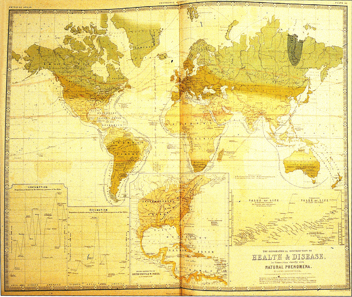
The Geographical Distribution of Health and Disease, 1856

Caption

The Geographical Distribution of Health and Disease, in connection chiefly
with Natural Phenomena

Summary

“Lines chart the progress of disease (by time and type) between countries …
The names of each disease are noted in areas of endemic occurrence. The result defines a landscape of disease districts … across each country.” (Koch, p.68)

The red lines show the progress of cholera.

Other diseases mentioned include:

  • Ague
  • Catarrh
  • Consumption
  • Cretinism
  • Diarrhea and Dysentry
  • Dysentry
  • Elephantiasis
  • Goitre
  • Guinea Worm
  • Influenza
  • Intermittent Fever
  • Intestinal Worms
  • Leprosy
  • Liver Disease
  • Measles
  • Opthalmia
  • Remittent Fever
  • Rheumatism
  • Scarlatina [Scarlet Fever]
  • Smallpox
  • Yellow Fever

The image currently available on QED is of low quality but is included because of the map’s historical significance.

Source

The image was scanned from Fig 3.11a in Tom Koch (2005). Cartographies of Disease. ESRI Press, Redlands, California.

The original source is Johnston, A.K. (1856). The Physical atlas of natural phenomena. Edinburgh: W. Blackwood.

Copyright

Public license

The two-dimensional work of art depicted in this image is in the public domain in the United States and in those countries with a copyright term of life of the author plus 100 years. This photograph of the work is also in the public domain in the United States (see Bridgeman Art Library v. Corel Corp.).

Collection

The Foreign Born from the Philippines in the United States, 2000

Caption

The Foreign Born from the Philippines in the United States: As Percentage of Total County Population, 2000

Summary

This map is color-coded to show the percentage of the Philippine-born population in each county of the U.S. in 2000. Additional maps are provided for Alaska, Puerto Rico, and Hawaii.

The Philippine-born population in the United States accounted for 0.5% of the total.

Source

The maps are available online at the Migration Policy Institute’s Data Hub.

The Migration Policy Institute is an independent, nonpartisan, nonprofit think tank dedicated to the study of the movement of people worldwide.

Primary Data Source:

U.S. Census Bureau, Census 2000.

Copyright

© 2004 Migration Policy Institute. All rights reserved.

Permission to use this map on the Mapping Globalization website was granted on June 7, 2007.

Series

This map is one of a series Maps of the Foreign Born in the US published by the Migration Policy Institute. The series includes separate maps for each of the following sources of immigrants:

  • China, India, Iran, Mexico, Philippines, Vietnam
  • Africa, Caribbean, South America
  • All sources

The Foreign Born in the United States, 2000

Caption

The Foreign Born in the United States: As Percentage of Total County Population, 2000

Summary

This map is color-coded to show the percentage of total foreign born living in the U.S. out of the total population. Additional maps are provided for Alaska, Puerto Rico, and Hawaii.

The foreign born population in the United States accounted for 11.1% of the total.

Source

The maps are available online at the Migration Policy Institute’s Data Hub.

The Migration Policy Institute is an independent, nonpartisan, nonprofit think tank dedicated to the study of the movement of people worldwide.

Primary Data Source:

U.S. Census Bureau, Census 2000.

Copyright

© 2004 Migration Policy Institute. All rights reserved.

Permission to use this map on the Mapping Globalization website was granted on June 7, 2007.

Series

This map is one of a series Maps of the Foreign Born in the US published by the Migration Policy Institute. The series includes separate maps for each of the following sources of immigrants:

  • China, India, Iran, Mexico, Philippines, Vietnam
  • Africa, Caribbean, South America
  • All sources

The Expansion of the Achaemenid Empire, 550 BCE to 525 BCE

Caption

The Expansion of the Achaemenid Empire

Summary

This map shows the expansion of the Achaemenid Empire into territories around Mideast and western Asia from 550 BCE to 525 BCE.

  • Persian core territory
  • Median kingdom
  • Lydian kingdom
  • Babylonian kingdom
  • Egyptian kingdom
  • Final expansion under Darius and Xerxes

Source

Oxford Atlas of World History, Oxford University Press, 1999. General Editor Patrick K. O’Brien. (pp. 42-43).

Copyright

Map copyright © Philip’s, a division of Octopus Publishing Group Ltd.
Source: Philip’s Atlas of World History

Used under license from Octopus Publishing Group.

Series

This map is one in a series of maps selected from the Oxford Atlas of World History.

A gallery using flyover images like this

Openness to Trade 1980
can be viewed here.

The Foreign Born from Mexico in the United States, 2000

Caption

The Foreign Born from Mexico in the United States: As Percentage of Total County Population, 2000

Summary

This map is color-coded to show the percentage of the Mexico-born population in each county of the U.S. in 2000. Additional maps are provided for Alaska, Puerto Rico, and Hawaii.

The Mexico-born population in the United States accounted for 3.3% of the total.

Source

The maps are available online at the Migration Policy Institute’s Data Hub.

The Migration Policy Institute is an independent, nonpartisan, nonprofit think tank dedicated to the study of the movement of people worldwide.

Primary Data Source:

U.S. Census Bureau, Census 2000.

Copyright

© 2004 Migration Policy Institute. All rights reserved.

Permission to use this map on the Mapping Globalization website was granted on June 7, 2007.

Series

This map is one of a series Maps of the Foreign Born in the US published by the Migration Policy Institute. The series includes separate maps for each of the following sources of immigrants:

The Economy after the Black Death, 1429 to 1525

Caption

The Economy after the Black Death

Summary

This map shows the effects of the Black Death on the European economy from 1429 to 1525.

Source

‘Oxford Atlas of World History, Oxford University Press, 1999. General Editor Patrick K. O’Brien. (p. 107)

Copyright

Map copyright © Philip’s, a division of Octopus Publishing Group Ltd.
Source: Philip’s Atlas of World History

Used under license from Octopus Publishing Group.

Series

This map is one in a series of maps selected from the Oxford Atlas of World History.

A gallery using flyover images like this

Openness to Trade 1980
can be viewed here.

The Effect of The Depression in North America and Europe, 1928 to 1934

Caption

The Effect of the Depression in North America and Europe

Summary

These two maps show the economic effects of the Depression in North America and Europe. Accompanying bar charts indicate the numbers of unemployed in the years.

Source

Oxford Atlas of World History, Oxford University Press, 1999. General Editor Patrick K. O’Brien. (p. 228)

Copyright

Map copyright © Philip’s, a division of Octopus Publishing Group Ltd.
Source: Philip’s Atlas of World History

Used under license from Octopus Publishing Group.

Series

This map is one in a series of maps selected from the Oxford Atlas of World History.

A gallery using flyover images like this

Openness to Trade 1980
can be viewed here.

The Distribution of the Principal Races and Varieties of Mankind, 1868

Caption

Map of the World showing the distribution of the principal Races and Varieties of Mankind

Summary

This map was published in New York, NY, in 1868. It depicts a nineteenth-century view of the classification of humanity into “races”, “varieties”, “branches”, and mixtures.

The legend gives this explanation of colors:

  • yellow – European
  • pale blue – Mongolian
  • pink – American
  • gray – African
  • brown – Malay

Labels on the map include:

  • American or Indian Race
  • Australian Negro Variety
  • Chinese
  • Esquimeaux
  • Finnic or Ugrian Branch
  • Hindoos (sic)
  • Hottentots
  • Indo-Chinese
  • Indo-Europeans
  • Indo-European Mixed
  • Japhetic or Indo-European Branch
  • Lapps
  • Malayans and Polynesians
  • Papuan-Negro Variety
  • Patagonians
  • Sclavonic (sic)
  • Semitic or Syro-Arabian Branch
  • Teutonic
  • Turkish

The map also indicates the northern and southern “limits of permanent habitation”.

Source

George W. Fitch, Outlines of Physical Geography (New York, NY: Ivison, Phinney, Blakeman & Company, 1868) 85.

Map Credit: Courtesy The Private Collection of Roy Winkelman.

Courtesy of the
MAPS Technology Clearinghouse of the
Florida Center for Instructional Technology (FCIT) at the University of South Florida.

Copyright

The original map is public domain, but “Maps ETC is copyright © 2007 by the University of South Florida”.
See [2] for the license.

The commercial and cultural bonds of Eurasia

Caption

The commercial and cultural bonds of Eurasia

Summary

This map of Eurasia and north Africa shows trading centers and the network of trade routes within Eurasia and its orbit.

The distribution of Han mirrors, Chinese silks, treasures of the Shoso-in (Japan), Graeco-Roman objects found in southeast Asia dated in the interval 1-300 CE, are also indicated.

The sites known to the author of A Voyage around the Red Sea are also indicated.

The crisis of the 3rd century

Caption

The crisis of the 3rd century

Summary

This map shows how the Mediterranean lands were divided in about 270 CE into three domains:

  • area under Roman control at the accession of Aurelian, 270 CE
  • Palmyrene empire of Edenathus and Zenobia, 26-72 CE
  • “Gallic empire” of Posthumus and Tetricus, 259-74 CE

Arrows indicate Germanic, Gothic, Sasanid Persian and nomadic incursions from outside these
domains.

The locations of besieged or sacked cities, and of Roman victories and defeats are also shown.

Copyright status

Copyright © Times Books 2007
Reproduced from The Times Complete History of the World by permission of HarperCollins Publishers Ltd.

Licensing

All rights reserved

Source

The Times Complete History of the World (2007), p. 102.

The Christian World c. 700-1050

Caption

The Christian World c. 700-1050

Summary

This map shows the types of Christianity in Europe, the Middle East, and North Africa with indications of Muslim rule from 700 to 1050.

Source

‘Oxford Atlas of World History, Oxford University Press, 1999. General Editor Patrick K. O’Brien. (p. 62)

Copyright

Map copyright © Philip’s, a division of Octopus Publishing Group Ltd.
Source: Philip’s Atlas of World History

Used under license from Octopus Publishing Group.

Series

This map is one in a series of maps selected from the Oxford Atlas of World History.

A gallery using flyover images like this

Openness to Trade 1980
can be viewed here.