Mapping Your Data with Carto
Creating Live Interactive Maps
Carto is an online mapping platform that helps users visualize spatial data and analysis. Carto requires datasets to have geo-spatial information, usually in the form of latitude and longitude columns. It requires that geo-location data to plot data in very precise locations on a map. If your dataset that does not already include geo-spatial coordinates, here are a couple useful sites that help transform other kinds of location data (such as addresses, cities, etc.) into latitude and longitude coordinates.
Sites:
- https://www.gpsvisualizer.com/
- https://www.geocod.io/ (free for 2,500 look ups per day)
To create a new Carto account:
Limited one-year free accounts on Carto are now available to everyone. If you are a student user, however, you can create a free account by following the directions here. Using these instructions you will:
To create a new project in Carto:
- First go to Carto.com.
- Create a new account (see the section above).
- From the dashboard home page, click on the New Map button.
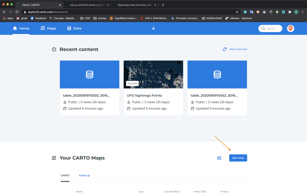
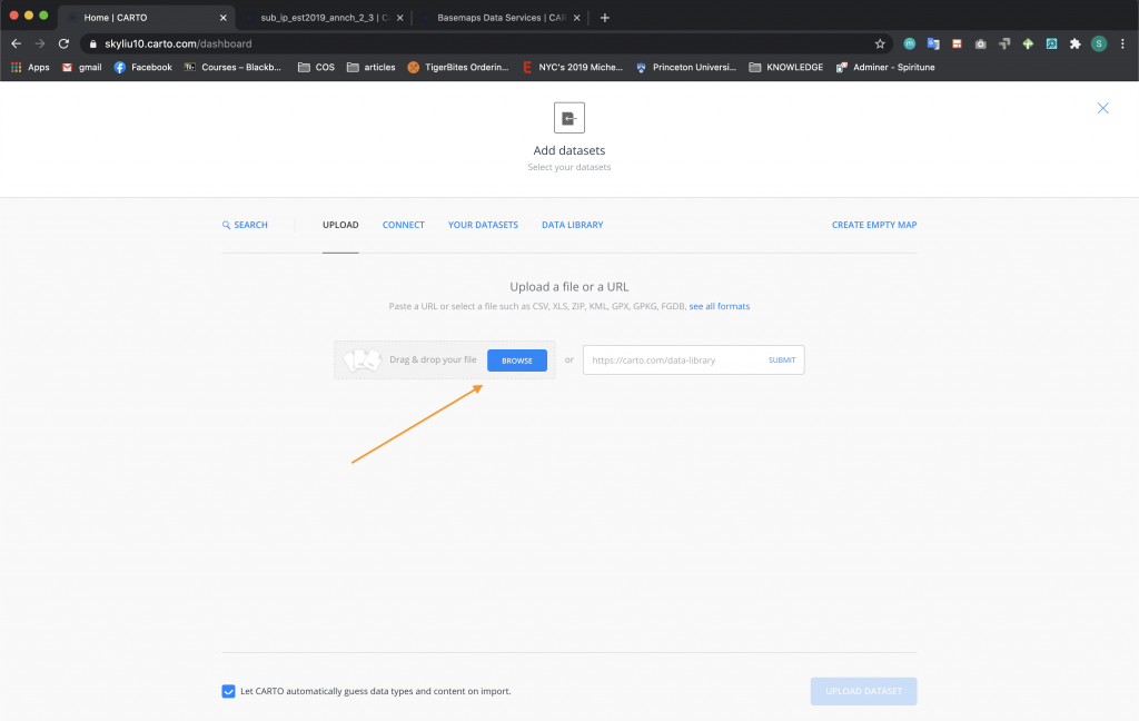
- Upload your dataset from either your local computer or connect to it through a web link.
To publish and embed your Carto map in web pages:
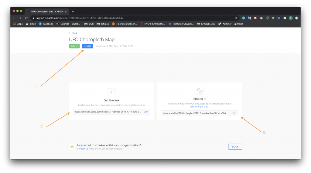
Before going further, let us explain how you will share your map when it is finished:
From the Publish page, you will see a blue button that either says Publish (if it is your first time publishing the map) or Update (if you have already published the map and want to publish changes). Make sure to click this button to refresh before publishing the map. Then, you have two ways of sharing your map:
-
- Get the Link – share the map as a full live web page hosted by Carto. For example, this link points to the map that you will be creating in the tutorial below using the URL: https://skyliu10.carto.com/builder/1798988e-0573-4719-a6fe-6694a4da8447/embed
- Embed It – get an “iframe” code to embed your live map within your own web page, as we’ve done below on this page.
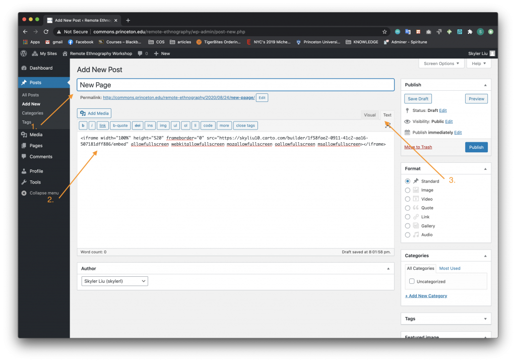
- If you are working in a WordPress site, for instance, create a new post or add to an existing post.
- Switch the post editor from Visual to Text. This will allow you to add or edit the html code.
- Paste the “iframe” embed code from the Carto Embed It section. Be sure that the code begins and ends with <iframe> </iframe>.
Creating Your Maps
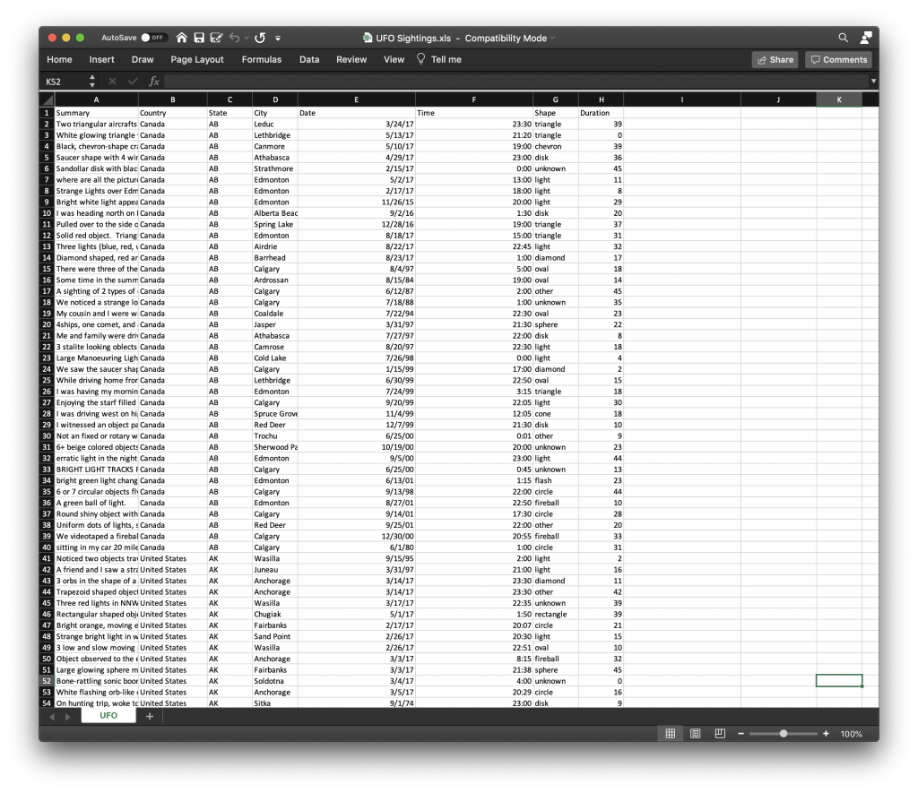
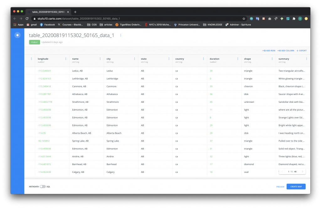
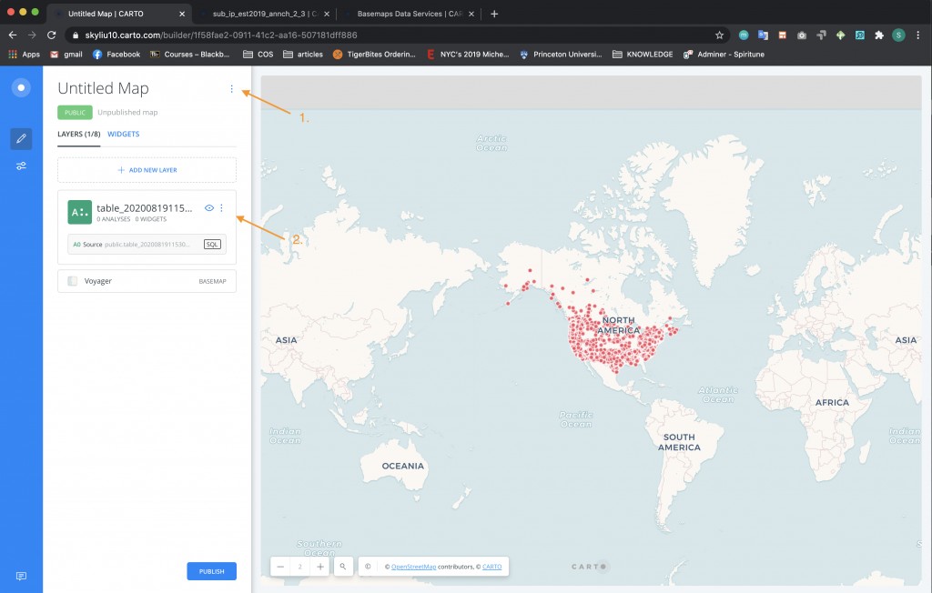
Let’s take a look at two examples that are both about UFO sightings. You can download the datasets and follow along with the tutorial (make sure to unzip the Carto_data folder that will be initially downloaded) – Carto_data. Here are screenshots of the datasets that we will using (the first picture is the local version, the second picture is after it is uploaded to Carto):
- UFO Sightings
Note that the original data does not have latitude and longitude coordinates. In order to generate this geo-spatial data, which is needed for Carto, you can upload this data to either of the websites listed above. The sites will create .gpx files with latitude and longitude coordinates that can then be uploaded to Carto.
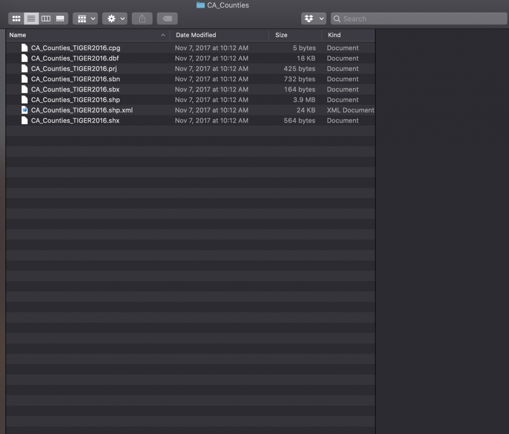
- ca-counties-boundaries.zip (note this first photo is of the contents of the zip folder but you should upload the folder as a .zip – do not unzip before you upload)
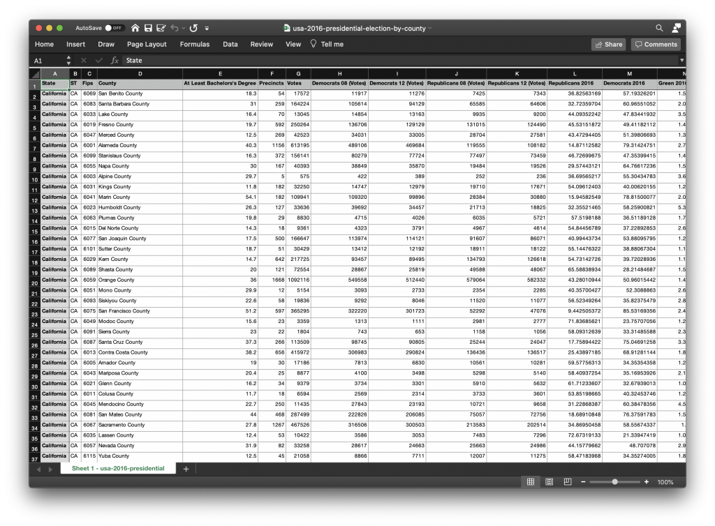
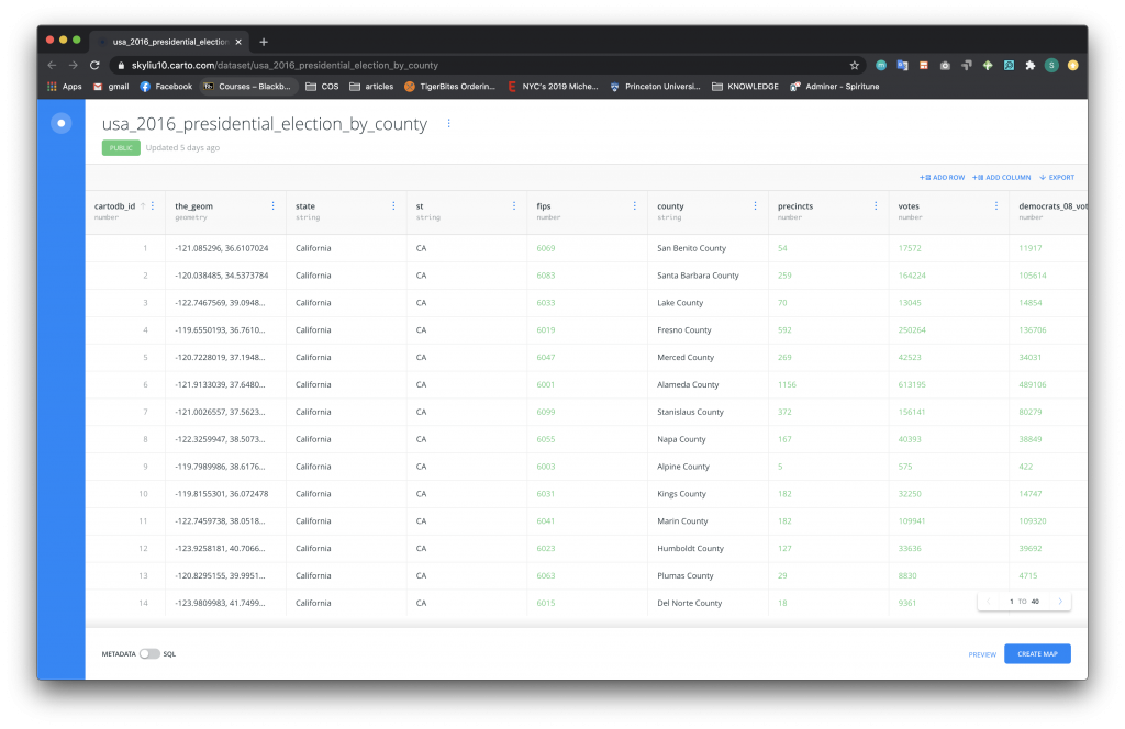
- usa-2016-presidential-election-by-county.csv
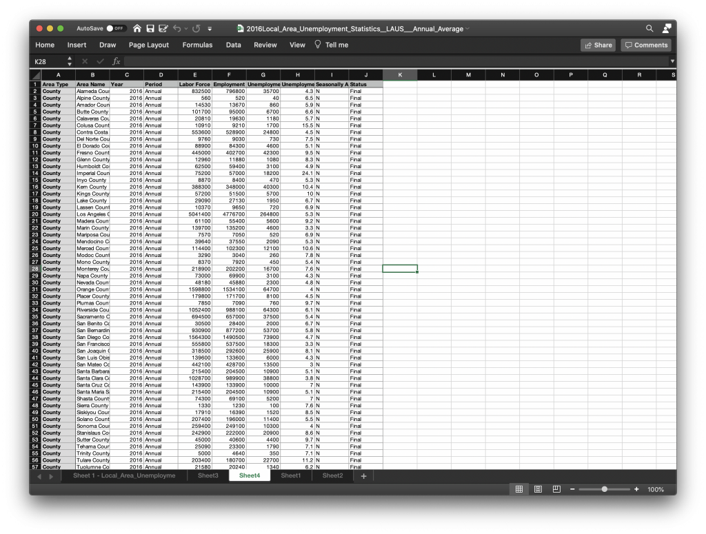
- 2016Local_Area_Unemployment_Statistics_LAUS_Annual_Average.xlsx

UFO Sightings by Point
In recreating this first Carto example above, you will map out different UFO sightings across the United States. Each sighting will be mapped as a point and you will learn how to make additional information appear in pop-up boxes that a user can reveal.
After uploading the dataset through the steps listed above:
-
-
- Using the side option menu, rename the map.
- Click on the dataset table to examine the information.
-
To style points on the graph:
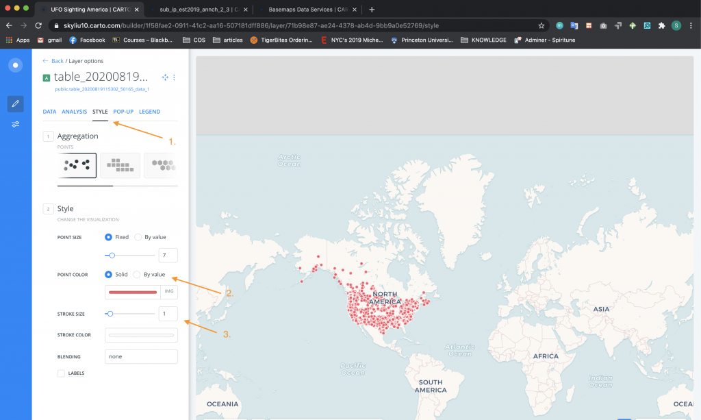
-
- Click on the Style tab and in Aggregation (Section 1), choose Points.
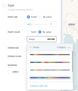
- In Style (Section 2), change the Point Color to By Value and to the “Shape” column. Choose a color set. We’re going to use a different color for the shapes of UFOs.
- In Style (Section 2), change the Stroke Size to 0.5.
To create pop-up tool-tips:
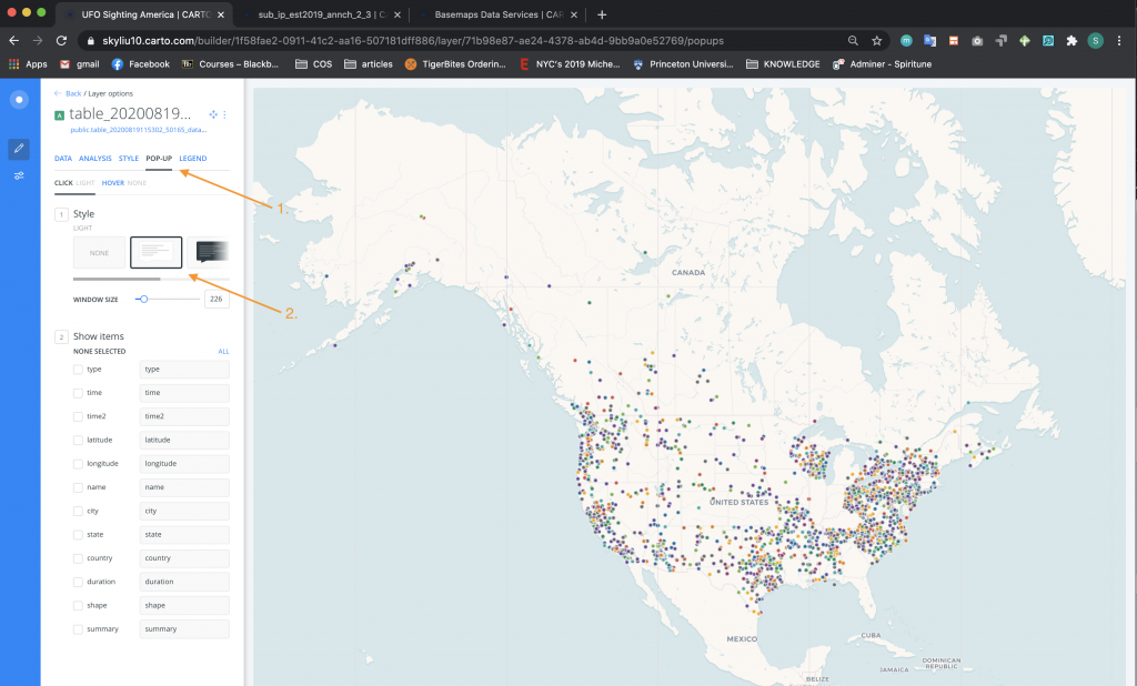
-
- Click on the Pop-Up tab. You can choose to make the pop-ups show up either by clicks or hovers, in this case it will show up by clicks, that is, when a user clicks on a point. We typically use hover when points are spread out less densely that they are here.
- In Style (Section 1), choose the Light style.
-
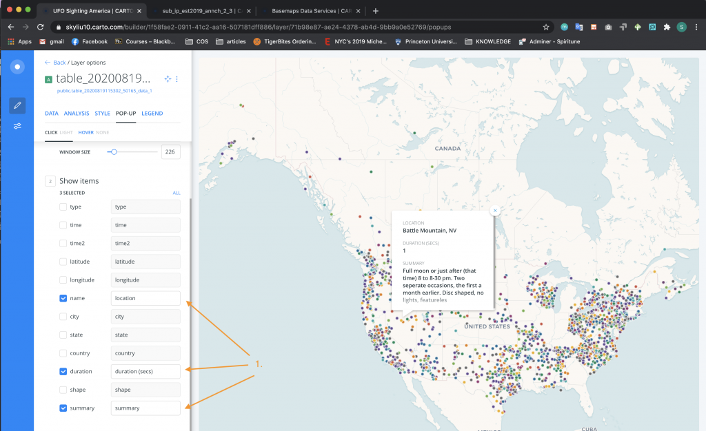
- In Show Items (Section 2), select the name, duration, and summary options you want to appear in the Pop-ups. These, of course, taken from columns that describe the sightings listed in each row of the original data set. Rename them in a readable way and according to how you want them to appear to your users in the Pop-up.
- Drag the variables up and down to the order you would like them to be displayed in the pop-up tool-tip.
Now, let’s add a legend:
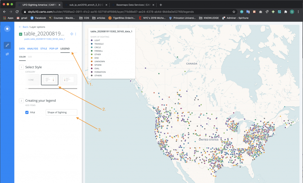
-
- Click on the Legend tab.
- In Select Style (Section 1), choose Category.
- In Creating Your Legend (Section 2), rename the title of the legend accordingly.
Change the name of the table and the background map (basemap):
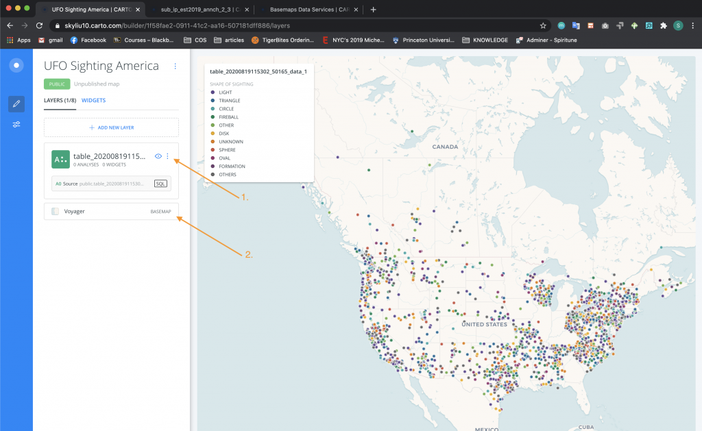
-
- Go back to the home page of the project and using the side option menu, rename the table in familiar terms and according to how you want this data to appear in the legend.
- Click on the basemap option.
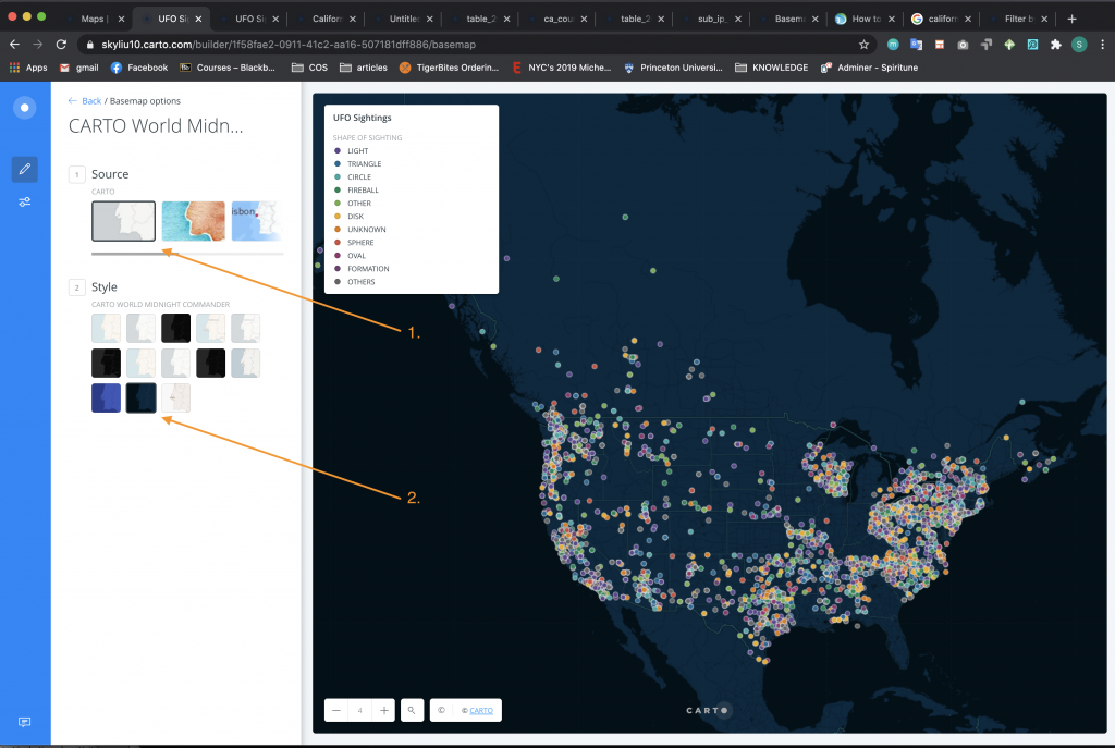
-
- In Source (Section 1), select the Carto source.
- In Style (Section 2), select the Carto World Midnight Commander style.
To review your map before publishing:
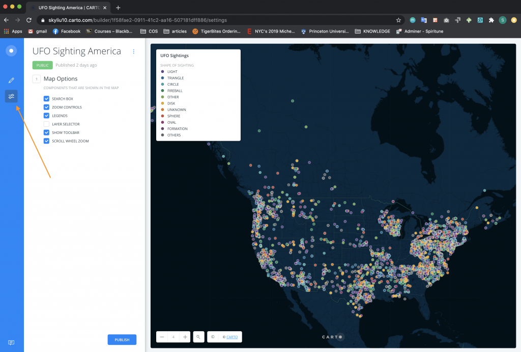
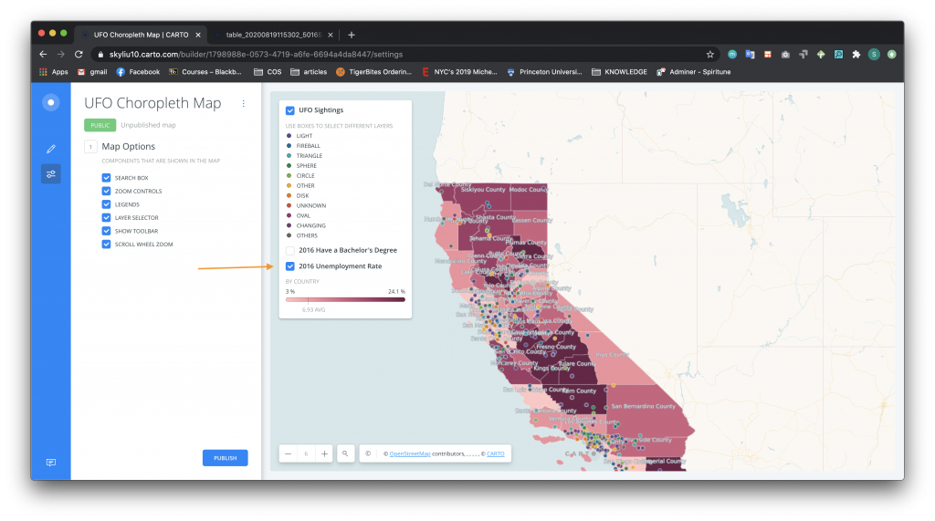
- Click on the Map Options icon on the left side bar. Review and select the components you want to include in the map. In this case, all the options are selected except the Layer Selection.
To publish your map:
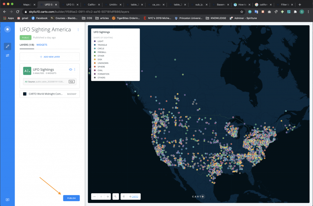
-
- Go back to the home page of the project (see above) and click the Publish button on the bottom of the screen. When redirected to the publish screen, click the blue Publish button under the map title. Links to the published map should appear. From there, you can copy the URL or the iframe embed code. Remember: after you make any changes to your map or data, you will need to Update the map from this page so that the changes propagate to all the sites places where your map appears.
Congratulations, you have created your first Carto map with Tool-tips!
UFO Sightings with Choropleth Maps
In this example, you will expand upon of the point data analysis that you completed in the example above and juxtapose that data with other sources of data. This is a way of visually contextualizing as well as analyzing the UFO data. We will use the other data sets to create Choropleth maps that use shading, color, or patterns in proportion to a statistical variable in a certain geographic area, such as the average for the area. In building this map, we add each data set as a layer of data. Using the legend users will be able to select or deselect that data, or layer.
In this example, you will learn how to create choropleth maps by aggregating datasets you want to examine with existing geospatial data.
- First upload the the ca-counties-boundaries.zip. This file includes the geospatial data on the county shapes in California. In addition, upload usa-2016-presidential-election-by-county.csv and 2016Local_Area_Unemployment_Statistics_LAUS_Annual_Average.xlsx.
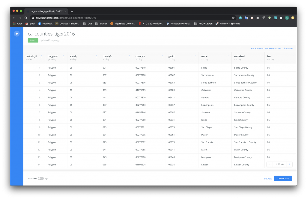
- Now following the steps from the first section, create a new project using the ca-countries-boundaries.zip data, which will show up as a table named “ca_counties_tiger2016.”After creating this new project,
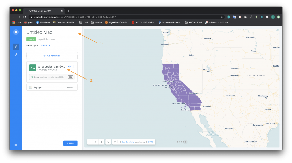
- Using the side option menu, rename the map.
- Click on the dataset table to examine the information.
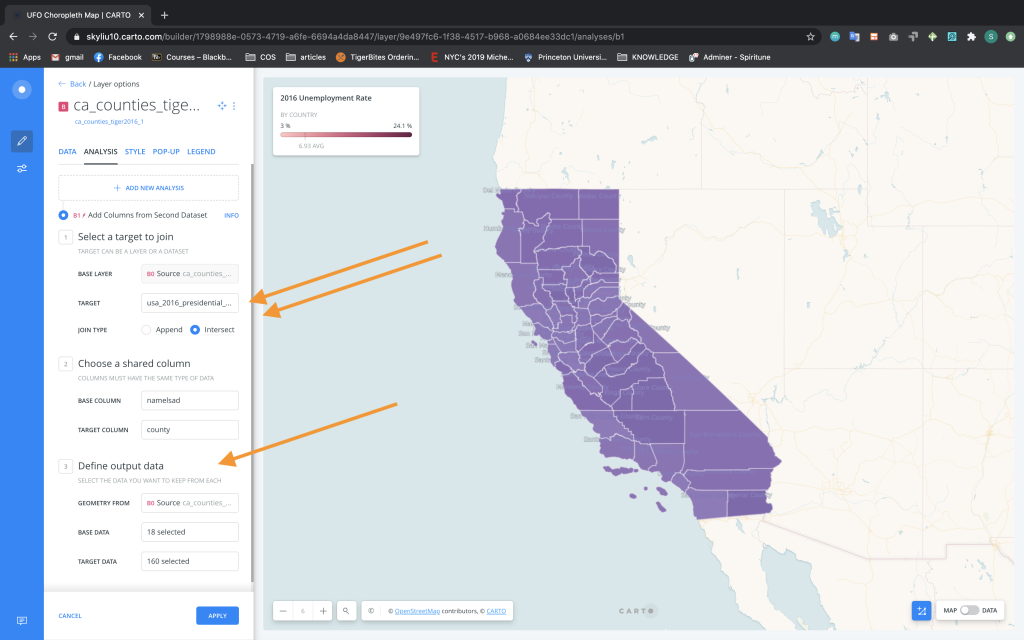
Now that the counties are plotted on the map, we need to match the counties with meaningful data analysis. In this first layer we are going to look at unemployment rates by county. To add analysis as a layer to the map:
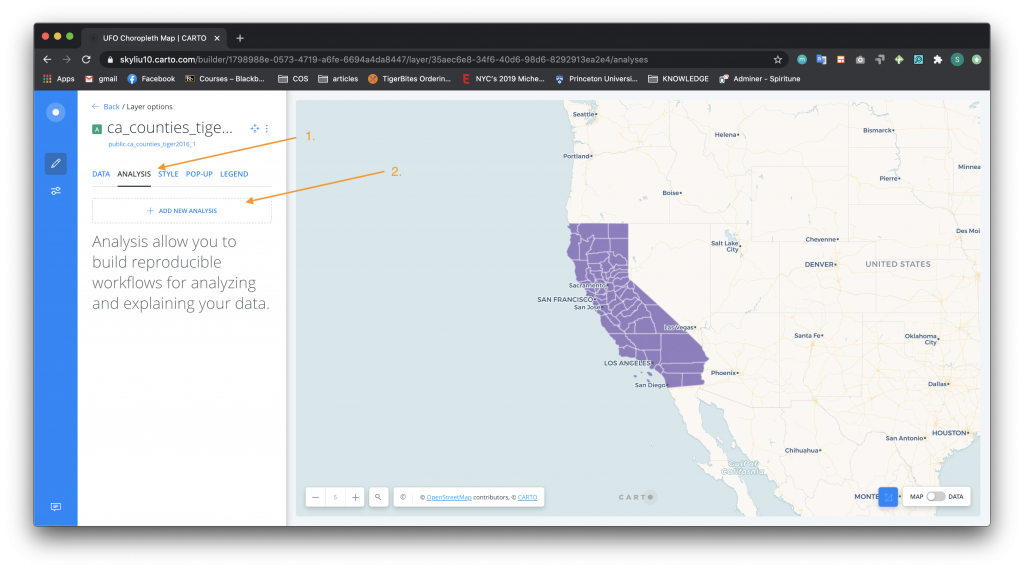
-
- Click on the Analysis tab.
- Click on the Add New Analysis section and choose the Add New Columns from 2nd Dataset option.
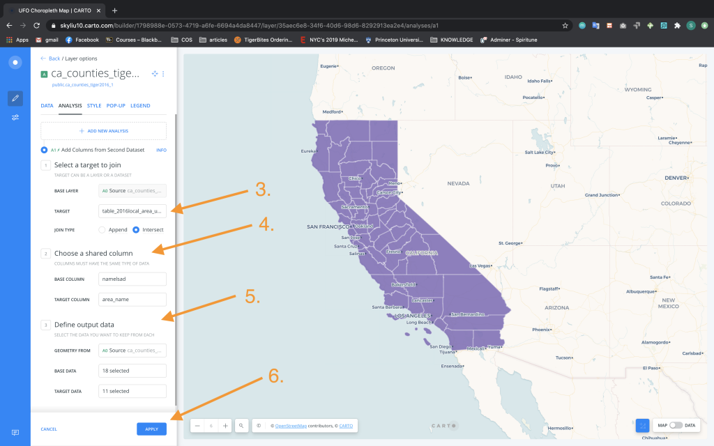
3. Select the target layer to be the data you uploaded for 2016 unemployment, in this case the table is named “table_2016_local_area_unemployment_statistics_laus_annual_averag”.
4. For the shared columns, match the datasets by county names, which are stored in “namelsad” and “area_name” in the two datasets.
5. For defining output data, in both the Base Data and Target Data boxes, select the “all” option.
6. Click the Apply button.
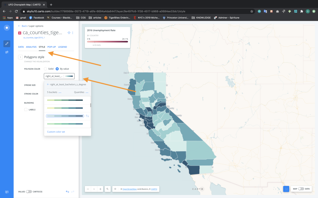
To style the map:

-
- Navigate to the Style tab.
- In Style (Section 2), change the Polygon Color to By Value and change it to “right_unemployment_rate”.
- In Style (Section 2), change the Stroke Size to 0.5.
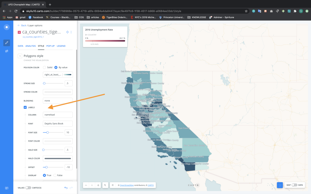
- Check the Label box. Choose the column as “namelsad” and the halo size to 0.5.
To add a legend:
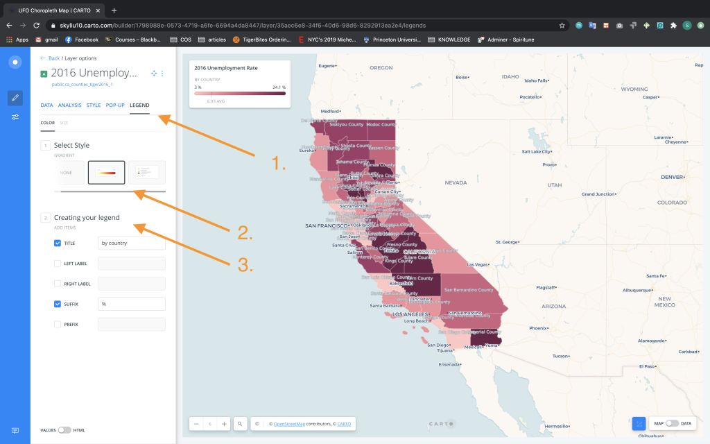
-
- Navigate to the Legend tab.
- In Select Style (Section 1), choose Gradient.
- In Creating Your Legend (Section 2), rename the title of the legend to “By County” (**note in the screenshot there is a misspelling) and add a “%” to the suffix section.
To change the background map: 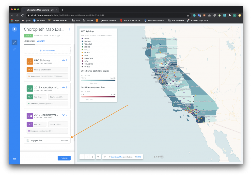
-
- On the home project page, click on the Basemap section on the bottom of the left column.
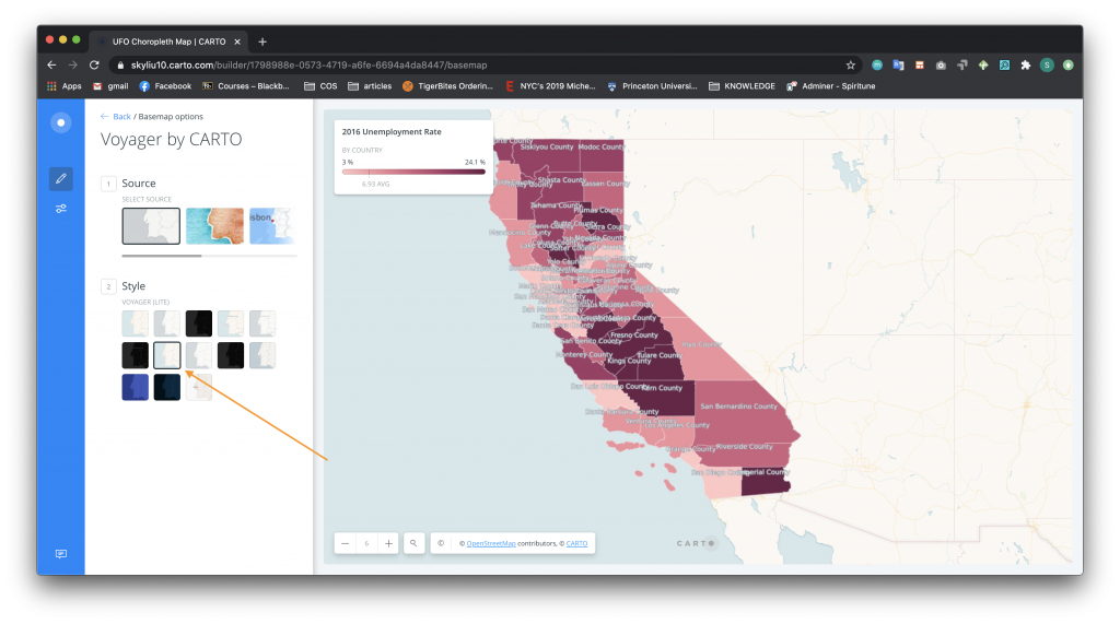
- Change the Style to “Voyager Lite”
- On the home project page, click on the Basemap section on the bottom of the left column.
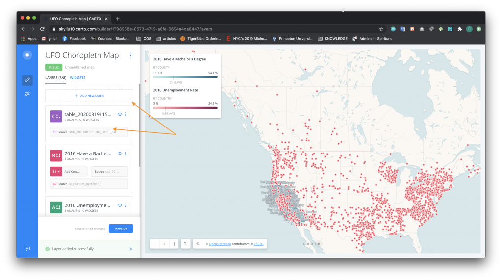
Now you’ve added the first choropleth layer – unemployment rates data. Repeat steps 2 through 5 to add another layer about the percent of the population that have at least Bachelor Degrees, but instead of creating a new project from the “ca_counties_tiger2016” table, add a new layer to the existing map. This can be done from the project home page where you will see an Add New Layer section. Screenshots of the process are below.
Add analysis:
Change the Style. Note how you can select different color gradients according to how you want to represent the aggregated data. Because these values exist along a common continuum, use a sequential color scheme.
Edit how you would like the labels for the data to appear.
Add a legend for the new data layer: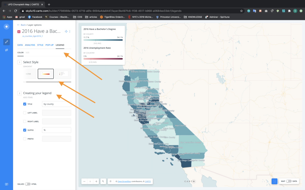
Now, let’s add in the UFO Sightings points data. In the same way we added the new choropleth layer, go back to the project home page and click on Add New Layer. Add the UFO dataset.
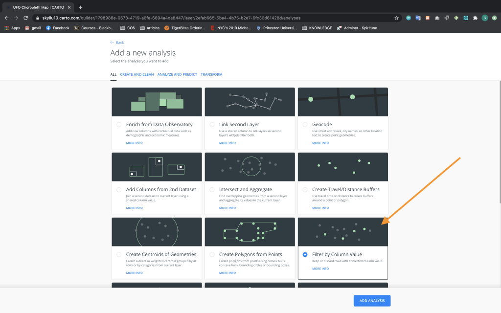
Just as with the other two datasets, let’s add analysis to the table. However, this time let’s select the Filter by Column Value option. This will allow us to filter the data so that only the points in California are displayed.
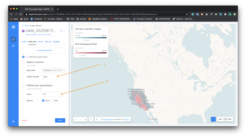
-
- In section 1, set the Target Column to “state”.
- In section 2, set the value to “CA”.
- As in our first example, style the points on the graph:
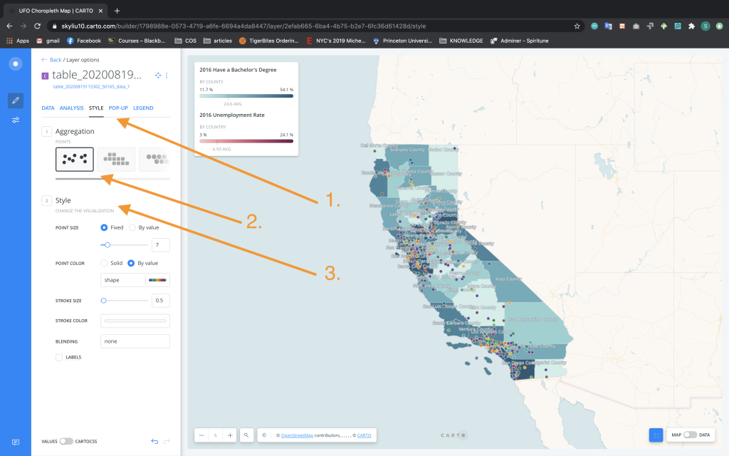
- Click on the Style tab.
- In Aggregation (Section 1), choose Points.
- In Style (Section 2), change the Point Color to By Value and to the “Shape” column. Choose a color set. Change the Stroke Size to 0.5.
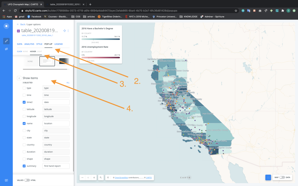
To create pop-up tool-tips:
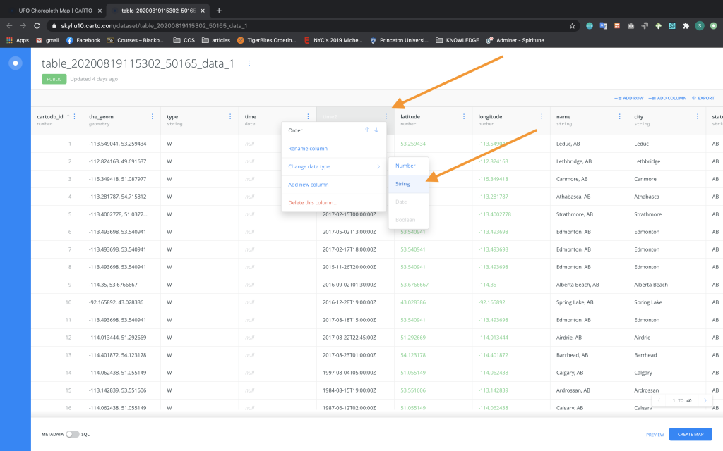
We will first need to change the data type of the date column so that it can be displayed as a string (i.e. text) in our pop-up. Click on the name of the table – it is highlighted in blue and right under the table name. Once the table is opened, select the side option menu by the column labeled “time 2” and change the data type to String.
Add the pop-ups:
-
- Click on the Pop-Up tab.
- Change the selection to Hover and Light.
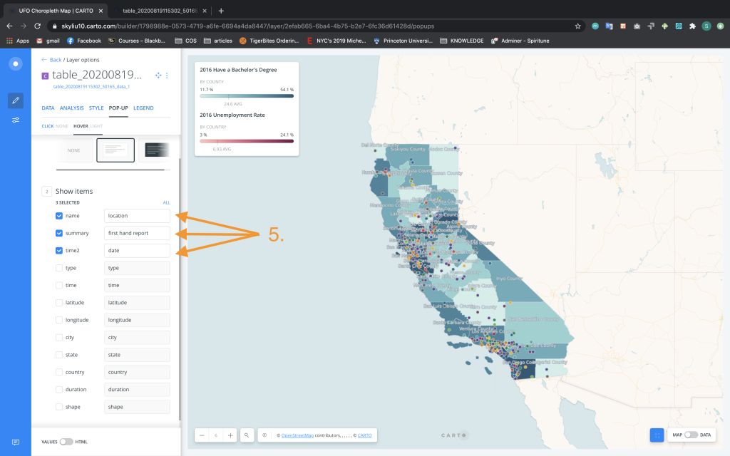
- Select the following items to show – time2, name, and summary. Rename them accordingly.
Edit the Pop-up order:
-
- Drag the variables up and down to the order you would like them to be displayed in the pop-up tool-tip.
To add a legend for the UFO Sightings layer:
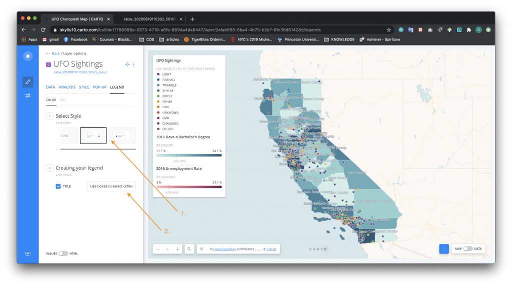
-
- Navigate to the Legend tab and select the Category style.
- Add a title. In this case the title is “Use boxes to select different layers”, which is an instruction to the user of the visualization on how to select different layers (this will make more sense after step 13).
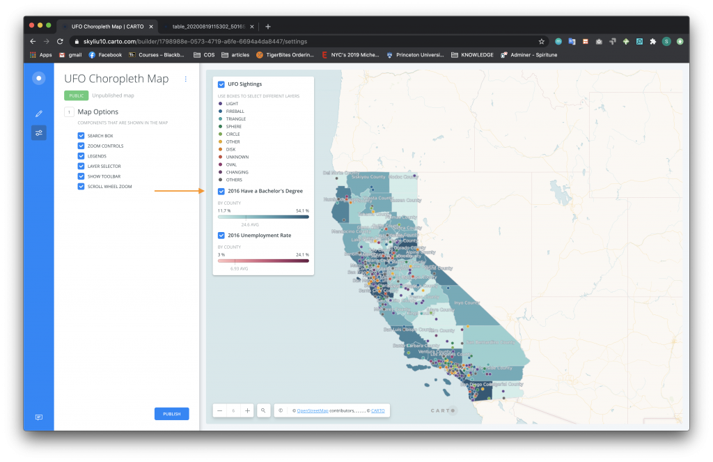
As you have probably noticed, the Bachelor Degree layer is right now covering the Unemployment Rate layer. To allow users to access different data layers, we will add a layer selector. To add a layer selector:
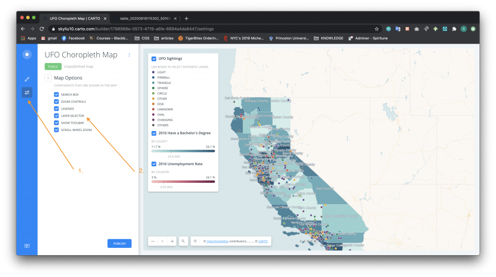
-
- Press the Map Options icon on the blue left sidebar.
- Click the Layer Selector box. Now you can use the checkboxes in the legend to view different data layers. Note that by default the data about Bachelor Degrees will be on top since it was the last layer added. See if you can also reorder these layers as you can with the Pop-up data!
- To publish your map, click on the blue Publish button on the bottom of the screen. Carto will publish whatever positioning the map is currently in, so make sure that your map is zoomed in/out appropriately before you are about to publish.When redirected to the publish screen, click the blue Publish button under the map title. The web links and iframe code to the published map should appear.
Congratulations on creating a Carto map with different choropleth layers and points! Highlights from this tutorial include using different analysis functions, creating dynamic legends, and adding different layers. Here is a live version of this map: