Mapping Data in Social Explorer
Social Explorer is a platform that allows users to visualize and interact with data and gives users the power to create maps, charts, reports, and downloads. The site offers hundreds of already uploaded datasets about a myriad of topics such as demography, politics, economy, health, environment, crime, and more. As a result, Social Explorer can be a good starting place to learn how to interact with data and to explore existing categorized data. However, the site does have limitations because it works only on the datasets that already exist in the Social Explorer library, which might not exactly match up to what you want to visualize, and there is less freedom when it comes to style choices of pop-ups, legends, etc. In addition, Social Explorer has a limited scope as it only focuses on the United States, with the exception of Canadian and United Kingdom Census data and two different tables on European Statistics (Eurostat) and World Development Indicators (World Bank).
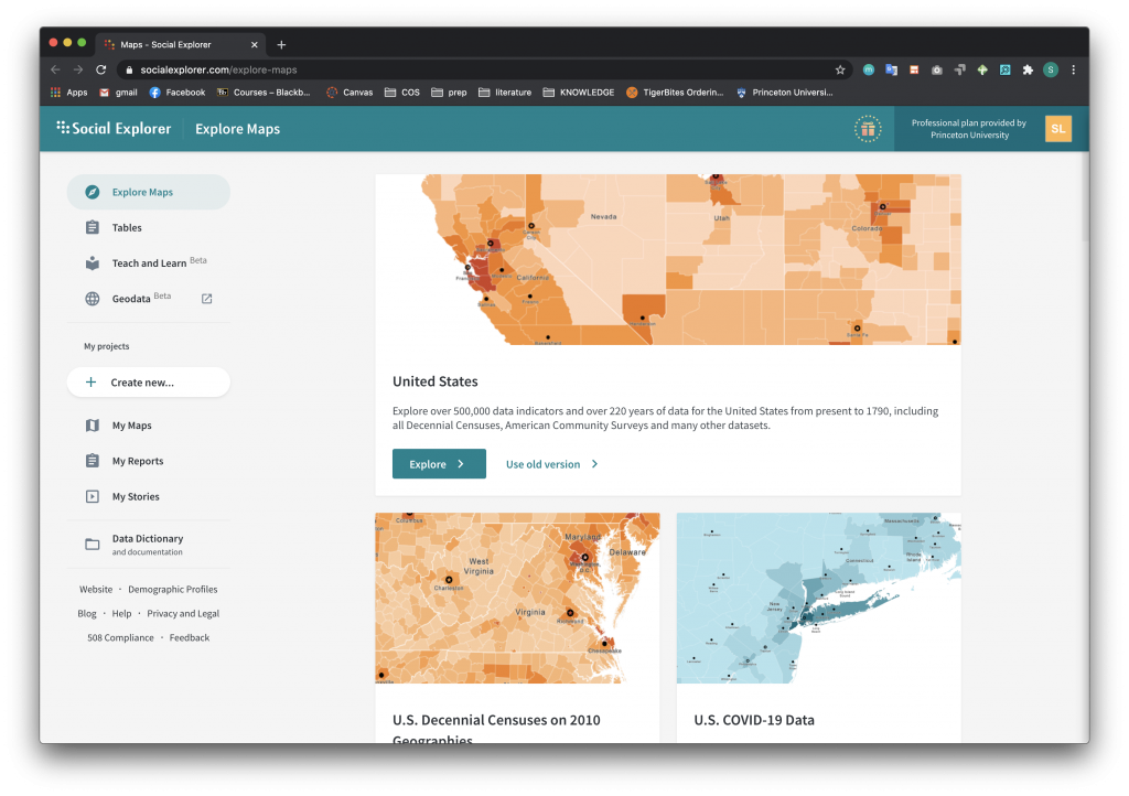
With a Princeton University email, you can log in and access the Professional Plan, which allows you to build and save map reports and stories. An example of the Social Explorer page is below. You can see that once you log in with your university credentials, you will be able to access the Social Explorer data catalog that consists of mappable data. In the image you can see there is data from the United States census over the last 40 years and COVID-19 data from the New York Times and The Covid Tracking Project.
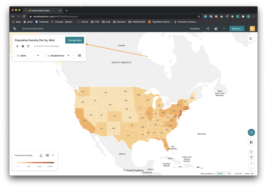
When you click on a dataset, you will be redirected to the corresponding map. From here, you can click the “Change Data” button to access different categories and data that can be applied to the map.
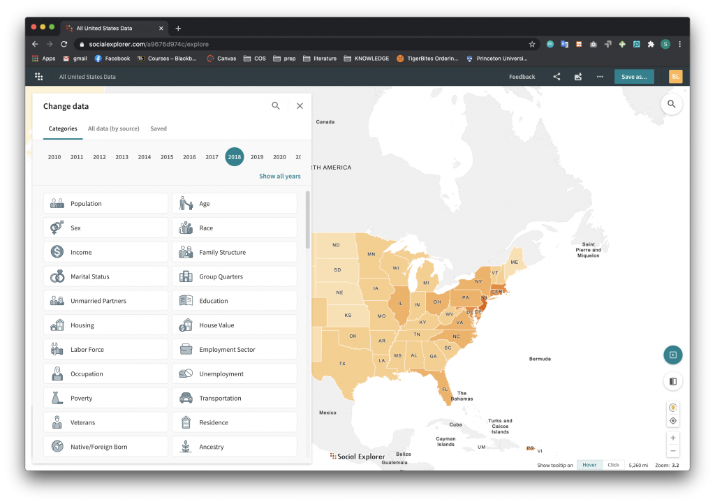
 The image below highlights some of the example categories that Social Explorer has data on. You can choose a category and then explore more detailed topics related to the category. For example, under “Education”, you can segment the map by educational attainment, school enrollment, school dropout rate, etc.
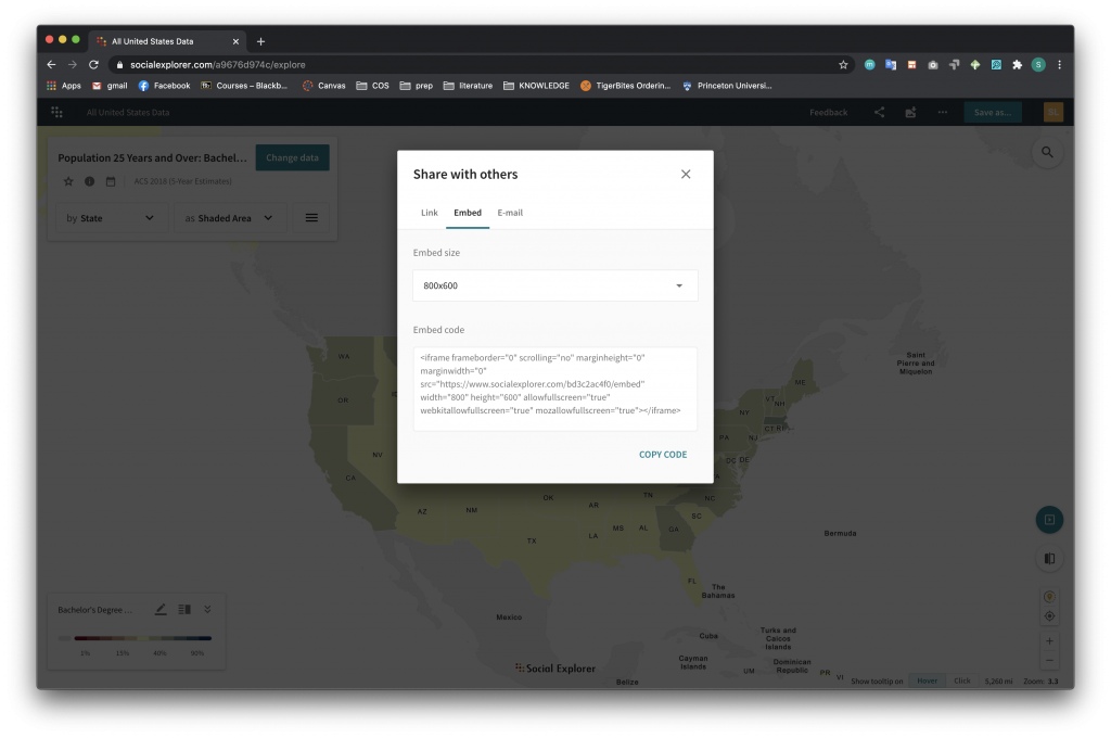
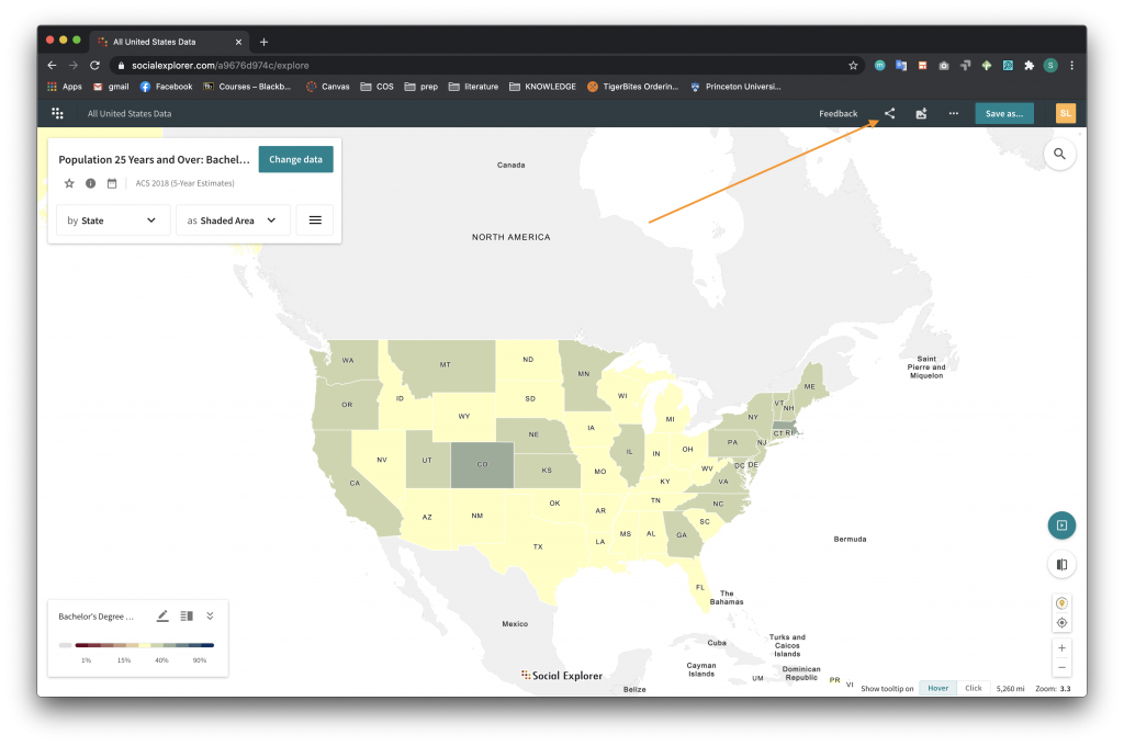
To share a map, you can navigate to the Share icon located in the right corner of the top navigation bar. In the screenshot below, the user wants to share a map created from data on Bachelor’s Degree attainment by state.
 After clicking the Share icon, you have the option of either sharing the map through a link, embedded code, or email. The picture below shows the Embed option, which generates iframe code that can be used to embed the map in a web page. To learn more about embedding iframe code in web pages, see the Mapping Your Data with Carto tutorial page.