- Open Google maps with a web browser at maps.google.com.
- Use the Search field to find your selected location of interest.
- Zoom in, move the map, and then click on the specific location you identify as your most accurate data point.
- Generate latitude and longitude information, using one of these methods:
a. Click on a select location, to open a small box with location details, or
b. Control/right-click on a spot to open a menu, select “What’s here?”, or
c. Click on a red location marker, select “What’s here?” if needed. - Click on the latitude and longitude data that appears in decimal degrees in the location information box at the bottom. These latitude and longitude details will appear in the Google Search field.
- Highlight and Copy both the latitude and longitude data together from the Search field.
Generating Geocoded Data Sets and Maps from Street Addresses
If you have a set of street addresses, finding geo-location data with these methods could be time consuming, if not tedious. GPS Visualizer and Gecodio (free for 2,500 look ups per day) are free tools that can generate tabular data as well as maps from GIS coordinates, addresses, travel routes, and a number of digital sources. In addition, the Social Explorer platform features a new geo-coder within the platform that transforms addresses into geographic coordinates.
Generating data while on location with your iPhone
- You can use your iPhone to collect geographic locations during your field research at your fieldsites where there is a GPS signal. Open the Compass app and your current geo-coordinates will appear on the bottom (your elevation appears beneath). Tap and hold on the latitude and longitude line, and select copy.
- From there you can paste the location data into a notebook, from which you can later copy and paste each location as an entry into an Excel or Sheets document. As you copy the data, you can remove the N,S,W,E initials from each entry.
- There are a number of Apps in the App Store for iPhone that collect GPS and geo-location data.
Storing your data in Excel
- Create a new workbook in Excel. Name the workbook and save it on your local drive. Title the first three columns, “Name,” “Latitude” and “Longitude.”
- Paste the copied latitude and longitude data into the latitude column.
- Separate the latitude and longitude values into their respective columns by cutting and pasting the longitude (the second decimal number) to the longitude column. Be sure to remove the leftover comma in the latitude column.
- You are ready to import the geographic data into software, such as ArcGIS, to create layered maps for data analysis and visualization. Be sure to save the workbook (sheet) on your own computer, or download it when you are ready to import to data analysis/visualization software.
Storing your data in Sheets
- Create or Open a new on-line workbook in Google Sheets. Name the workbook and Title the first three columns as “Name,” “Latitude” and “Longitude.”
- Paste the copied latitude and longitude data into the Latitude column.
- Separate the latitude and longitude values into their respective columns by clicking on the small pop-up paste menu that appears, and selecting “Split text to columns….” Leave the Separator as “Comma,” by clicking outside the menu. [Note: This step is done manually in Excel; see above.]
- You are ready to import the geographic data into software, such as Carto, Datawrapper, or ArcGIS, to create maps for data analysis and visualization. To do this, first download the sheet from the google on-line platform. Export it as a new Excel, CSV or TSV file on your local drive.
Exporting your data
Export and archive your Sheets and Excel worksheets in either the .TSV (tab separated values) or .CSV (comma separated values) format. Both Sheets and Excel are proprietary software that contain invisible formatting data. Further, Google Sheets can can only download your data in Excel, PDF, OpenDocument, .html (e.g. for web pages), .CSV and .TSV files. So in order to ensure that the data from your worksheets can be imported, visualized using the widest variety of other software tools, it is important to preserve your data in one of these plain formats. Even if some visualization software tools are currently able to read Excel files (e.g. Tableau), saving your work in plain .TSV or .CSV formats will ensure that you will be able to access your data from a wider variety of existing visualization tools and future generations of software. (See more tips on collecting structured data here.)
Choosing your map’s color scheme based on the data
A sequential color scheme (or palette) plots a continuum of shades of a single color to represent values that use the same units of measure, from lesser to greater. Examples are population densities, dollars, or average ages. Note they can be aggregate numbers or specific values. A diverse color scheme use a palette to highlight how your data can represent diverse categories without a common underlying measure or continuum, such as social identities, or pizza toppings; data points only belong to one category. Any combinations would require their own discrete categories defined as such.
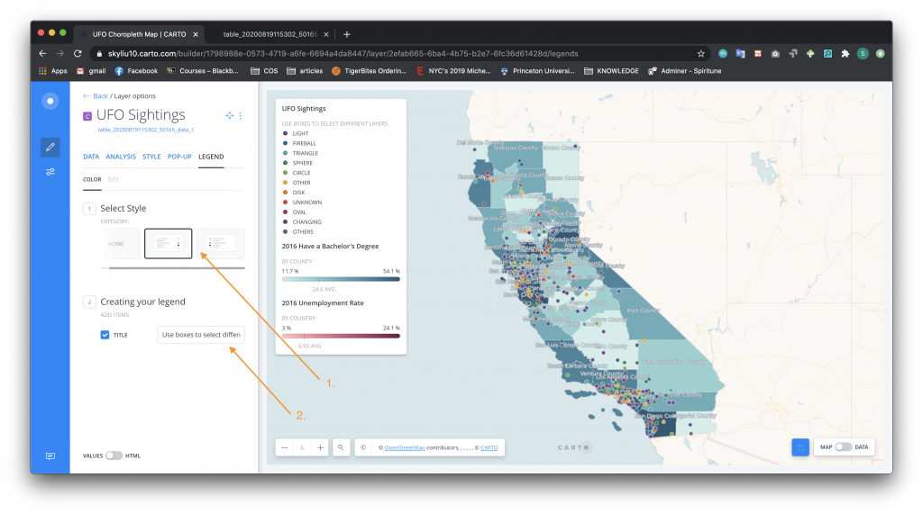
Look at the example above from our Carto tutorial on UFO sightings, where both color schemes appear. Each scheme represents a different data set. The diverse colors represent the data on different types of UFOs that were reported. Each UFO only has one discrete color. Among the shaded counties, however, data on the number of people with Bachelor’s degrees is plotted. Here, the sequential lighter-to-darker shades of a common color – blue – represent a linear measurable continuum of people with a BA ranging from 11.7% to 54.1%.
A third color scheme is a divergent palette. In this case, the data is represented as starting from a single point and moves away from that point in two opposite, positive and negative directions. For instance, colors are sequentially shaded in one color toward the positive side and sequentially shaded in a contrasting color toward the opposite negative side. Note that these are sometimes used instead of a sequential palette. Yet this can be misleading if there is no meaning central point in the data. For example, a divergent scheme applied to the Bachelor’s degree data in this has no necessary central point in the context of stories about UFOs. That depiction would add an unnecessary degree of visual complexity, and possibly confuse readings. If you did want to map how each county is related to the California average in another context, however, you would make the 24% the center of a divergent palette of two contrasting colors. But here, that data seems to get in the way of a narrative about UFO sightings.