Data Visualizaton with Tableau
Creating Powerful Data Visualizations
Tableau is a software analytics program that gives users the power to build a variety of data visualizations. Tableau is most commonly known as an enterprise tool for data analytics, but the program’s expansive set of tools and functions make it equally as powerful as a visualization tool for more creative projects. The popularity of Tableau inside and outside the workplace has given rise to a strong Tableau community so if you run into any problems, chances are that there is a Tableau Community Forum post that addresses the issue. The program can be accessed either by downloading the software to the desktop or through the Tableau Public site that allows users to build visualizations online. Using Tableau, users can create dashboards and workbooks from different types of data sources, from excel sheets and csv files to Tableau Prep workflows.
Creating a Tableau Account
As a student, you can get a 1 year Tableau license for free. Use your .edu email and follow the link here to create an account. The student Tableau license gives you access to Tableau Desktop and Tableau Prep Builder (Tableau’s platform for data cleaning, editing, and merging). Follow the instructions to download the Tableau Desktop application to your computer.
Building Tableau Dashboards
To illustrate the power of Tableau, this tutorial will walk you through how to create and publish Tableau dashboards. Tableau dashboards are composed of different worksheets, text fields, and images. As with our Carto tutorial, we will focus on UFO sightings in the United States. To follow along with the tutorial, download the datasets – Tableau_data (make sure to unzip the Tableau_data folder that will be initially downloaded). You will notice that two of these datasets are also used in the Carto tutorial.
Tableau allows users to incorporate and blend numerous datasets together so we will try to visualize both UFO Sightings in the United States and the number of UFO-related movies over the years to better understand the relationship between UFO sightings and the media’s fascination with extraterrestrial life. The first section will cover how to create your very first Tableau dashboard. The following two sections (Working with Animations and Using Preset Filters) will cover more advanced topics for those who want to explore unique Tableau functions. Below is an image that gives you a quick introduction the the Tableau interface.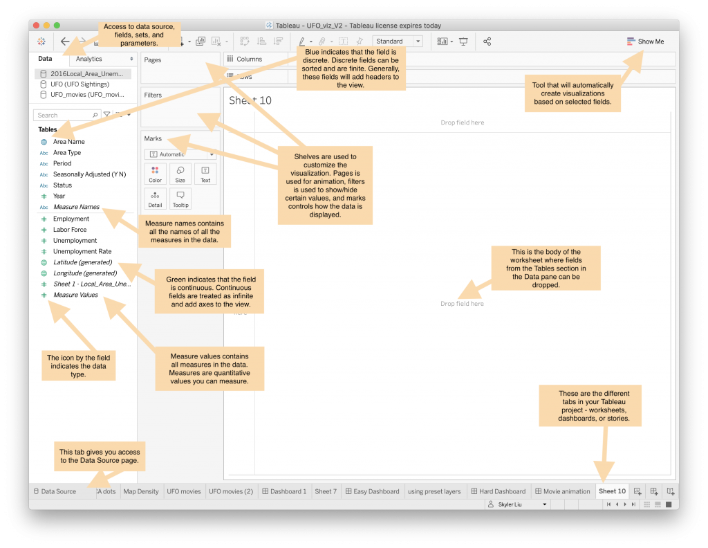
Your First Tableau Dashboard
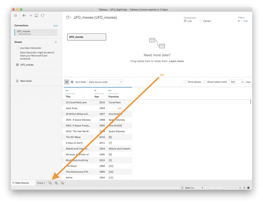
Once you have created an account and downloaded the Tableau Desktop application and the UFO related datasets (in the sections above), open up the Tableau application. On the right hand side of the application you will see options to connect “To a File” or “To a Server.” Choose the option to connect to a Microsoft Excel file. Select the UFO Sightings.xls file (from wherever you downloaded it on your computer) and open it. A new connection should be formed to this dataset.
To create your first Map worksheet:
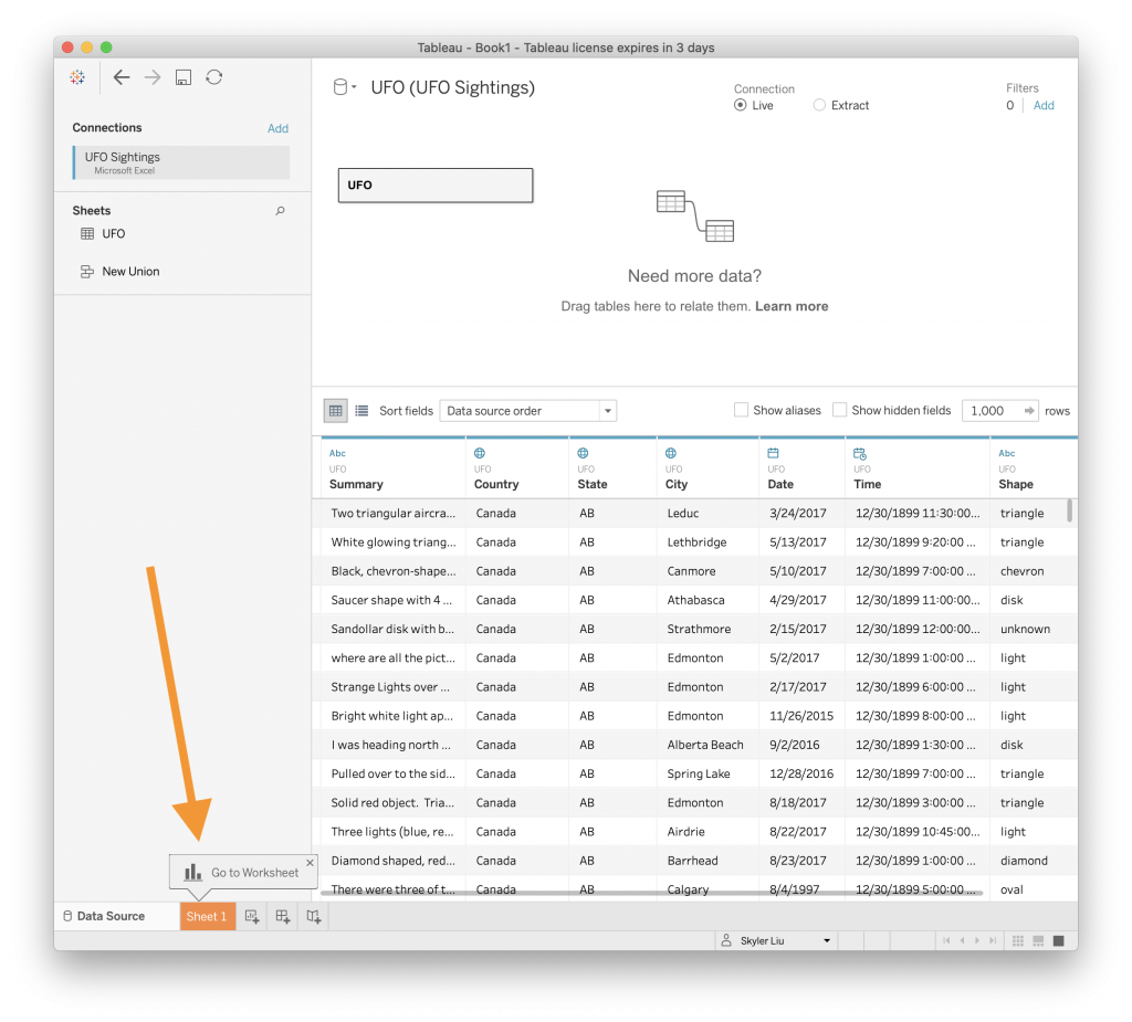
- If the data has been connected correctly, you should see a screen like the one above. Click on the “Sheet 1” worksheet in the navigation bar on the bottom of the screen.
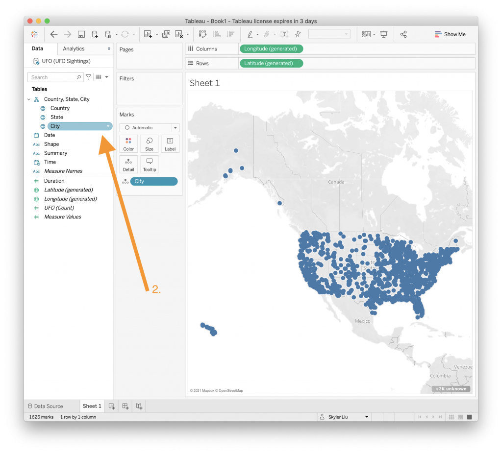
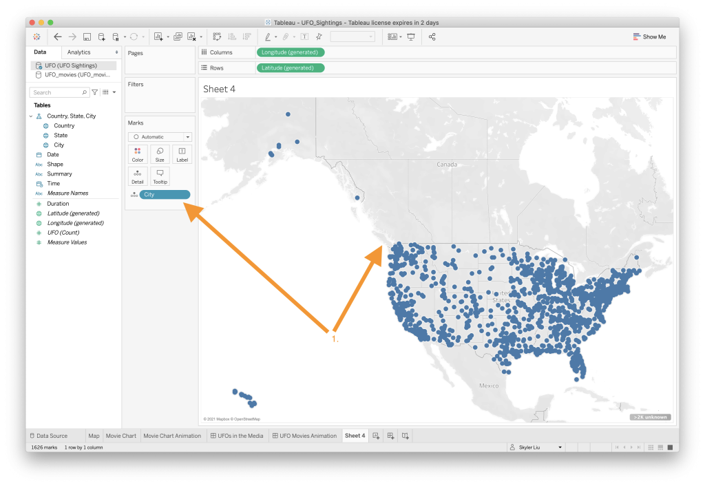
- Once on Sheet 1, Drag the “City” value directly on to the worksheet. Tableau will recognize that the data in this column corresponds to geographic locations and will automatically create a map.
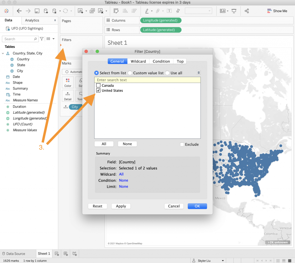
- To filter the dataset so that only United States sightings are displayed, drag the “Country” value to the “Filters” section. Select only the United States value.

- To color code the points by year, drag the “Date” value to the “Color” category in the “Marks” section.
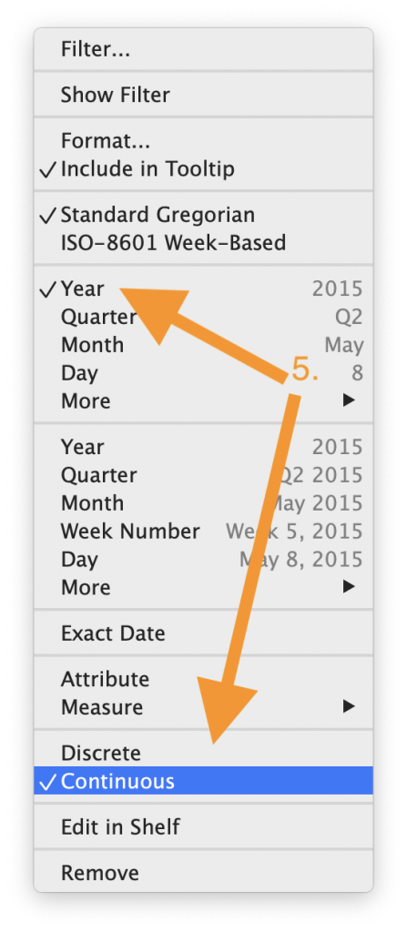
- Since there are a lot of different dates in the dataset, change the “Date” to “Year” and change the data type to “Continuous.” By changing the data type from discrete to continuous we can visualize the trends of the data over a continuous period of time and the color coding of the data will reflect this.
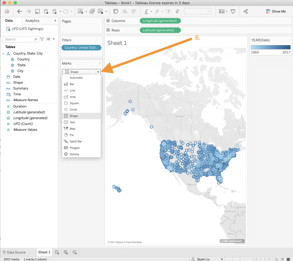
- To make it easier to see the different points on the map, we will change the shape of the type of graph to be “Shape” by using the dropdown menu in the “Marks” section.
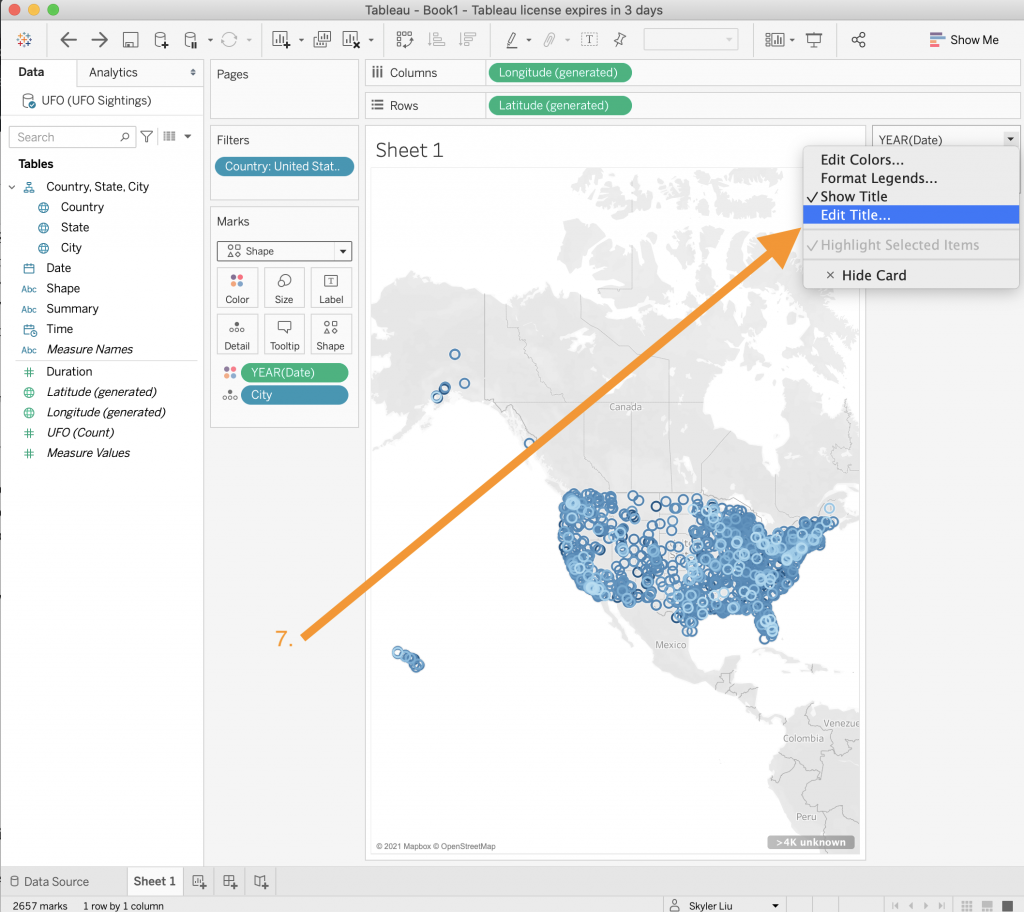
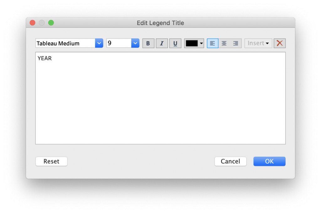
- You will notice that the title of the color legend still says “YEAR(Date)”.We can clean this up by right clicking on the legend and editing the title to just say “YEAR”.
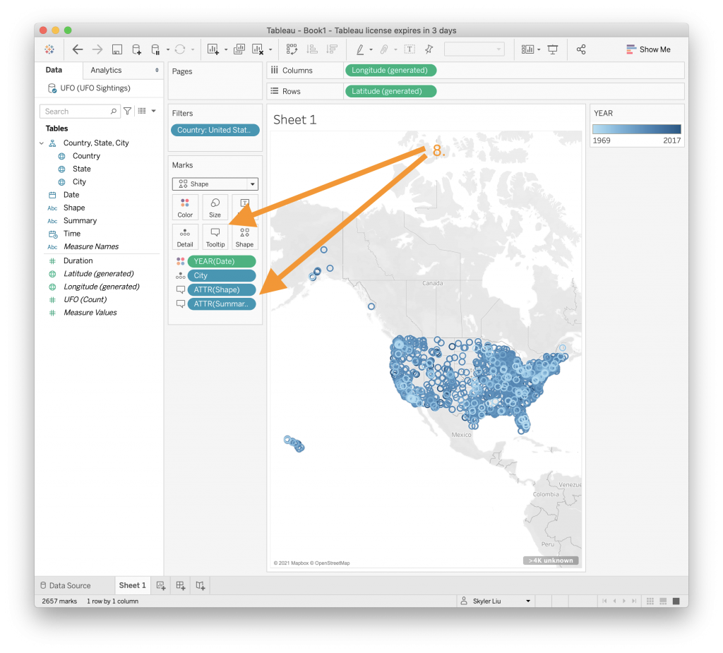
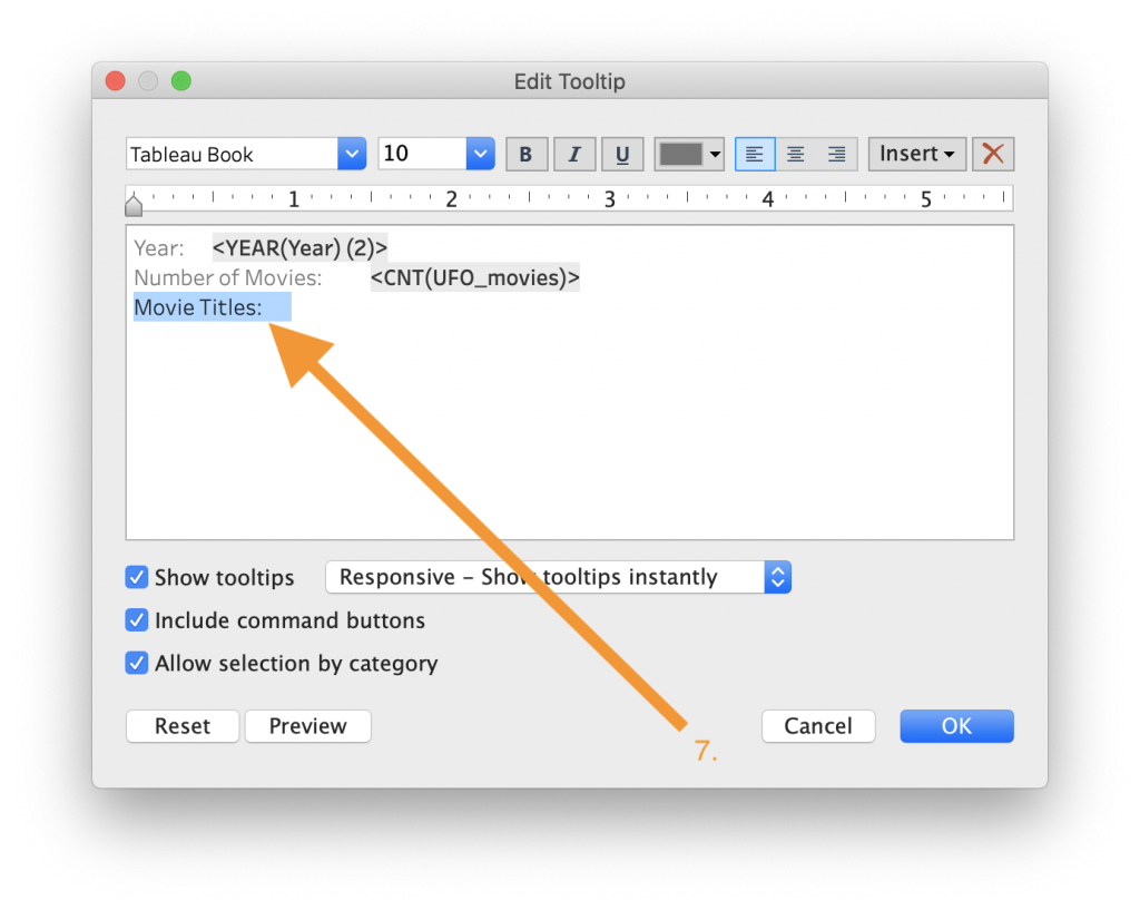
- A cool feature of Tableau is the ability to customize tooltips – the text boxes that pop up when you interact with visualizations. To customize the tooltips to show each UFO sighting’s year, city, shape, and summary, drag the “Shape” and “Summary” values from the Data list to the Tooltip category in the “Marks” section. This is shown in the video above.

- You can move customize the tooltip text however you would like. In this case, we can move around some of the fields on the tooltip.
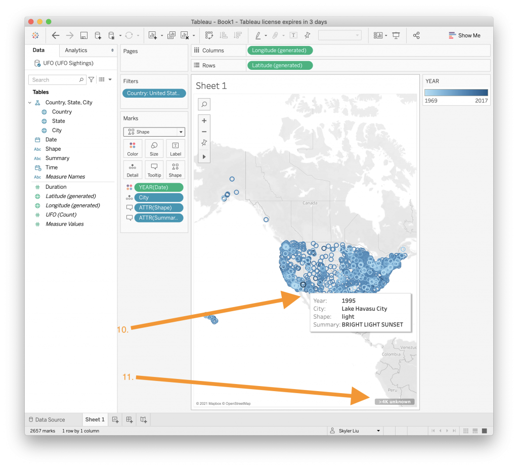
- Now when you hover above a point on the map, a tooltip should appear with more information about that sighting. Of course, you can zoom in to view more discretely the detail for smaller areas.
- You might notice that there is a message on the bottom of the screen that says “>4k unknown”. These are points that did not come with accurate locations. To hide this message, right click on the text of the message and choose the hide option.
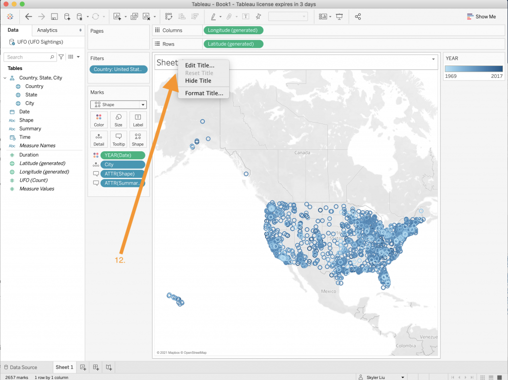
- Rename the map by right clicking on the title of the worksheet and selecting “Edit Title”. For now, change the title to “Map”.
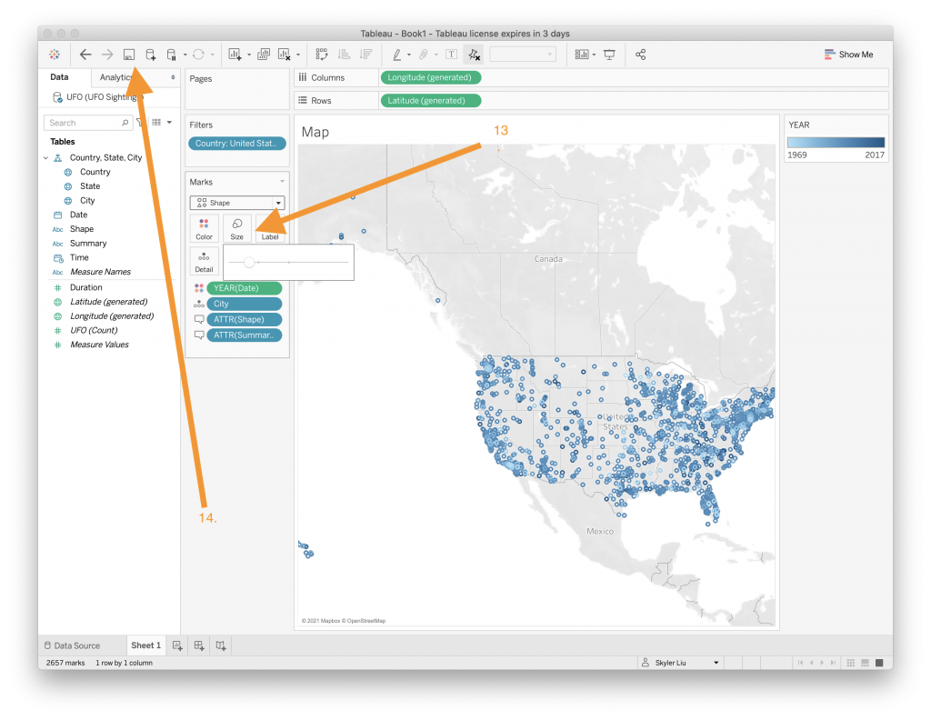
- The different UFO sighting points are overlapping quite a bit and make the map look chaotic. To change the size of the points, click on the “Size” category in the “Marks” section and drag the slider to an appropriate size level.
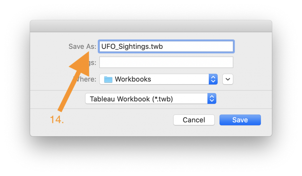
- Now that the worksheet is complete, save your work by clicking the save icon on the top navigation bar. You should be periodically saving your work throughout the entire process.

- Congratulations! You have just created your first Tableau worksheet!
To create a line chart:
Now that you’ve created a map worksheet, let’s create a line chart worksheet.
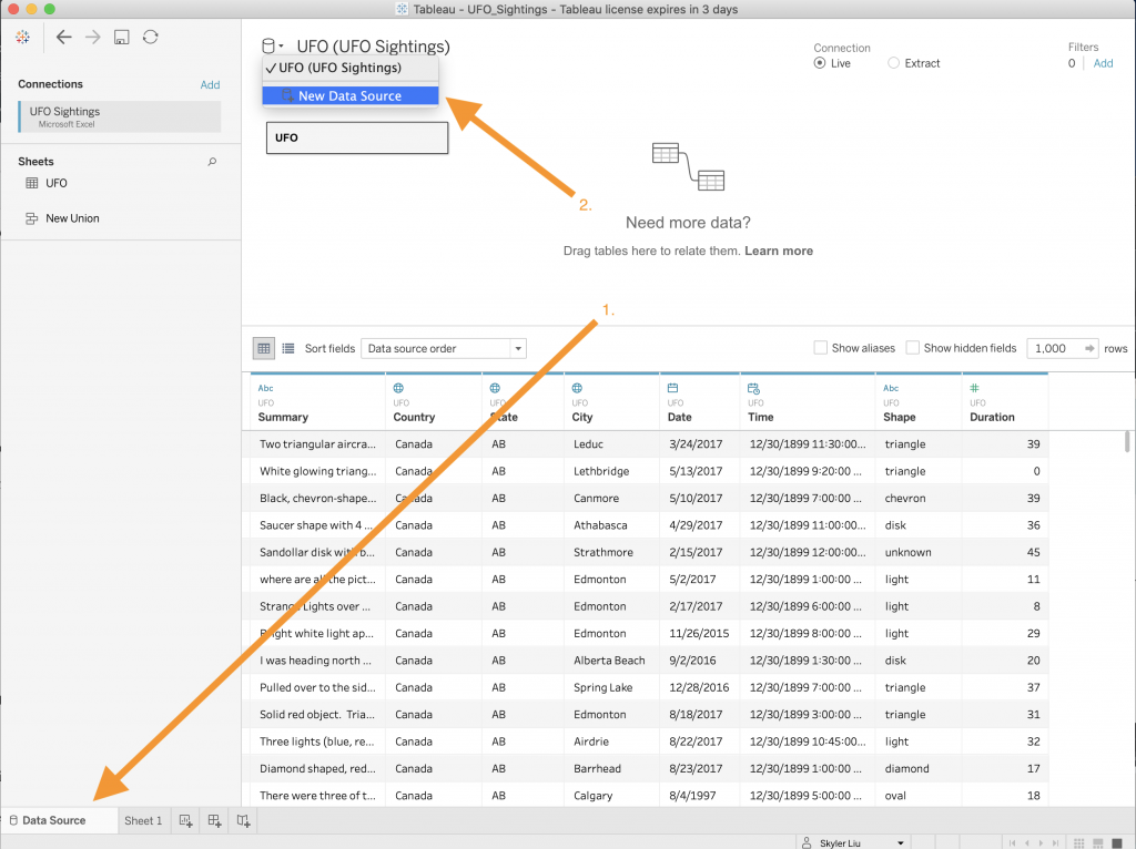
- Navigate back to the “Data Source” tab on the bottom navigation bar.
- On the top left you will see a cylinder icon representing a data source. Click on the dropdown menu and select “New Data Source.”
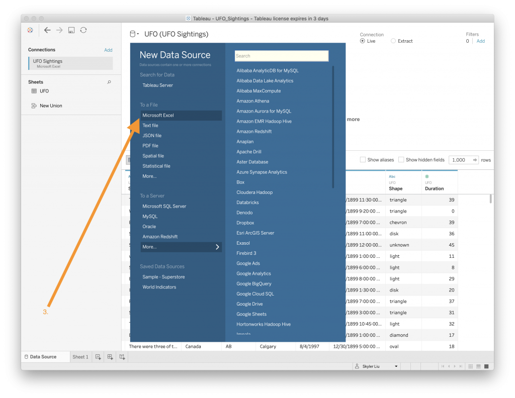
- Select the “Microsoft Excel” file choice and upload the UFO_movies.xls file. You should see that a new data connection is created.
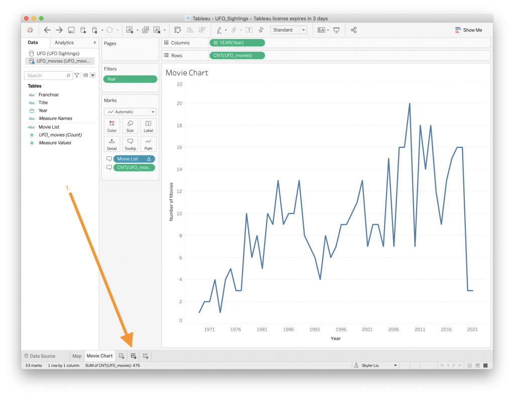
- Navigate back to the bottom navigation bar and press the icon to create a new worksheet.

- Another way to customize the title of a worksheet is to rename it by going to the bottom navigation bar and right clicking on the worksheet that you want to edit. Select the option to “Rename” the worksheet.
- To create a line chart, drag the “Year” value to the Columns section and the “UFO_movies (Count)” value to the Rows section, both of which are located on the top of the screen. The video above demonstrates how this is done.

- Now that the line chart is created, change the data type of “Year” to a Date by right clicking on the “Year” value in the “Tables” section on the left side of the screen.

- Since the UFO sightings map only contains data since 1969, we will only show data after 1969 in this chart. Drag the “Year” value to the “Filters” section and select the “Range of dates” option.
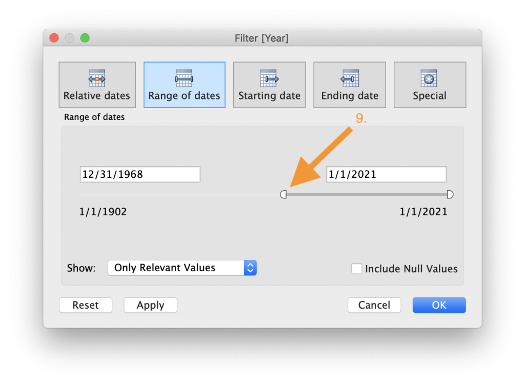
- Drag the slider so that only values after 12/31/1968 are displayed in the chart.
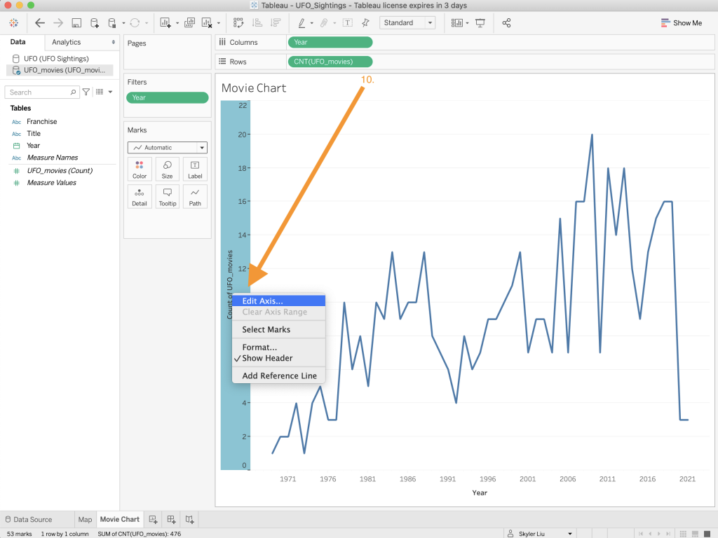
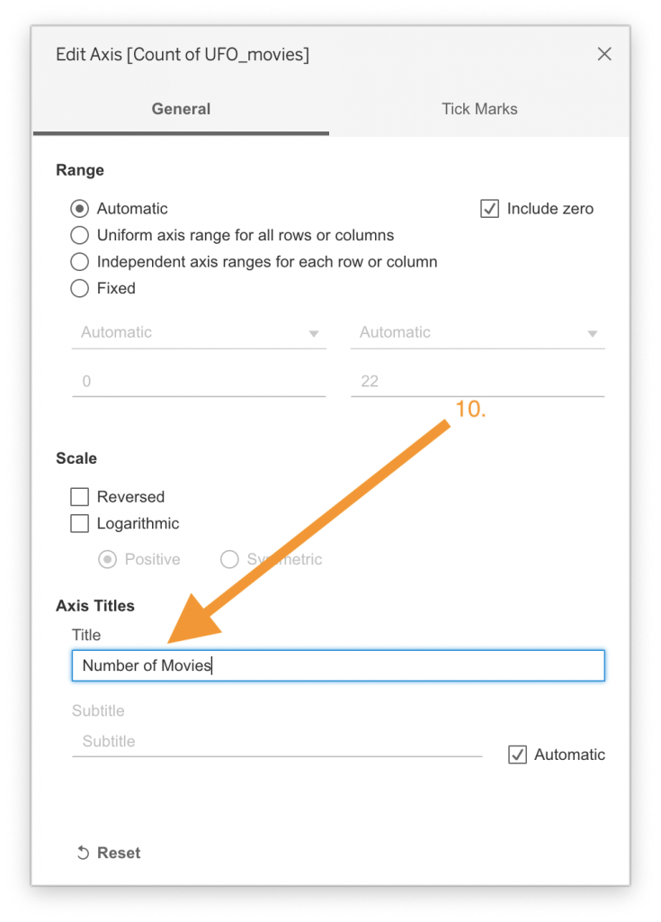
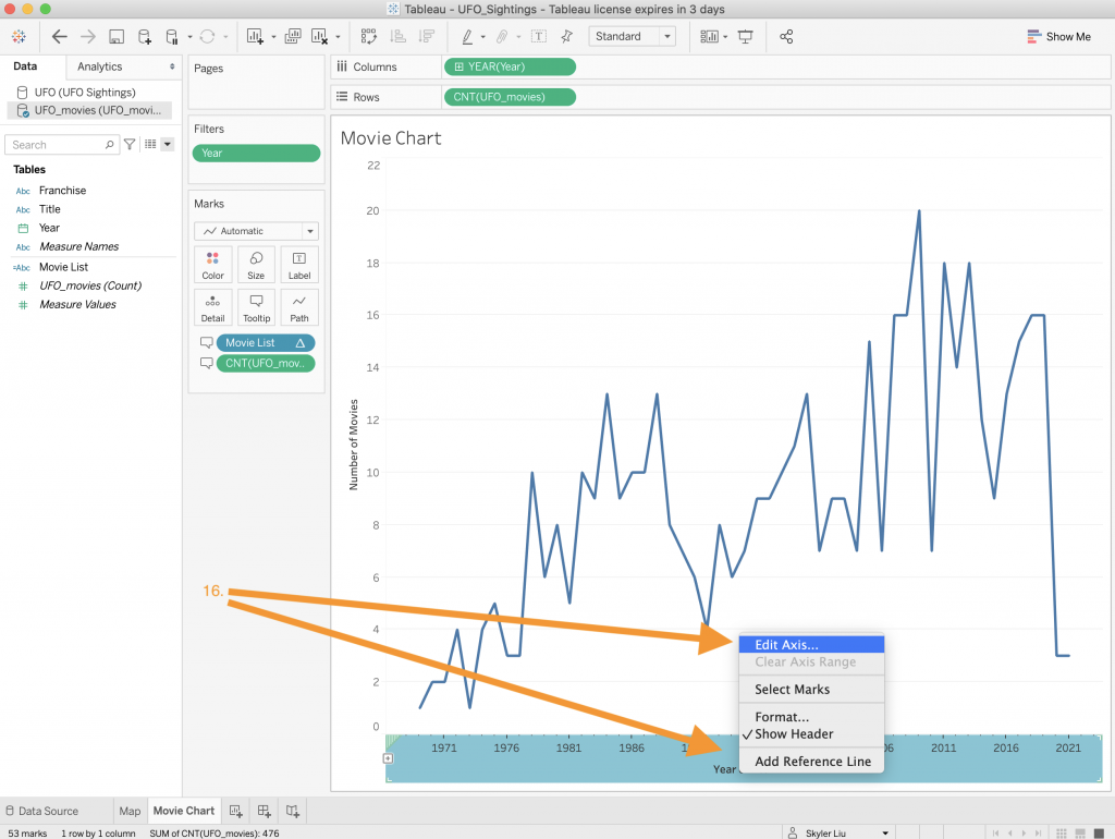
- Back on the main view, change the y-axis title by right clicking on it. Select the “Edit Axis” option and change the title to “Number of Movies.”
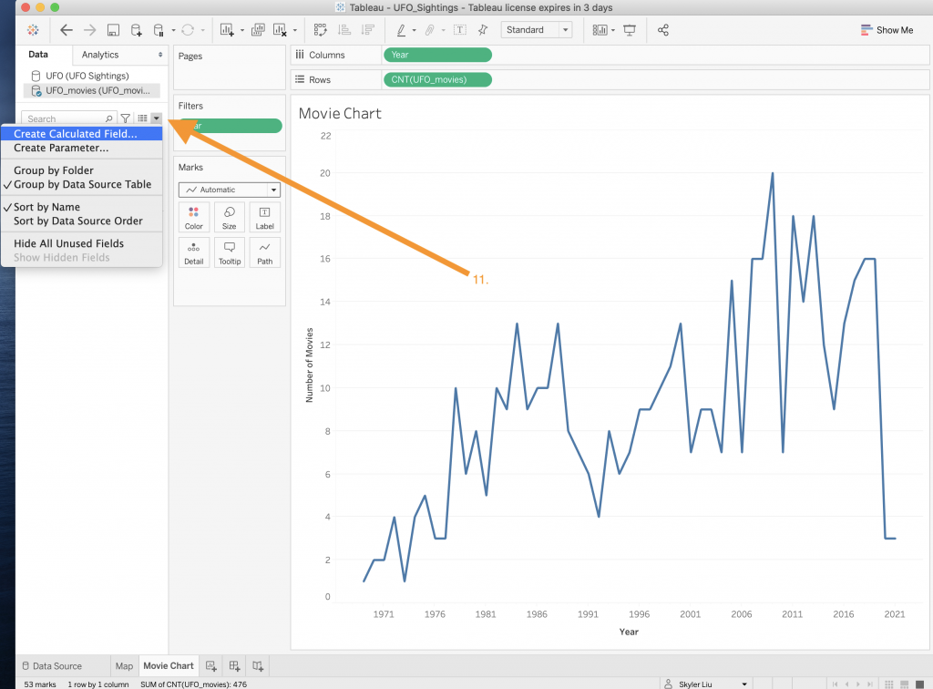
- When thinking about the tooltips for this worksheet, it would be nice to know the titles of the movies that were released in each year. In order to do this, we will need to create a calculated field – which is either customized data or a formula that we can add to the worksheet. To create a calculated field, click on the drop down menu in the menu pane on the left side of the screen.
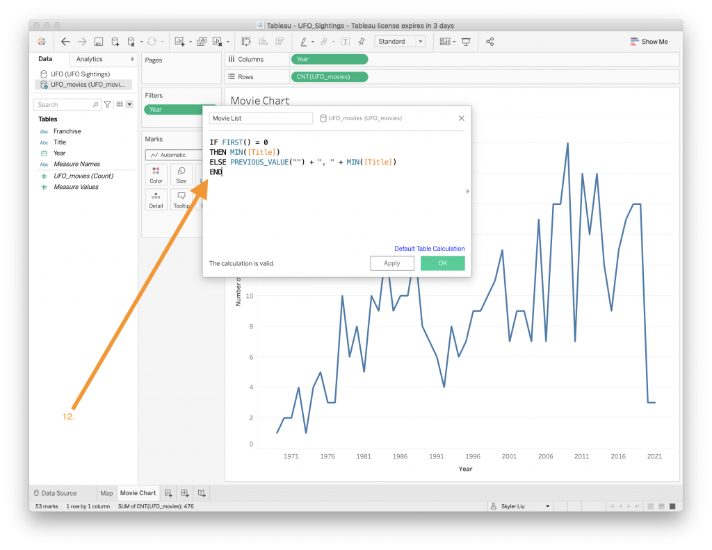
- When the calculated field box pops up, input the “code” that is shown in the photo above and title the field “Movie List.” The code loops through the values in the “Title” column and appends them to a string that contains all the movie titles associated with a year. In general, calculated fields allow you to manipulate the data to suit your visualization needs and are a helpful trick to learn how to use in Tableau.
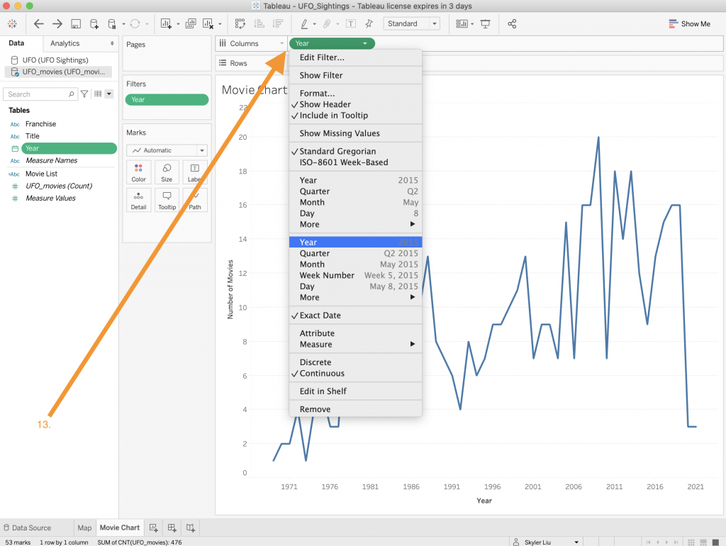
- Another step we need to take in order to display the correct tooltip is to change the “Year” column value to an actual Year data type. You can do this by right clicking on the “Year” value in the column section on the top of the screen.
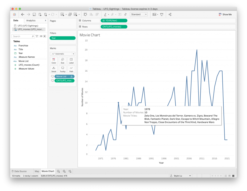
- Now that all the values are created and cleaned up, drag the “Movie List” and “UFO_movies (Count)” values to the “Tooltip” category under the “Marks” section like in the video above.
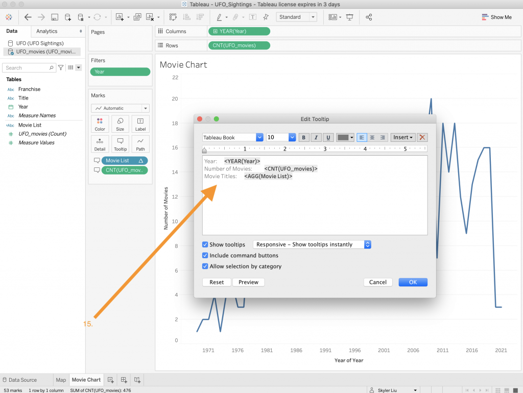
- Edit the tooltip so that the titles are clear and understandable for the user.
- Lastly just like the y-axis, rename the x-axis by right clicking on the x-axis on the bottom of the screen.
- Congrats! You have finished creating a line chart in Tableau. Make sure to save your work.
To create a dashboard:
Now that we have 2 different worksheets, it is time to put them together to create a dashboard. Tableau dashboards are composed of different worksheets, texts, and images and are used to bring together different data components.
 To start, click on the dashboard icon on the bottom navigation bar to create a new dashboard.
- Once a new dashboard has been created, drop the Map sheet and the Movie Chart sheet on to the dashboard like in the video above.
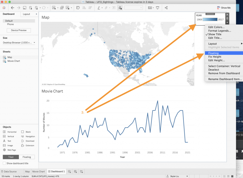
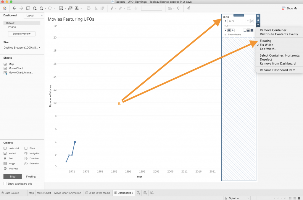
- On a dashboard, components can be either fixed in place or floating. For certain items like legends and certain text segments, floating can be a good option to better utilize space. Right click on the Year legend and select the “Floating” option.
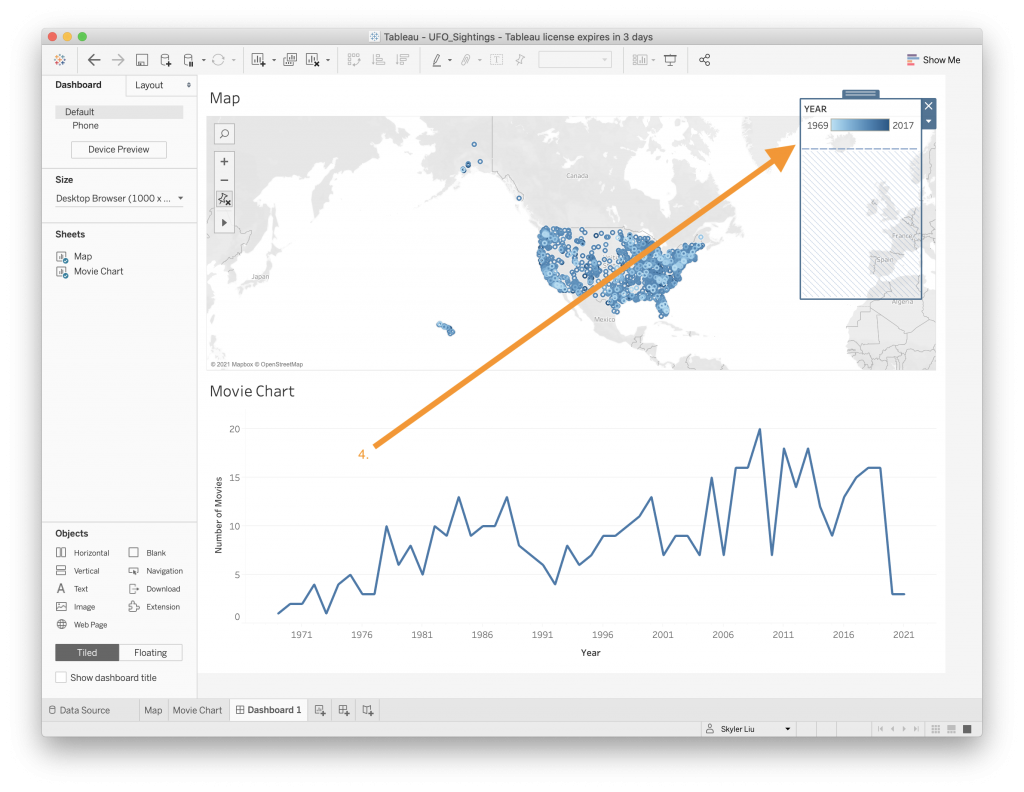
- Now that the legend is floating, you can drag it to wherever you want on the dashboard.
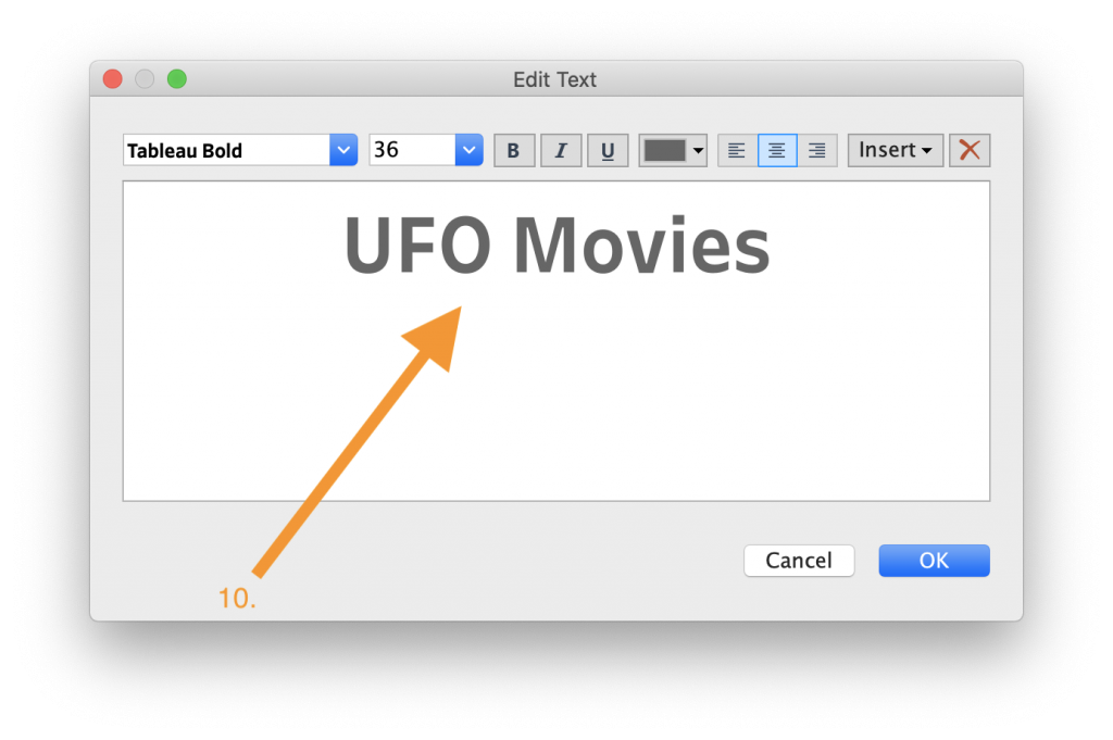
- To create a text element, drag the “Text” option from the “Objects” menu located in the bottom left corner to the dashboard. Reference the video above.
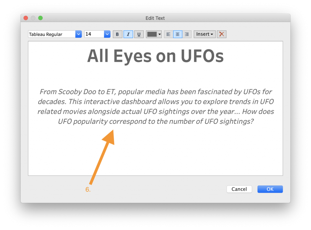
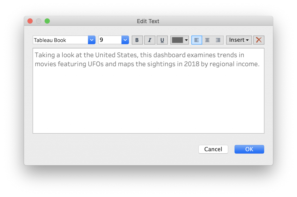
- In the box that pops up, write an appropriate caption and title. Feel free to play around with different colors, sizes, fonts, and alignments of the text.
- After clicking the OK button in the text pop up and going back to the main dashboard view, right click the Map title and select “Hide Title”. This gets rid of the redundant title text. The video above walks you through how to do this.
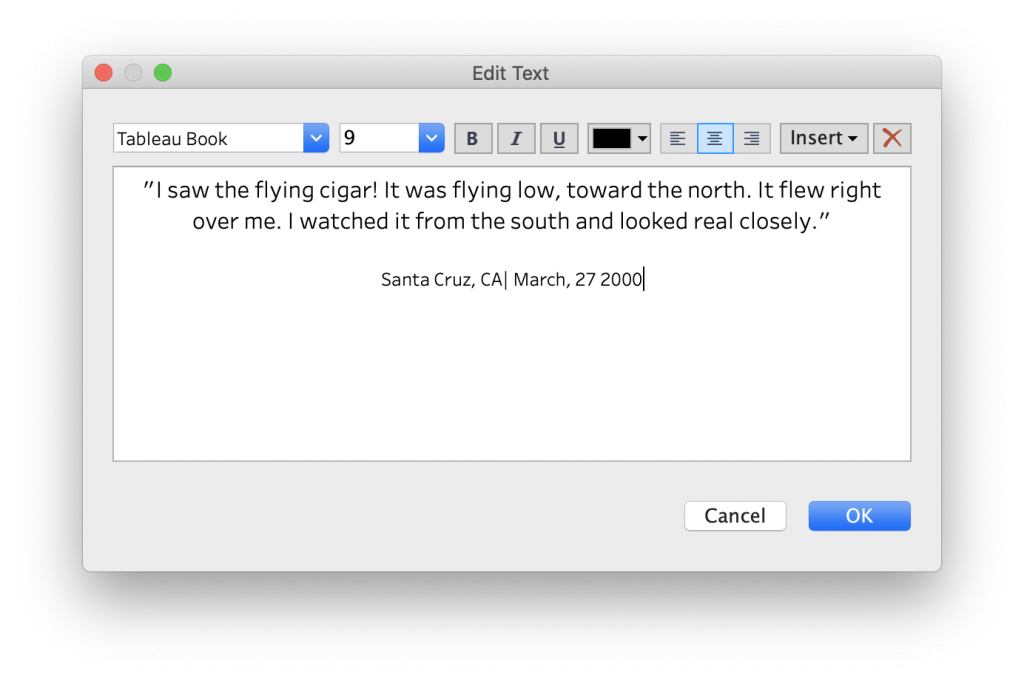
- While visualizations show a lot of data and numbers, it is important to also highlight specific examples and insights. In this example, we can do this by including one summary from a UFO sighting (which can be found in the UFO_Sightings.xls file). Drag a new text box on to the dashboard and include the text above, which was from a UFO sighting in Santa Cruz, California in 2000.
- To change the heights and widths of the different components, click on each component’s bounding box and drag the box to the desired size. The video above shows an example of how to size the different components in this dashboard.

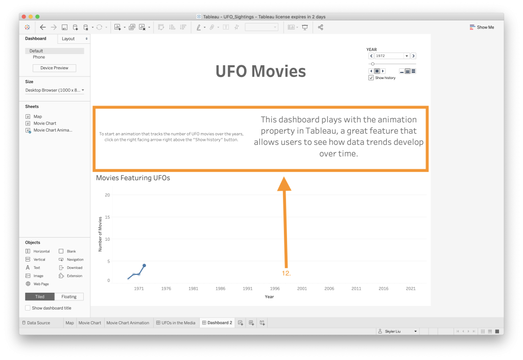
- One way to organize different text segments is to add boxes or outlines. Click on the title text box and navigate to the “Layout” tab on the left side of the screen. In the “Border” section, select the thick black border option. Repeat this process with the other text box.
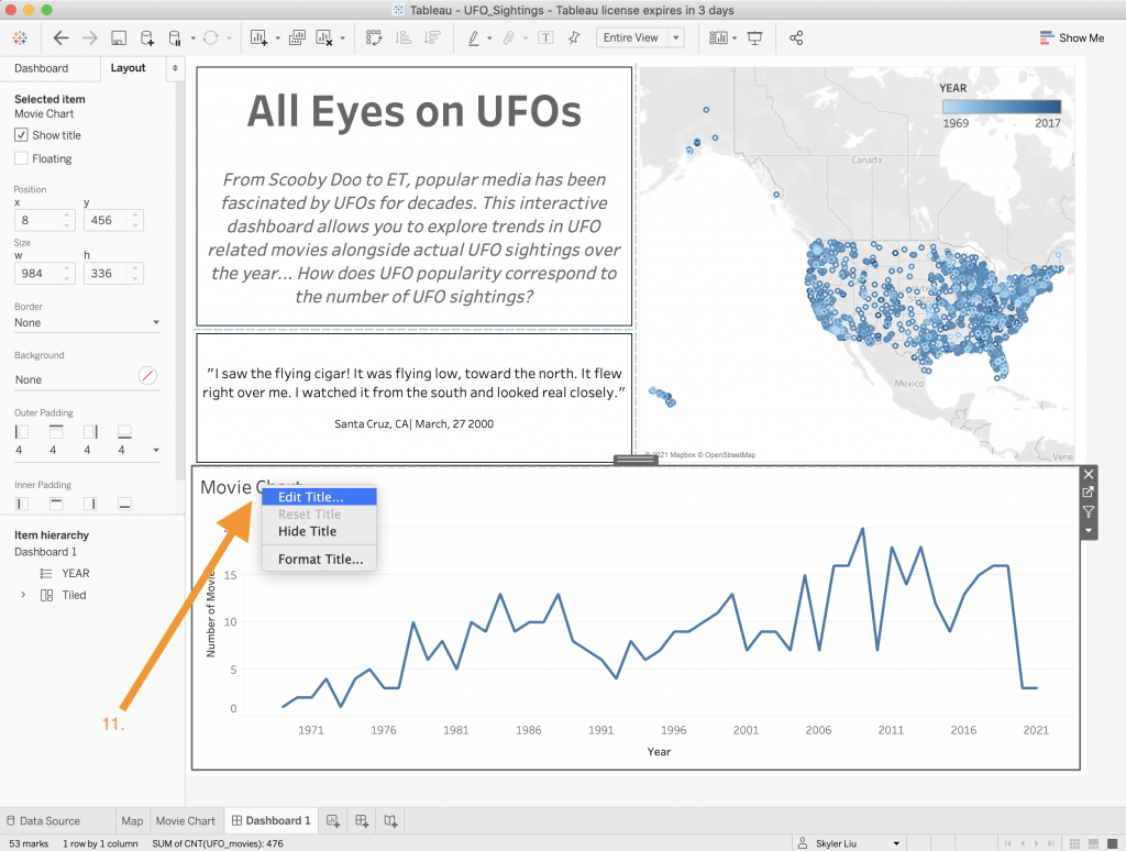
- To edit a title in a dashboard, right click on the title of the worksheet within the dashboard and select “Edit Title”. In this case, we will edit the Movie Chart’s title to say “Movies Featuring UFOs”. This can also be done to the worksheet’s axis if needed.

- The last step is to rename the dashboard. Right click on the dashboard’s tab located on the bottom navigation tag and select the “Rename” option. Rename the dashboard to “UFOs in the Media”.

- Congrats! You have created your first interactive dashboard!
To publish a dashboard:
Now that you have created your wonderful dashboard, it is time to share it with others. While you might not have access to a private Tableau server, it might be easiest to publish it to Tableau Public, Tableau’s free public server that allows anyone to publish and share their projects.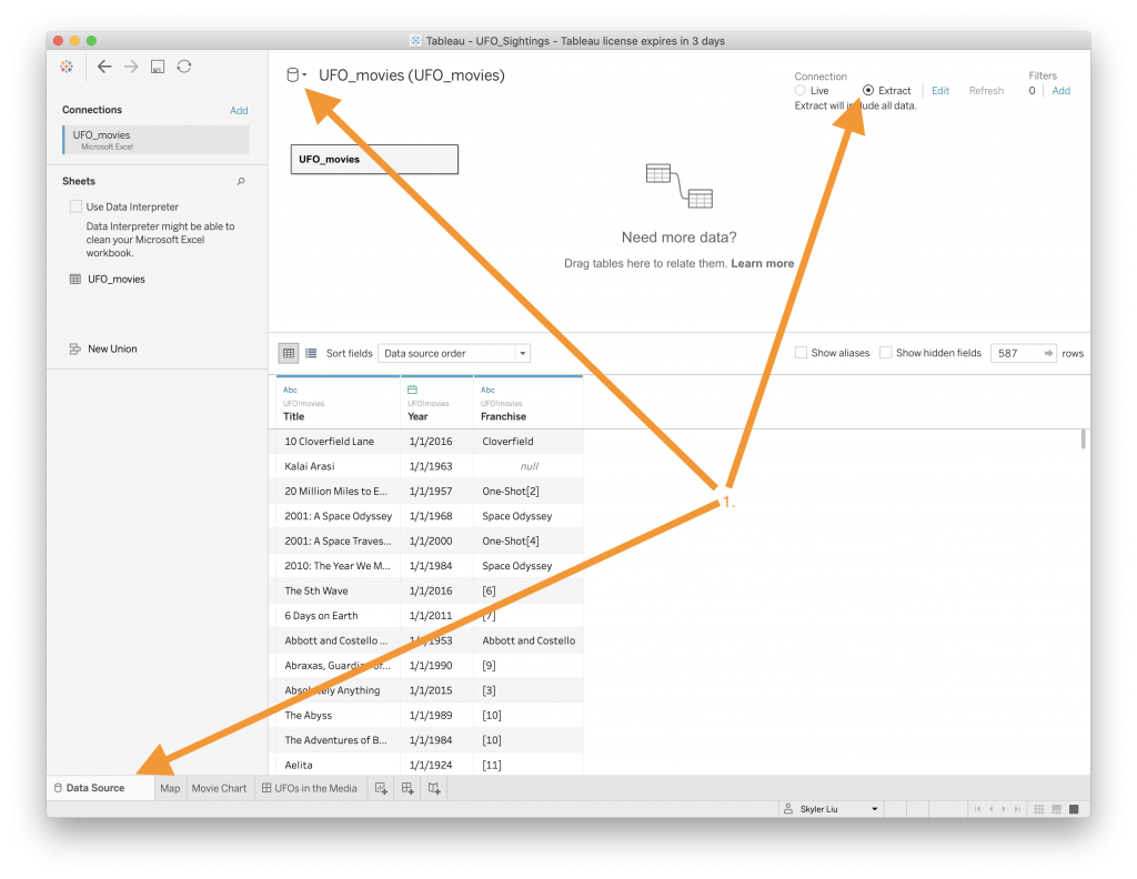
- Before publishing your dashboard to Tableau, make sure to change your data sources to extracts so that they will not be further manipulated. Navigate to the “Data Source” tab located in the bottom navigation bar. On the top right side of the screen, change the Connection to “Extract”. Repeat this step for the other data set by clicking on the cylinder right by the dataset name and navigating to the other data source. This will take the data you connected from the Excel sheets and send it to a server along with your visualizations work.
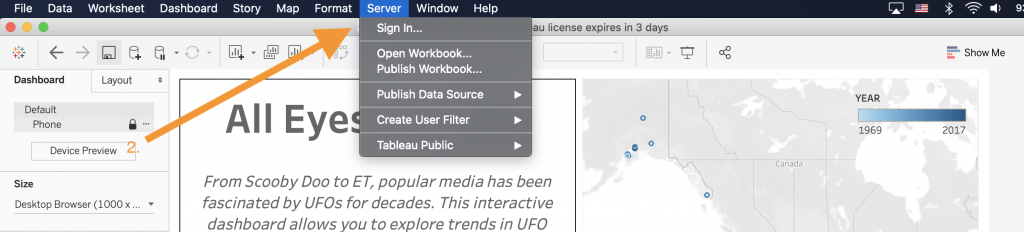
- On the main navigation bar at the top of your computer screen, click on “Server” and the “Sign in…” option.
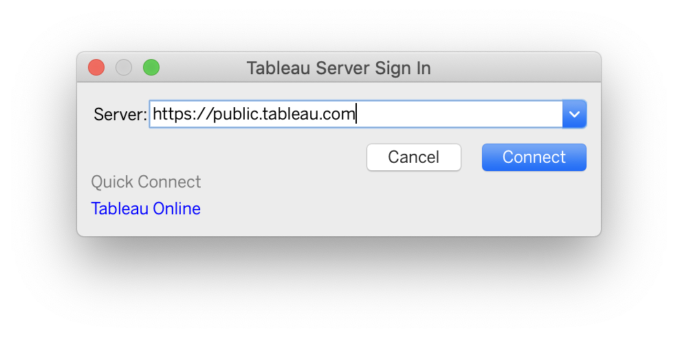
- Choose which Tableau server to sign on to depending on what is available to you. For this tutorial, we will be signing into Tableau public using the link https://public.tableau.com. Follow the steps to sign into your Tableau Public account. It may be the case that you will need to create a separate Tableau Public account from your student Tableau dashboard account – follow the prompts accordingly.
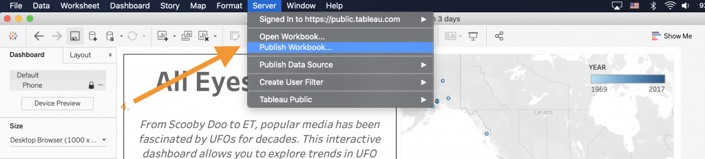
- Once you are signed into your Tableau public account, select the “Publish Workbook…” option. Note that each time you publish your workbook, Tableau Public will create a new instance of the workbook on its server.
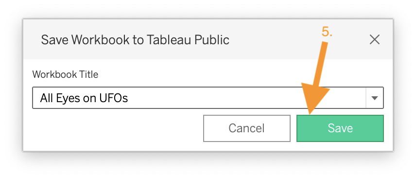
- Choose the appropriate title for your workbook and press the Save button.
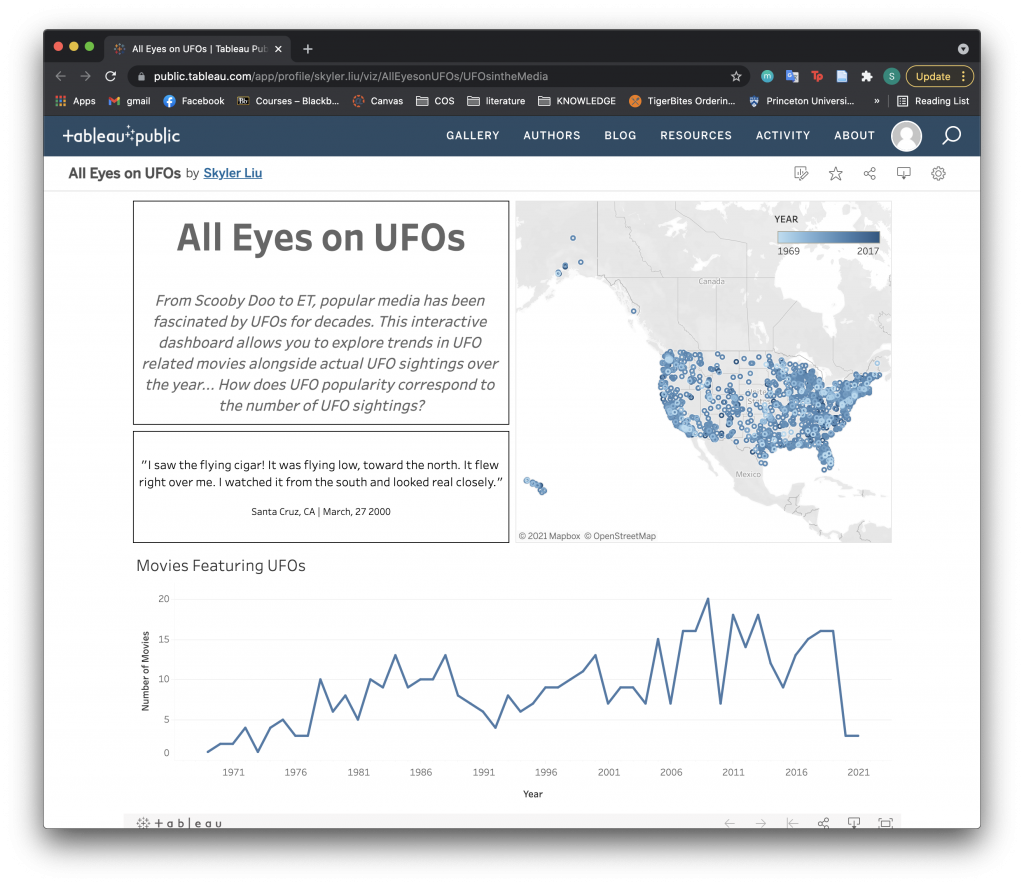
- When Tableau Public has finished publishing your workbook to the server, a window will open up in your browser showing your workbook published online.
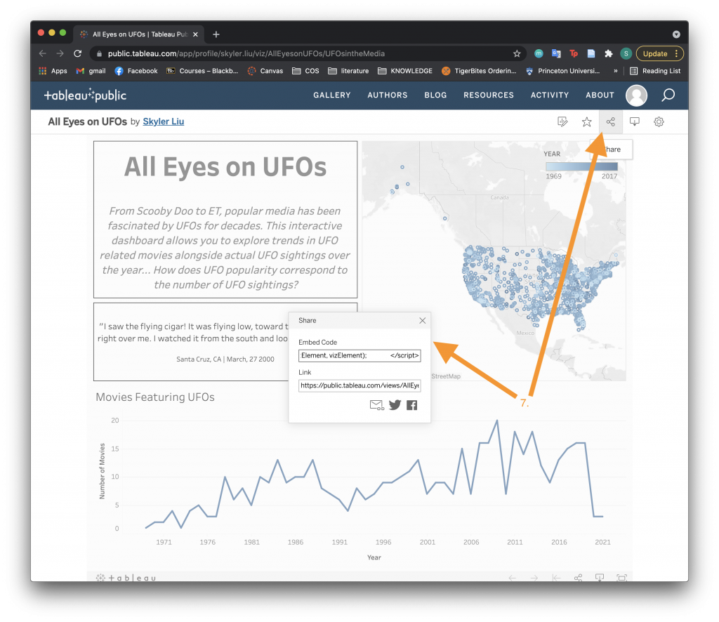
- From here, you can share your Tableau dashboard using either a link or embed code. To embed your dashboard into Princeton specific WordPress pages, use the code below but replace the bolded link with your specific Share link (use the link from the Link section, not the Embed Code).
<iframe src="https://public.tableau.com/views/AllEyesonUFOs/UFOsintheMedia?:language=en-US&:display_count=n&:origin=viz_share_link?:language=en&:display_count=y&publish=yes&:origin=viz_share_link?:language=en&:display_count=y&:origin=viz_share_link?:language=en&:display_count=y&:origin=viz_share_link?:language=en&:display_count=y&:origin=viz_share_link?:language=en&:display_count=y&:origin=viz_share_link?:language=en&:display_count=y&publish=yes&:origin=viz_share_link?:language=en&:display_count=y&publish=yes&:origin=viz_share_link?:language=en&:display_count=y&:origin=viz_share_link?:language=en&:display_count=y&:showVizHome=no" width="700" height="520" frameborder="0"><span data-mce-type="bookmark" style="width: 0px; overflow: hidden; line-height: 0;" class="mce_SELRES_start"></span><span data-mce-type="bookmark" style="width: 0px; overflow: hidden; line-height: 0;" class="mce_SELRES_start"></span><span data-mce-type="bookmark" style="width: 0px; overflow: hidden; line-height: 0;" class="mce_SELRES_start"></span><span data-mce-type="bookmark" style="width: 0px; overflow: hidden; line-height: 0;" class="mce_SELRES_start"></span><span data-mce-type="bookmark" style="width: 0px; overflow: hidden; line-height: 0;" class="mce_SELRES_start"></span><span data-mce-type="bookmark" style="width: 0px; overflow: hidden; line-height: 0;" class="mce_SELRES_start"></span><span data-mce-type="bookmark" style="width: 0px; overflow: hidden; line-height: 0;" class="mce_SELRES_start"></span></iframe>
Congratulations on creating and publishing your first Tableau dashboard! While this tutorial walked through multiple steps, hopefully you have learned how different components and features in Tableau can be combined to create interactive dashboards. For reference, check out the embedded Tableau dashboard below. **Note: To open the dashboard in a new window click the link HERE.
Working with Animations
Now that we have created our first dashboard, we can move on to more advanced Tableau topics. One cool feature in Tableau is animation, which adds movement to visualizations to highlight trends over time. Animation works well when you are building visualizations that are mapped out across a certain time period.
To create an animated dashboard:
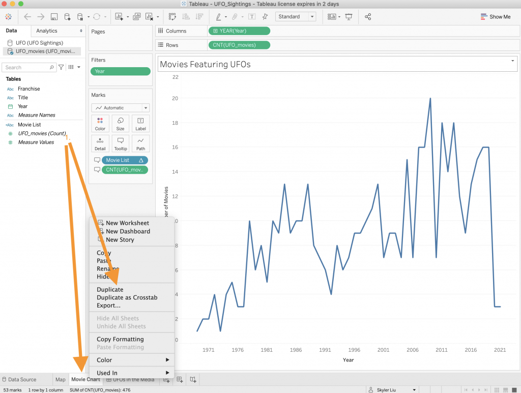 Duplicate the Movie Chart worksheet that you created in the previous section by right clicking on the Movie Chart worksheet located in the bottom navigation menu. Rename this worksheet “Movie Chart Animation”.
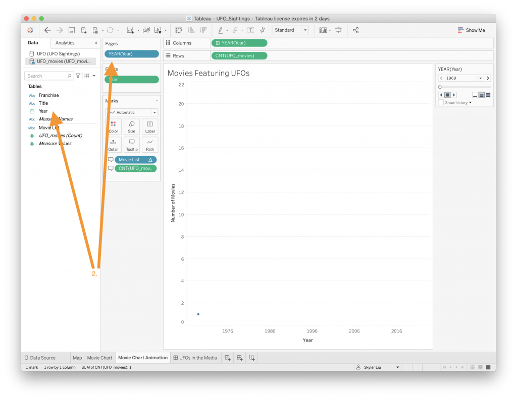
- Drag the “Year” value to the “Pages” section to create an animation that changes over the years.
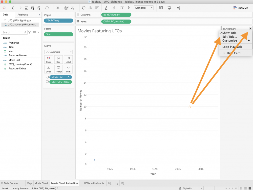
- Rename the toolbox that displays the controls for the animation to just say “YEAR”.
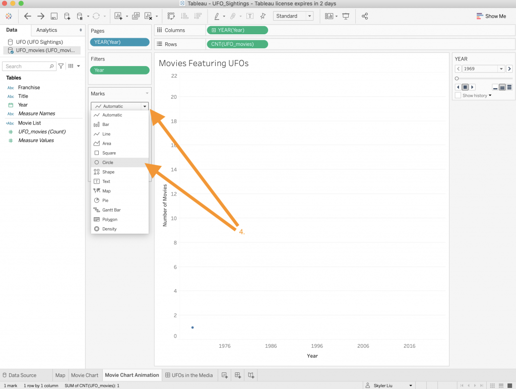
- Change the type of visualization from “Automatic” to “Circle”using the dropdown menu in the “Marks” section.
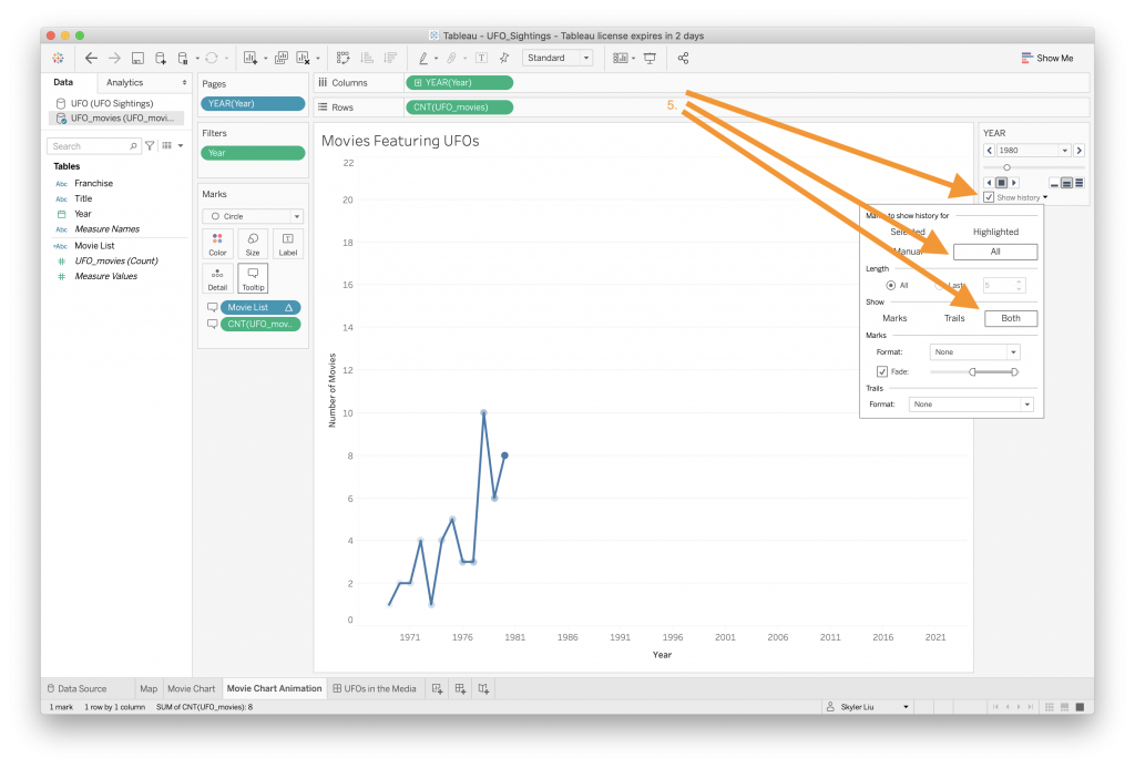
- To have the visualization continue to show previous year’s data, click on the “Show history” checkbox in the animation toolbox. In addition, check the options to show history for “All” and to show “Both” marks and trails. Feel free to play around with these different options.

- Unfortunately, due to the specific way we created our Movie List calculated field, the movie list will not correctly display all the movie titles in this animated version. To get rid of values in a “Marks” category, right click on the value and click “Remove”. This is useful in any situation where you want to get rid of a value fora certain category.
- Click on the “Tooltip” category in “Marks” to also get rid of the “Movie Titles” text in the tooltip.

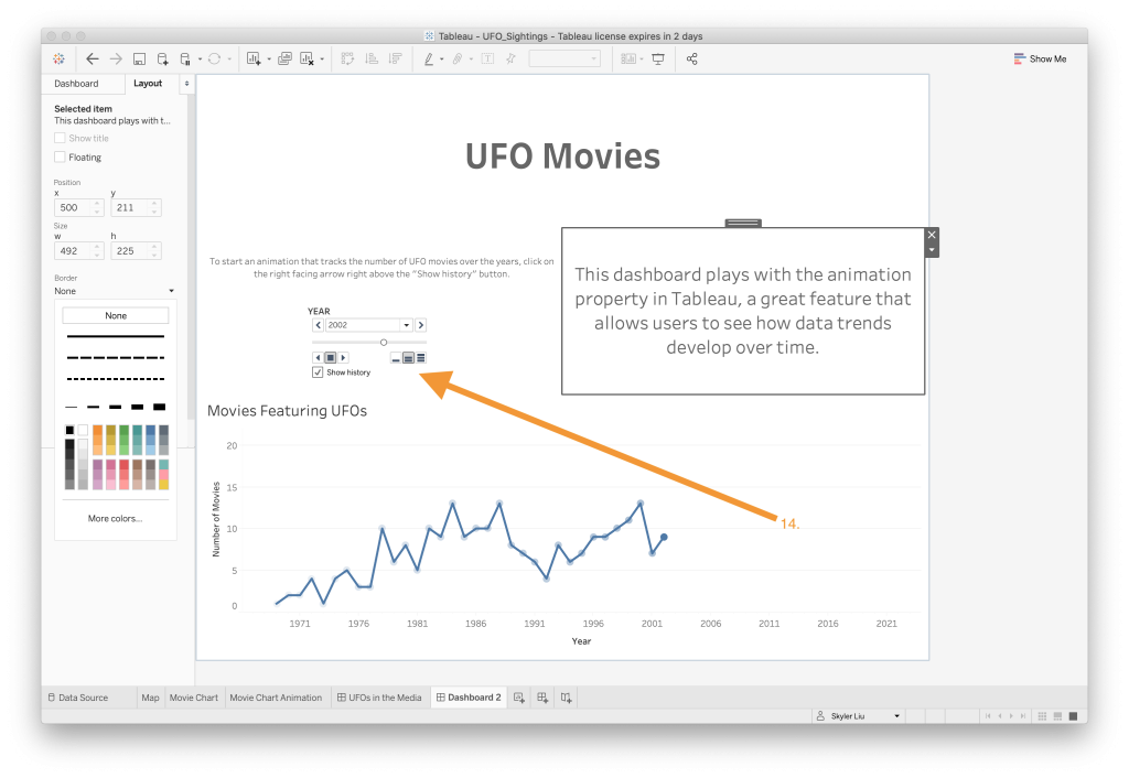
- Now that the worksheet is complete, create a new dashboard and drag the Movie Chart Animation worksheet on to the dashboard.
- Select the animation toolbox and set its property to “Floating” so that it can be moved to a different location on the dashboard.
- Drag a Text object on to the screen to create a new title.
- Vertical and Horizontal Objects are helpful in organizing different objects on the dashboard. In this case, we want to position two text objects side by side. Drag a Vertical object on to the dashboard and drag a Text object inside of the Vertical object like in the video above.
- Next drag another Text object to be positioned within the Vertical object but to the right of the existing Text object like in the video above. The two text boxes should now be in line with each other.
- To create some space under the left Text object, edit the text and add multiple empty lines of text at the end.
- Drag the animation toolbox under the left side text (now that we have created extra space in the previous step).
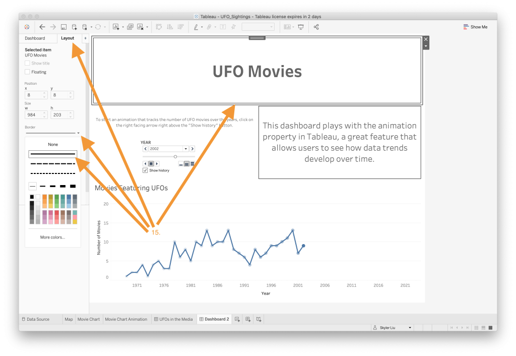
- Click on the different containers to resize them. In addition, add black borders to the outside of the title and right side Text objects like we did in the first dashboard tutorial.
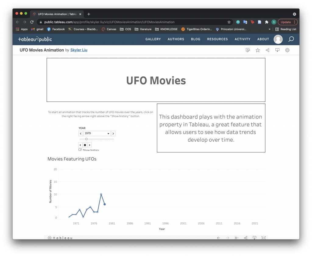
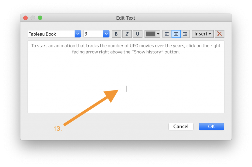
- Congrats! You have created an animated dashboard. You can click on the right arrow right above the “Show history” checkbox in the animation toolbox to start the animation. To publish your dashboard, follow the same steps we went through in the first dashboard tutorial. A published and embedded version of this animated dashboard is included below.
Using Preset Data and Filters
Another helpful feature in Tableau is that it provides preset geographical layers that can be added to map visualizations. This can be helpful for projects that involve mapping geographic data and can save you the time of having to look for or create your own geographically encoded data layers.
To use preset geographical layers:
-
-
- Create a new worksheet and drag the “City” value like we did in the first dashboard tutorial.
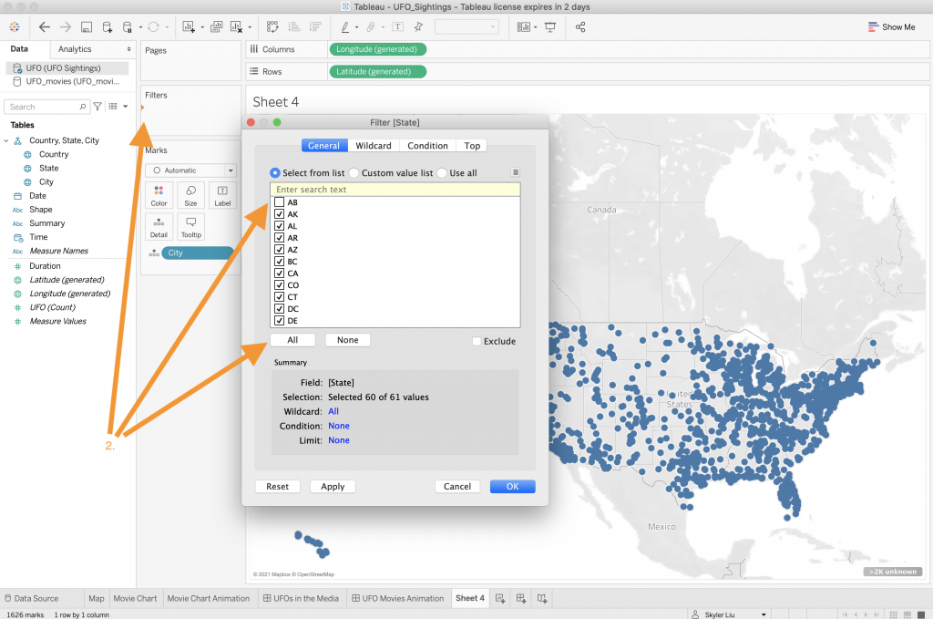
- In our previous map worksheet, we used the “Country” value to filter out values that were not located in the United States. We can also use the “State” value to achieve the same goal. Drag the “State” value to the “Filter” section and select the “All” button and then deselect “AB,” the Canadian state.
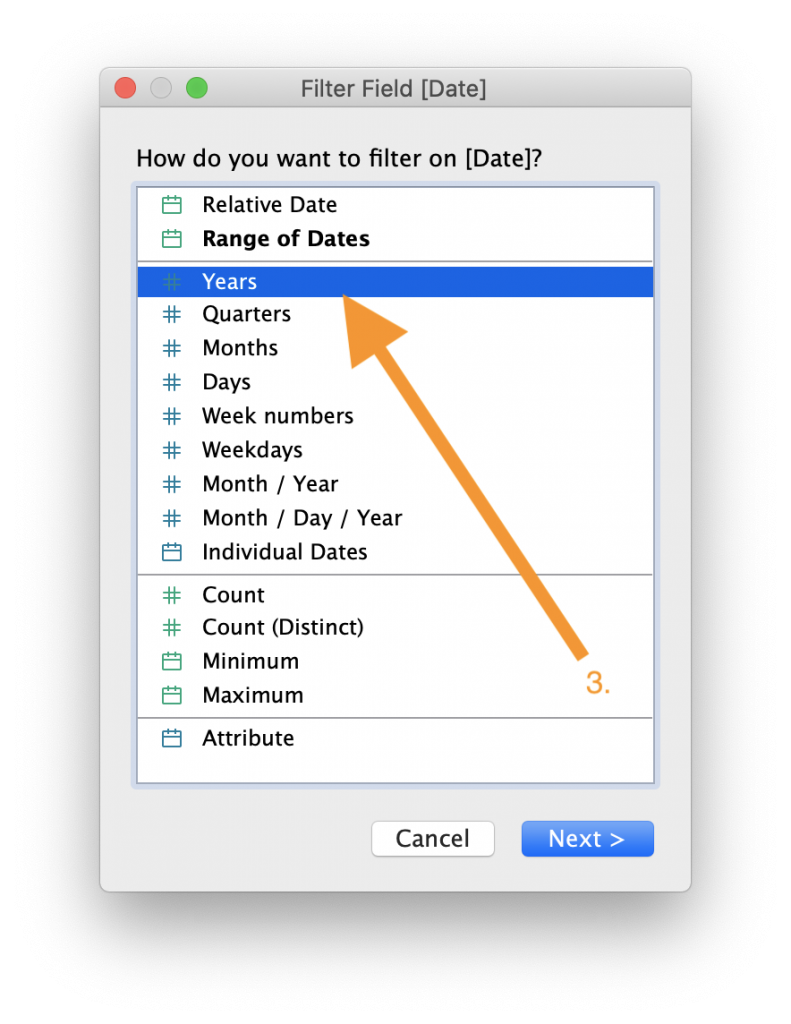
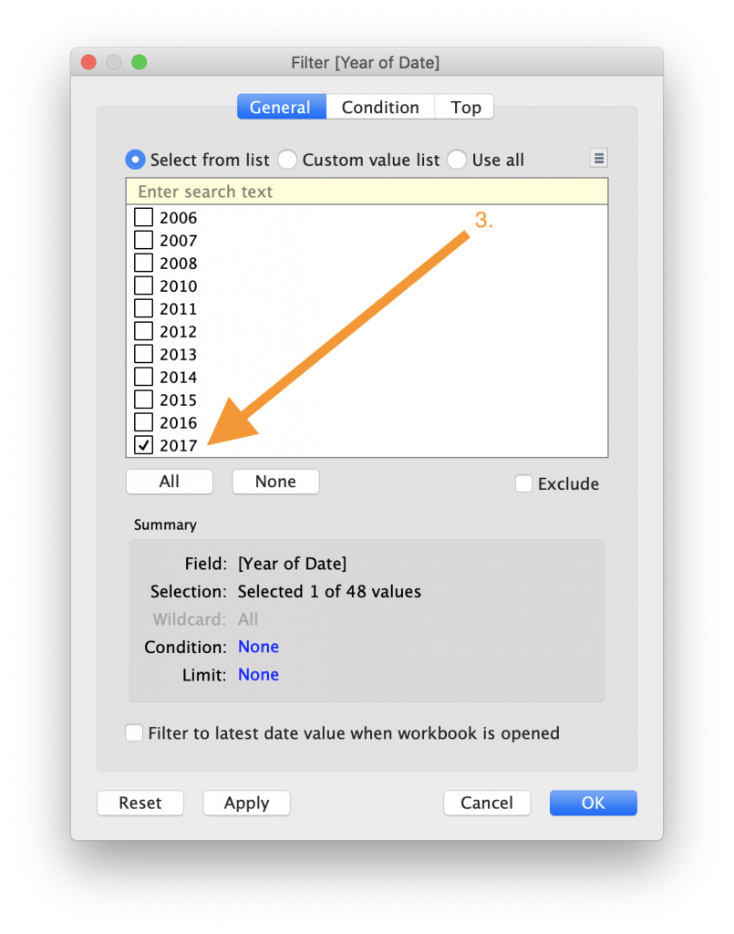
- Drag the “Date” value to the “Filter” section. Select the option to filter by “Years” and scroll to the bottom of the value list and check the “2017” option.

- Now that we have added the geographic and date filters, drag the “Shape” value and drop it on top of the “Color” category in the “Marks” section so that the data can be color coded by shape.
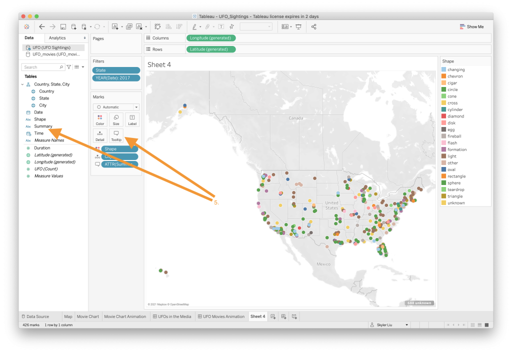
- Drag the “Summary” value and drop it on top of the “Tooltip” category.
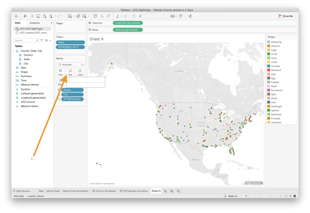

- To make the points look sharper and easier to view, change the size of the shapes using the slider value bar that shows up when you click on the “Size” category. In addition, change the type of the visualization form “Automatic” to “Map” using the dropdown menu under the “Marks” section.
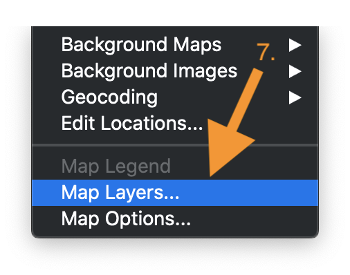
- Now that the UFO sighting data has been mapped out, it is time to add the preset layers. Navigate to the Tableau menu bar at the top of the screen and under the “Map” option choose “Map Layers…”
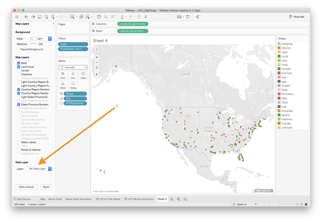
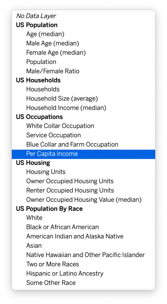
- The Map Layers editing bar should pop up on the left hand side of the screen. Navigate down to the bottom left of the screen to the “Data Layer” section. In the dropdown “Layer” selection tool, choose “Per Capita Income”. As you can see, Tableau provides you with a lot of different map layer choices. Feel free to play around with these different options.
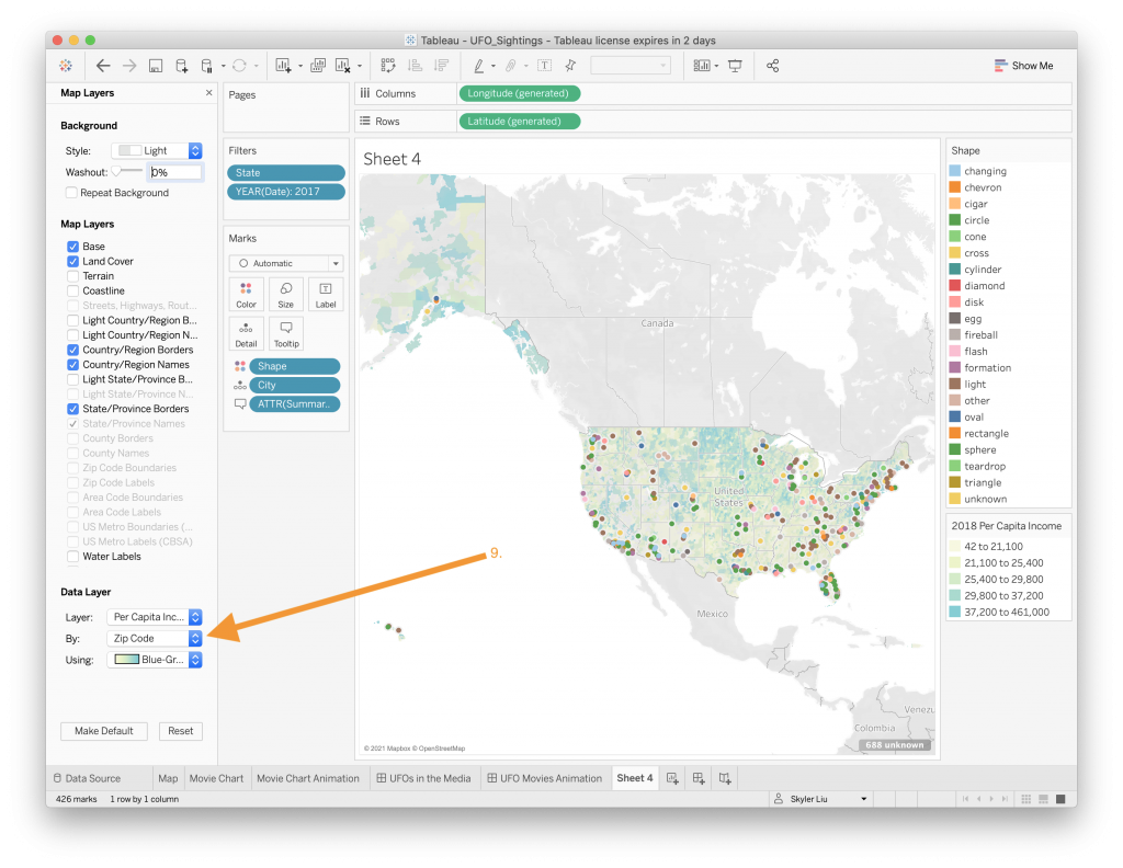
- Once you have selected the layer, set the data layer’s “By” attribute to “Zip Code”. Again, feel free to play around with the different “By” options and also change the color scheme.
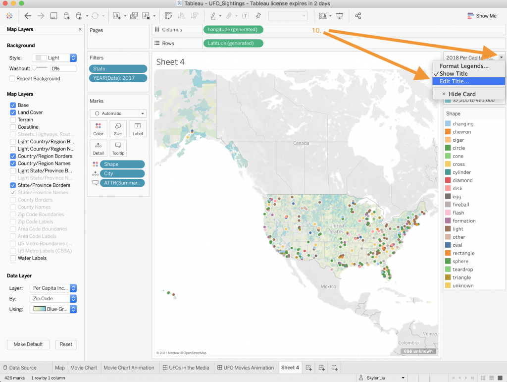
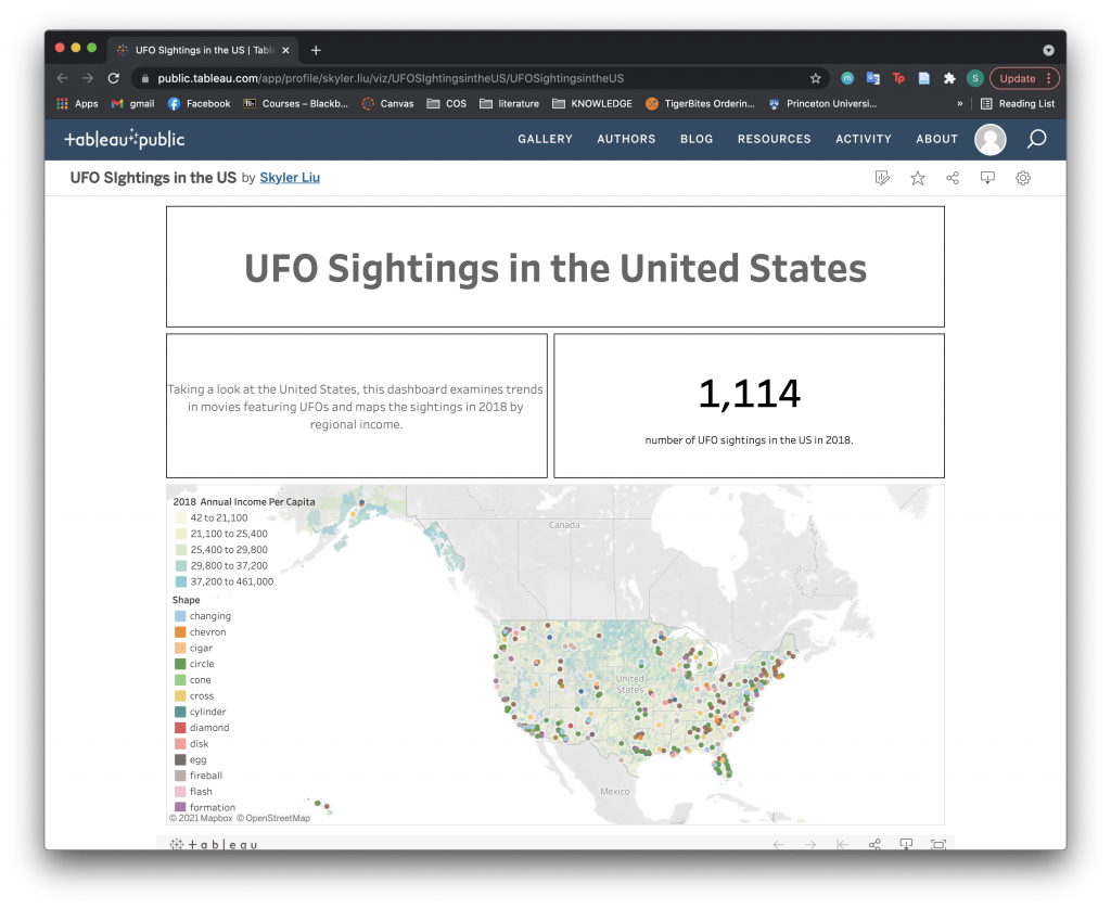
- Drag the legend for the map layer to the top of the screen and edit the title to “2018 Annual Income Per Capita”by selecting the dropdown menu on the top right of the legend box.
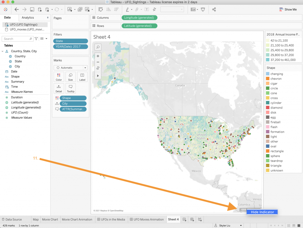
- Hide the indicator at the bottom right of the map like we did in the first dashboard tutorial.
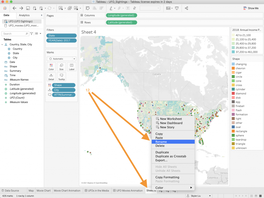
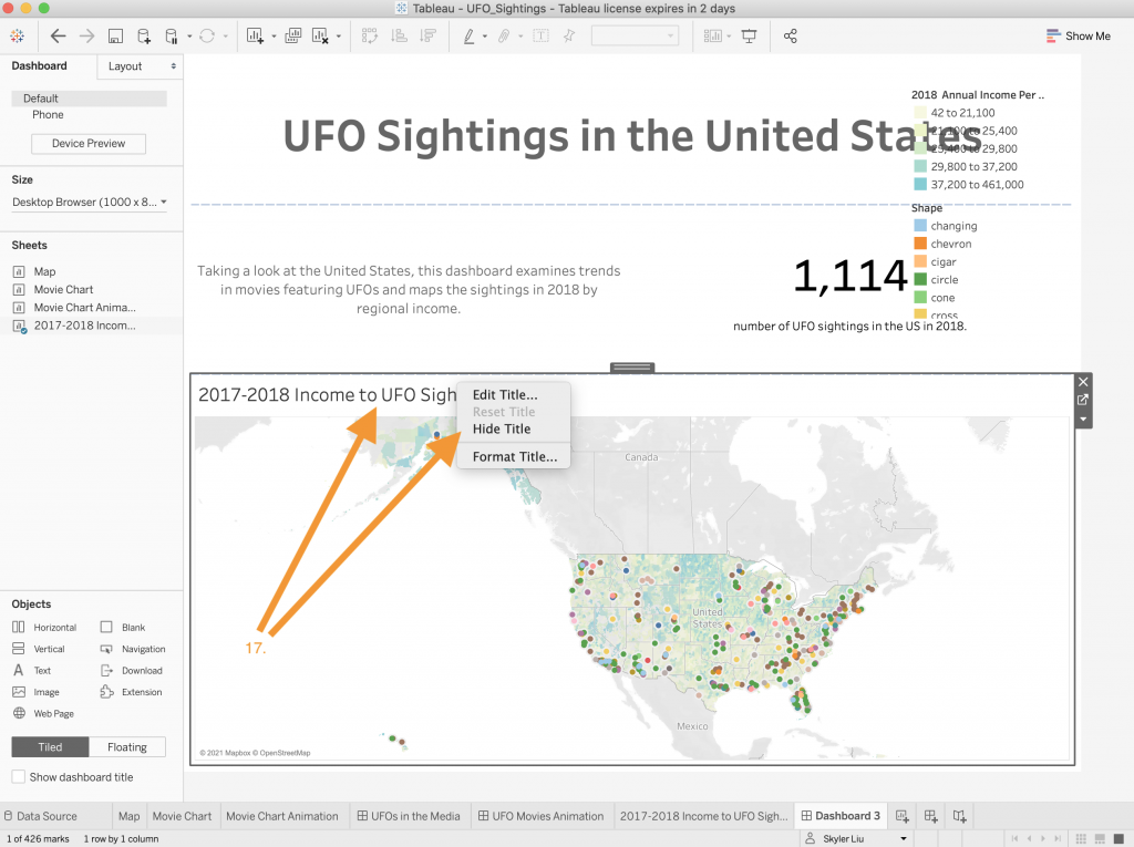
- Rename the worksheet to “2017-2018 Income to UFO Sightings”. As you can see, changing the sheet name also changes the title on the actual map.
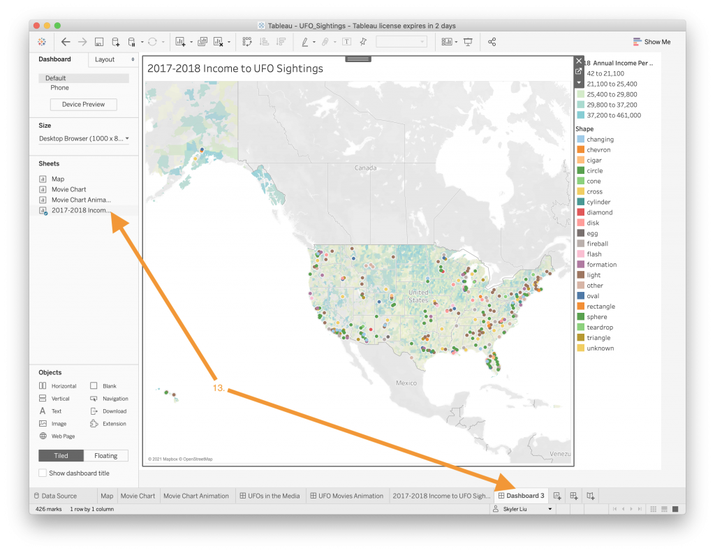
- Now that we have created the worksheet, create a new dashboard and drag the map worksheet to the dashboard.
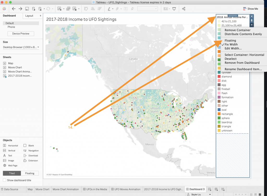
- Change the attribute of the two legends to “Floating” by selecting their container and right clicking.
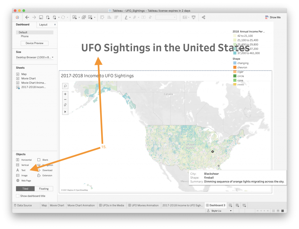
- Drag a Text object to the top of the dashboard and create a new title.


- “BANs – Big A** Numbers” are data that has been highlighted. BANs help attract the user to specific aspects of the dataset and learning how to use them is an important Tableau design concept. We will create a BAN that displays the number of UFO sightings that were reported in 2017/2018 – 1,114. Just like in the Animation Dashboard tutorial, drag a Vertical Object and drag two Text Objects inside of this object. The two texts should look like the ones above.
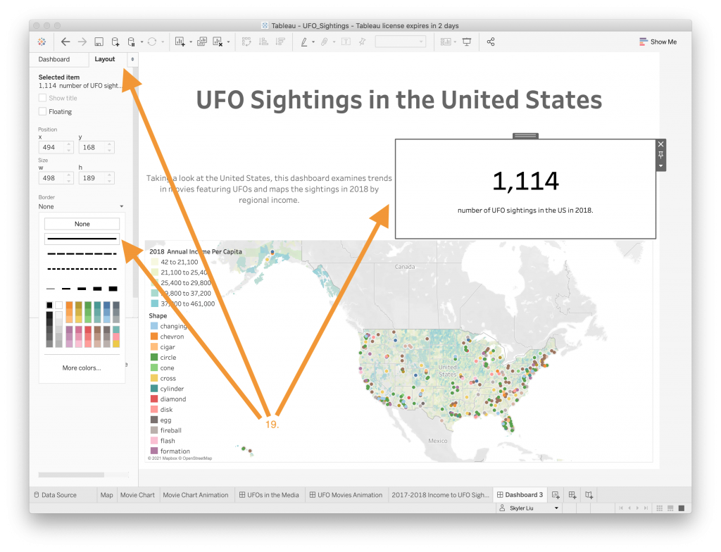
- Since the title of the map is redundant given the layer legend, hide it.

- To organize the dashboard, resize the different containers by clicking on them and using the resize mouse tool to drag them to your desired size. In addition, drag the shape and annual income per capita legends.
- Like in the previous two tutorials, add borders around the Text Objects to help them stand out. Feel free to play around with different border colors, styles, etc.
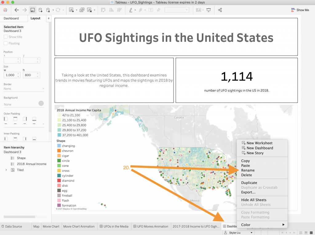
- Rename and save the dashboard.
- Congrats on creating a dashboard with preset geographic layers! Publish the dashboard by following the steps listed in the first dashboard tutorial. A published and embedded version of this animated dashboard is included below. **Note: To open the dashboard in a new window click the link HERE.
- Create a new worksheet and drag the “City” value like we did in the first dashboard tutorial.
-