Interactive Charts in Datawrapper
Creating Interactive Charts and Graphs
Datawrapper is a free online platform that helps users easily create interactive charts, maps, or tables. The tool does not require any code or design skills, but provides users with an accessible interface to visualize their datasets. In addition, Datawrapper does not require you to create an account, though you may want to in order to save and return to your work. The following tutorial will walk through how to use Datawrapper to build an interactive chart. Charts enable you to analyze complex datasets, reveal relationships in the data, and make complexity intelligible to a wider audience.
We are going to revisit 2016 Election and Unemployment data sets that are used in the Mapping Your Data with Carto tutorial. Download the datasets and follow along with the tutorial here: Carto_data. [Make sure to unzip the first Carto_data folder that will be initially downloaded.] We will use this data to create two different graphs – a scatterplot that compares unemployment rates between different counties and a bar chart that examines these same counties through the lens of other factors.
Note that in this example, the original data set has a lot of information so before we create our visualizations, we are going to filter the data in two ways. Before that, however, here are the first typical steps in creating a new project and uploading data.
Creating a New Project in Datawrapper
- Go to https://www.datawrapper.de/.
- Press the “Start Creating” button in the center of the page. Or log-in to your account and click “+ chart”.

- Typically, in Step 1 Upload Data, you would click on the XLS/CSV option and select the type of data set that you want to use. As mentioned, we’ll do that after we filter the data.
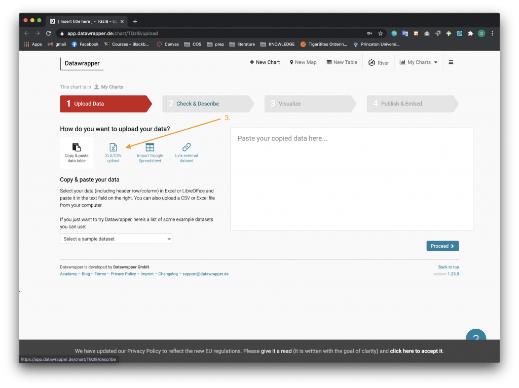
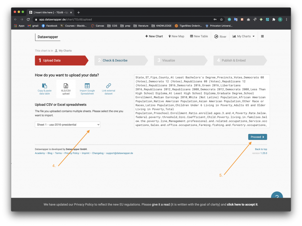
- Select the sheet that you want to use from your local drive or an external online source.
- Click the Proceed button to go on to Step 2 Check & Describe. The Filtering the Data section below will be useful if you want to filter your data. Otherwise, you are ready to start creating your visualization!
Filtering the Data
There are multiple options when it comes to filtering data – you can use Excel, the Datawrapper platform, etc. We are going to show how to filter data in both Excel and Datawrapper.
To filter in Excel:
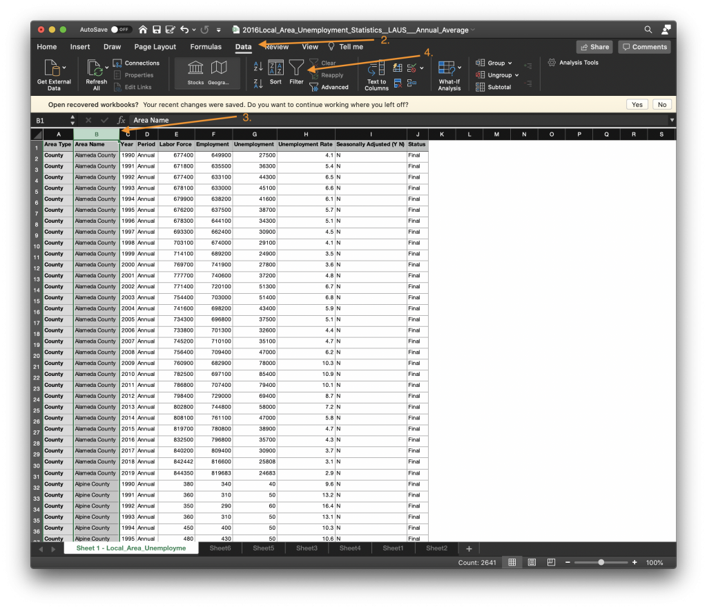
- Open up the 2016Local_Area_Unemployment_Statistics_LAUS_Annual_Average.xlsx sheet in Excel.
- In the top menu bar, click on the Data tab.
- Highlight the column you would like to filter, in this case highlight the Area Name column. This will enable us to pick certain counties to include in the data set and visualizations.
- While this column is still highlighted, press the Filter button from the menu options.
- When the filter menu pops up, deselect all the options by unchecking the Select All box.
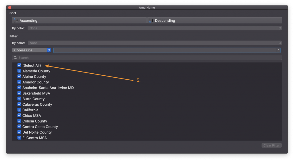
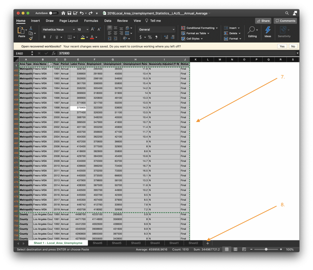
- Now, go through the list and select the counties you want to display. In this case we are going to examine counties that are on the coast, inland, and on the border of Nevada. To do this, check the boxes for Fresno, San Joaquin, Shasta, Los Angeles, San Bernardino, and Sonoma counties.
- Now back on the main sheet, Select All and copy the entire table.
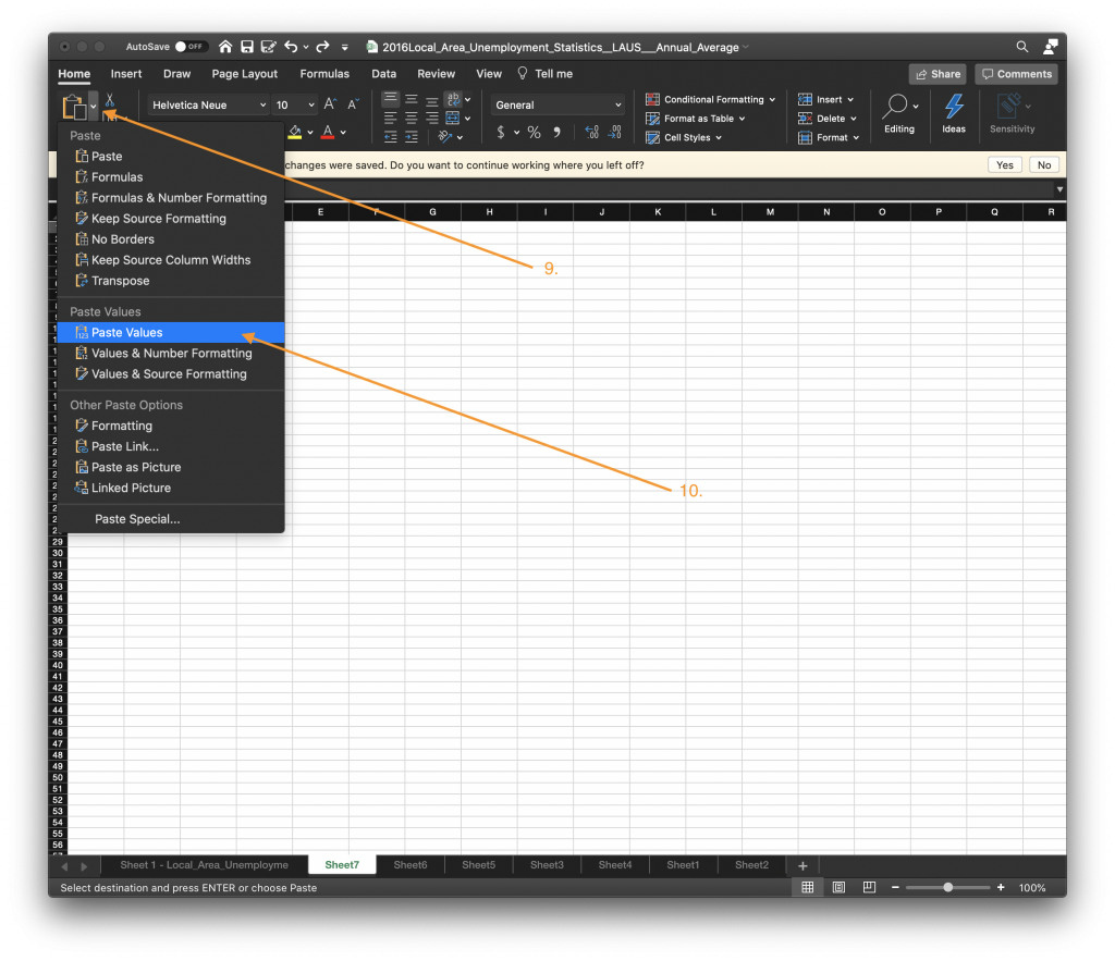
- Open a new sheet by navigating the bottom menu and clicking on the “+” button.
- Once you are on the new sheet, navigate to the Clipboard icon on the top menu bar and click on the arrow next to the icon.
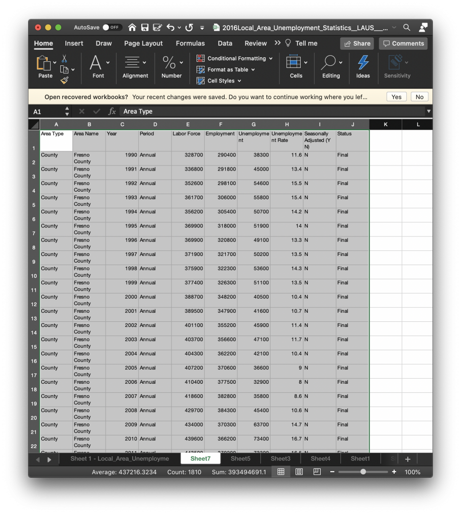
- Select the Paste Values option, as this will paste only the values you previously filtered without the active filter. This will be important when you upload the data to the visualization platform.
- Save your Excel workbook. At this point, you could upload the filtered dataset to Datawrapper and select the sheet when you create a new project (see Step 4 in the Creating A New Project in Datawrapper section above).
To filter in Carto:
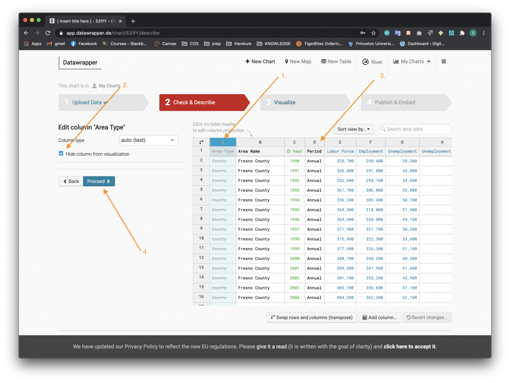
Upload the initial excel workbook as a data set using the steps above in the “Creating a New Project in DataWrapper”
- Click on the column you want to filter/hide from the visualization. We will start with the Area Type.
- Once the column has been highlighted, check the Hide column from visualization box that appears on the left side.
- Repeat steps 1 and 2 to filter out the columns titled Area Type, Period, Seasonally Adjusted (Y N), and Status. You can do these same steps with any other columns you want to hide.
- Click the Proceed Button.
Scatter Plot
After filtering out the data in Datawrapper’s Step 2 Check & Describe, you will now move on to Step 3 Visualize. Follow these steps to learn how to make a scatter plot from the filtered 2016Local_Area_Unemployment_Statistics_LAUS_Annual_Average.xlsx dataset.
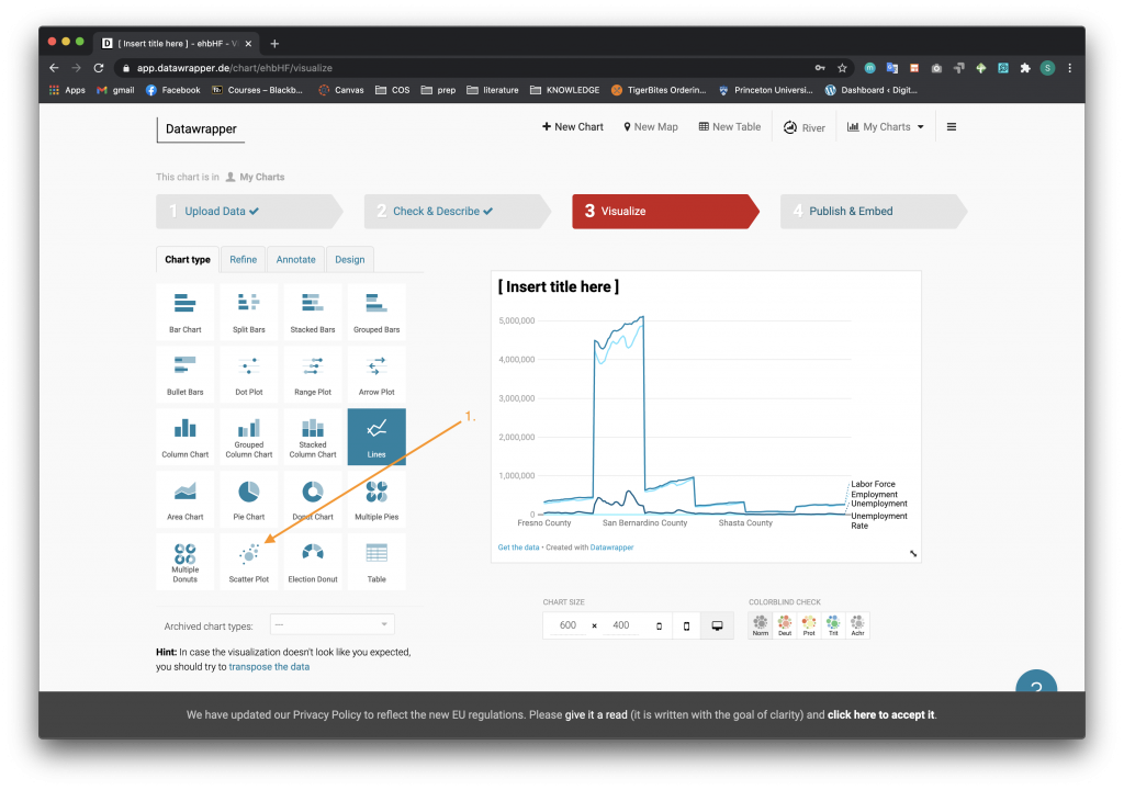
- When you navigate to Step 3 Visualize you will see different chart types in a table on the left of the screen. Choose the Scatter Plot option.
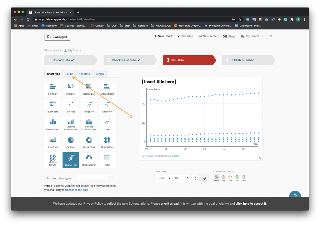
- Once the chart has changed to a scatter plot, click the Refine option tab. Do not worry if the dots on the chart do not make any sense at this step.
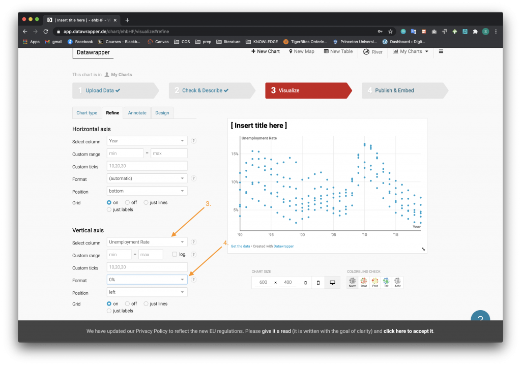
- We want the horizontal axis to be the Year, so you can keep this the same. However, change the vertical axis to Unemployment Rate. You can do this by selecting the arrow on the dropdown menu.
- Change the format to the “0%” option.
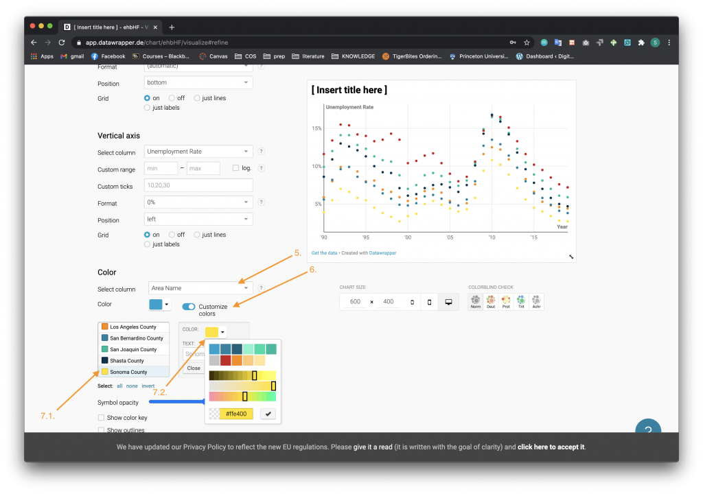
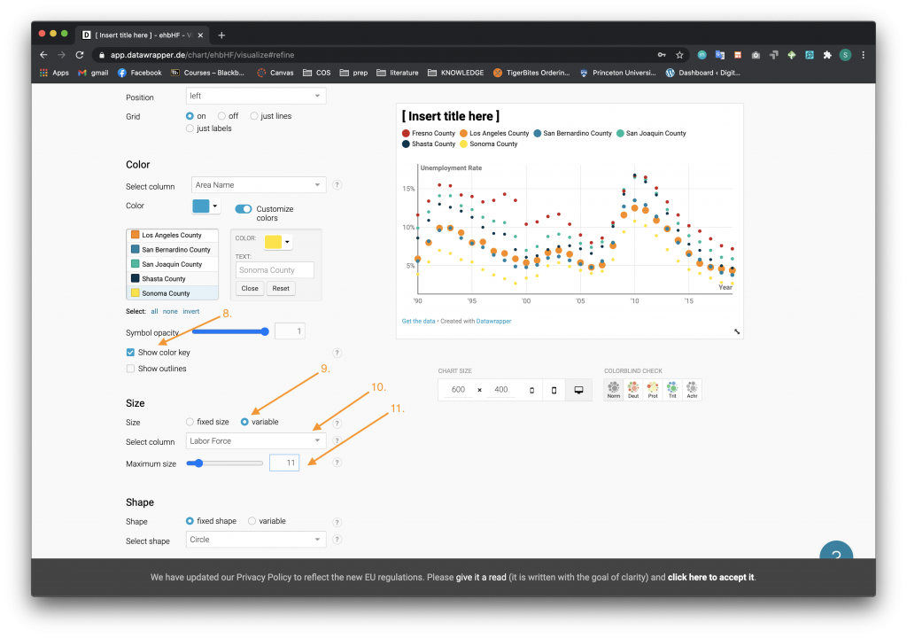
- Scroll down the page and change the color of the dots to be associated with the Area Name column.
- Click the Customize Colors option.
- For each county,
- Click on the County name.
- Click on the Color drop down menu and choose a different color.
- Check the box that displays the color key.
- Under the Size category, select the radio button for variable size.
- Select the Labor Force column to be associated with the size.
- Change the maximum size to your desired number, in this case it is 11.
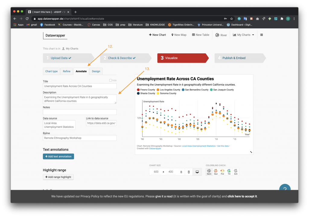
- Click on the Annotate tab to move to the next tool-pane.
- Fill in the Title, Description, Notes, Data Source, Link to Data source, and Byline accordingly as shown. The link to the original data source is here: https://data.edd.ca.gov/Labor-Force-and-Unemployment-Rates/Local-Area-Unemployment-Statistics-LAUS-/e6gw-gvii.
- Under the Text Annotations section, click the “+ Add text annotation” button. Click on the chart to add the text box.
- Create a text annotation by filling in the text and associated text styles.
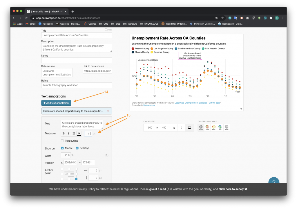
- Move the text annotation by clicking on the box on the chart and dragging it to your desired location.
- Scroll to the Customize Tooltips section and click on the “Customize tooltips” button.
- Press the buttons denoting different columns in the dataset to select and add values to the popup tooltip.
- To format the appearance of the date, click on the side arrow of the column button and select the option that you want.
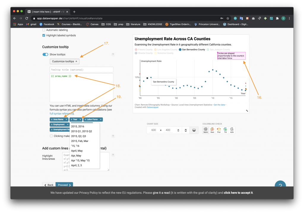
- Here is the example of a tooltip that you can create. When you hover on a dot in the plot, the tooltip will be displayed. Note that a “</br>” in the tooltip creation box is HTML to create a new line.

- After clicking the Proceed Button at the bottom of the page, you will move on to Step 4 Publish & Embed. Click on the Publish Chart button.
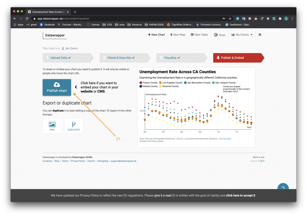
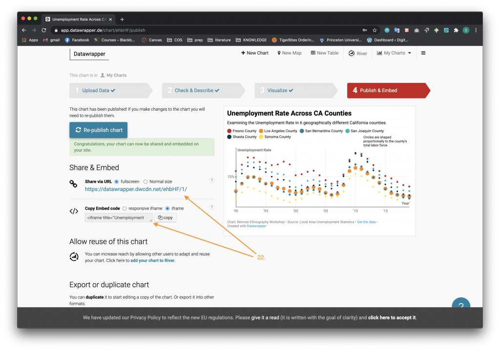
- Datawrapper will create a URL and an embed code so you can share your chart. Congrats, you have created your first scatter plot in Datawrapper!
Column Chart
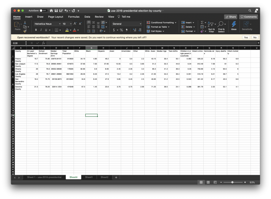
The next visualization we are going to create is a column chart from the usa-2016-presidential-eleciton-by-county.xlsx dataset. Filter out the data in a similar way you did with the unemployment data in the Filtering the Data section listed above. We will filter for the same counties as we did for the scatter plot – Fresno, San Joaquin, Shasta, Los Angeles, San Bernardino, and Sonoma. This Excel sheet also has a lot of extra columns so to streamline the process, delete columns that are unnecessary. In this case, we deleted all the extra columns and kept the columns listed below.
Follow these steps to learn how to make a column chart from the usa-2016-presidential-eleciton-by-county.xlsx dataset.
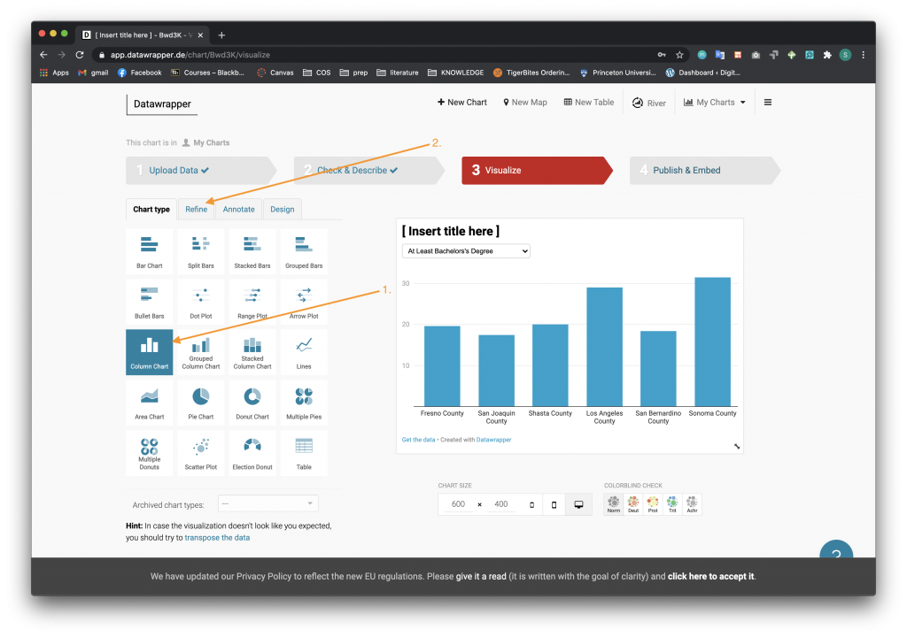
- Upload the dataset as above in the Creating a New Project in Datawrapper and Scatter Plot examples. When you navigate to Step 3 Visualize you will see different chart types in a table on the left of the screen. Choose the Column Chart option.
- Navigate to the Refine tab.
- Once on the Refine menu page, scroll down to the Appearance section. We are going to color code the counties similar to the scatter plot. Press the Customize Colors button.
- For each county,
- Select the county for which you want to choose a color.
- Select the color drop down menu and choose the column color.
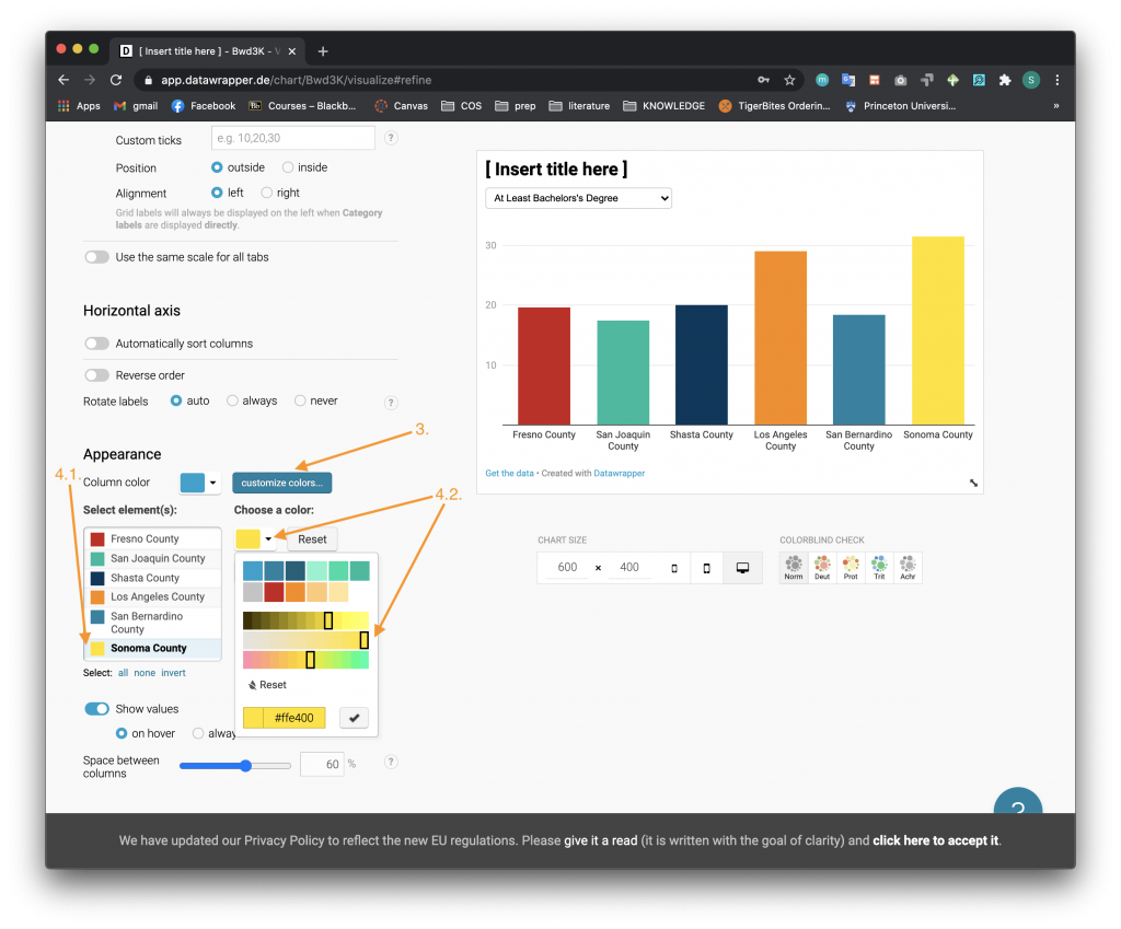
- Under the Show Values switch button, select the Always radio button option.
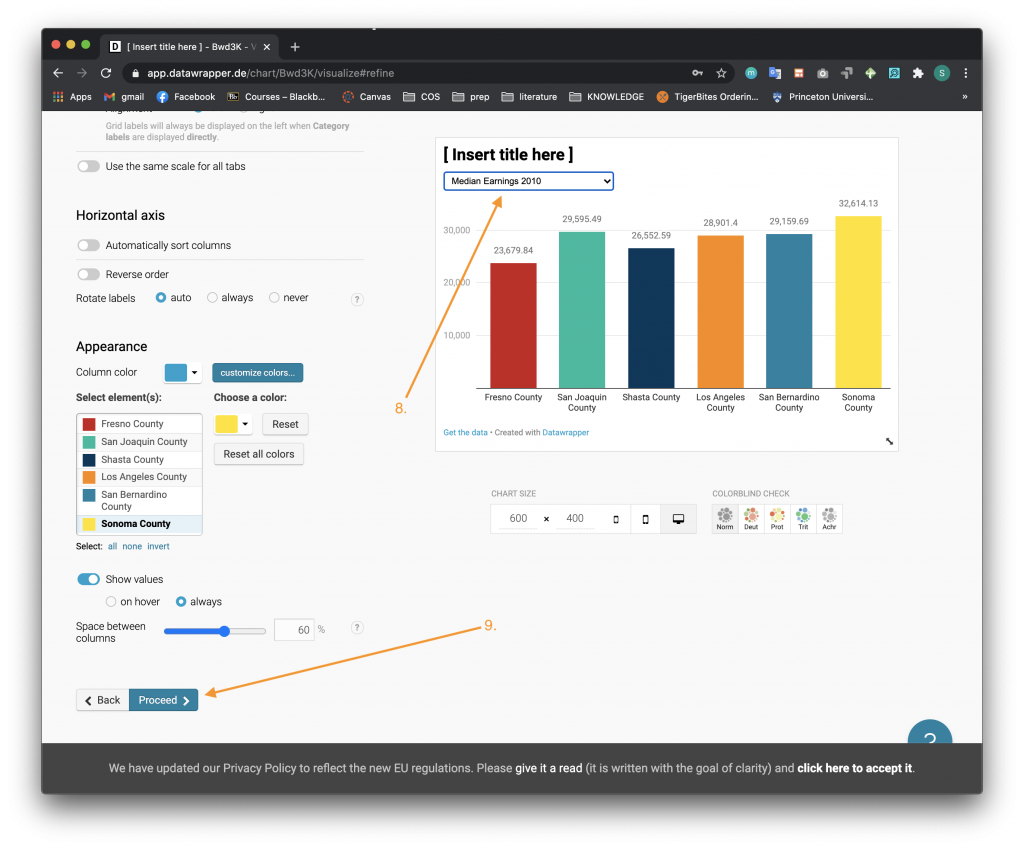
- To switch between different statistics click the dropdown menu at the top of the chart.
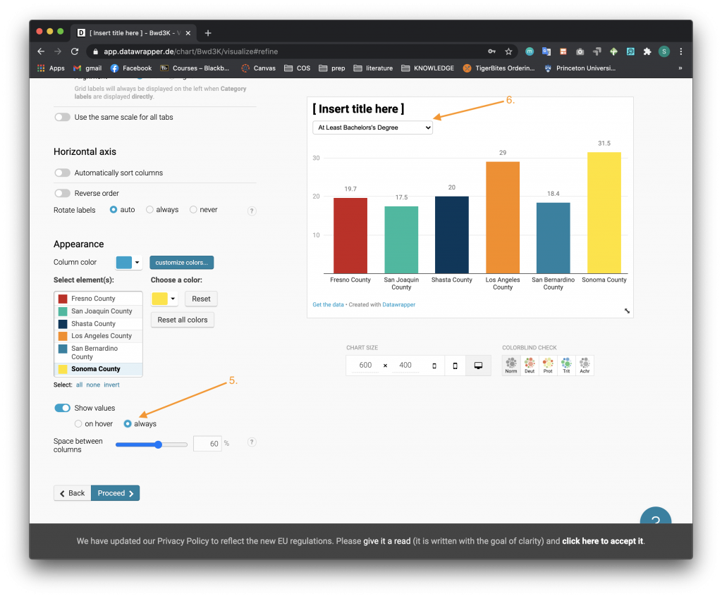
- A dropdown menu will appear where you can switch between different columns from the data set that you want to analyze.
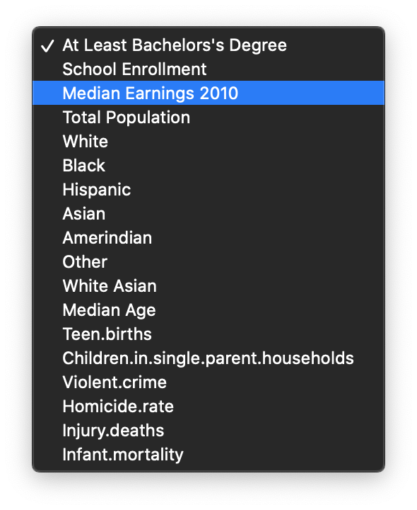
- Once you select a different option, the chart will change and the horizontal axis will also re-scale.
- Click the Proceed button on the bottom of the page to move on to the next step.
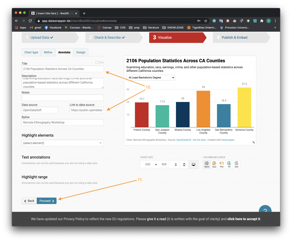
- In the Annotate section, fill in the Title, Description, Notes, Data Source, Link to Data source, and Byline accordingly. The link to the original data source is here: https://public.opendatasoft.com/explore/dataset/usa-2016-presidential-election-by-county/table/?disjunctive.state.
- Click the Proceed button on the bottom of the page to move on to the next step.
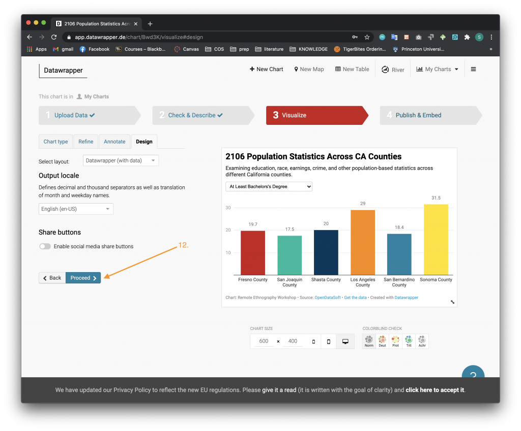
- In the Design section, you can choose if you want to enable social media share buttons. Click the Proceed button on the bottom of the page to move on.
- Publish your column chart as you did with the scatter plot. Once on the Step 4 Publish & Embed, click on the Publish Chart button.
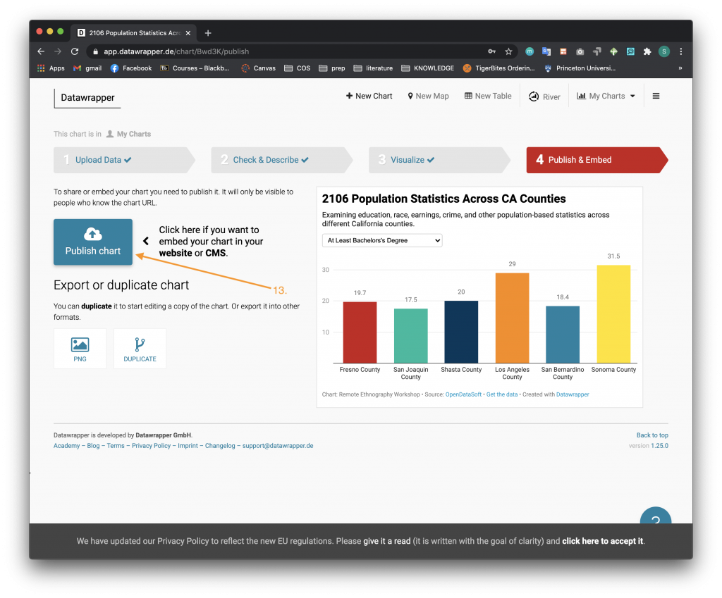
- Datawrapper will create a URL and embedded code so you can share your chart. Congrats, you have created your first column chart in Datawrapper!

Remember, if you return to your charts to edit them the changes you make will be reflected in their web page hosted on Datawrapper as well as wherever you have embedded your charts.