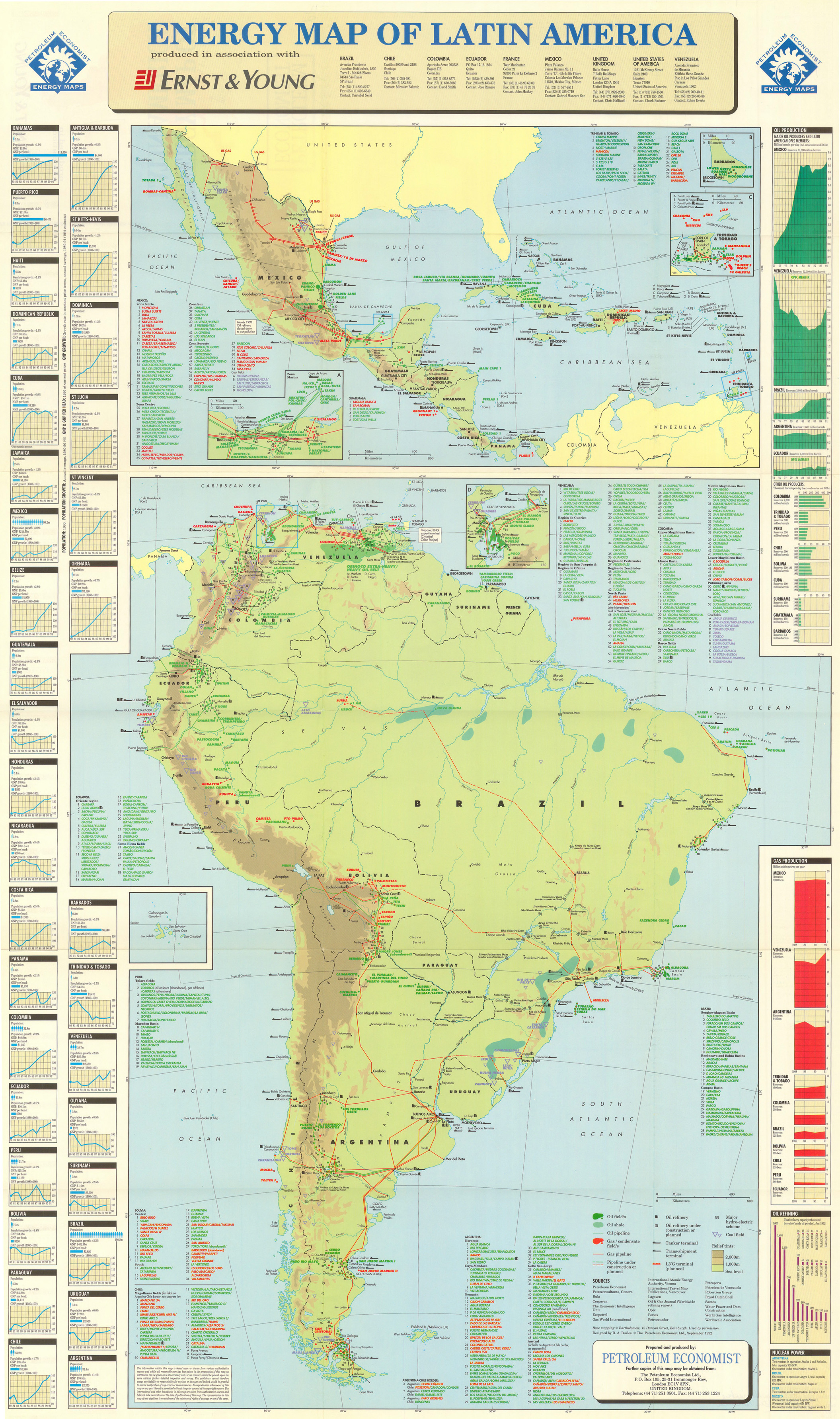
Category Archives: Restricted

Energy Map of Latin America, 1992

Caption

Energy Map of Latin America – Petroleum Economist Energy Maps

Summary

World map shows oil and gas resources for each country in Latin America, providing lists with names of oil and gas fields and pipelines.

Legend at the bottom indicates for both maps:

  • Oil Field (green-colored areas)
  • Oil Shale (light green-colored areas)
  • Oil Pipelines (green line)
  • Gas/condensate field/s (red-colored areas)
  • Gas Pipeline (red line)
  • Pipeline under construction or planned (red/green intermittent line)
  • Symbols for:
    • Oil refinery
    • Oil refinery under construction or planned
    • Tanker terminal
    • Trans-shipment terminal
    • LNG terminal (planned)
    • Major hydro-electric scheme
    • Coal Field
    • Relief tints (2,000 m-1,000 m above sea level, sea level)

Country inset panels on the left provide information about population, Gross National Product, and GNP per capita, and a graph of Gross National Product growth between 1980-1991.

Inset panels on the right include data (of countries for which information is available) on: oil production, gas production, oil refining, and nuclear power.

Source

Petroleum Economist Energy Maps. Produced in association with Ernst & Young Brazil, Chile, Colombia, Ecuador, France, Mexico, United Kingdom, United States of America, Venezuela.

Designed by D.A. Burles.


  • Other sources:
    • Petroconsultants, Geneva
    • Bula
    • Corpoven
    • The Economist Intelligence Unit
    • Ecopetrol
    • Gas World International
    • International Atomic Energy Authority, Vienna
    • International Travel Map Publications, Vancouver
    • Langoven
    • Oil & Gas Journal (Worldwide refining report)
    • Opec
    • Pemex
    • Petroecuador
    • Petroperu
    • Petroleos de Venezuela
    • Robertson Group
    • Royal Dutch/Shell
    • Santos
    • Water Power and Dam Construction
    • World Gas Intelligence
    • Worldscale Association

This map is in the collection of copyrighted maps of the Geosciences and Map Library, Fine Hall (B level), Princeton University.

Call number: LF G3292.L3N3.1992.P4

Copyright

© The Petroleum Economist Ltd., London, United Kingdom, September 1992.

Base mapping © Bartholomew, 12 Duncan Street, Edinburgh.

Series

This map is one in a series:


Emigration of European Jewry at the End of the Nineteenth Century

Caption

Emigration of European Jewry at the End of the Nineteenth Century

Summary

Color-coded map shows countries or regions with various degrees of Jewish emigration, their points of departure, and their main communities.

Source

The Penguin Atlas of Diasporas. By Gerard Chaliand and Jean-Pierre Rageau. Maps by Catherine Petit. Penguin Books U.S.A. Inc., 1995. (p. 46)

Copyright

Gerard Chaliand and Jean-Pierre Rageau

Endangered Earth, 1988

Caption

Endangered Earth, 1988

Summary

This map shows the areas where the earth is in trouble due to carbon dioxide, the greenhouse effect, and other prominent threats.

Paragraphs describing population pressure, air pollution, ozone concerns, acid rain, water pollution, water diversion, toxic wastes, radiation perils, species extinction, fisheries depletion, deforestation and desertification are displayed above the map.

Inset maps: Ice Age Vegetation and the Greenhouse-Effect Vegetation Zones.

Inset timeline: “People and the Planet: a Troubled Partnership.”

Source

Produced by National Geographic Magazine, 1988.

This map is Map Number 1402 in the collection of copyrighted maps of the Geosciences and Map Library, Fine Hall (B level), Princeton University.

Copyright

© 1988 National Geographic Society

Effectifs Diplomatiques Américains

Caption

Effectifs Diplomatiques Américains
(American Diplomatic Service)

Summary

Color-coded map shows U.S. diplomatic presence: density/amount of officers by country; c. 1990s.

This is a copyrighted work. Its use on QED is under the “Fair Use” rule.

Source

Atlas des ɉtats-Unis – Les paradoxes de la puissance. By Philippe Lemarchand, ed Atlande et complexes, Bruxelles, 1997. (p. 169)

Copyright

© 1997 Philippe Lemarchand

Eastern Influences, 500 to 15 AD

Caption

Eastern Influences, 500 to 63 BC

Summary

This map shows the spread of Eastern influence into Europe from 500 BC to 15 AD mostly through trade and expanding empires. One can find these influences in the artifacts that have been discovered in different areas of Europe, from Oriental silks to Scythian Scythian animal-style objects. Evidence has also been found of burial sites of different groups, such as Thraco-Getic Thraco-Getic, as well as evidence of Greek colonies on the Southern coast of France. .

Source

Atlas of World Art (p. 58)
Oxford University Press

Copyright

© 2004 Laurance King Publishing

Distribution of Roman coins in Free Germany prior to 250 A.D.

Caption

Map 7. Distribution of Roman coins in Free Germany prior to 250 A.D.

Summary

Map shows the distribution of Roman coins during the first century of the Common Era.

Source

The Ancient Amber Routes and the Geographical Discovery of the Eastern Baltic (p. 79).

By Arnolds Spekke (Mag. Phil., Dr. Phil., formerly Professor of the University of Latvia).

Published by M. Goppers (Zelta Abele – The Golden Appletree), Stockholm, 1957.

Copyright

Arnolds Spekke, 1957.
Originally from O. Brogan, Trade Between the Roman Empire and the Free Germans, (The Journal of Roman Studies, XXVI, London, 1936).

Cultures – Consumption and Circulation, 1999

Caption

Consumption & Circulation around the World

Summary

These maps illustrate with several examples how globalized the world has become, especially in terms of production and consumption of goods and services

  • Coca-Cola consumption (number of eight-ounce servings per person per year)

Legend indicates (shades of different colors):

    • more than 200
    • 125-200
    • 50-124
    • fewer than 50

Source: Coca Cola Company

  • Vehicles Sold, 1998

Legend indicates (shades of different colors):

    • more than 1 million
    • 100,000-1 million
    • 10,000-99,999
    • fewer than 1,000

Source: Toyota Motor Corporation

  • Theater Admissions to Star Wars, 1997

Legend indicates (shades of different colors):

    • more than 2 million
    • 1 million-2 million
    • 100,000-999,999
    • fewer than 100,000

Source: Lucasfilm Ltd. and Twentieth Century Fox

  • Circulation

Legend indicates (shades of different colors):

    • more than 100,000
    • 10,000-100,000
    • 1,000-9,999
    • fewer than 1,000

Source:National Geographic Society

  • Number of Nestle Factories

Legend indicates (shades of different colors):

    • more than 24
    • 10-24
    • 4-9
    • 1-3

Source: Nestle S.A.

These maps are part of a larger map called [Image:MG©Millennium in Maps – Cultures, 1999.djvu]]

Copyright status

©1999 National Geographic Society, Washington D.C. All rights reserved

Series

This map is one in a series:


Defeat of the Axis in Europe 1942 – 1945

Caption

Defeat of the Axis in Europe, 1942 – 1945

Summary

“Here we see some major steps in the progress toward Allied victory against Axis Europe. From the south through Italy, the west through France, and the east through Russia, the Allies gradually conquered the Continent to bring the war in Europe to a close.” [book] Map of Europe with battle sites and Axis/Allied powers.

Source

Donald Kagan et al. The Western Heritage Since 1300. (p. 1014)

Prentice Hall [Pearson]

Copyright

© 2004 Prentice Hall [Pearson]

Contemporary World – Ship Routes

Caption

Contemporary World – Ship Routes

Summary

Undated map (c. 1962) shows Ship Routes worldwide in nautical miles. Capitals and international and other boundaries are distinguished. World map is laid out as Mercator’s projection.

Hammond Incorporated, Maplewood, N.J., U.S.A.

Source

This map is Map Number 5953 in the collection of copyrighted maps of the Geosciences and Map Library, Fine Hall (B level), Princeton University..

Copyright

Hammond Incorporated, Maplewood, N.J., U.S.A.

Countries from which Jews were expelled, 15th-17th Centuries

Caption

Countries from which Jews were expelled

Summary

Map shows the expulsions of Jews from Spain (the Sephardim) and Italy, their exodus routes, points of departure, and resettlement sites.

Source

The Penguin Atlas of Diasporas. By Gerard Chaliand and Jean-Pierre Rageau. Maps by Catherine Petit. Penguin Books U.S.A. Inc., 1995. (p. 31)

Copyright

Gerard Chaliand and Jean-Pierre Rageau

Contemporary State Religions

Caption

State Religions

Summary

Map shows official religions worldwide, by country, late 20th Century. It also depicts countries according to freedom, toleration or coercion of religion practice (see color shades).
This is a copyrighted work. Its use on QED is under the “Fair Use” rule..

Source

The MacMillan Atlas History of Christianity (pp. 126-127)

By Franklin H. Littell. Cartography by Emanuel Hausman.

Copyright

© 1976 Maps and plans copyright by Carta Ltd. Text copyright Macmillan Publishing Co., Inc.

Commercial Nuclear Power Stations around the World, 1991

Caption

Commercial Nuclear Power Stations around the World – Operable, Under Construction or Ordered – September 1991

Summary

These regional maps (Europe, the Americas, Japan, the United Kingdom, and Africa and Asia) show the location of each plant site with tabular information about the reactor’s net MWe, the reactor supplier, design type or architect engineer, and date of commercial operation.
U.S. nuclear power plants are shown only on the U.S. map, not the worldwide map.
The nuclear power plant totals, and the abbreviations for the name tags are additionally provided.

Source

Nuclear News Magazine, American Nuclear Society

This map is in the collection of copyrighted maps of the Geosciences and Map Library, Fine Hall (B level), Princeton University.

Call number: MC G3201.N35.1991.A4

Copyright

© 1991 American Nuclear Society

Series

This map is one in a series:


Connecting the Planet – Cables and Satellites, 2004

Caption

Connecting the Planet – Communications by Cables and Satellites

Summary

World map shows major fiber-optic submarine cables in service as of 2004 by capacity of gigabites per second.

Countries are colored according to the estimate number of telephone lines and cellular subscribers per 1,000 people as follows:

  • Red: More than 1,000
  • Orange: 501-1,000
  • Amber: 251-500
  • Metallic Gold: 100-250
  • Beige: Less than 100

Second map indicates satellites’ simultaneous call capacity as follows:

  • Violet: Greater then 54,000
  • Red: 36,001-54,000
  • Orange: 22,500-36,000
  • Beige: Less than 22,500

See Wikipedia List of Colors

Source

National Geographic Atlas of the World, Eigth Edition. Published by the National Geographic Society. Prepared by National Geographic Maps for The Book Division, 2005.

Copyright

© 2005 National Geographic Society. All rights reserved.

Series

This map is one in a series:


Commercial Nuclear Power Stations around the World, 1983

Caption

Commercial Nuclear Power Stations around the World – Operable, Under Construction or Ordered – September 1, 1983

Summary

These regional maps (Europe, the Americas, Japan, the United Kingdom, and Africa and Asia) show the location of each plant site with tabular information about the reactor’s net MWe, the reactor supplier, design type or architect engineer, and date of commercial operation.
U.S. nuclear power plants are shown only on the U.S. map, not the worldwide map.
The nuclear power plant totals, and the abbreviations for the name tags are additionally provided.

Source

Nuclear News Magazine, American Nuclear Society

This map is in the collection of copyrighted maps of the Geosciences and Map Library, Fine Hall (B level), Princeton University.

Call number: LF G3201.N35.1983.N8

Copyright

© 1983 American Nuclear Society

Series

This map is one in a series:


Commercial Nuclear Power Stations around the World, 1984

Caption

Commercial Nuclear Power Stations around the World – Operable, Under Construction or Ordered – September 1, 1984

Summary

These regional maps (Europe, the Americas, Japan, the United Kingdom, and Africa and Asia) show the location of each plant site with tabular information about the reactor’s net MWe, the reactor supplier, design type or architect engineer, and date of commercial operation.
U.S. nuclear power plants are shown only on the U.S. map, not the worldwide map.
The nuclear power plant totals, and the abbreviations for the name tags are additionally provided.

Source

Nuclear News Magazine, American Nuclear Society

This map is in the collection of copyrighted maps of the Geosciences and Map Library, Fine Hall (B level), Princeton University.

Call number: LF G3201.N35.1984.A4

Copyright

© 1984 American Nuclear Society

Series

This map is one in a series:


Commercial Nuclear Power Stations around the World, 1982

Caption

Commercial Nuclear Power Stations around the World – Operable, Under Construction or Ordered – September 1, 1982

Summary

These regional maps (Europe, the Americas, Japan, the United Kingdom, and Africa and Asia) show the location of each plant site with tabular information about the reactor’s net MWe, the reactor supplier, design type or architect engineer, and date of commercial operation.
U.S. nuclear power plants are shown only on the U.S. map, not the worldwide map.
Nuclear power plant totals, and the abbreviations for the name tags are additionally provided.

Source

Nuclear News Magazine, American Nuclear Society

This map is in the collection of copyrighted maps of the Geosciences and Map Library, Fine Hall (B level), Princeton University.

Call number: LF G3201.N35.1982.A4

Copyright

© 1982 American Nuclear Society

Series

This map is one in a series:


Colonial South Pacific

Caption

Colonial South Pacific

Summary

Map shows Christian missions in southeast Asia and Australia, c. 1825-1965.
This is a copyrighted work. Its use on QED is under the “Fair Use” rule..

Source

The MacMillan Atlas History of Christianity (p. 112)

By Franklin H. Littell. Cartography by Emanuel Hausman.

Copyright

© 1976 Maps and plans copyright by Carta Ltd. Text copyright Macmillan Publishing Co., Inc.

Colonial Trade in Asia and Africa in the Early 18th Century

Caption

Colonial Trade in Asia and Africa in the Early 18th Century

Summary

This map shows Dutch, English, Spanish, French, and Portuguese colonial areas and European trade routes between them in the early 1700s.

Source

Geoffrey Barraclough. Times Atlas of World History (p. 157).

Times Books Division of Harper Collins Publishers, London. 4th edition, 1993.

GIS Library. Scanned at 400dpi, digitized at 300dpi.

Copyright

Geoffrey Barraclough.

This is a copyrighted work. Its use on QED is under the “Fair Use” rule.

Colonial Penetration 1815 – 1914

Caption

Colonial Penetration, 1815 – 1914

Summary

The map shows worldwide French, Dutch, Ottoman, British, German, Portuguese, Italian, Spanish, Belgian, and Russian colonial empires and influence from the 19th to 20th centuries, with raw exports and sea routes from the colonies.

Source

Geoffrey Barraclough. Times Atlas of World History (p. 241).

Times Books Division of Harper Collins Publishers, London. 4th edition, 1993.

GIS Library. Scanned at 400dpi, digitized at 300dpi.

Copyright

Geoffrey Barraclough.

This is a copyrighted work. Its use on QED is under the “Fair Use” rule.

Christianity in Byzantium c. 787

Caption

Christianity in Byzantium c. 787

Summary

Map shows Christian missionary routes, Muslim invasion routes, Christian/Muslim territories, eastern Mediterranean and surrounding lands, c. 539 – 787.
This is a copyrighted work. Its use on QED is under the “Fair Use” rule..

Source

The MacMillan Atlas History of Christianity (p. 23)

By Franklin H. Littell. Cartography by Emanuel Hausman.

Copyright

© 1976 Maps and plans copyright by Carta Ltd. Text copyright Macmillan Publishing Co., Inc.

Christendom and Islam (c.800-850 A.D.)

Caption

Christendom and Islam

Summary

Map shows the spread of Islam, its conquests, power, and territories. Colored areas depict the Byzantine Empire, Charlemagne’s Empire, papal and Christian states, locations/names of pagan peoples, and the northern raid routes.
This is a copyrighted work. Its use on QED is under the “Fair Use” rule..

Source

Atlas of Man and Religion (p. 115)

By Gordon K. Hawes, The Religious Education Press, a member of the Pergamon Group, Oxford, 1970. Layout and maps by Stanley Knight R. R. G. S.

Copyright

© 1970 Gordon K. Hawes & Stanley Knight

China c. 1860 and Inroads in China by 1912

Caption

China, c. 1860, Inroads made by foreign powers in China by 1912

Summary

The state of China in 1860 with internal uprisings and the threat of colonization from Russia and Britain. By 1912, the influence and power of foreign powers had increased, compressing the borders of China.

Source

The Penguin Atlas of World History Vol. 2 (p. 90)

Copyright

© 2003 Penguin

Chemical, Biological and Nuclear Weapons, 2005

Caption

Conflict and Terror: Chemical, Biological and Nuclear Weapons, 2005

Summary

In these maps countries are colored according to the presence of chemical, biological and nuclear weapons.

Legends indicate:

  • Chemical weapons possession (mainly poison gases and nerve agents):
    • Cerulean blue: Declared stockpile now being destroyed
    • Cornflower blue: Undeclared stockpile or development program
  • Biological weapons possession:
    • Olive grab: Suspected offensive development program
  • Nuclear weapons possession:
    • Alizarin: Declared stockpile
    • Gamboge: Undeclared stockpile

Source

National Geographic Atlas of the World, Eigth Edition. Published by the National Geographic Society. Prepared by National Geographic Maps for The Book Division, 2005, page 17.

Copyright

© 2005 National Geographic Society. All rights reserved.

Series

This map is one in a series:


Central America and the Caribbean, 1900-2000

Caption

Central America and the Caribbean, 1900-2000

Summary

This map shows the impact, influence and role of art in the Caribbean and Central America in the 20th Century. The map indicates places of US intervention, art academies and exhibitions and sites of muralism Muralism. Blue arrows indicate foreign visits and contacts made by artists.

Also indicated on the map are places where major artists were active. In some instances, numbers corresponding to a box on the map with the names and life-spans of these artists are placed next to a red marker.

Additionally, there are boxes of information included on the map,
noting important cities and countries who had international
exhibitions, sites of important murals and artist publications.

Source

Atlas of World Art (pp. 266-267).
Oxford University Press

Copyright

© 2004 Laurance King Publishing

Caspian Sea, 1999

Caption

Caspian Sea and its natural resources

Summary

This poster includes four maps centered on the Caspian Sea:

  • “A Dynamic Landscape” — a topographic map showing groundwater resources and their depletion or pollution.
  • “Major Ethnolinguistic Groups” — an ethnolinguistic map also showing regional conflicts
  • A map showing natural resources (gas, oil, fish), swamps, and pollution
  • A map showing actual and proposed gas and oil pipelines, tanker routes, oil concessions, oil fields and oil ports

The poster also includes two essays (“A Tapestry of Cultures” and “The Struggle for Prosperity”),
and a graph on the Caspian Sturgeon Catch.

“Though called a sea, the landlocked Caspian is geologically the
largest lake on earth, covering more than four times the surface area
of its closest rival, North America’s Lake Superior. Once the
exclusive domain of Iran and the U.S.S.R., the Caspian now figures
prominently in the aspirations of three new coastal states:
Azerbaijan, Kazakhstan, and Turkmenistan. Notorious environmental
negligence and long-suppressed ethnic conflicts — the toxic fallout of
decades of communist rule — challenge the former Soviet republics as
they struggle to build viable economies and stable governments.”

The legend of the ethnolinguistic map is as follows:

  • Altaic
    • Azerbaijani
    • Kalmyk
    • Kazakh
    • Kirghiz
    • Turk
    • Turkmen
    • Uzbek
  • Indo-European
    • Armenian
    • Bakhtiari
    • Baluchi
    • Chahar Almak
    • Hazara
    • Kurdish
    • Lur
    • Persian
    • Punjabi
    • Pushtun
    • Russian
    • Sindhi
    • Tajik
  • Caucasian
    • Chechen-Ingush
    • Dagestani
    • Georgian
  • Afro-Asiatic
    • Arabic
  • Other
  • Uninhabited or sparsely populated

Source

National Geographic Magazine, May 1999. Related article by Robert Cullen, The Rise and Fall of the Caspian Sea.

This map is in the collection of copyrighted maps of the Geosciences and Map Library, Fine Hall (B level), Princeton University.

Call number: MC G5692.C3F1.1999.N3

Copyright

© 1999 National Geographic Society, Washington, D.C.