
Caption
Population by Income Level, 2005
Summary
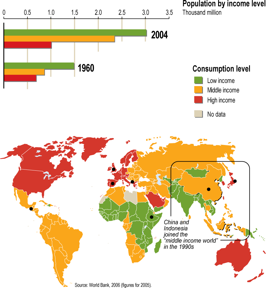
In this map, countries are color-coded according to national income per capita in 2005, categorized as low, middle, and high income. An inset bar chart compares the number of people in each of these categories in 1960 and 2004. “China and Indonesia joined the “”middle income world”” in the 1990s.””
.
Source
United Nations Environment Programme / GRID-Arendal[1]
Cartographer/Designer: Emmanuelle Bournay, UNEP/GRID-Arendal
Primary Sources:
- World Bank, 2006 (figures for 2005)
Copyright
© 2006 UNEP / GRID-Arendal
Licensing
Used with permission.
For use constraints, see [2].
Series
This map is one in a series For a listing with flyovers, see Series:UNEP / GRID-Arendal.