
Image:Mapping the Future of World Population to 2025.jpg
From QED

Size of this preview: 800 × 547 pixels
Full resolution (5,700 × 3,900 pixel, file size: 5.58 MB, MIME type: image/jpeg)

A high-resolution DjVuwp version of this map is available here.
The main map may also be viewed interactively with a Flash magnifier at
[1]
Captions
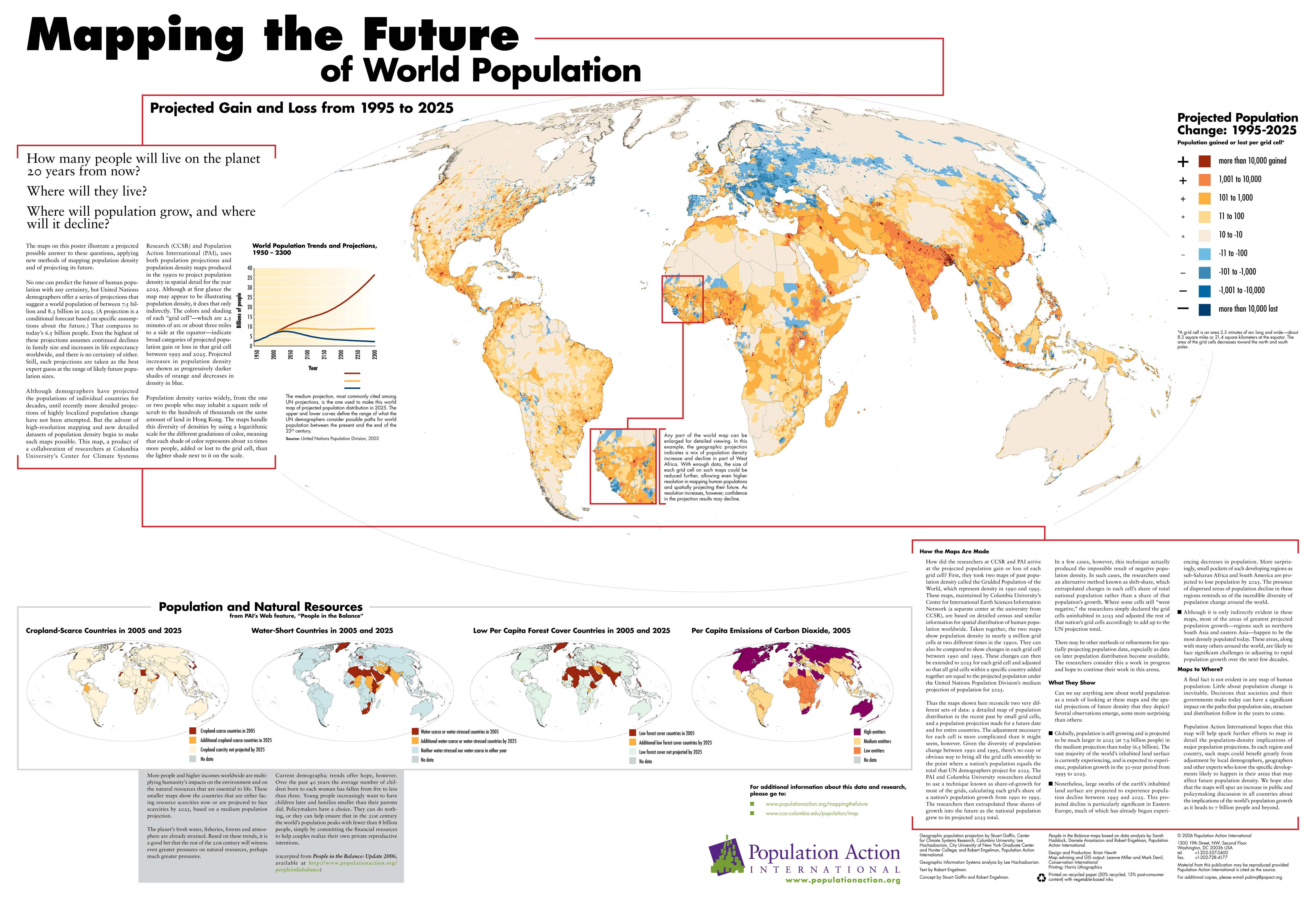
Mapping the Future of World Population: Projected Gain and Loss from 1995 to 2025.
Cropland-Scarce Countries in 2005 and 2025
Water-Short Countries in 2005 and 2025
Low Per Capita Forest Cover Countries in 2005 and 2025
Per Capita Emissions of Carbon Dioxide, 2005
Summary
The main map shows projected population changes per grid cell, each
cell being 2.5 minutes of arc long and wide. At the equator, each cell
is about 8.3 square miles (21.4 square kilometers). The coloring is
on a logarithmic scale.
Most of the text displayed on the map is also available at [2].
For additional information:
Source
Population Action International
Copyright
© 2006 Population Action International
License
“Material from this publication may be reproduced provided Population Action International
is cited as the source.”