
Caption
Energy Consumption Per Capita and Projected Energy Demand, 2004
Summary
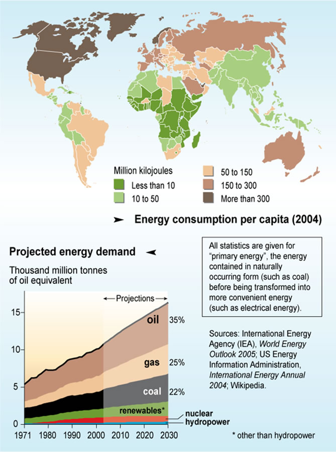
This map shows countries color-keyed according to their per capita level of energy consumption.
Legend indicates:
- Million kilojoules
- Less than 10
- 10 to 50
- 50 to 150
- 150 to 300
- More than 300
An inset graph for the period 1971-2030 shows a projection on energy demand as per thousand million tonnes of oil equivalent.
 All statistics are given for "primary energy", the energy contained in naturally occurring form
(such as coal) before being transformed into more convenient energy (such as electrical energy).
Source
United Nations Environment Programme / GRID-Arendal [1].
Cartographer/Designer: Emmanuelle Bournay
Primary sources:
- International Energy Agency (IEA); World Energy Outlook 2005; US Energy Information Administration;
- International Energy Annual 2004; and Wikipedia.
Copyright
© 2006 UNEP / GRID-Arendal
Licensing
For use constraints see
[2]
Series
This map is one in a series
For a listing with flyovers, see Series:UNEP / GRID-Arendal.