
Caption
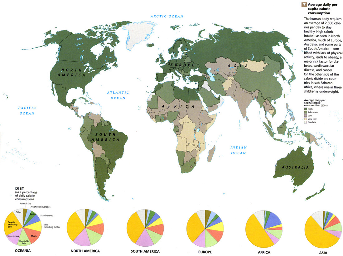
Average daily per capita calorie consumption
Summary
Color-coded world map shows average per capita calorie consumption in the following fashion:
- Fern Green: High
- Asparagus Green: Adequate
- Khaki: Low
- Buff: Very Low
- Beige: No data
High caloric intake is mainly seen in North America, much of Europe, Australia, and some parts of South America. Insufficient caloric intake and malnutrition are seen mainly in Sub-Saharan Africa.
Pie charts at the bottom further indicate dietary habits in each continent.
Source
National Geographic Atlas of the World, Eigth Edition. Published by the National Geographic Society. Prepared by National Geographic Maps for The Book Division, 2005.
Copyright
© 2005 National Geographic Society. All rights reserved.
Series
This map is one in a series:
- Image:Language Tapestry c. 2004.jpg
- Image:MG©Energy and Minerals, 2005.jpg
- Image:MG©Regional Trade Agreements, 2005.jpg
- Image:MG©Flow of Oil in the World, 2005.jpg
- Image:MG©World Grains, 2005.jpg
- Image:MG©World Debt, 2005.jpg
- Image:MG©World Forests, 2005.jpg
- Image:MG©Inter-Region Agricultural Trade, 2005.jpg
- Image:MG©Tourist Arrivals Worldwide, 2005.jpg
- Image:MG©The Internet Explosion, 2003.jpg
- Image:MG©Average daily per capita calorie consumption, 2005.jpg
- Image:MG©Connecting the Planet – Cables and Satellites, 2004.jpg
- Image:MG©Gross Domestic Product, 2005.jpg
- Image:MG©Labor Migration, 2005.jpg
- Image:MG©Chemical, Biological and Nuclear Weapons, 2005.jpg
- Image:MG©Political regimes, 2005.jpg
- Image:MG©Human Trafficking, 2005.jpg
- Image:MG©Peacebuilding, 2005.jpg
- Image:MG©International Migration, 2004.jpg
- Image:MG©Terrorism, 1995-2003.jpg