
Caption
Population, 1999
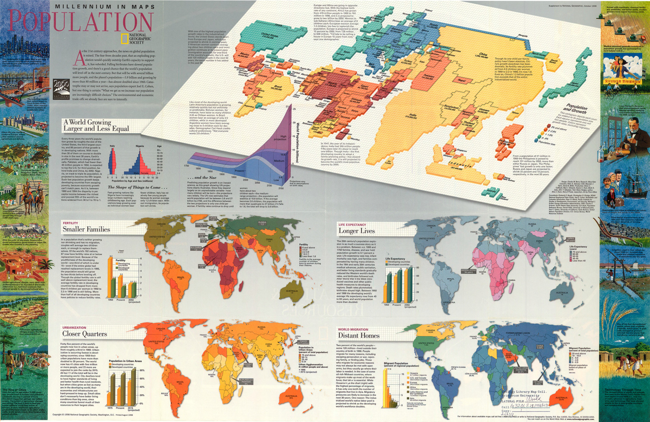
Summary
This poster includes:
- a world cartogramwp depicting national population and growth;
- four world maps on:
- Fertility (“the average number of children born to women during their lifetime”)
- Life Expectancy
- Urbanization (urban population as a percent of total population)
- World Migration
- graphs on population by age and sex for Italy and Nigeria
- a graph showing world population growth from 1750, with three projections to 2150
On the cartogram, each country’s area is proportional to its population.
Countries are color-keyed according to their population growth rates, not including migration.
Additional graphs:
- Fertility in developing and in developed countries (in 1950, the present, and projected in 2050)
- Urban Agglomeration (5 million people and above) in 1998 and 2015 (projected)
- Life Expectancy in developing and in developed countries
- Migrant Population (based on place of birth)
Source
Produced by National Geographic Maps for National Geographic Magazine, Washington, D.C., 1999.
This map is in the collection of copyrighted maps of the Geosciences and Map Library, Fine Hall (B level), Princeton University.
Call number: G3201.E39.1998.N3 (a)
Copyright
© 1998 National Geographic Society, Washington, D.C.
Series
This map is one in a series:
- Image:MG©Millennium in Maps – Biodiversity, 1999.djvu
- Image:MG©Millennium in Maps – Cultures, 1999.djvu
- Image:MG©Millennium in Maps – Diversity of Life, 1999.djvu
- Image:MG©Millennium in Maps – Population, 1999.djvu
- Image:MG©Cultures – Consumption and Circulation, 1999.jpg