
Caption
Wealth Year 1900
Summary
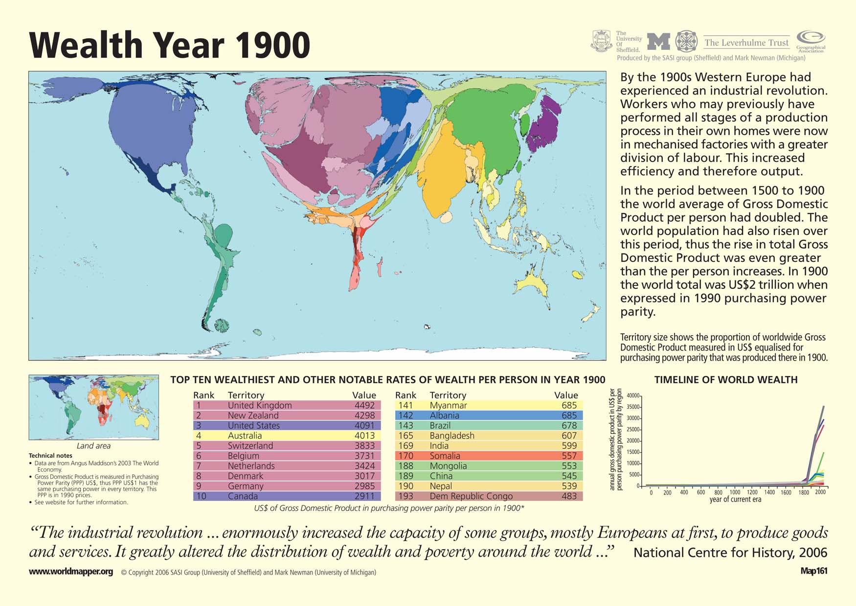
This “Worldmapper” map shows the global distribution of wealth in the year 1900. Territory size reflects the proportion of worldwide gross domestic product (GDP) adjusted for purchasing power parity from each particular country.
The map is accompanied by two tables that show the ten wealthiest countries in terms of wealth per person and show some other other notable rankings. In the tables, wealth is defined as the average GDP per person in purchasing power parity of the US dollar in 1990. There is also a graph that charts changes in wealth over time by region. The great jump in GDP over the past 200 hundred years reflects the increases in efficiency and output achieved through the Industrial Revolution.
Copyright status
© Copyright 2006 SASI Group (University of Sheffield) and Mark Newman (University of Michigan)
Used on QED by permission.
Licensing
All rights reserved