
Caption
Health Service Quality
Summary
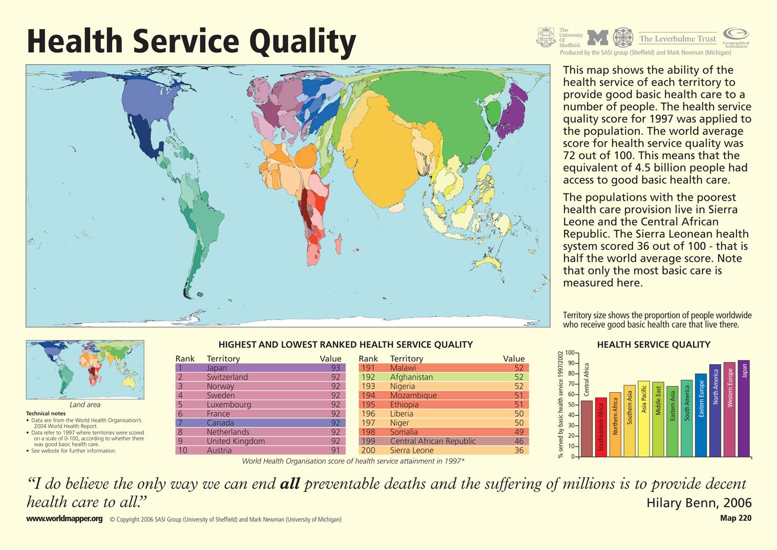
This “Worldmapper” map shows the ability of the health services of different countries to provide good basic health care to their people. Territory size shows the proportion of people worldwide who receive good basic health care that live in a specific territory. India and China are shown larger than normal not because they have high health service quality scores, but because they have larger than normal populations. This map can be better understood when compared to the world map below, which shows country size in proportion to population.

The map is accompanied by two tables that show ranked lists of the ten countries with the highest and lowest health service quality scores. There is also a bar graph that shows the percentage of the population who are served by basic health services by region.
Copyright status
© Copyright 2006 SASI Group (University of Sheffield) and Mark Newman (University of Michigan)
Used on QED by permission.
Licensing
All rights reserved
Source
Worldmapper[1]
Category:Service]]