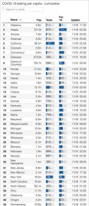
Description:
For this assignment, I thought it would be interesting to investigate each state’s COVID testing capacity to try to gauge its confounding influence on current understandings of the distribution of coronavirus cases within the United States. The data for my visualization was obtained through the data set provided below, which was created as part of the COVID project. As you can see, the original creators decided to list the states, which I thought limited the audience’s interpretation when it comes to comparing larger regional and inter-state discrepancies. While most discourse and data pertaining to COVID-19 is centered around the number of cases, the impact of testing is often overlooked. As such, I thought it would be valuable to map out the differences to visually assess the landscape and identify any patterns, as it lends insight into the accuracy of each state’s confirmed case rate.
After completing the first graphic, I then similarly mapped out each state’s confirmed case rate to cross reference between the two visualizations. This yielded a few key observations. Of these, I personally found Oregon’s extremely low testing capacity and low confirmed case rate to be the most noteworthy, as I have always considered them ahead of the curve in terms of listening to the science and making data-driven decisions (marijuana legalization, drug decriminalization, etc). This has really made me question what is driving this trend – why is their testing capacity so low? Is it a lack of state or federal funding? Pennsylvania also really stood out to me because it had the lowest testing capacity (0.2154%), but still had a relatively high confirmed case rate (0.6019%), which indicates that the pandemic has probably hit that much area worse in reality. Texas and Florida also reflected this dynamic, although I wasn’t necessarily shocked due to the press coverage these states have received in recent months. Lastly, I was surprisingly impressed by Alaska’s response to the pandemic. Despite being a Red state, Alaska appears to have been able to capitalize on their geographic isolation and low population density, as they not only have the highest testing capacity (1.15%), but also the second lowest confirmed case rate behind Hawaii.
Original Data Visualization:
Hi Zack, I think your choice of using a spatial maps in order to visualize the original data visualization really helped to contextualize all the floating numbers in the chart by allowing us to compare not the same state to itself but also to all other states. The insights that you brought up are really interesting in that the news mostly focuses on the lack of testing capabilities yet your maps reveal and allow us to question and guess why certain states, like Alaska, were able to respond better than others.
I was thinking maybe another way to approach this visualization is to take the difference between each state in terms of testing capacity and confirmed coronavirus cases (testing capacity-confirmed coronavirus cases). This might lead to more insights about the level of over or under preparedness that the states might have in terms of testing than having to kind of guess between the difference between two shades of colors. I also wonder if there’s way to further disaggregate this data to see the distribution of testing capabilities as well as coronavirus cases to see if there’s any correlation.