Grace Logan, November 3, 2020
DataI had a few false starts with this assignment, which ended up revealing to me some “data gaps”. I had initially gone to Facebook to get a copy of my data and activity from the last week. This would have included posts, photos and videos, comments, likes and reactions, friends, stories, messages, groups, events, pages, and so forth. Unfortunately however, I did not have much data from the past week. I did not realize how little I actually use Facebook. I am not active in any groups or pages and I don’t really look at what my friends post. I realized that I had thought I was a more active user simply because I use Facebook messenger. So my messages from the last week were available, but there was not much to look at because I had begun using other messaging apps.
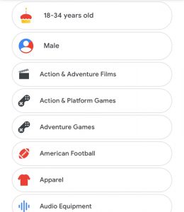
I then checked my ad settings on my Google account to see what they thought I was interested in. I compared the ad settings of my personal account with my school account and found that they were very different. Even though I use my personal account more frequently, I felt that the personalized ads for my school account were actually a better fit. If you showed me both side by side I would think the school account was me, and the other was a different person. When I looked further into the reasoning behind each characteristic I found that on my personal account it was often because I had visited the advertisers site, while on my school account it was based on an aggregate of my searches and activity. Many of the sites that it listed I had visited on my personal account, I only recall visiting once or twice, and usually for a specific reason.
It was interesting to me that even though I had visited these specific advertiser’s sites I did not really identify with this “pixelated self” that Google made of me. On the other hand though, just by looking at an amalgamation of my search engine history and watch history on YouTube and comparing it to information they have on others with similar histories, Google was able to paint a picture of me that I felt was more accurate.
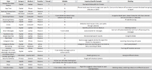
| School Account |
Reason |
Personal Account |
Reason |
| Indie and Alt Music |
search/history |
Target |
visited |
| Local News |
search/history |
Home Chef |
visited |
| Comedy Films |
search/history |
YouTube |
visited |
| Drama Films |
search/history |
P.F Chang’s |
visited |
| Dogs |
search/history |
Dove |
visited |
| Career Resources and Planning |
search/history |
Allure |
visited |
| Books and Literature |
search/history |
Bloomberg L.P. |
visited |
| Urban Transit |
search/history |
Coursera |
visited |
| Not a Parent |
search/history |
Etsy |
visited |
| Home improvement |
search/history |
25-34 yo |
info I gave |
| Homeowner |
search/history |
Female |
info I gave |
| Single |
search/history |
Married |
search/history |
| Household income: High |
search/history |
Household income: Upper middle |
search/history |
I went to my screentime to see the apps that I was using, hopefully to lead me to a digital location (if that term makes sense) where I have more activity, and so more data. I realized that there is actually an app that I use very consistently to track personal data. I use a mood tracking app called Daily.io and am currently on a 51 day streak.
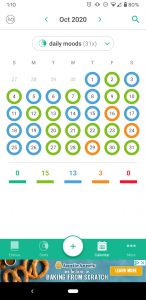
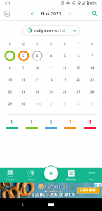
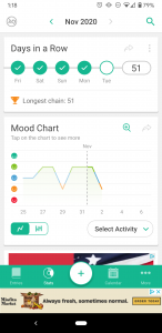
I appreciate how easily the app allows you to visualize the trends in your moods and frequency of activities that you track. The way that this app functions allows you to see potential correlations between different activities and your moods. This seems like an example of personal data collection and visualization that feels empowering as Boyd and Crawford discussed. I looked further into what the app states it does with the data. They claim that if you agreed to data collection they use Google Analytics to collect device IDs and usage information “in order to understand usage patterns and to improve our Android app”. The app claims that they do not collect any personal or identifying data such as your name, surname, email or anything you type in the app. The app does have ads, since I refuse to pay for the adless version, and claims that these ads are not based on entries on the app. Instead they defer to Google’s AdMod, so this probably uses similar personalization as I listed above.
Anna Durak, November 3, 2020
DataBefore starting to reflect on my data footprint, I had believed that I did not produce that much data, like how much digital data can I actually produce? Then I realized I have 4 devices that I use every. single. day. My watch tracking my every move, literally. My phone, iPad, and computer. At that realization, I was very overwhelmed. I did not know where to start so I just started going through the screen time on the devices, all of which are fairly high because I am a week and a half into a quarantine. Upon this reflection, I realized that all of the data that I have produced in the last week of this journal would automatically be skewed because I had lost the regularity of my routine. Where I normally would have data that showed my movement from the house to the Y, the grocery store, a drive, but nothing. The only movement I have had is from my room to the kitchen, maybe just outside of the house to the beach. On top of this, I did not have my normal YMCA check-ins, workout data, grocery store visits, gas. What I did have was exorbitant amounts of time on streaming services and loads of notifications from my watch telling me to get back on my routine. I decided that for my data journal, I wanted to look at the discrepancies in my routine data footprints to my quarantine data footprint.
I found it rather interesting to first look at some of my watch data, specifically the daily activity tracker. I like to wear my watch every day, no matter what, and I only take it off to sleep so that it can charge up and be ready for the next day. I included a screenshot of my activity data and it interestingly reflects the time I have been in quarantine rather well. I went into quarantine on the 25th, a day where I barely had any activity. My data since then has been very inconsistent in comparison to the rest of the month of October.
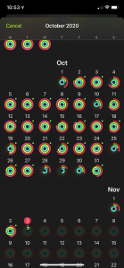
I also decided to take a look at a few of the specific days, the 24th- the day before quarantine, and the 29th. 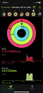
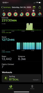
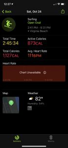

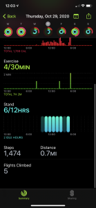
Looking at this data now I am realizing that even though I thought my watch was recording the data correctly, it was not all completely correct. Sometimes the watch records standing hours falsely. I did not exercise at all on the 29th, but it recorded that I was active for 4 minutes. Something that I also did not realize before this was the amount of detail that is recorded for every workout I do. The place, the temperature, the humidity, the exact times. I also have the power to share my daily activity with my friends in an easy way, while simultaneously being able to track the other person’s daily data, what they did, where they did it, the weather at that location, etc.
But perhaps the most overwhelming is that this was two days, on one device. I can go back to when I first got this watch and look at the data for every day that I have worn it. The device compiles all of this information about me, my heart rate, my trends, and comes up with tailored suggestions for me, not unlike the ads that I receive on my phone. One thing I have noticed on my phone, which is connected to my watch, is that I have more ads geared toward surfing. That is kind of unnerving but here we are. I get ads about wetsuits, Instagram shows me surfing videos, my Facebook shows me surfboard giveaways. Much of my tailored data is centered around this hobby that I track on my watch. My watch has created a representation of me that is only partially true but yet is present in all of my digital endeavors.
Matthew Gancayco, November 3, 2020
DataPersonalized advertisements and there accuracy have been a hot topic for the past couple years. As someone who often experiences the phenomenon of thinking about a product and it appearing in an ad while I’m surfing the web, I find it both convenient and unsettling that websites are becoming so effective at targeting audiences. It makes it hard to believe that the phone isn’t listening to you. Or is it?
I admit that my phone has become an attachment of my body at this point. After opening my phone activity for the past 10 days, the average screen time per day was 8 hours. The most used app was Youtube, which I had used for a staggering 45 hours during the 10 day period. I like to keep videos playing in the background during the day, whether it be while exercising, cooking, etc. For my data entry, I decided to look at the ad personalization that Google had given to me. Google has a list of ad categories that it believed to be preferable for me. This list is generated from my profile and activity. As I sifted through the list, most of the categories seemed accurate, such as comedy and video games. There were occasional categories in the list that seemed completely inaccurate such as patio/lawn care or swimming. This data is based on past activity, so although I may have clicked on a video in the past I may have no interest in the topic.
In order to measure the accuracy of Youtube’s digital identity for me, I pulled up the ad personalization that Facebook, a website I use much less, had documented for me since I created the account in 2009. As expected, Facebook’s list was much longer and more broad. It also includes specific things such as sports teams, actors or businesses. The list is made from my profile and pages/ads I have clicked in the past, so the range varies greatly. There are too many to include in this post.
For both Google and Facebook, my identity was based on my activity on the platform. Therefore, all the site can gather is what I prefer when using that specific platform. The fact that I use Youtube more frequently enables it to be more accurate than Facebook.
This data could be divided into two categories, that which is accurate and inaccurate. Just going off of my clicks, both sites will not be able to decipher between my interests and disinterests. I may click on some subjects more than others, but the existence of a click on a video or ad implies interest. If it were possible to look at every click I’ve made on both sites and divide them into an interest and disinterest, my digital identity be more accurate.
The limitation of the platform of basing your identity off of usage is the most obvious. Both websites can only analyze your activity, so if you aren’t active your identity will be inaccurate. In many ways this data used to be considered private, but I would argue that this data is now public and the only private data you own is that which isn’t recorded.
Recently, a class action lawsuit was filed against Google for tracking user data when using incognito mode. Although it is advertised to be a private browser mode, websites were able to mine information from users while using the setting. This is just another reason why what used to be considered private data is in fact the opposite.
Phone Activity

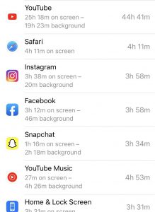
youtube
facebook
Maya Stepansky, November 3, 2020
DataFor my data, I decided to look at the data that was generated through my use of the app Instagram, but more specifically, looking at the insights section of the app, which provides data on my follower demographics, their actions, and my content reach. Here is the first data page that I looked at:
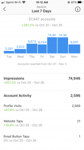
This page shows me my content reach (the amount of people who have seen my content whether or not they’ve clicked on it or not) within the past week (Oct 27 to Nov 2). The number at the top says 57,447, meaning that my account has reached about that many accounts this past week, which appears to be a 381.2% increase from the week before. Now, these numbers are very very large and, though they give me a rough a idea of the scope of my audience or at least how many people have seen my content, it is not the kind of data that tells me exactly who the users are that can see my posts — I simply do not have access to that unless someone actually interacts with my post by liking/commenting on it. Is this large categorization of data by instagram an example of what we’ve talked about as Big Data? The rest of my screenshots of the insights section do a similar thing of grouping binary data into categories, which make it appear more accessible. This insights page seems to act as a compression of my raw data, which makes it more accessible to user — who would want to scroll through the hundreds of thousands of accounts that come into contact with your content in some form or another? In this situation, it appears that compression of data may equal accessibility. Unlike the essay on mp3 encoding which compresses data into something that appears to sound exactly the same from the human ear, this type of compression in instagram insights is much more visible and generalizing. Also, though it’s being “compressed”, which is synonymous with making something smaller/more compact, it is rather ironic that, in fact, this is possible turning into Big Data, as you will go on to see that that further generalized categorization of this data. Also, keep in mind that these terms above, such as impressions, content reach, etc, are rather vague, and so to a regular user like me, was not exactly clear–I had to search up online separately to understand what each category actually meant- it was not the most intuitive and intelligible in familiar language. I think that this page could have benefitted by providing the definitions for the categories, since most people do not have the patient to look up their exact meanings separately.
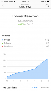
Next on the insights page, we have data on my audience, and specifically on my follower growth over the past week. This is yet again, another example of a categorization and generalization of my data. I cannot see who exactly has followed or unfollowed me, but I get an overall sense of my growth. This is an example of data that has already been measured for me– I wouldn’t say that there is much else that I can do to analyze or generate new data for myself.
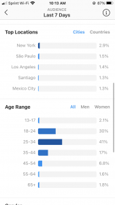
This next screenshot shows what cities/countries are particularly seeing my content from the past week, and what age ranges (both men and women) are seeing my content. To me, it is very fascinating that my content would be seen in Sao Paulo, Santiago, and Mexico City. I would love for this insights page to show me the data trail that leads to my content being shown in these cities. This made a little more since when I went to look at my top countries, and Brazil and Mexico were just below the US.
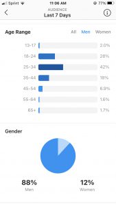
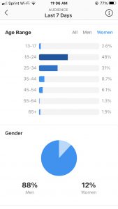
This next page shows the overall gender breakup by age. It made sense to me that 88% of my audience is men and 12% women, since I post a lot of drum videos, and the drumming industry has been historically dominated by men. However, it is particularly fascinating the way in which the age range of men and women particularly highlights this issue. The more I have grown my account, the more my page has come into contact with professionals in the drumming community who are likely to be particularly in the age category 25-34 and 35-44. As you can see, the age category of 25-34 is dominated by 42% of men, while a similar number, 48%, is dominated by younger women in the 18-24 category. I really do believe that this piece of data points to the great disparity in gender in the drumming community– and it so interesting that this small piece of data from an instagram insights page can point and give evidence to this larger issue.
What’s also interesting about this form of data, is that it is less about creating a “pixelated” form of myself that was discussed in the Schull and Ruckenstein reading, but more about a possible pixelated version of the audience that my content is targeting. Does this data give an authentic picture or identity of the current drum community? Is this kind of data about an audience more accurate in curating an identity of a community than of one’s individual personhood? I think that this is possible, since it’s probably easier to understand that generalizations of a large community than it is to understand the complexities of a single person. I am also wondering if that data page which focuses on my content and the users I reach can still tell me anything about myself. To be perfectly honest, so far my Instagram page itself has been mainly used for the career side of my identity, therefore, I would say that these insights do not say much about anything personal to my identity other than that I am a musicians. Possibly the artistic choices and the song I choose to play to might certainly say something about my taste and music and could affect who my audience is. Having Los Angeles and New York City (2 of the mainstream music capitals of the country and the 2 cities I hope to live in after school) as my top cities certainly indicates the type of scenes I would like to find myself in. However, do a person’s audiences really tell them anything about their own personal identity? I think, certainly not. I believe that external response is completely separate from individual identity, however, it can certainly affect a person’s perception of themself if they let it.
Ailee Mendoza, November 3, 2020
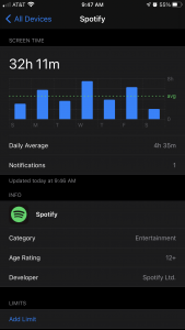
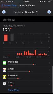
DataI’m not very good at data/technology stuff in general, so I went to Settings on my iPhone and visited the “Screen Time” page for the first time ever to see what kinds of habits I could track for myself. As many of my friends could tell you, I’m an avid Snapchatter and I’m pretty responsive over iMessage at all times, so I was STUNNED to see that my most used app in a week- by far- is Spotify According to Screen Time, my daily average last week (10/25-11/1) for using Spotify alone was 4 hours and 35 minutes. This added up to a total of 32 hours and 11 minutes of usage over the course of 7 days with my second most-used (Snapchat) being only 10 hours and 44 minutes.
I decided to “track” my Spotify usage over the course of a few days to see what kinds of patterns I would find: when do I listen to music the most? Is it active listening? What are the ways in which I interact with the app that I didn’t really notice before? Where do these 32 hours come from? I created an Excel sheet where I could input time stamps for when I started and stopped a listening session, and I added in some columns where I could describe the listening experience. I recorded playlist name(s) as well as the physical activity/tasks I was doing while listening. Since Spotify is a pretty portable app that can be synced across multiple devices, I also included a column for what listening “medium” I was using during a given session.
Tracking my Spotify data turned out to be a very hands-on- at times tedious- but reflective process. Because turning on music (very apparently) seems to be an unconscious habit for me, I had to constantly remind myself to be aware of what playlists I was selecting when I got in the car, when I started and stopped listening, and what my general mood was during the experience. I relied primarily on an app called Life360 (glorified Find My Friends that me and my family use to keep track of each other) to tell me when I left the house and for how long I drove so that I could figure out the approximate duration of a listening session. I also used my call log and my text messages as reference points (a certain listening session would end when Anna called, I started a listening session after responding to a text from Renie, etc.) I also took note- when I could- of how I was feeling and why I may have chosen a particular playlist. Sometimes I just needed background music on a drive throughout which I was accompanied by my friends, but other times I deliberately turned on music I could sing to or would enjoy at a given moment.
Some general things I noticed from tracking this data is that…well, first: I drive a lot. My primary listening device is Carplay, which means that the majority of time I spend using Spotify is when I’m on the go. The descriptions for these listening sessions consistently state the locations to which I’m traveling, indicating that I don’t just drive to…drive. There is always an objective, or a purpose beyond just listening to music. It reminds me a lot of the MP3 article; the portability of music is more valuable than the music itself, as my activity indicates.
Looking at the correlation between my playlists and the activity descriptions was perhaps the most interesting aspect of the data…to me. I could immediately tell from my choices what I was feeling at the time, or for what purpose I was listening in the first place. For example, Friday, the first day I started tracking data, was a very rainy and cold day. I also have no swim practice on Friday’s, no class, and I was actually fighting with my best friend on this particular day as well. I see that I listened to 4 Coldplay albums all the way through on that day. I know Coldplay pretty well, so this data to me suggests- no, screams– that I needed to keep myself busy by not only going on drives to run random errands, but also to keep my mind busy with singing lyrics. On the other hand, on Sunday, I hosted a little post-Halloween party at my house. I can clearly tell that the music served as social filler, as I quite literally only listened to “Swim Vibezz,” an upbeat and primarily modern pop/EDM playlist, and “On Repeat” which is a Spotify-curated playlist that throws your 100 most listened to songs at the moment together. Most of the songs on “On Repeat” are from “Swim Vibezz,” so I think of the two playlists as interchangeable. My listening time on Sunday was during car rides to pick up/drop off my friends, so clearly I was paying more attention to interacting with them than to the music itself.
I know by all means that my data isn’t the most quantitative or even intelligible in any way to probably anyone other than myself, but my main takeaway from this exercise was that- as Renie said in her post- there is a lot of data consistently being recorded even when we don’t realize it. My “On Repeat” playlist is a perfect example of this unconscious interaction/user participation: although it seems crazy, I interact with Spotify for 32 hours a week literally just by turning on my car and choosing music that I don’t even end up REALLY listening to. From this data, Spotify figures out what songs I tend to skip, what songs I listen to all the way through, what songs I select as the “starting point” for my seemingly mindless listening sessions and feeds this data back to me in a neatly packaged “On Repeat” playlist. It’s all very clever, really. I think a major hole in my methodology is created by my subjectivity. I don’t think anyone else would be able to interpret and to draw the same conclusions about my active listening habits, let alone decipher the playlist names, because they simply just…weren’t there. And here is where I start questioning the “objectivity” and the portrayal of lived realities in ethnography again…
Here is the link to my spreadsheet and also a few screenshots showing my insane Spotify usage! (Note: my Carplay data is also included in my iPhone data because it’s Bluetooth that is connected to my phone.) Truly learned a lot from this activity, like how my iPhone storage is probably always full because all of the cached data on Spotify…
https://docs.google.com/spreadsheets/d/1-Yt22O_hUlhuFP0X1nHPJxU4GjO-kpYThb07_brkZYQ/edit?usp=sharing
Cynthia Vu, November 3, 2020
DataFor my data journal, I decided to track information about my grocery purchases. Going grocery shopping and cooking are some of my favorite hobbies, but it is only fairly recently that they have become regular activities for me. I have been cooking for myself since January 2019, when I was studying abroad in London. One of the most fascinating things I’ve realized in these past two years is how much what I decide to buy, to cook, and to eat is dependent on my physical location and what grocery stores are available in the nearby vicinity. For example, the King Soopers in Denver sold a cornbread loaf I especially liked, but is unique to the King Soopers brand and is not an item I can easily purchase elsewhere.
I assembled examples of the different ways that grocery stores tracked my purchases and data here: https://docs.google.com/document/d/1uMLp2VzeTkmfopgoljgBvmGVvvWh2HuFCKaBUG_4Hg0/edit?usp=sharing. This is an example of a recent, manual way in which we are keeping track of grocery shopping data:
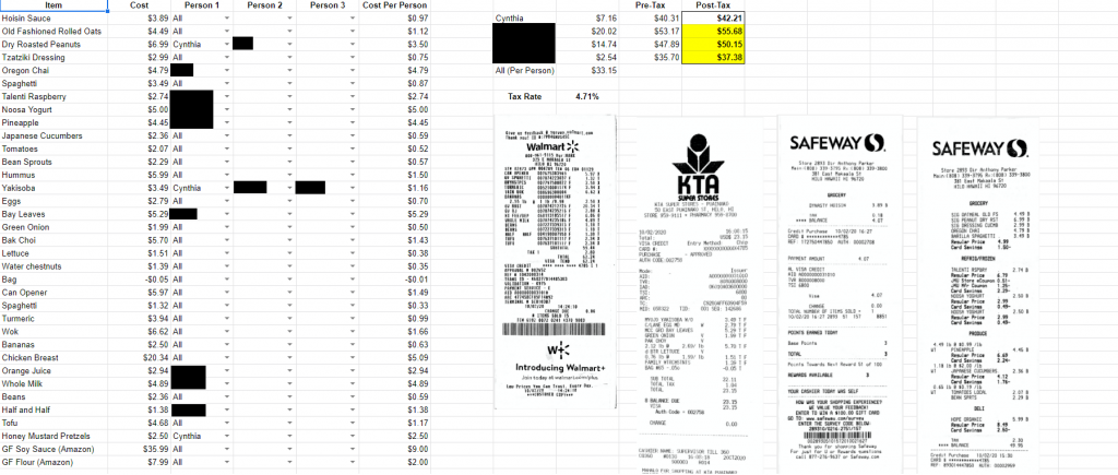
All receipts specify the time and location of a grocery purchase, and as I always pay with a credit card, that information is also tracked in my bank account statements. For some grocery stores, I don’t have an app or an account that allows me to associate a unique number with my identity and purchases, and as such the only records I have of my grocery purchases exist in my bank statements (and maybe in photos I took of either the groceries or the meal I made from the groceries). I was interested to see that the Wegman’s app also directly records the exact time that a single transaction occurs, as opposed to King Soopers which only records the dates of individual transactions, or Safeway which only lists past items that I have purchased in a random amalgamation. Although I can sort my Safeway purchases by category or frequency of purchase, the app and website do not allow me to view individual transactions. For some reason, I was also unable to find the past purchases associated with my Shoprite account, even though I have definitely shopped there using the ID on my app. Finally, since I have been in Hawaii, I have been more strict about explicitly keeping track of my grocery store purchases, since we are now buying groceries as a household.
One of the most significant things I’ve noticed in my attempts to track down data about my grocery purchases from the past two years is how each grocery store app is designed differently and also records data differently. I wonder at some of the decisions made behind those designs. The Safeway app design seems especially brutalist, as it uses the least helpful method of displaying past purchases to a user. However, the information that it records about my purchases is used to recommend to me a specialized set of coupons each week based on what I’ve purchased and might be interested in purchasing. On the other hand, the Wegman’s app seems most thorough for specifying the times of my transactions, but this also seems like unnecessary information to record. I wonder at what data these apps are recording but not necessarily displaying to their users.
Having already mentioned that my grocery purchases are impacted by my physical location, of which there are a total of four different locations specified by my data sheet (London, Denver, Princeton, and Hilo), I would like to more closely examine what sorts of items I was repurchasing in one location or what items I was repurchasing across all locations and try to contextualize why this was the case. For example, I know that I purchased a lot more bread when I was in Princeton than I do here in Hilo. At Princeton, I wanted to be able to make quick lunches for myself to accommodate the more busy schedule. Here in Hilo, I rarely leave the house, and thus have more time to make a more complex lunch. I’m curious to see what other habits can be gleaned from my grocery shopping data, and what that might say about me.
The Ruckenstein and Schull article about the datafication of health addresses the concept of a “pixelated person”, a person split into parts through their presence across digital spaces. I’m interested in how this intersects with the concept that “you are what you eat”, which is best recorded through a person’s grocery purchasing habits. Ruckenstein and Schull suggested that individuals who have access to their own personal data could discover new information about themselves and take greater agency of their lives. I wonder if a closer examination of my grocery data would cause me to make any changes in my life.
Zack Kurtovich, November 2, 2020
DataFor my data journal, I was presented with the daunting task of distilling my digital footprint into a few screenshots and a single, cohesive post. From clickstream data to financial transactions, there were innumerable data sets to choose from, each one representing a different aspect of my behavior and personality. As such, for the purpose of this post, I decided to restrict my analysis to the three most invasive forms of data mining monitoring my daily life. Thus, I will be examining the data “exhaust trails” collected by my Health app, intelligent alarm clock, and Alexa in order to examine the implications of Greenfield (2016)’s “pixelated person”.
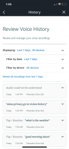
To start, I first inspected the Alexa located in my dining room to try to determine the degree of surveillance I am subjected to. Over the past 7 days, my Alexa reportedly made 36 different recordings of my family’s conversations, averaging out to around 5 recordings a day. I was actually not aware that they are legally allowed to record me and considering the limited amount of time my family spends in that room each day, this statistic is truly deeply concerning. In fact, the phrase “alexa privacy go to review history” from the screenshot’s second data entry is literally a direct quote from when I was instructing my sister on how to obtain this data. Although most of the recordings provided in the Alexa app were of mundane and admittedly insignificant interactions, it begs the question: if Alexa has publicly demonstrated a capacity for this sort of panoptical surveillance, what are they recording and listening to without disclosing to the consumer? This challenges the validity of the consumer’s consent by interrogating the informed status of relationship and agreement.
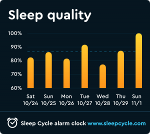
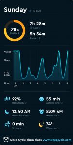
To further illustrate the invasiveness of my digital surveillance, I similarly chose to examine an app called “Sleep Cycle” that monitors my REM cycle and sleeping patterns in order to assess the quality of my rest and identify the least abrasive time to administer my alarm. In this case, I was complicit in my surveillance, as I willingly forfeited my privacy in order to enjoy the practical advantages associated with my sleep’s datafication. As such, I find Sleep Cycle’s corporate surveillance to be less disconcerting despite the intimate nature of the information, which speaks to the incentives facilitating this collective encroachment of our rights. In many ways, Sleep Cycle gathers more personal information than Alexa, as it does everything from tracking what time I went to bed to recording my snoring whenever I have a stuffy nose. As exhibited by the provided screenshots, the app monitors the ambient temperature of my room, my body’s response to auditory stimulus, and the “regularity” of my sleep at any given point in my REM cycle. However, personally, this is still not nearly as alarming as Alexa’s omnipresent, panoptical surveillance, at least not at first glance. This once again underscores the importance of informed participation and supports the argument against the increasing prevalence of what I refer to as “one click consent”.
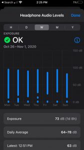
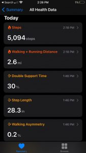
Lastly, for this post, I decided to provide some of the health data collected by Apple’s fully integrated “Health” app. Data from this app will likely be extensively discussed in other posts given its importance in the iOS ecosystem, so I will only briefly touch on the information and insight it provided. That said, I thought it provided a valuable encapsulation of the inverse correlation between technologization and privacy. Of course, the app recorded my daily number of steps and the distance I travel on a daily basis. However, beyond that, the app also calculated my estimated step length, my walking speed, the asymmetry of my gait, and my average headphone level. Although conceptually I was aware that my activity, from the location of my cursor to the time it takes me to swipe through a series of Snapchat stories, is all tracked by someone, to see my unconscious behavior unknowingly quantified and displayed was jarring, regardless of its possible benefits. Even though I was cognizant of their sophistication when I upgraded to AirPods from simple headphones, I never considered that it would retain information of our interactions. As more “smart” devices become integrated into the technological landscape, this will undoubtedly occur with increasing regularity, emphasizing the necessity for a more thorough consideration of their potential consequences.
In conclusion, my data journal supports the conception of the “pixelated person” by demonstrating how intense data mining can delimit a well-rounded, incredibly detailed depiction of an individual. Furthermore, it is important to keep in mind that we are only interpreting data these companies have willingly disclosed, which suggests that these representations are probably even more complex and nuanced in reality. Given the astonishing granularity of the collected data, at a certain point, it becomes almost impossible to separate the person from their representation. After all, how am I different from my heartbeat? Through this exercise, I was not only reminded of the unrelenting, unblinking gaze of digital surveillance, but also alerted to the centrality of consent which it comes to defining the relationship between technology and the individual. If consent is coerced, irrevocable, and uninformed, then it was never truly given. Thus, future policy solutions should aim to target this erosion by implementing stringent transparency requirements. That said, there are still some lingering points of uncertainty. Would a consumer or industry-oriented solution be more effective? Is it even possible to mitigate digital surveillance at this point? How are we supposed to hold corporations accountable for their surveillance when we can’t even do so for our own government? I’m looking forward to hearing all of your insights tomorrow!
“Alexa” Data:
“Sleep Cycle” Data:
“Health” Data:
Rei Zhang, November 2, 2020
DataData Journal:
Above is a spreadsheet, which is how I chose to record my data journal: as a list of some of the ways I generated data this past week.
Data simply describes the data; some are specific, like Amazon purchase history, whereas some are more general, such as Browsing History. I attempted to categorize the data into ‘types’, as seen in the Category column. For example, location data was classified as Privacy, whereas my steps seem to be health data. Medium is the technology or method by which my data is collected, the container, or the transmitter, so to speak. Passivity tracks whether the data is generated automatically, or if I choose to track or type up my own data (Active). Notably, only the two sources of data that I choose to track myself are guaranteed to be private to only me; other sources are able to be leveraged as part of larger datasets, such as my google searches or email statistics.
I addressed the question of access in two different ways: the columns of Viewable and Editable. Viewable means that I can view the data, whereas Editable means that I can choose to delete (most important!) or change the data in some way.
Impetus/Specific Example is a column for me to note what incidents prompted me to write them down in this data journal, and Blocking is a column for me to note down how I can create gaps or otherwise disrupt the recording of my data, if I choose to do so.
Notably missing from this log are interactions with non-digital things, or in-person conversations. If I wanted to create maps or visualizations of this data, I think I would have to more clearly define categories (problematic in and of itself, since categories never encompass a full range of information), and have some way of locating physical locations or relationships to conduct geographic or concept mapping.
Also problematic was the Editable column; for example, I marked Google searches as editable because I can delete them, but are they truly deleted, or do they continue to exist on Google’s servers somewhere?
I found that two loci of digital data were my laptop and my phone. This data journal presents an incomplete version of my interests filtered through these two mediators; me as a pixelated person fails to include aspects of my life that do not interact with the digital, like what I eat for dinner or the way my room is set up.
Google’s Pixelated Me:
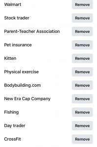
In addition, I also wanted to explore a different way that I’ve been represented as a pixelated person, by Google. As I search things and visit websites through their search engine, my data was being collected and analyzed, to better target ads. Google provides this data in the Ad Personalization section of my user bio, and they offer the option to turn it off.
Below is a list of what Google thinks I’m interested in or who Google thinks I am, based on my past search history and interests. Notably, some demographics and interests are wrong (e.g. I’m not in a relationship, and I’m not interested in all American Football, just college), but just as unerringly, some demographics are correct (age, status as current college student, for example). In contrast to some of the other data that I noted in my Data Journal, Google’s pixelated ad-version of me is ahistorical – there’s no sense of time. Google thinks I’m interested in Hotels and Accommodation, although that’s probably an interest specific to when I was searching for places to live last summer. Additionally, there’s no sense of place: this pixelated version of me is also interested in Australian football, although that’s likely just a remnant of my time studying abroad. While this pixelated person is a fairly comprehensive list of my interests, it only represents those that have been filtered first through Google (and thus, the digital).
Edit: For some reason, the photo of my personalized ad interests isn’t showing up, so here’s a link to the list as a Word document: https://drive.google.com/file/d/1Jq9q-fKko4uH6n0_M8yBoH3Wxwbn2OLk/view?usp=sharing
Lauren McGrath, November 2, 2020
DataFor our data journal assignment, I transferred data from my iPhone’s battery and activity pages and extracted data from my SugarWod app (my gym’s tracking app). Here is the link to the spreadsheet:
https://docs.google.com/spreadsheets/d/1Xh992dbhlvU-JV-2-xfVM744YW9924r0JEVBFdVG3Go/edit?usp=sharing
When I started this assignment, I initially was interested in looking at my google searching data. However, when I looked into accessing it, I learned that my data tracking was turned off; I remembered that a friend of mine had turned it off last year when I was trying to purchase airline tickets. She told me that google or other websites are able to see what flights you are looking for, and therefore raises the price. Because I didn’t have any google data that I could access, I turned to data that apps and my iPhone collect.
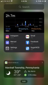
The data I looked at I seemed to have varying levels of access; for example, my SugarWod app enables me to download a spreadsheet of my data with one tap: it is seamlessly emailed to me. However, my iPhone data is available in pictorial or numerical form but I could not find a way to download it into a condensed, spreadsheet form. Therefore, I decided to transfer the pictorial data into a spreadsheet. I will also attach images to show how this data is oftentimes shown in bar charts, and is now a “widget” feature of the new iPhone update. This data is intelligible, as when you click on different bars on the chart it highlights the specific data it contains, but it is bothersome to me that I am not quite sure why the iPhone gathers this data if I don’t allow apple to collect my data and I’m personally unable to download it. Conversely, after realizing through this exercise that SugarWod easily exports data, I’m thinking that this feature was central in the creation of the app. However, I am uncertain who has access to this data. It is not clear to me whether SugarWod collects this data or even if my gym, which I “join” through the app, is able to see all of the content in my app.
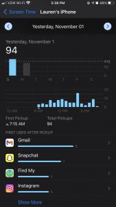
The design of iPhone data collection is very vague in categorizing data which makes me question the data holes that are in this design. For example, my iPhone tells me that on October 27th, I had 6.7 hours of activity: about 3 hours with my screen on, about 4 hours with my screen off. But, there are 12 hours in a day. What is happening for the rest of those hours, if they aren’t included in the “screen off” activity. There are inherently holes in this data collection, but it is presented as if it depicts the whole story of iPhone activity.
In terms of time and space, I was a bit unsettled when realizing that the iPhone collects “pickups;” to me, this data wasn’t only symbolic of when I use my phone, but indicates when I am asleep and waking up each day. It inherently reveals my daily routine in a very convoluted way.
I knew that my data from SugarWod was inherently “measurable:” I input numbers that correspond with my workouts. However, I realized from my iPhone data that some things are measurable that I did not think to be possible (I’m thinking about the pickups specifically here).
I am drawn to this idea of “pickups” in depicting my daily routine; a visualization that I would be interested in creating would be documenting different locations in which I picked up my phone. Each pick up could be a dot on a map, with the size indicating the amount of times the phone was picked up in that location. The iPhone shows a bar chart as a timeline of this, showing what times of day pickups occur most frequently.
I feel like the “pixelated person” that emerges from the data is one of “hard data.” I recently listened to a podcast that talked about the presence of “hard data” vs “soft data” with soft data being tied to an individual’s “less quantifiable self,” like their emotions. The types of data that I looked at are easily comparable to others (many people have iPhones and workout); however, I’ve been thinking about how, being in a sport that is largely driven by “data” in times, I was always told to not let my numbers define me. I think these questions loop back to our conversation of what constitutes a person, and if data availability has come to define that.
Joe Bartusek, November 2, 2020
DataWhen it comes to user profiles—ad preferences, interests, taste profiles—the relevant data are usually available in their relatively “raw” state. This could be individual, atomic google searches, youtube videos watched, songs played, locations visited.
What’s usually not directly available:
- Mid-level representations: histograms, frequencies, time-series plots
- Exceptions:
- Facebook allowed me to see my “interests,” the content tags that determine my news feed. These are probably a slight aggregation of “raw” clicks and interactions. (matching them to predetermined tags) (see Facebook screenshot)
- Spotify generates mid-level personalized content, such as the “On Repeat” playlist, which lists your 30 most played songs from the last 30 days. This is likely just a very small portion of all the mid-level representational information computed by Spotify. (see Spotify screenshot)
- Usage statistics (phone, browser, etc.) are usually directly available in histogram form.
- Generating mid-level representations from available “raw” data would take some work; in most cases it would be possible, but also infeasible for most.
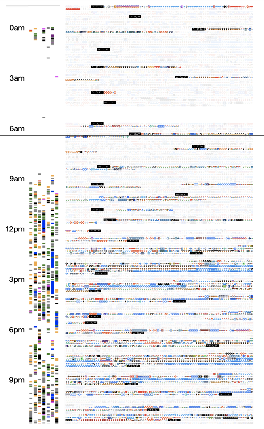
- Sometimes, 3rd-party applications exist to do this for some type of data: for example, I used a chrome extension to produce a representation of my browsing history. (see browsing history screenshot)
- Without 3rd-party assistance, generating mid-level representations (or even downloading the data in a form that allows manipulation) is likely unreasonable for most users who may be interested in them.
- High-level, abstract, latent representations: membership in the groups by which advertisers and other data-buyers understand us. These are only available to an entity (like a social media company) with access to many user profiles, which can be jointly analyzed for latent variation.
- Obtaining this information may be within the realm of theoretical possibility for a very motivated individual using a site such as Twitter with large amounts of public, scrapeable data, but decidedly outside of the realm of possibility for the vast majority.
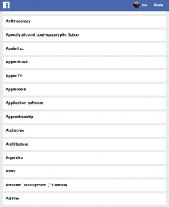
Some of my interests, (likely) based on Facebook interactions, used for ad targeting
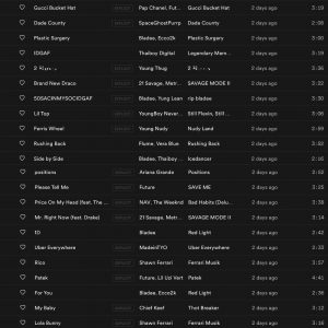
Most of my “On Repeat” playlist based on the last 30 days of Spotify use, part of the listening data used to recommend new music
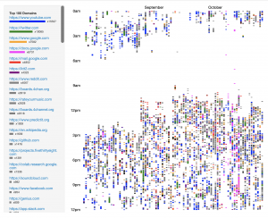
My last 3 months of browsing history, visualized by day and by time of day; also frequency tallied by website on the left. Unclear exactly what it is used for
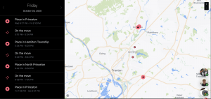
My location on Friday, as tracked by Facebook, who purportedly uses this data as part of its ad targeting
Opacity of data usage
- Most opaque: location tracking—performed by Facebook and Google (by default), both of which do not exhaustively announce the uses of that data
- Least opaque: probably taste profiles like those constructed by YouTube and Spotify, both of which openly use algorithms to recommend new content to users.
Feedback
- Most obvious data collection featuring feedback is in Facebook, Spotify, and YouTube, where the generation of preferences and the consumption based on those preferences occur in a very tight feedback loop—on the scale of the consumption of individual units of content.
- The feedback loop involving browsing history is much less clear, and likely occurs on a much larger scale, both in terms of time and in terms of user base. The output of Google’s webpage-ranking algorithm, for example, evolves based on links between webpages and trends in searching across its billions of users.
Emily Yu, November 2, 2020
Data(All data was from the past week October 25th – November 1st)
The data “exhaust” that not only generated the most data but was also the source that I most readily had access to was my browsing history. Though my browsing data belonged to Google, I was able to access and see it. However, the form (see google browsing history below) it was in was predetermined by Google, was not available to download in another form, and perhaps most importantly, did not tell me anything about the greater trends and patterns of my browsing history. In other words, the raw, singular pieces of data were there for me to access and see but what was not evident was what these individual pieces of data meant when they were aggregated together.
It was only after using several tools to create data visualizations that my browser history began to take on more meaning as larger trends and patterns emerged. The first data visualization (browsing history #1) gives an overview of how many sites I visited within a one-hour chunk as well as which sites I visited the most. The second data visualization (browsing history #2) was another way to visualize time and browsing activity. The images on the right corresponded to four six-hour periods of time (12AM – 6AM; 6AM-12PM; 12PM-6PM; 6PM-12AM) and the order of links that I clicked within those six-hour windows. These visualizations were able to show me not only when I tended to browse the Internet, but also where and how often. Scarily enough, I think I spend way too much time on a few, select websites (Blackboard, Facebook, any Google product, Reddit) where I am passively consuming information rather than actively and consciously engaging and creating information to share.
-
-
google browsing history
-

-
browsing history #1
-
-
browsing history #2
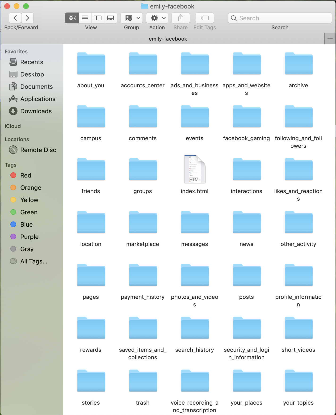
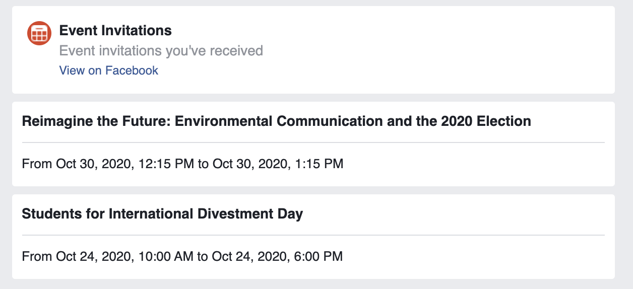
I also wanted to dive a little deeper to see what my “pixelated self” looks like on Facebook. They allowed me to download “me,” aka my past engagements from the past week in data. Something that stood out immediately was little data was available to me ( see facebook data and filtered facebook data ). The data was already separated for me in discrete folders and categories. That data was embedded within individual html files that opened up to a webpage where, similar to my Google browsing history, I could see raw, singular pieces of data, but wasn’t allowed to access a form of that data that would let me visualize larger and patterns and trends (see html example and html opened).
-
-
facebook data
-

-
filtered facebook data
-
-
html example
-
-
html opened
In conclusion, neither small nor big data that Boyd and Crawford refer to are available to me in the form of digital data. The digital data that is available is in singular, concrete units that can’t be easily aggregated and cross-referenced with other forms of digital data (i.e. I can’t use some sort of programming language to reformat the data and form some sort of relationship between my browsing history and my Facebook data). By not allowing the relationship between pieces of data to form, the meaning and ability to contextualize singular, pieces of data as well as multiple datasets across my virtual self is taken away.
I also think back to the Editor-in-Chief of Wired’s comment: “Who knows why people do what they do? The point is they do it, and we can track and measure it with unprecedented fidelity (666).” After collecting this data, it’s clear that the what I am doing on the Internet is clearly available, but what is clearly lacking and immeasurable is the why. What does the data available say about me as a person beyond just merely describing my actions? Will having more data lead to me to cross some line that will tell me something more about myself as a person or are those qualitative aspects of me as a person just inherently immeasurable? Or perhaps is it that the data that is necessary for me to understand the why just unavailable to me as a user because that’s where the value of the data is and is thus purposely kept unavailable?
Comments
Hi Grace,
I saw your comment on my post and you said that you also looked at Google ad selection as a pixelated identity. We had similar issues with Facebook as you were inactive on it. I think that helps highlight the most limiting factor of social media sites which is usage. If a person isn’t using the app frequently then it obviously will be inaccurate.
The Mood app that your using brings up some interesting points and questions. The app provides a correlation for different activities and moods, so in a way certain activities could be a proxy for mood. If people tend to exercise when they are in a good mood, then exercise could be a proxy for happiness. But the fact that mood is self reported does limit the objectivity of this practice. The “Ways of Knowing” piece we read for today stated that data visualization is separated and at a distance from the individual. I would consider self reporting the data to be immersive. I also find it interesting that the app does not collect personal data i.e. names, email, etc. This really calls on the question we had earlier of who counts as a person. Without any identifying characteristics, is it possible to include any of the users on the app as real individuals?