Matthew Gancayco, November 20, 2020
Data
Notes:
The first adjustment I wanted to make from the original was making the company in question more apparent. The original had all of the companies the same color, so it was hard to distinguish. I also wanted to add context to the carbon emission values. I discovered the total amount of carbon emissions for the time period. Although these companies are the largest contributors to carbon emissions, they are not the only ones to blame. Their totals are miniscule in comparison to the grand total of the world. The entire world is accountable, not just these companies.
Emily Yu, November 18, 2020
Data
Note: first picture is the original data visualization (in this instance, I’m considering an Excel table to be a data table) which contains information about certified poll watchers for Clayton County, GA. The second is a spatial map plotting the location from which the the certified poll watcher for Clayton County, GA originates from.
Looking at the first data table, the way in which it is formatted makes it hard to draw any kind of correlation between the individual pieces of data. As a result, it appears that this data table and information is somehow neutral and doesn’t have the capability of being weaved into narrative. One of the most pressing questions that I wanted to be answered from the data set was whether there was any correlation between birth location and party affiliation. Thus, creating this second visualization was a way to spatialize these data points and see correlations that would not have been easy to with the first visualization.
The few takeaways from this map is that there seems to be more Democratic poll watchers than for any other party and these poll watchers seem to be come from a wider range of locations. In contrast, the Republican party seems to have poll watchers concentrated from a few location. Another insight is that those who were born in the county seemed to be chosen at a higher rate, leading into questions such as whether the selection process for poll watchers just inherently favors individuals born in the county or whether there is just greater likelihood of being political active hence a greater sample size to choose poll watchers from.
In creating this second visualization, one of the largest takeaways is that transforming data visualizations into other formats can allow for further questioning and weaving of narratives than other types of data visualizations.
Cynthia Vu, November 17, 2020
DataOriginal Visualization:
New Visualization:
I was really curious to look at the distribution of coronavirus cases in Hawaii. I found a very simple map that displayed coronavirus cases broken down by zip codes. A lot of Hawaii is dominated by natural landscapes that have no residents. However, one thing I realized from staying in Hawaii is how non-uniform the population distribution is. This is true for plenty of states, and I was reminded of the different election map visualizations we viewed that tried to demonstrate the idea that “dirt doesn’t vote”.
My edited map still uses the same data about coronavirus cases, but I’ve included new data about the populations of the different zip codes and the relative ranks of those population sizes. This provides more context with which to analyze the distribution of coronavirus cases, as a viewer can compare the population size to the number of COVID cases in a particular zip code and calculate cases per capita. I’ve also highlighted a few of these population ranks, including zip code 96720, which contains the 11th largest population in Hawaii but only has between 6 – 30 coronavirus cases. The other zip codes with population ranks 1 – 10 all have 60+ coronavirus cases. By taking a closer look at this comparable data, new and potentially actionable information is revealed. Zip code 96720 represents Hilo, which is where I am currently staying.
Even in my new visualization, which I think provides better context, there is still a lot of missing data that could clarify specific details about each zip code and give greater context to a reading of the coronavirus case distribution. For example, zip code 96863 is in last place for population size but still has 1 – 5 coronavirus cases. It actually corresponds to a Marine Corps Base, so its residents live in very close proximity and likely also have faster access to tests. Some of these zip codes reflect areas where millionaires like Bill Gates or Beyonce have bought out sections of land, while others reflect actual urban centers. Assumptions about where these activities might be occurring cannot be intuited from just the population information. There is still a lot missing from my map.
Maya Stepansky, November 17, 2020
DataRevisualization
Original
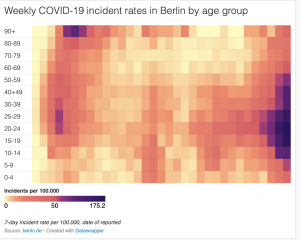
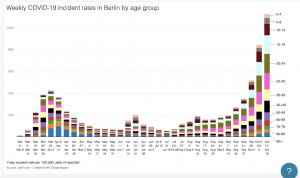
As you probably know from class, I had trouble embedding my visualization (I think it had to do with the specific visualization that I chose from Datawrapper). The original visualization shows the weekly COVID incident rates in the city of Berlin by age group over each week from March to October. I found that though the visualization emphasized weekly rates, that was not clearly reflected in the initial visual. I also though that hear map was slightly misleading because it didn’t show how the overall weekly rates fluctuated. The only real relationship show was the increase and decrease in rates per age group by rough approximation of color gradation. In effort to make this visualization more accessible and intuitive as well as highlighting the actual comparison of weekly rates, I decided to make a stacked bar graph that clearly reflected the change in rates by both week AND age group. This made it overall much easier to see trends and correlations.
Ailee Mendoza, November 17, 2020
Data
Description:
I seem to have lost the original visualization, so I’ll just describe as best I can the choices I made in creating my version. The question Prof. H posed yesterday about what factor should be the most privileged in constructing a data representation really got me thinking about which of those 4 factors have inherently guided my thought processes and my creativity. I mentioned this in my comment on Maya’s visualization, but I really think this question highlights how 1) anything interpretive or creative is subjective and 2) I personally privilege accessibility/comprehensibility. To be honest, I’m not really a fan at all of frequency ratios. For someone like me, the original dataset that only showed the frequency rations was hard to understand without great intellectual effort. I wanted to figure out a way to supplement these ratios with a visual component to accompany and to give these numbers some “immediate” significance. I think the bar chart format allows for an easy and concrete way in which we can interpret the significance of the frequency ratios at first glance. I do, however, appreciate interactivity in data representation as well. I scrolled past Cynthia’s visualization and liked how you could learn more about specific territories in Hawaii by hovering over them- but then we have to ask ourselves which information will be available at “first glance” and which is only accessible when you interact with it? These choices end up producing very different narratives with the same set of data…
Zack Kurtovich, November 17, 2020
Data
Description:
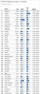
For this assignment, I thought it would be interesting to investigate each state’s COVID testing capacity to try to gauge its confounding influence on current understandings of the distribution of coronavirus cases within the United States. The data for my visualization was obtained through the data set provided below, which was created as part of the COVID project. As you can see, the original creators decided to list the states, which I thought limited the audience’s interpretation when it comes to comparing larger regional and inter-state discrepancies. While most discourse and data pertaining to COVID-19 is centered around the number of cases, the impact of testing is often overlooked. As such, I thought it would be valuable to map out the differences to visually assess the landscape and identify any patterns, as it lends insight into the accuracy of each state’s confirmed case rate.
After completing the first graphic, I then similarly mapped out each state’s confirmed case rate to cross reference between the two visualizations. This yielded a few key observations. Of these, I personally found Oregon’s extremely low testing capacity and low confirmed case rate to be the most noteworthy, as I have always considered them ahead of the curve in terms of listening to the science and making data-driven decisions (marijuana legalization, drug decriminalization, etc). This has really made me question what is driving this trend – why is their testing capacity so low? Is it a lack of state or federal funding? Pennsylvania also really stood out to me because it had the lowest testing capacity (0.2154%), but still had a relatively high confirmed case rate (0.6019%), which indicates that the pandemic has probably hit that much area worse in reality. Texas and Florida also reflected this dynamic, although I wasn’t necessarily shocked due to the press coverage these states have received in recent months. Lastly, I was surprisingly impressed by Alaska’s response to the pandemic. Despite being a Red state, Alaska appears to have been able to capitalize on their geographic isolation and low population density, as they not only have the highest testing capacity (1.15%), but also the second lowest confirmed case rate behind Hawaii.
Original Data Visualization:
Rei Zhang, November 17, 2020
DataThis is my chart:
Based on this chart:
I thought that it would be nice to include a more historical aspect and contextualize the effect of the Industrial Revolution by pulling carbon data from the beginning of the Common Era.
What I don’t like as much about my visualization are the overlapping labels, although they do help emphasize the similarity of atmospheric carbon levels until humans start emitting many tons more of CO2.
Anna Durak, November 17, 2020
Datahttp://
Lauren McGrath, November 17, 2020
Data
both of these were based on:
Hi all,
So like I said in class, I saw this table by the COVID19 project (the embed doesn’t seem to be updating right now but I’ll double check on it) that essentially walked the viewer through calculations, starting on the lefthand columns and working towards the righthand columns, that resulted in a designation of an “up” or “down” arrow value for a state in their COVID19 hospitalizations. This table showed aggregations of data and a specific sequence of calculations (like dividing the number of cases per population of the state to make it comparable) that ended in a simple symbol. I wondered what the effect would be if each of these columns were to be visualized on a map. Seeing the data dis-aggregated from the table made me realize how many different dynamics are at play with COVID19 data; as you can probably tell, the images of the two maps I created invoke drastically different reactions.
Grace Logan, November 17, 2020
DataOriginal:
The original visualization shows a target temperature, that is the number of degrees in celsius that the global temperature will rise, with a corresponding emissions budget, a percentage of how much of that budget has been used, a trend line showining how rapidly yearly emissions need to reduce to stay within the target temperature and the number of years to halve emissions. There is a lot of information here. In my opinion, too much information for this one visualization. I think it is straight forward and effectivley communicates that different target temperatures will have very different trajectories for how much we need to curb emissions. But I felt lke the more visual representations, that is the percentage of budget used bar and trend line for yearly emissions, are too small to be as impactful as they could have been. I realize that this visualization was probably made to stand on its own, but I think for our projects ir would be more helpful to break up the components to make them more impactful, and because we have the room to explain and discuss the content I think there is no reason not to.
My Visualizations:
I have taken a piece from the original which is a bar chart that shows the global carbon budget for each target temperature. I think that putting it in a bar chart emphasizes how different these budgets are per target temperature and makes the “budget used” more visible. In the original the small percentage bar that was meant to represent this gets lost and the variation is harder to see. Originally I wanted to also make a second visualization to show a line graph of the trajectory for emissions at each target, but my one semester of math is failing me. The data set has emissions for each year from 2021 to 2100 that they used to produce the trend line. I realize that the solution is probably a simple equation and formula added to a new column, but I do not currently know what it should be. Anyways, to reiterate my main reason for doing this was to show that with or projects we have the space to break down these components and discuss them further so they do not need to be crammed into one visualization.
Joe Bartusek, November 17, 2020
Data
Jerome Desrosiers, November 17, 2020
Data
Jerome Desrosiers, November 3, 2020
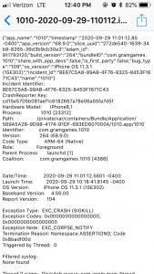
DataOver the past week, I tried to keep track of the data that I produced while using my favorite phone applications. At first I went into my settings to try and find the hidden data that we are not offered to us unless we look for it. The problem is, once I found it, I wasn’t able to read it in order to understand what I had produced. As you can see on the first picture included with this post, the text is impossible to understand
. 
I then searched for more information that would be easier to understand like my daily average screen time. All my friends have been talking about it except me and the reason is that I haven’t updated my phone by fear of slowing it down. This meant I had no way to find such data unless I downloaded another application. I then went on Spotify, and as soon as I opened the app, the algorithm had figured out what I had been listening to it and offered me multiple playlists that I would probably like.

Lastly, since I spent most of the time on my phone on youtube, I decided to see what kind of data I produced. The first thing that I found was the main page that offers me videos based on my research history and previously watched videos.

What I found interesting while going over my produced data is that it was never given to me automatically. I always had to make the effort to find the data I produced while using applications. It is data that I produced yet it is hidden from us.
Comments
Hi Matthew! I thought your modifications to the Pemex visualization made a lot of sense. I liked the way you made the visualization more accessible by distinguishing the company in question from the other companies by giving it a different color, as well as the way you took into account the total context by showing that most of the carbon emissions are not just through these companies. I also like the way that you practically made a political statement in the process of changing the visualization, because you emphasized the importance of accountability and accuracy in visualizations, and specifically when it comes to carbon emissions. It made me realize how easy it is for these visualizations to focus on one particular thing that results in a misrepresentation of the full picture. This I think that that last contribution had the biggest effect on this visualization because it moved the emphasis of this visualization from Pemex to a general focus on the outrageous amount of carbon emissions that are being released globally. It makes me wonder, if it isn’t these companies that are dominating carbon emissions globally, then what is? Possibly, it would make sense to change the title of the visualization from one that emphasizes Pemex to something else that focuses on the large amount of global carbon emissions being released in the word. If this change is made, it might not even make sense to highlight Pemex anymore—possibly it would make more sense to highlight the Global Total. I am also wondering, was there a specific intention behind changing the bar graph from horizontal to vertical?