Revisualization
Original
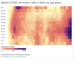
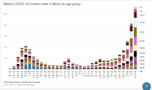
As you probably know from class, I had trouble embedding my visualization (I think it had to do with the specific visualization that I chose from Datawrapper). The original visualization shows the weekly COVID incident rates in the city of Berlin by age group over each week from March to October. I found that though the visualization emphasized weekly rates, that was not clearly reflected in the initial visual. I also though that hear map was slightly misleading because it didn’t show how the overall weekly rates fluctuated. The only real relationship show was the increase and decrease in rates per age group by rough approximation of color gradation. In effort to make this visualization more accessible and intuitive as well as highlighting the actual comparison of weekly rates, I decided to make a stacked bar graph that clearly reflected the change in rates by both week AND age group. This made it overall much easier to see trends and correlations.
Maya, after class yesterday I couldn’t stop thinking about your visualization. Considering that, admittedly, all I really did in my visualization was change the chart style into bar form (what I personally deem to be the most intelligible), I really appreciated how you were able to simplify a chart that was initially so “crowded” and intimidating.
I started to think about the criteria for data visualizations that I’ve arbitrarily designated as “intelligible” and the reasoning behind these criteria. I think the temporal aspect you introduced in your version of the visualization was particularly compelling to this self-reflection. The addition of axes immediately gave me a sense of direction, of progression, of narrative. It’s crazy how aesthetically and intellectually satisfying the presence of time is in a graph. Whereas before I had to interact with the data in order to orient myself temporally, now it has been laid out for me in a single tagline, if you will.
I honestly wonder if I am the only person who has this perspective on data- does simplicity and “obviousness” appeal to you? Do you privilege immediate accessibility or creativity? Or both?
Hi Maya,
Your comparison of these two visualizations based on the same data made me think about the visualization of US immigration as metaphorical rings that we discussed in class.
As an aggregate, the original viz is a visually striking image in an “artistic” sense, but as we discussed in lecture, it doesn’t reveal the complexities of the data like your version does (being able to see the weekly labels, the colors showing age categories rather than incidence rates).
I think with data visualizations, some authors have the intention of making data “beautiful” while others really want to show the irregularities, patterns, or inconsistencies in data. I don’t think that there is a “right” way to visualize data, as long as the author is able to be forthcoming about their methods and reasoning for their creation. I think your comparison here does a great job of showing those dynamics!