
Caption
Wealth Year 1
Summary
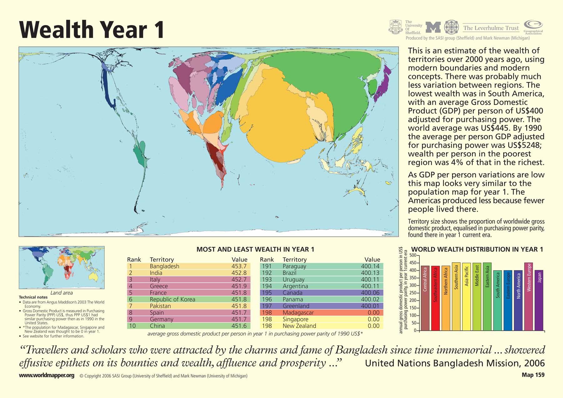
This “Worldmapper” map shows the global distribution of wealth in the year 1 current era. Territory size reflects the proportion of worldwide gross domestic product (GDP) adjusted for purchasing power parity from each particular country. In the year 1, there was a relatively low variation in wealth between different regions of the world. Since the map reflects total wealth, not wealth per capita, this map looks very similar to the population map for year 1–the countries with the largest populations have the most wealth.
The map is accompanied by two tables that show ranked lists of the ten countries with the most and least wealth per capita. Here, wealth is defined as the average GDP per person in purchasing power parity of the US dollar in 1990. There is also a bar graph that shows the the global distribution of wealth by region in 1 C.E.
Copyright status
© Copyright 2006 SASI Group (University of Sheffield) and Mark Newman (University of Michigan)
Used on QED by permission.
Licensing
All rights reserved