
Caption
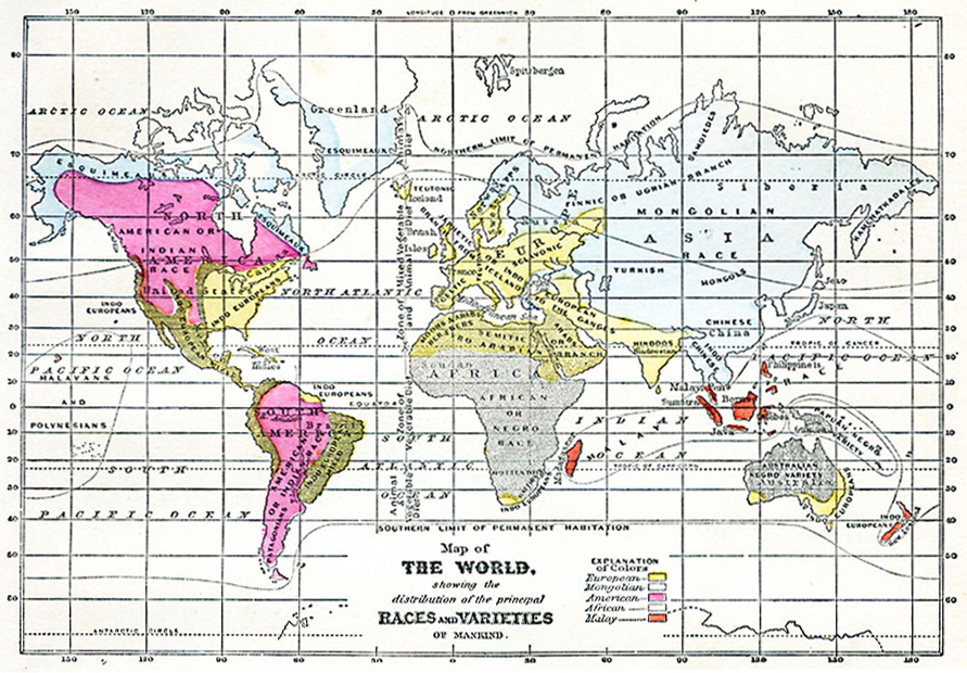
Map of the World showing the distribution of the principal Races and Varieties of Mankind
Summary
This map was published in New York, NY, in 1868. It depicts a nineteenth-century view of the classification of humanity into “races”, “varieties”, “branches”, and mixtures.
The legend gives this explanation of colors:
- yellow – European
- pale blue – Mongolian
- pink – American
- gray – African
- brown – Malay
Labels on the map include:
- American or Indian Race
- Australian Negro Variety
- Chinese
- Esquimeaux
- Finnic or Ugrian Branch
- Hindoos (sic)
- Hottentots
- Indo-Chinese
- Indo-Europeans
- Indo-European Mixed
- Japhetic or Indo-European Branch
- Lapps
- Malayans and Polynesians
- Papuan-Negro Variety
- Patagonians
- Sclavonic (sic)
- Semitic or Syro-Arabian Branch
- Teutonic
- Turkish
The map also indicates the northern and southern “limits of permanent habitation”.
Source
George W. Fitch, Outlines of Physical Geography (New York, NY: Ivison, Phinney, Blakeman & Company, 1868) 85.
Map Credit: Courtesy The Private Collection of Roy Winkelman.
Courtesy of the
MAPS Technology Clearinghouse of the
Florida Center for Instructional Technology (FCIT) at the University of South Florida.
Copyright
The original map is public domain, but “Maps ETC is copyright © 2007 by the University of South Florida”.
See [2] for the license.