
Caption
Public Health Spending
Summary
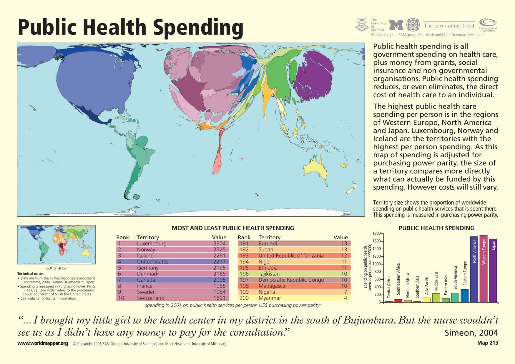
This “Worldmapper” map shows public health spending by country. Public health spending includes all government spending on health care and money from grants, social insurance, and non-governmental organizations (NGOs). Territory size shows the proportion of worldwide spending on public health services in each country. This spending is measured in purchasing power parity. The regions of Western Europe, North America, and Japan have the highest levels of public spending on health care.
The map is accompanied by two tables that show ranked lists of the ten countries with the most and least public health spending per person. There is also a bar graph that shows the spending on public health services per person by region.
Copyright status
© Copyright 2006 SASI Group (University of Sheffield) and Mark Newman (University of Michigan)
Used on QED by permission.
Licensing
All rights reserved