
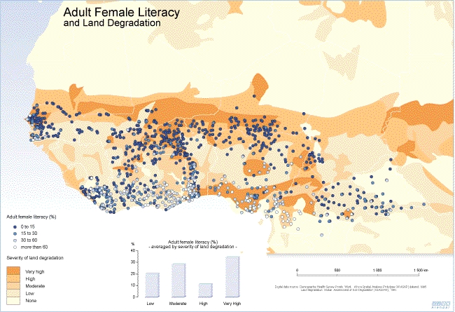
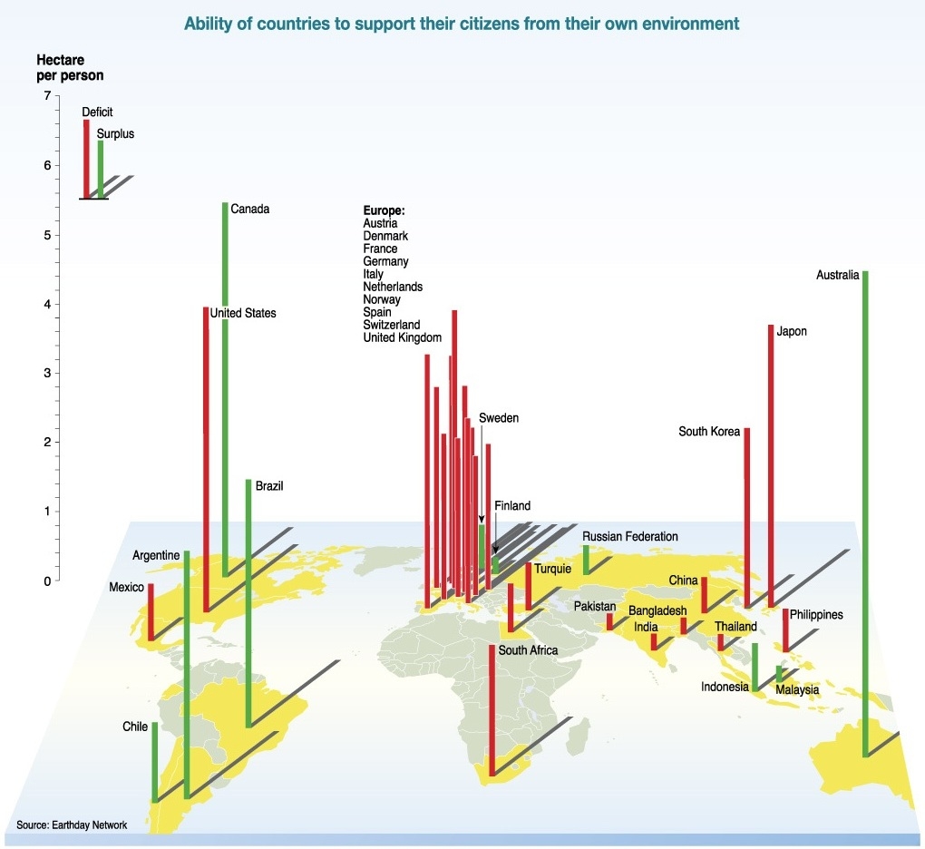
Caption
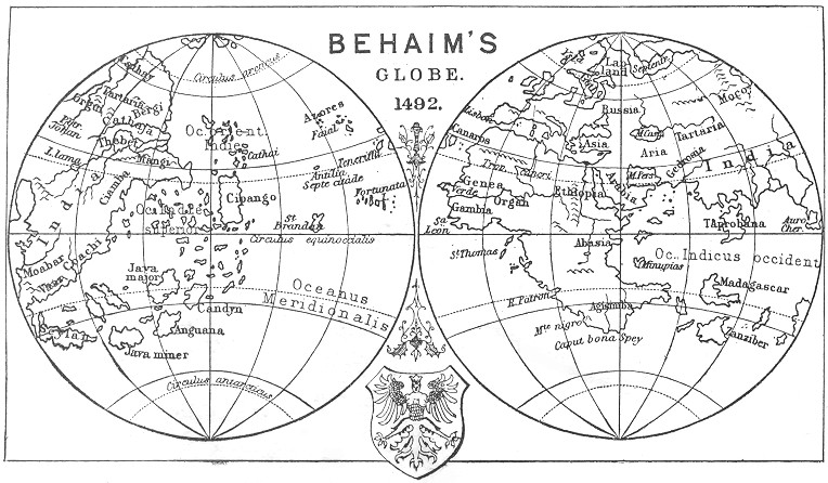
Behaim’s Globe. 1492.
Summary
This map is a projection of the Behaim Globe or Erdapfel (Earth apple) that was constructed by Martin Behaim in 1492. The Erdapfel is the oldest extant terrestrial globe drawn according to Ptolemaic principles, and is thought to be one of the first such globes ever made.
Source
The map was published in Joseph Jacobs, The Story of Geographical Discovery: How the World Became Known,
London : G. Newnes, 1899. [1]
The image was copied from The Project Gutenberg.
Copyright status
This image is a photograph of a map whose copyright has expired.
For licensing details, see License.


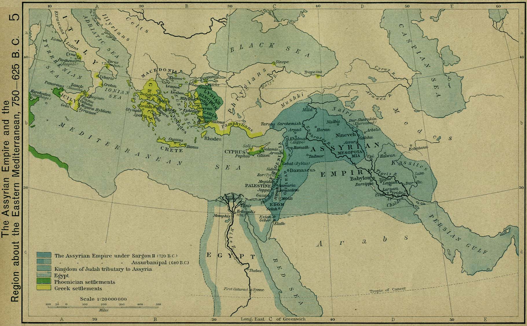
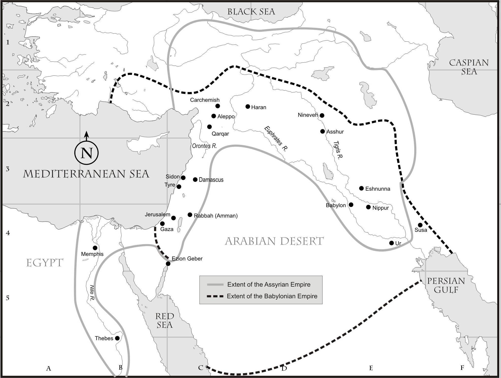
![[1]](http://www.lib.utexas.edu/maps/historical/shepherd/assyrian_empire_750_625.jpg)
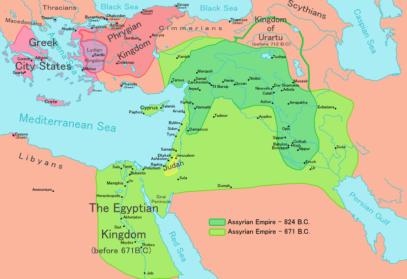
![[2]](http://www.bible.org/assets/netbible/ot6.jpg)
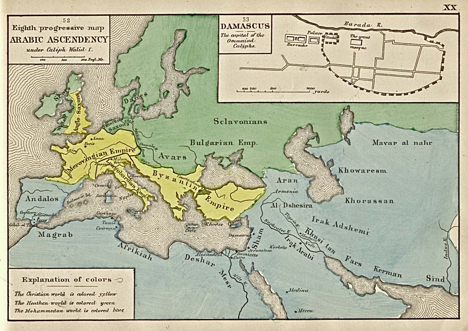
![[1]](http://www.lib.utexas.edu/maps/historical/arabic_ascendency_1884.jpg)
![[1]](http://www.gl.iit.edu/govdocs/maps/Middle%20East-Age%20of%20the%20Caliphs.gif)