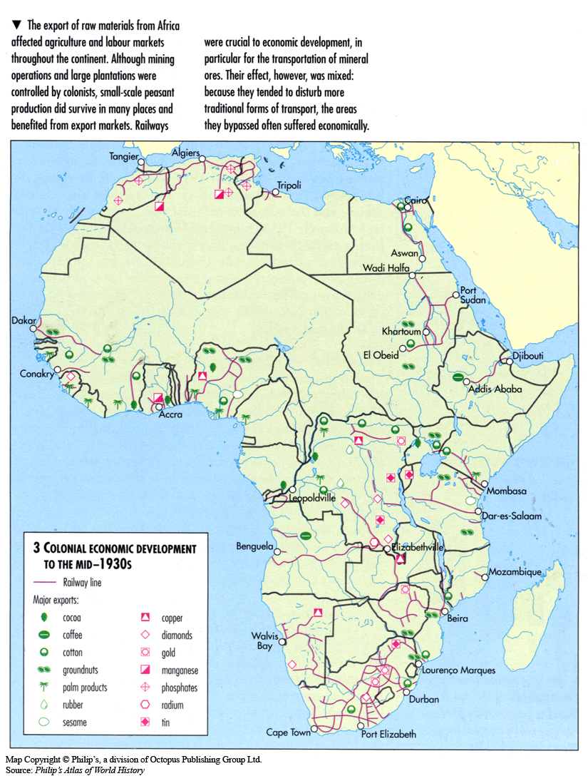
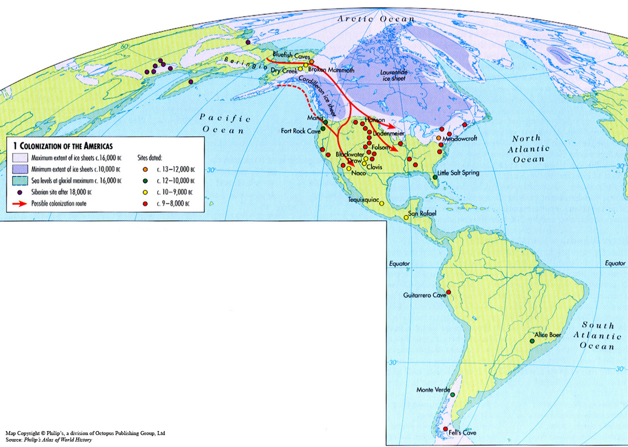
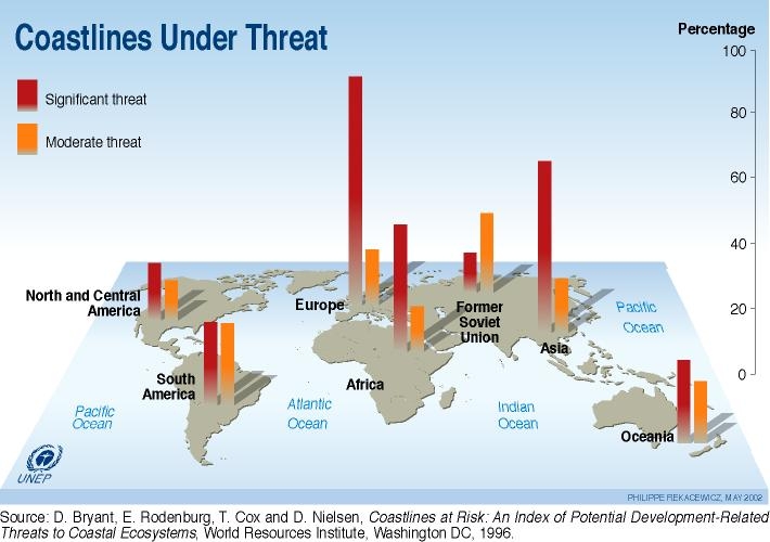
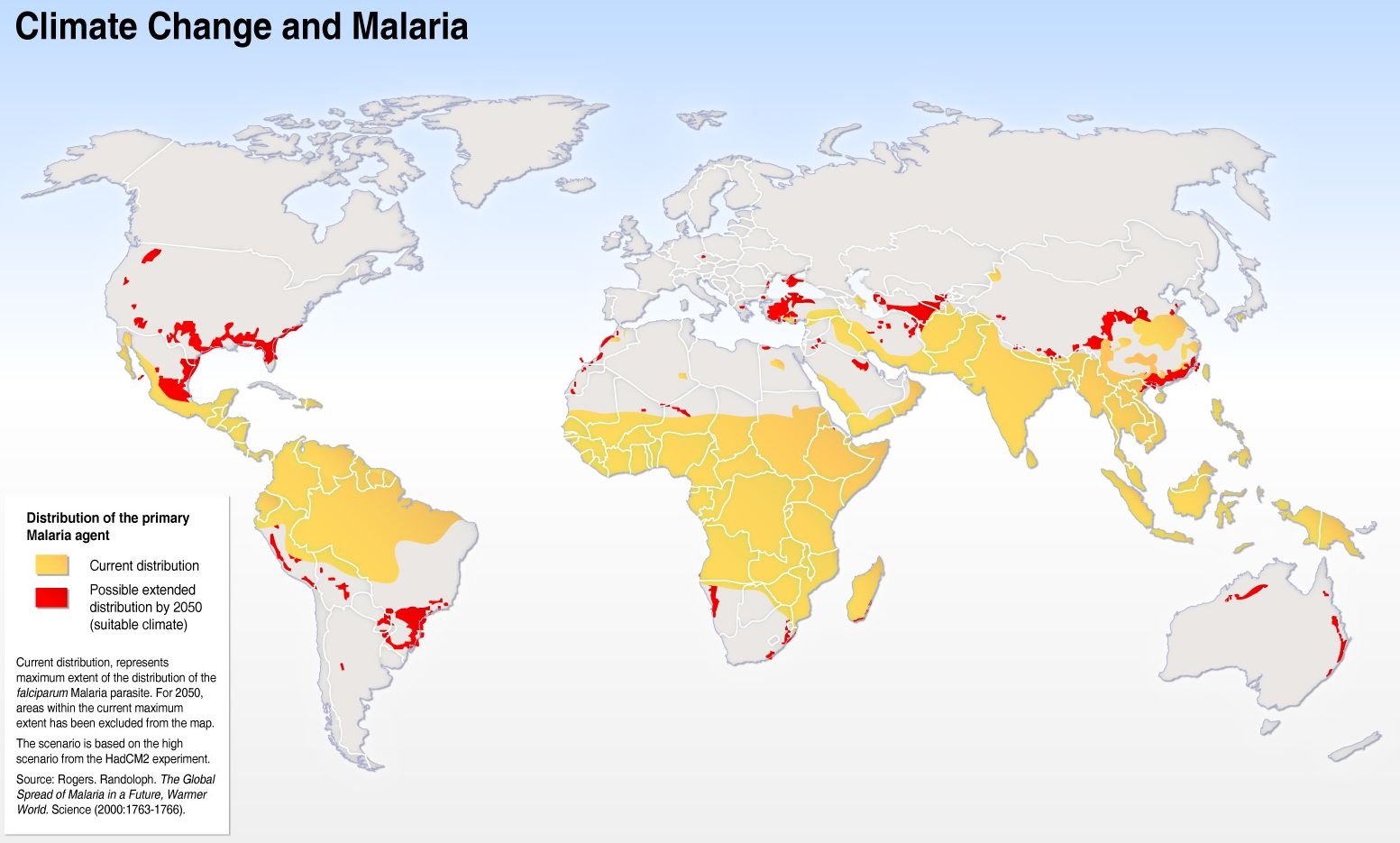
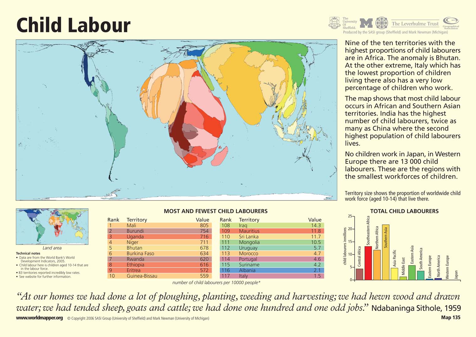
Category Archives: Unrestricted

Condom Use by Women, 2002-2004

Caption

Condom Use by Women

Summary

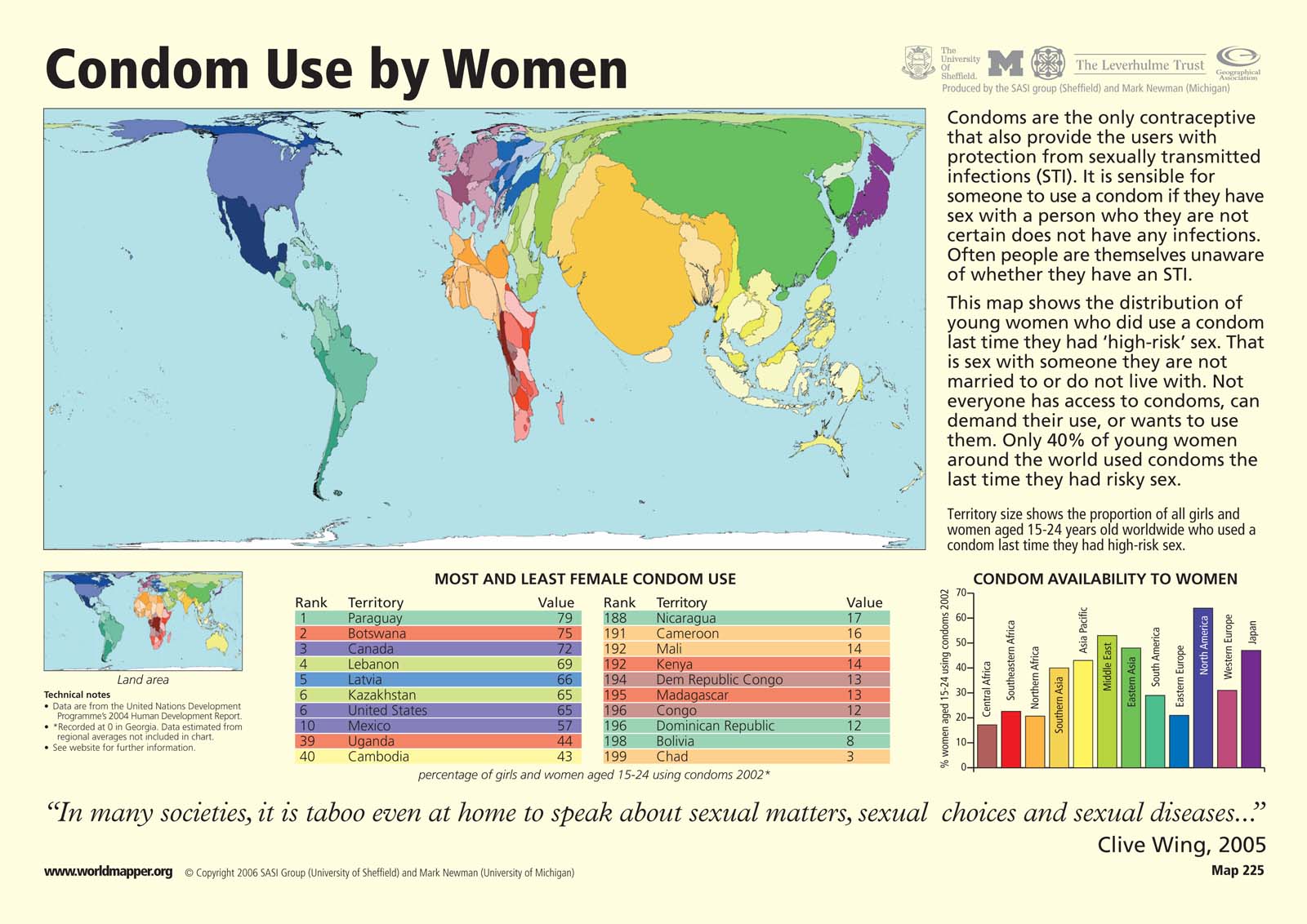
This “Worldmapper” map shows condom use by females aged 15-24 by country. Territory size shows the proportion of all females aged 15-24 worldwide who used a condom the last time they had high-risk sex. High-risk sex is defined as sex with someone that the woman is neither living with nor married to. Country size does not take population into account. Therefore, countries like the United States with high condom use per capita may be shown smaller on the map than countries like India, with a lower level of condom use per capita but a larger total population.

The map is accompanied by two tables that show ranked lists of the ten countries with the highest and lowest percentages of females using condoms in 2002. There is also a bar graph that shows the percentage of females aged 15-24 using condoms by region.

Copyright status

© Copyright 2006 SASI Group (University of Sheffield) and Mark Newman (University of Michigan)

Used on QED by permission.

Licensing

All rights reserved

Source

Worldmapper[1]

Colonization of the Pacific, 60,000 BCE to 400 AD

Caption

Colonization of the Pacific

Summary

This map indicates the colonization routes around the Pacific Islands, including Australia, from 60,000 BCE to 400 AD. Different colonization routes are portrayed in different colors, and Ice Age coastlines, key settlements, and ritual structures after 700 AD are also noted.

Source

Oxford Atlas of World History, Oxford University Press, 1999. General Editor Patrick K. O’Brien. (p. 26)

Copyright

Map copyright © Philip’s, a division of Octopus Publishing Group Ltd.
Source: Philip’s Atlas of World History

Used under license from Octopus Publishing Group.

Series

This map is one in a series of maps selected from the Oxford Atlas of World History.

A gallery using flyover images like this

Openness to Trade 1980
can be viewed here.

Computer Ownership, 1995

Caption

Computer Ownership 1995

Summary

This map shows countries color-keyed according to their share of computer ownership per 1,000 people. The number of computers linked to the internet in is also indicated.

Legend indicates:

  • Number of computers per 1,000 people 1995:
    • over 200
    • 100-200
    • 10-100
    • 1-10
    • no data
  • Number of computers linked to the internet January 1996:
    • over 6 million
    • 100,000-500,000
    • 10,000-100,000

An explanation about the production of computer technology and the unequal access to it is additionally offered.

Source

Oxford Atlas of World History, Oxford University Press, 2002. General Editor Patrick K. O’Brien.

Chapter 5. The Twentieth Century: “Transport and Communication since 1945,” page 283.

Copyright

Map copyright © Philip’s, a division of Octopus Publishing Ltd. Source: Philip’s Atlas of World History.

Used under license from Octopus Publishing Group.

Series

This map is one in a series:
This map is one in a series of maps selected from the Oxford Atlas of World History.

A gallery using flyover images like this

Openness to Trade 1980
can be viewed here.

Colonization of the Globe c. 120,000-9,000 BC

Caption

Colonization of the Globe c. 120,000-9,000

Summary

This map shows the colonization route that originated in Africa and followed several paths through Europe and Asia to end in South America approximately 9,000 BC.

Legend indicates:

  • Maximum extent of ice sheets c. 16,000 BC
  • Land exposed by lower sea level c. 16,000 BC
  • Colonization
  • Area occupied by H. neanderthalensis
  • Area occupied by H. erectus
  • Settlement site
  • Burial site
  • Early art site

Source

Oxford Atlas of World History, Oxford University Press, 2002. General Editor Patrick K. O’Brien.

Chapter 1. The Ancient World: “The Human Revolution: 5 Million Years Ago to 10,000 BC,” page 16.

Copyright

Map copyright © Philip’s, a division of Octopus Publishing Ltd. Source: Philip’s Atlas of World History.

Used under license from Octopus Publishing Group.

Series

This map is one in a series:
This map is one in a series of maps selected from the Oxford Atlas of World History.

A gallery using flyover images like this

Openness to Trade 1980
can be viewed here.

Colonial Economic Development to the mid-1930s

Caption

Colonial Economic Development to the mid-1930s

Summary

This map shows the economic development of Africa from 1880 to 1939, indicating railways and sites of key resources and exports (listed as cocoa, coffee, cotton, groundnuts, palm products, rubber, sesame, copper, diamonds, gold, manganese, phosphates, radium, and tin).

Source

Oxford Atlas of World History, Oxford University Press, 1999. General Editor Patrick K. O’Brien. (p. 207)

Copyright

Map copyright © Philip’s, a division of Octopus Publishing Group Ltd.
Source: Philip’s Atlas of World History

Used under license from Octopus Publishing Group.

Series

This map is one in a series of maps selected from the Oxford Atlas of World History.

A gallery using flyover images like this

Openness to Trade 1980
can be viewed here.

Colonization of the Americas c. 18,000-8,000 BC

Caption

Colonization of the Americas c. 18,000-8,000 BC

Summary

This map shows the possible colonization route from Asia to the Americas. The sites located date approximately between 13,000-8,000.

Legend indicates:

  • Maximum extent of ice sheets c. 16,000 BC
  • Minimum extent of ice sheets c. 10,000 BC
  • Sea levels at glacial maximum c. 16,000 BC
  • Siberian site after 18,000 BC
  • Possible colonization route
  • Sites dated:
    • c. 13-12,000 BC
    • c. 12-10,000 BC
    • c. 10-9,000 BC
    • c. 9-8,000 BC

Source

Oxford Atlas of World History, Oxford University Press, 2002. General Editor Patrick K. O’Brien.

Chapter 1. The Ancient World: “From Hunting to Farming: The Americas 12,000-1000 BC,” page 24.

Copyright

Map copyright © Philip’s, a division of Octopus Publishing Ltd. Source: Philip’s Atlas of World History.

Used under license from Octopus Publishing Group.

Series

This map is one in a series:
This map is one in a series of maps selected from the Oxford Atlas of World History.

A gallery using flyover images like this

Openness to Trade 1980
can be viewed here.

Collapse of the Chinese empire – rebellions and foreign attacks, 1839-1901

Caption

Rebellions and foreign attacks, 1839-1901

Summary

After the Opium War of 1839-1842, the
Qing dynasty was challenged from within by a number of
rebellions and uprisings that caused immense destruction and loss of
life. The Sino-Japanese War of 1894-5
resulted in significant loss of imperial territory, including
Korea, Taiwan, and the Liaodong peninsula.

The map shows the area of Taiping (Wade-Giles: T’ai-p’ing) control at
various times; the routes taken by the Taiping rebels, and the the
locations and dates of the following:

  • Yunnan Muslim rebellion
  • northwestern Muslim uprising
  • Boxer rebellion
  • Nien rebellion (捻軍起義; pinyin: niǎn jūn qǐ yì)
  • Nian invasion of Zhili (Wade-Giles: Nien; Chihli; Zhili’s modern name is Hebei)
  • Guizhou-Miao tribal rising (Wade-Giles: Kuei-chou, also spelled Kweichow)
  • Hakka-Cantonese war
  • Japanese naval victory of 1894

Arrows indicate British, Anglo-French, French, Japanese and Chinese attacks.

Copyright status

Copyright © Times Books 2007
Reproduced from The Times Complete History of the World by permission of HarperCollins Publishers Ltd.

Licensing

All rights reserved

Source

The Times Complete History of the World (2007), p. 257.

Coffee Cultivation c1998

Caption

Coffee Cultivation

Summary

The map, which shows the areas in which coffee is grown commercially, appears in two online
articles:

The second of these identifies the districts within each country where coffee is grown.

The date of the original map file (coffee.worldc.gif) is 1998.

Source

Majestic Coffee & Tea, Inc.

Copyright

This work may still be under copyright and therefore care is required in its use. Its use on QED is under the “Fair Use” rule.

Cold War Conflicts and inset showing The Cuban Missile Crisis 1962

Caption

Cold War Conflicts and inset showing The Cuban Missile Crisis 1962

Summary

In the main map countries are color-keyed according to their involvement in Cold War conflicts.

Legend indicates:

  • Countries in North Atlantic Treaty Organization (NATO) (1949-)
  • Countries in Warsaw Pact (1955-91)
  • Non-aligned communist states 1987
  • Country with nuclear capability by 1987
  • Cruise and Pershing II missiles deployed in 1980s
  • SS20 missiles deployed in 1980s
  • Direct military action by USSR and/or allies
  • Direct military action by USA and/or allies
  • Economic and political intervention by USA and/or allies
  • Iron Curtain

The inset map illustrates the conflict arising from the installation of Soviet missiles in Cuba.

Legend indicates:

  • US-backed invasion force April 1961
  • Soviet ships
  • US naval blockade
  • US naval base
  • Soviet missile base
  • US military build-up

Brief explanations of these events are also provided.
The map additionally includes a chronology of Cold War world conflicts in which the US, the Soviet Union and their respective allies where involved.

Source

Oxford Atlas of World History, Oxford University Press, 2002. General Editor Patrick K. O’Brien.

Chapter 5. The Twentieth Century: “The Cold War 1947-91,” page 245.

Copyright

Map copyright © Philip’s, a division of Octopus Publishing Ltd. Source: Philip’s Atlas of World History.

Used under license from Octopus Publishing Group.

Series

This map is one in a series:
This map is one in a series of maps selected from the Oxford Atlas of World History.

A gallery using flyover images like this

Openness to Trade 1980
can be viewed here.

Coastal Populations and Shoreline Degradation, 2001

Caption

Coastal Populations and Shoreline Degradation, 2001

Summary

This map shows the relationship between shoreline population and shoreline degradation.

Studies show that the cities and ports with large populations are also the areas with the highest amount of shore degradation.

Source

United Nations Environment Programme / GRID-Arendal[1]

Cartographer/Designer: Philippe Rekacewicz, UNEP/GRID-Arendal

Primary Source:

  • Burke et al, World Resources Institute (WRI), Washington DC, 2001
  • Paul Harrison and Fred Pearce, AAAS Atlas of Population and Environment 2001, AAAS, University of California Press, Berkeley

Copyright

© 2006 UNEP / GRID-Arendal

Licensing

Used with permission.

For use constraints, see [2].

Series

This map is one in a series For a listing with flyovers, see Series:UNEP / GRID-Arendal.

Coastlines Under Threat, 1996

Caption

Coastlines Under Threat, 1996

Summary

This map shows the coastlines most in danger of erosion and pollution, and most in need of biodiversity protection.

The coastlines in Europe, Asia and Africa are under most threat.

The bars placed on each region compare the significant and moderate threats that their coastlines face.

Source

United Nations Environment Programme / GRID-Arendal[1]

Cartographer/Designer: Philippe Rekacewicz, UNEP/GRID-Arendal

Primary Source:

  • D. Bryant, E. Rodenburg, T. Cox and D. Nielsen, Coastlines at Risk: an Index of Potential Development-Related Threats to Coastal Ecosystems
  • World Resources Institute (WRI), Washington DC, 1996.

Copyright

© 2006 UNEP / GRID-Arendal

Licensing

Used with permission.

For use constraints, see [2].

Series

This map is one in a series For a listing with flyovers, see Series:UNEP / GRID-Arendal.

CO2 Emissions from Industrial Processes, 1997

Caption

CO2 Emissions from Industrial Processes, 1997

Summary

The first map shows the CO2 emissions from industrial processes, mainly coming from energy production in in 1997. The map also depicts the unequal industrialization in the world.

The second map indicates the emissions of carbon dioxide coming from land use change, mainly due to deforestation, agriculture and urbanization in 1997.

Source

United Nations Environment Programme / GRID-Arendal[1]

Cartographer/Designer: UNEP/GRID-Arendal

Primary Source:

  • Climate Change Information Kit, UNEPs Information Unit for Conventions (IUC) (feb 97)

Copyright

© 2006 UNEP / GRID-Arendal

Licensing

Used with permission.

For use constraints, see [2].

Series

This map is one in a series For a listing with flyovers, see Series:UNEP / GRID-Arendal.

Coastal Issues In the Islands of Comoros and Mayotte, 2004

Caption

Coastal Issues In the Islands of Comoros and Mayotte, 2004

Summary

This map shows the population density, extension of coral reefs and of marine national parks for the islands between Madagascar and East Africa, Comoros and Myotte.

The infographic underneath illustrates inter-related issues faced by the islands, such like poverty, coastline erosion and pollution.

Source

United Nations Environment Programme / GRID-Arendal[1]

Cartographer/Designer: Hugo Ahlenius, UNEP/GRID-Arendal

Primary Source:

  • UNEP Western Indian Ocean Environment Outlook (1999).
  • UNEP/GIWA Indian Ocean Islands, Giwa Regional assessment 45b (2004).
  • CORDIO Status report (1999).
  • ORNL LandScan 2004 (2005).

Copyright

© 2006 UNEP / GRID-Arendal

Licensing

For use constraints, see [2].

Series

This map is one in a series For a listing with flyovers, see Series:UNEP / GRID-Arendal.

Climate Change Scenario in Deserts, 2001

Caption

Climate Change Scenario in Deserts, 2001

Summary

These maps show projected climate change in deserts in the period 2071-2100 in comparison to the period 1961-1990.

One shows the projected increase in average temperature, and the other the projected change in the average rate of precipitation.

“SRES scenarios show the period 2071 to 2100 relative to the period 1961 to 1990, and were performed by AOGCMs.””.

Source

United Nations Environment Programme / GRID-Arendal[1]

Cartographer/Designer: Hugo Ahlenius, UNEP/GRID-Arendal

Primary Source:

  • IPCC TAR synthesis report, Climate Change 2001, based on figure 3-2 and 3-3, for question 3

Copyright

© 2006 UNEP / GRID-Arendal

Licensing

Used with permission.

For use constraints, see [2].

Series

This map is one in a series For a listing with flyovers, see Series:UNEP / GRID-Arendal.

Climate Change and Malaria, Scenario for 2050

Caption

Climate Change and Malaria, Scenario for 2050

Summary

Using the Hadley CM2 high scenario, this map shows the projected spread of malaria to new areas by 2050 due to climate change.

The map, however, does not show areas that are projected to become uninhabitable for malaria carriers.

Source

United Nations Environment Programme / GRID-Arendal[1]

Cartographer/Designer: Hugo Ahlenius, UNEP/GRID-Arendal

Primary Source:

  • Rogers & Randolph, Science 2000 (see map for full details)

Copyright

© 2006 UNEP / GRID-Arendal

Licensing

Used with permission.

For use constraints, see [2].

Series

This map is one in a series For a listing with flyovers, see Series:UNEP / GRID-Arendal.

Christianity in Asia, 600 to 1500

Caption

Christianity in Asia

Summary

This map of the Middle East and Asia shows the distribution of Islam,
Buddhism and Hinduism, and the medieval expansion of Christianity,
largely along the trade routes of Central Asia and the Persian Gulf,
up to about 1500 CE. Arrows depict Nestorian, Coptic (Egyptian Monophysite), and Syrian missions.

The map also shows the location of metropolitan sees and important churches and monasteries.

The Manichees, whose dualist religion had been persecuted in the Christian west, were also active in China.

Copyright status

Copyright © Times Books 2007
Reproduced from The Times Complete History of the World by permission of HarperCollins Publishers Ltd.

Licensing

All rights reserved

Source

The Times Complete History of the World (2007), p. 114

Classic Highland Civilizations c. AD 1-700

Caption

Classic Highland Civilizations c. AD 1-700

Summary

This map shows the extension of the Teotihuacan dominion neighboring the Mayan and Monte Alban civilizations.
Map also includes a brief explanation about the nature of the Teotihuacan influence.

Legend indicates:

  • Monte Alban Empire and area of cultural influence
  • Teotihuacan Empire and area of cultural influence
  • Major urban centre
  • Other urban centre
  • Contemporary culture
  • Inscribed stelae
  • Traded commodities:
    • obsidian
    • building stone
    • iron ore for mirrors
    • jade and other green stones
    • flint
    • shells
    • feathers
    • pottery
    • salt

Source

Oxford Atlas of World History, Oxford University Press, 2002. General Editor Patrick K. O’Brien.

Chapter 2. The Ancient World: “Civilizations in Mesoamerica 1200 BC-AD 700,” page 32.

Copyright

Map copyright © Philip’s, a division of Octopus Publishing Ltd. Source: Philip’s Atlas of World History.

Used under license from Octopus Publishing Group.

Series

This map is one in a series:
This map is one in a series of maps selected from the Oxford Atlas of World History.

A gallery using flyover images like this

Openness to Trade 1980
can be viewed here.

Cholera Diffusion in Zanzibar c. 1869

Caption

Track of the Epidemic from Taveta to Bura and from Zanzibar by Mombasa to Ribe

In Koch (2005), the caption is
“Christie’s map of cholera diffusion in Zanzibar. Source: Reproduced courtesy of College of Physicians of Philadelphia.”

Summary

In this map, which was published in 1876, the physician James Christie
charts the route of two distinct cholera epidemics.
The only date on the map is December 1869 at Mombasa.

The map provides detailed evidence against miasmatic views about the spread of cholera.
For context, see the description page for the companion map,
The Geographical Diffusion of Epidemic Cholera in Eastern Africa.

Source

The image was scanned from Fig 7.10 in Tom Koch (2005). Cartographies of Disease. ESRI Press, Redlands, California.

The original map was published in Christie, J. (1876). “Cholera Epidemics in East Africa: An Account of the Several Diffusions of the Disease in that Country from 1821 till 1872, with an Outline of the Geography, Ethnography, and Trade Connections of the Region through which the Epidemics Passed”. London: MacMillan.

Copyright status

Public license

The two-dimensional work of art depicted in this image is in the public domain in the United States and in those countries with a copyright term of life of the author plus 100 years. This photograph of the work is also in the public domain in the United States (see Bridgeman Art Library v. Corel Corp.).

Collection

Chinese exploration by c. 1450

Caption

Chinese exploration by c. 1450

Summary

This map is one in a series of maps in the source book illustrating
the boundaries of geographical knowledge of different civilizations at
the time of Columbus’s voyage to the Americas.

The map distinguishes between the areas which were mapped in detail and
those which were known by observation but not mapped in detail, and identifies the routes of:

  • Faxian (Wade-Giles: Fa Hsien), 399-414
  • Xuanzang (Wade-Giles: Hsüan Tsang), 629-645
  • Qiu Chuji (Taoist name: Changchun (Wade Giles: Ch’ang Ch’un)), 1219-1222
  • Seventh voyage of Zheng He (Wade Giles: Cheng Ho), 1431-1433

Copyright status

Copyright © Times Books 2007
Reproduced from The Times Complete History of the World by permission of HarperCollins Publishers Ltd.

Licensing

All rights reserved

Source

The Times Complete History of the World (2007), p. 170.

See also


Islamic knowledge of the world by c. 1500

China’s New Commercial Power, 2002

Caption

China’s New Commercial Power, 2002

Summary

These two world maps show China’s imports and exports in billions of dollars in 2002.

The bar graph under the exports map shows China’s biggest market (manufactured goods) in comparison to agriculture and natural resources in 2002. The line graph above the imports map shows Asia’s increasing trade surplus from 1990 to 2002.

Source

Le Monde Diplomatique [1]

Cartographer: Philippe Rekacewicz

Primary Sources:

  • Paul Kennedy, The Rise and Fall of the Great Powers: Economic Change and Military Conflict from 1500 to 2000, HarperCollins, 1989
  • Paul Bairoch, Victoires et déboires, histoire économique et sociale du monde du XVIe siècle à nos jours, vol II, Gallimard “Folio Histoire”, Paris, 1997
  • Angus Maddison, L’Economie mondiale: une perspective millénaire and Statistiques historiques (published in 2001 and 2003 respectively), Etudes du centre de développement, OECD, Paris.

Copyright

© Le Monde Diplomatique

Chinese abroad, ca. 1930 A.D.

Caption

Chinese emigration to the World

Summary

The first map (above) indicates the number of Chinese in a foreign country or town, amounting to a total of 12 millions. The second map shows the distribution of Chinese emigrants by percentages. This map also indicates numbers of emigrants in each country, percentages of emigrants in each town, provinces with large amounts of emigrants, and harbours of emigration.

Legend for “Distribution of Chinese Emigrants”:

  • less than 1%
  • 1-10%
  • 10-50%
  • 50-90%
  • 90-100%

Source

History and Commercial Atlas of China, Albert Herrmann, Ph.D., Harvard University Press, 1935.

See Huhai Website.

Copyright status

Public license
This work is believed to be in the public domain because its copyright is believed to have expired.

Series

This map is one in the series:

Children Stunted and Land Degradation, 1995

Caption

Children Stunted and Land Degradation, 1995

Summary

This map shows the relationship between the severity of land degradation and stunted growth of the child population in West Africa.

A bar graph showing the same information is also included on the map.

Source

United Nations Environment Programme / GRID-Arendal[1]

Cartographer/Designer: Emmanuelle Bournay, Philippe Rekacewicz, UNEP/GRID-Arendal

Primary Source:

  • Low Digital data source: Demographic Health Survey Points: West Africa Spatial Analysis Prototype (WASAP) dataset, 1995.
  • Land degradation: Global Assessment of Soil Degradation (GLASOW)

Copyright

© 2006 UNEP / GRID-Arendal

Licensing

For use constraints, see [2].

Series

This map is one in a series For a listing with flyovers, see Series:UNEP / GRID-Arendal.

Child Labor, 2005

Caption

Child Labor

Summary

This “Worldmapper” map shows the prevalence of child labor, or children aged 10-14 in the labor force, by country. Territory size shows the proportion of the worldwide child work force from each particular country. Most child labor occurs in African and Southern Asian territories. Although African nations have the most child laborers per capita, regions like India with large populations of child laborers are shown larger on the map. 83 territories reported incredibly low rates of child labor.

The map is accompanied by two tables that show ranked lists of the ten countries with the most and fewest child laborers per 10,000 people. There is also a bar graph that shows the number of child laborers in millions by region.

Copyright status

© Copyright 2006 SASI Group (University of Sheffield) and Mark Newman (University of Michigan)

Used on QED by permission.

Licensing

All rights reserved

Source

Worldmapper[1]

Centres of Learning c. 1770

Caption

Centres of Learning in Europe c. 1770

Summary

This map shows the location of universities, science academies, and botanical gardens all over Europe. Between the early 16th and 18th centuries, there was a remarkable growth of science and understanding of the natural sciences, the hard sciences, and other disciplines such as Philosophy. The map also includes a brief explanation about the phenomenon.

Legend indicates:

  • University founded:
    • before 1400
    • 1400-1500
    • 1501-1600 (with date)
    • 1601-1770 (with date)
  • Academy of Science founded:
    • 1600-1770 (with date)
  • Botanical garden founded:
    • 1500-1600
    • 1601-1770

Source

Oxford Atlas of World History, Oxford University Press, 2002. General Editor Patrick K. O’Brien.

Chapter 3. The Early Modern World: “The Development of Science and Technology in Europe 1500-1770,” page 134.

Copyright

Map copyright © Philip’s, a division of Octopus Publishing Ltd. Source: Philip’s Atlas of World History.

Used under license from Octopus Publishing Group.

Series

This map is one in a series:
This map is one in a series of maps selected from the Oxford Atlas of World History.

A gallery using flyover images like this

Openness to Trade 1980
can be viewed here.

Child Labor: Growing Up Too Quickly, c. 2004

Caption

Child Labor: Growing Up Too Quickly

Summary

Color-coded map shows percentage of children aged 5-14 years who are working in 2001 or later. It also shows countries that have not yet ratified the ILO Convention 182 to combat worst forms of child labor. The map reflects concerns regarding children’s exposure to hazardous working conditions, occupational risks, and school drop-out.

Legend indicates:

  • Dark Purple: Over 50%
  • Dark Blue: 26%-50%
  • Light Purple: 11%-25%
  • Light Blue: 10% and under
  • Light Brown: no data

A more detailed version of this map:
[1]

Source

Inheriting the World: The Atlas of Children’s Health and the Environment, Part Two: Global Environmental Issues. By Bruce Gordon, Richard Mackay and Eva Rehfuess, World Health Organization, 2004.
ISBN 92 4 159156 0.

Copyright

© WHO 2004. All rights reserved.

Series

This map is one in a series:

Central Asia c. 2000-1000 BC with inset showing the Spread of Indo-European Languages

Caption

Central Asia c. 2000-1000 BC with inset showing the Spread of Indo-European Languages

Summary

This map shows the spread of Central Asian nomads as is reflected by the dispersion of the chariot, wheeled vehicles, herders, and farming.

Legend indicates:

  • Spread of wheeled vehicles
  • Spread of war chariots
  • Dispersal of nomads
  • Hunters-gatherers, herders and simple farmers
  • Early pastoral nomads c. 2000-1500 BC
  • Secondary area of pastoral nomads
  • Hunter-gatherer site
  • Early nomadic pastoralist culture
  • Settlement of steppe farmers and pastoralists

Inset map indicates the pattern of dispersion of Indo-Europeans and their languages in Central Asia.

Legend indicates:

  • Suggested Indo-European homeland 3rd millenium BC
  • Spread of Indo-Europeans 2nd millenium BC
  • Indo-European speakers 2nd millenium BC

Map also includes a brief explanation about the new way of life that appeared in the Central Asian steppe linking European Russia with western China.

Source

Oxford Atlas of World History, Oxford University Press, 2002. General Editor Patrick K. O’Brien.

Chapter 1. The Ancient World: “Peoples in Central Asia 6000 BC-AD 500,” page 50.

Copyright

Map copyright © Philip’s, a division of Octopus Publishing Ltd. Source: Philip’s Atlas of World History.

Used under license from Octopus Publishing Group.

Series

This map is one in a series:
This map is one in a series of maps selected from the Oxford Atlas of World History.

A gallery using flyover images like this

Openness to Trade 1980
can be viewed here.

Carte Des Lignes Aeropostales, 1953

Caption

Carte Des Lignes Aeropostales – Planisphere

Summary

World map shows Air Postal Routes: internal postal routes, international postal routes, and airports. Smaller maps showing more detailed information of different regions are framed separately. Map was edited by the International Office of the Universal Postal Union.

Kummerly & Frey, Berne, Switzerland. Edited by the Bureau International de L’Union Postale Universelle, 24th edition, Berne 1953.

Copyright

None asserted.

Carte Des Lignes Aeropostales (Europe and Mediterranean), 1953

Caption

Carte Des Lignes Aeropostales – Europe et Bassin Mediterraneen

Summary

Map shows Air Postal Routes: internal postal routes, international postal routes, and airports. Map was edited by the International Office of the Universal Postal Union.

Conical Projection.

Kummerly & Frey, Berne, Switzerland. Edited by the Bureau International de L’Union Postale Universelle, 24th edition, Berne 1953.

Copyright

None asserted.

Caribbean Casualties due to Hurricanes, 2004

Caption

Caribbean Casualties due to Hurricanes, 2004

Summary

This map shows the number of casualties in the Caribbean and Florida caused by hurricanes and tropical storms. The circles indicate the average number of deaths per year between 1980 and 2000, and the color of the circles shows the number of deaths per million people exposed per year.

Graphs comparing the affected deforestation rates and the human development rates are additionally provided.

Due to the disaster caused by the hurricane season, the tourist industry, one of the primary revenues of income in the Caribbean, was negatively affected.

Source

United Nations Environment Programme / GRID-Arendal[1]

Cartographer/Designer: Emmanuelle Bournay, UNEP/GRID-Arendal

Primary Source:

  • Preview UNEP/GRID-Europe, 2002
  • CRED 2004
  • FAO 2000
  • UNDP 2001

Copyright

© 2006 UNEP / GRID-Arendal

Licensing

For use constraints, see [2].

Series

This map is one in a series For a listing with flyovers, see Series:UNEP / GRID-Arendal.

Car Ownership and Production, 1960-90

Caption

Car Ownership and Production 1990s

Summary

In this map countries are color-keyed according to the number of people per car in the mid-1990s.

Legend indicates:

  • Under 5
  • 5-25
  • 25-100
  • 100-500
  • 500-1,000
  • Over 1,000
  • Increase in car production 1960-90:
    • 200-500%
    • 500-1,000%
    • over 1,000%

Map also includes a brief explanation about car ownership in the industrialized world and in the non-industrialized world, making the case that global inequality can be measured with this indicator.

Source

Oxford Atlas of World History, Oxford University Press, 2002. General Editor Patrick K. O’Brien.

Chapter 5. The Twentieth Century: “Transport and Communication since 1945,” page 282.

Copyright

Map copyright © Philip’s, a division of Octopus Publishing Ltd. Source: Philip’s Atlas of World History.

Used under license from Octopus Publishing Group.

Series

This map is one in a series:
This map is one in a series of maps selected from the Oxford Atlas of World History.

A gallery using flyover images like this

Openness to Trade 1980
can be viewed here.

Books Borrowed, 2005

Caption

Books Borrowed

Summary

This “Worldmapper” map shows the number of books borrowed from public libraries by country. Territory size shows the proportion of all library books in the world that were borrowed in a particular country. The most books were borrowed in Russia, and there were high rates of borrowing in Europe and Japan. Many territories reported very little borrowing.

The map is accompanied by two tables that show ranked lists of the ten countries with the most and least library books borrowed per person in 1999. Territories for which data was estimated are not shown in the table. No data was available for Southern Asia, so estimates were created from the Asia Pacific rates. There is also a bar graph that shows the number of library books borrowed per person by region.

Copyright status

© Copyright 2006 SASI Group (University of Sheffield) and Mark Newman (University of Michigan)

Used on QED by permission.

Licensing

All rights reserved

Source

Worldmapper[1]

Black Sea Water Indicators, 1988 to 2000

Caption

Black Sea Water Indicators, 1988 to 2000

Summary

This set of four maps shows four water resource indicators for the Black Sea region: annual renewable water resources, annual withdrawal (or water use), sectoral withdrawal share (industry, households, and agriculture), and emission of organic water pollutants (kg per day per worker).

An inset chart shows sectoral withrdrawal shares for Hungary, Germany, Slovenia, Croatia, Switzerland, Czech Republic, Slovakia, Austria, Russia, Ukraine, Moldova, Bulgaria, Turkey, Georgia, and Belarus.

Source

United Nations Environment Programme / GRID-Arendal[1]

Cartographer/Designer: Philippe Rekacewicz, UNEP/GRID-Arendal

Primary Source:

  • World Resources Institute (WRI) Washington DC.

Copyright

© 2006 UNEP / GRID-Arendal

Licensing

For use constraints, see [2].

Series

This map is one in a series For a listing with flyovers, see Series:UNEP / GRID-Arendal.