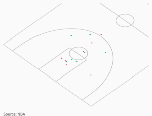
I’m not sure why link isn’t embedding so I just made it into a photo, however you can’t see the pop-ups which make it a little easier to understand. This is visualizing sentiment of our team going into our UCONN game today. There were three main questions on my survey, and there were all on a sliding scale. First, who do you think is the better team, us or UCONN. Dots further to the left mean that the player thinks UCONN is better and to the right means they think we are the better team. Most of the dots are near the middle which shows that most of the players think it is a pretty evenly matched game. The next question was about the perceived difficulty of the game, represented by the distance from the basket. Last the color of the dot represents where the player thinks we will win or loose.


Leave a Reply