Drug use continues to present major sociological issues across the United States. In particular, the rise of COVID-19 in the early months of 2020 contributed greatly to the consumption of illicit substances, and ultimately, overdose deaths. The following visualizations convey the geographic locations in which substance abuse was most prevalent during this time, while comparing this data to that of mental illness experiences. In doing so, it becomes quite evident that many states experiencing high levels of mental illness find similarities in their rates of drug use.

This pie chart, taken from data gathered by the CDC, illustrates the numbers of individuals aged 18 and older who reported using each drug within the year of 2020. While later graphs emphasize the deadliness of opioids and heroin, it is clear that such users do not make up the majority of substance abusers.
This map of the United States shows similar numbers, yet from a geographic point of view, emphasizing the vast disparities across state lines, in simply trying any illicit substance.
Highlighting the number of heroin users, in thousands, this map shows a very similar breakdown to that of all illicit substances, yet with a striking emergence by Pennsylvania. While PA reports near the lower end in the consumption of all illicit drugs, it surprisingly contains the second highest number of heroin users, specifically.
Moving on to opioid overdose deaths, this visualization utilizes points to illustrate the varying numbers of deaths in March 2020, across state lines. While some states are missing from the data set, this visualization highlights a propensity for opioid-related deaths along the East Coast of the United States, rather than the stereotypical-thought-of rural areas.
This maps the total number of deaths, compared with that of any drug overdose. While the total number, for the most part, tends to correspond with the number of drug overdose deaths, this map highlights a deeply troubling trend within a select few states, who boast higher numbers of deaths (both drug and non-drug related) as well as substance abusers.
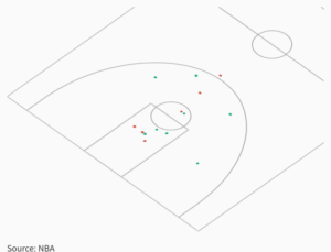
This scatter plot seeks to demonstrate the difference in percentage of reporting a cause of death in suspected drug overdoses.
To emphasize the ways in which mental health affects substance abuse, I created a visualization that explored the rates of reported mental illness across the states. In doing so, it became quite evident that the same trends appearing in those who have both used and died from substances present themselves when examining mental illness. California, Texas, and Florida, in particular, hold steady at the highest rates in the country across all three criteria.
This visualization targets those who have actually received mental health services over the year of 2020. It looks remarkably similar to the map of those who reported suffering, with the only difference pertaining to the overall scale of numbers: not everyone who reported experiencing a mental illness sought assistance.
This last map pinpoints the exact locations where from 2022-2025, the Substance Abuse and Mental Health Services Administration distributed grants, specifically for the implementation of various harm reduction practices (such as needle exchanges). While clearly not all those who are being affected by either mental illness and substance abuse received resources from these grants, it is important to note that many centers receiving funds lie within the more heavily ravaged states (such as California and Texas). As these funds are only just being distributed, there is very little data concerning the efficacy of these harm reduction programs, however over time, the policies surrounding harm reduction have gained much traction as they are shown to curb overdose deaths and limit hospitalizations.
BIBLIOGRAPHY
“Grants Dashboard.” SAMHSA, https://www.samhsa.gov/grants/grants-dashboard?f%5B0%5D=by_award_fy%3A2022&f%5B1%5D=by_nofo_number%3ASP-22-001#awards-tab.
“Harm Reduction.” SAMHSA, https://www.samhsa.gov/find-help/harm-reduction.
“Products – Vital Statistics Rapid Release – Provisional Drug Overdose Data.” Centers for Disease Control and Prevention, Centers for Disease Control and Prevention, 14 Dec. 2022, https://www.cdc.gov/nchs/nvss/vsrr/drug-overdose-data.htm.
“2020 NSDUH Annual National Report.” SAMHSA.gov, https://www.samhsa.gov/data/report/2020-nsduh-annual-national-report.
“2019-2020 National Surveys on Drug Use and Health: Model-Based Estimated Totals (in Thousands).” SAMHSA.gov, https://www.samhsa.gov/data/report/2019-2020-nsduh-estimated-totals-state.